 Fredrin
Developer
Vercel
A paper-white developer launch with precise type and a readable build trail.
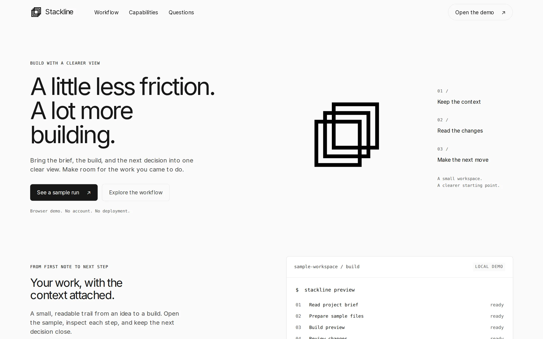
A monochrome developer landing page with an asymmetric three-zone hero, original stacked-square artwork and a working local build-log demo. Compact bordered cards and plain-spoken FAQ copy keep the focus on the product.
- Best for
- Developer tools, build utilities and technical product launches.
- Tech stack
- Use Next.js App Router, React Server Components, TypeScript and plain CSS custom properties; keep equivalent tools already installed in the destination repository. Server-render the navigation, hero, sections, FAQ and footer. Use one small client component for the sample build-log interaction. Store example steps in a typed local array and keep state inside the tab. Inline SVG supplies the original mark and small icons. Use native details/summary for disclosures and fragment links for page sections. No backend, authentication, database, analytics, paid services, real deployments or third-party APIs. Font files, if included, must be self-hosted with their license; system fallbacks must remain usable. Supply a README with development, production build/start and customization instructions. Named technologies: - Next.js (App Router) - React Server Components - TypeScript - CSS custom properties - Local SVG artwork
- Tags
- developer-tools · monochrome · light · typography · terminal
The creation prompt
1458 words, self-contained. Paste it into a chat session with your coding agent and it builds Vercel end to end.
Build the "Vercel" kickstart — A paper-white developer launch with precise type and a readable build trail.

## Design
Create a light developer-tool landing page for Stackline, a fictional workspace for reviewing software builds. Use an uninterrupted Paper White #FAFAFA canvas, Pure White #FFFFFF cards, Obsidian #171717 primary text and filled actions, Charcoal #4D4D4D paragraphs, Stone #666666 secondary text and Hairline #EBEBEB borders. The catalog accent is #171717 with #FFFFFF labels. Pure black #000000 belongs only to the original geometric mark. Reserve Terminal Green #297A3A for short demo confirmations paired with a check icon and explicit text. Keep low-contrast gray tokens out of readable text. No decorative gradient is needed for this version.

Use Geist Sans, Inter, ui-sans-serif, system-ui, sans-serif for headings and body. Prefer properly licensed self-hosted Geist Sans and Geist Mono when available, with local Inter and system monospace fallbacks; never depend on a font CDN. Headings use weight 400–450, never bold. Set the desktop hero to 64px/1 with -0.06em tracking, section headings to 30px/1.1 with -0.05em tracking, body to 16px/1.5 and navigation to 14px. Use Geist Mono, ui-monospace, SFMono-Regular, Menlo, Consolas, monospace for 11–12px uppercase eyebrows and metadata with 0.071em tracking, and 13px sentence-case code at 1.6 line height. Do not render useful text at the source's decorative 8px size.

Use a centered 1280px maximum container, 24–48px responsive gutters, a 4px spacing grid, 96–128px between sections, 16–24px card padding and 12px small gaps. The 64px sticky navigation has the same canvas fill, optional 20px backdrop blur and no shadow or dividing rule. Place a small original stacked-square symbol and Stackline wordmark left, Workflow, Capabilities and Questions links next, and a quiet Open the demo pill on the far right. At 1440×900, the main container starts around x=80; the hero begins about 100px below the nav and uses three asymmetric zones. The left half contains an uppercase BUILD WITH A CLEARER VIEW eyebrow, a three-line headline, a short paragraph and two actions. The middle contains a 180–220px original black mark made from three offset square outlines. The right is a narrow technical aside with three numbered short statements. Do not use a triangle mark, borrowed wordmark or customer logo strip. Keep the hero airy but the type compact; the next section should be visible in the first screenshot.

The primary See a sample run action is #171717 with #FFFFFF text; the secondary Explore the workflow action has a transparent fill, #4D4D4D text and a #EBEBEB outline. Rectangular buttons and cards have exactly 6px corners; only compact nav actions may be pills. Controls have at least 44px hit targets. Depth is a hairline ring, optionally 0 0 0 1px rgba(0,0,0,.08), 0 0 0 2px #FAFAFA; never a floating drop shadow. A white outlined CLI panel anchors the next two-column section. Give it a compact title bar, local-demo badge, monospace command and a readable build log. Use $ for commands and a check plus green text for successful simulated steps. Pair every status with words. Follow with a three-column capability grid; two cards stay white and one is inverted #171717 with white text. Keep inverted text readable and reserve this treatment for one card. End with three native FAQ disclosures and a modest footer.

Below 800px, reduce the headline to 40–48px, stack the hero, workflow and card grid, shrink the mark to 120px and wrap the navigation into an accessible second row. Preserve 20–24px gutters, visible focus and 44px controls from 360px upward. No horizontal page overflow; code can scroll only inside its own labeled panel. Keep content visible in server HTML and at 200% zoom. Use 150ms color transitions only, disabled under prefers-reduced-motion. No entrance reveals, autoplay, photographic backgrounds, remote assets or looping animation.

Page structure, in order:
1. Minimal navigation with the original Stackline wordmark and in-page links
2. Three-zone hero with a regular-weight headline, stacked-square mark and technical aside
3. Two-column workflow section with a working local build-log demo
4. Three compact capability cards with one inverted surface
5. Native FAQ disclosures and an honest fictional-product footer

## Tech stack
Use Next.js App Router, React Server Components, TypeScript and plain CSS custom properties; keep equivalent tools already installed in the destination repository. Server-render the navigation, hero, sections, FAQ and footer. Use one small client component for the sample build-log interaction. Store example steps in a typed local array and keep state inside the tab. Inline SVG supplies the original mark and small icons. Use native details/summary for disclosures and fragment links for page sections. No backend, authentication, database, analytics, paid services, real deployments or third-party APIs. Font files, if included, must be self-hosted with their license; system fallbacks must remain usable. Supply a README with development, production build/start and customization instructions.

Named technologies:
- Next.js (App Router)
- React Server Components
- TypeScript
- CSS custom properties
- Local SVG artwork
Where the repo you are working in already has an equivalent in place, keep the repo's choice and say which one you kept.

## Everything else
Build a rebrandable developer-tool landing page with a local build-log demo. The sample product is Stackline, a fictional workspace for reviewing software builds. Hero headline: A little less friction. A lot more building. Break it over three lines on desktop. Supporting copy: Bring the brief, the build, and the next decision into one clear view. Make room for the work you came to do. The hero aside reads 01 / Keep the context; 02 / Read the changes; 03 / Make the next move. Below the hero actions add Browser demo. No account. No deployment.

Workflow, Explore the workflow, Open the demo and See a sample run all target #workflow. Capabilities targets #capabilities and Questions targets #questions. The wordmark and Back to top target #top. The workflow eyebrow is FROM FIRST NOTE TO NEXT STEP. Its heading is Your work, with the context attached. Its paragraph is A small, readable trail from an idea to a build. Open the sample, inspect each step, and keep the next decision close. Show a numbered list: Gather the brief; Follow the build; Review what changed.

The demo panel is titled sample-workspace / build and explicitly labeled LOCAL DEMO. Initially show the illustrative command $ stackline preview and four rows: Read project brief — ready; Prepare sample files — ready; Build preview — ready; Review changes — ready. A Run sample button immediately replaces ready labels with completed and reveals Sample run complete. Nothing was deployed. Announce this in a polite live region. The button becomes Reset sample; resetting restores the initial state. Do not invoke any real CLI, network, deployment or filesystem operation. Keep the static example visible with JavaScript off and state that running the sample needs JavaScript. Every activation must have a visible result, with no fake loading delay or invented timing metric.

The capability cards are Context that stays close; A readable build trail; Room for your next idea. Describe keeping sample notes alongside work, reviewing a short local activity trail, and adapting the page to the user's own product. Avoid unverifiable performance, uptime, adoption, security or customer claims. FAQ questions: Is Stackline a real service? Does the demo deploy anything? Can I adapt this page? Answers must explain that Stackline is a fictional sample, the interaction changes only local browser state and resets on reload, and all copy, colors and demo steps are editable. The footer says Fictional product. Local browser demo. No affiliation or endorsement. Do not add signup, login, pricing or download controls without real destinations.

Use header, navigation, main, section and footer landmarks, one h1, a skip link, meaningful accessible names and a visible focus outline. Mark the decorative SVG aria-hidden and keep the sample panel labeled. The page must remain legible without JavaScript and at narrow widths and 200% zoom. In the README, explain how to replace the product name, hero copy, palette, capability data and demo steps. The brief is self-contained and needs no access to its inspiration site.

### Non-negotiables
- Responsive from 360px through desktop — no horizontal page overflow at any width. Deliberately scrollable regions stay within the viewport and remain keyboard and touch accessible.
- Every text/background pair clears WCAG AA (4.5:1 for body, 3:1 for large text); adjust a tint rather than shipping a failing pair.
- Fully keyboard operable, with a visible focus ring drawn in the accent colour.
- Honour `prefers-reduced-motion` — swap every transition for an instant state change.
- Write real copy in the voice described above; no lorem ipsum and no TODO placeholders.
- Use system or self-hosted fonts and CSS/SVG-drawn graphics — do not depend on a remote image or icon service.

Build the whole page end to end and show me the result running — not a description of it.
Pasting the prompt is step one. Fredrin runs the agent that builds it, one ticket per look.