Vanta
A full-bleed lavender hero under a deep-plum announcement bar: a two-line 88px light serif headline, a pill email field with a violet demo button, a spectacled owl mascot wearing framework medals, and a white app window rising into a fixed strip of customer wordmarks.
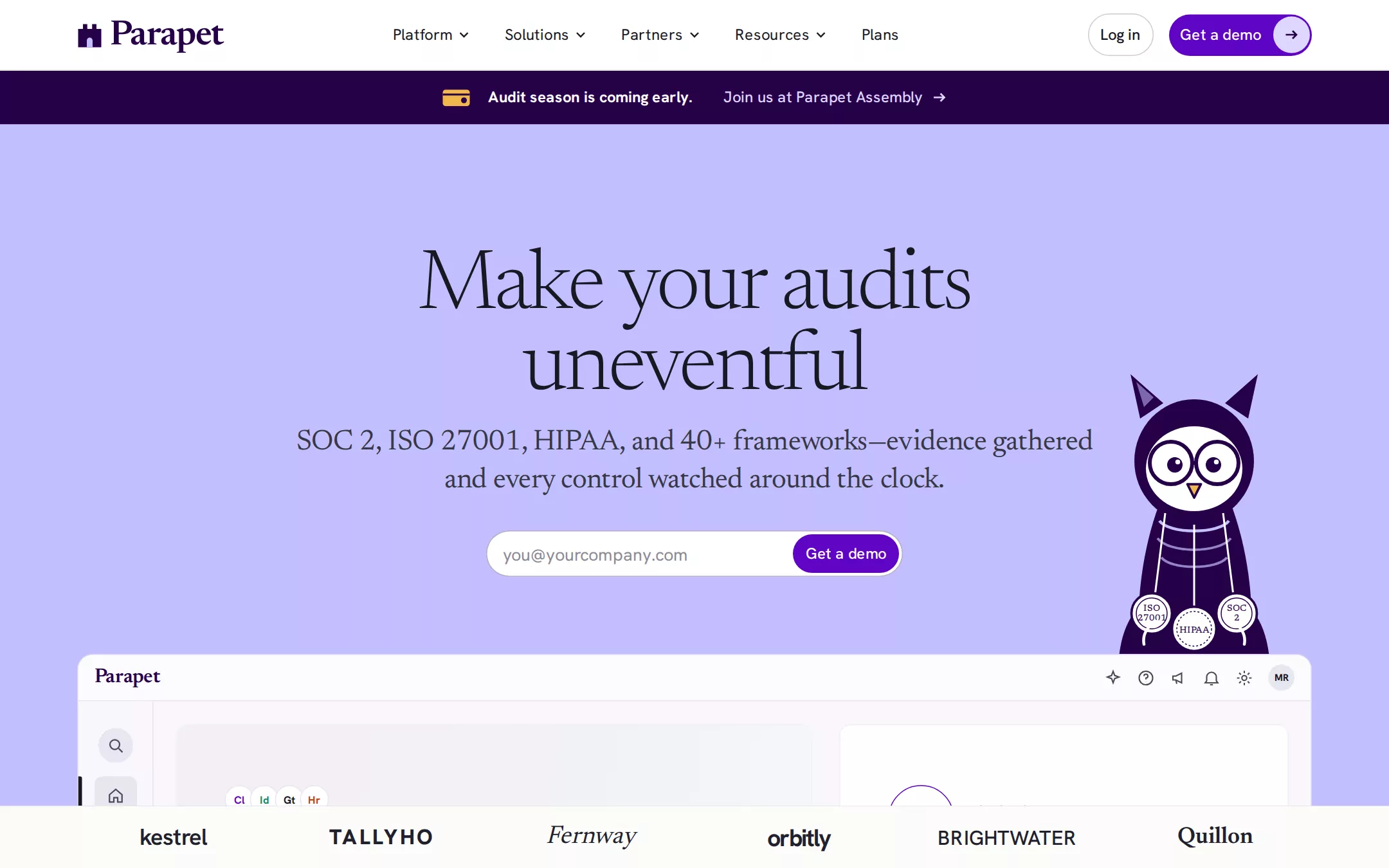
An original Parapet homepage: a sticky white 73px header with a plum battlement mark, five 16px links with chevrons, a Log in outline pill and a violet Get a demo pill ending in a lilac arrow disc; a 56px plum announcement bar; a full-bleed lavender hero with a centred two-line 88px light serif headline, a 30px serif subline and a pill email field, with a spectacled plum owl mascot wearing ISO 27001, HIPAA and SOC 2 medals; a white app window rising into the fold above a fixed chalk strip of invented customer wordmarks; then a six-card platform grid, an agent section, a big serif testimonial, a framework carousel, a dark segments band, resources, a lavender closing statement and a plum footer.
- Best forCompliance automation, security and GRC tools, trust centres, audit and risk software, and any B2B product that wants a friendly, editorial light page with a mascot and one violet action colour.
- Tech stack- Next.js (App Router) - React - TypeScript - CSS custom properties Use Next.js App Router, React and TypeScript with plain CSS custom properties for every colour, radius and spacing token. Render the page as a server component; the only client code is the email field's validation, the framework row's arrow buttons and the logo strip's pin-until-scrolled behaviour. Self-host Newsreader (variable, with the opsz axis) and Hanken Grotesk (variable), both SIL Open Font License, as woff2 through next/font/local — no remote font request. Draw the battlement mark, the owl mascot, every icon, the product window and the framework seals in HTML, CSS and inline SVG — never a bitmap or screenshot. Provide page metadata. Build and run the production page before capturing its preview.
The prompt. 2009 words, self-contained.
Build the "Vanta" kickstart — A full-bleed lavender hero under a deep-plum announcement bar: a two-line 88px light serif headline, a pill email field with a violet demo button, a spectacled owl mascot wearing framework medals, and a white app window rising into a fixed strip of customer wordmarks.

## Design
Build a rebrandable landing page for a continuous compliance and trust-management platform. Security leads, founders and GRC teams use it to get SOC 2, ISO 27001, HIPAA and 40+ other frameworks done once and then kept true: it connects to the cloud, identity and HR tools a company already runs, checks every control around the clock, gathers audit evidence automatically and hands the auditor a finished file.

Create a complete landing page for Parapet, a fictional compliance company. This is a concept presentation, not a real company — no real product, customer, person or logo. Use original branding, illustration and copy throughout.

Color: one lavender field, deep plum chrome and a single violet action colour on white. Lavender #C2BEFF fills the whole hero, edge to edge, and returns as the closing band — it is the page's signature. Paper #FFFFFF is the header, every section below the hero, the product window's cards and the email field. Ink #181822 is headings, nav and body text (never pure black). Slate #373744 is the hero subline and secondary copy. Violet #5E05C4 fills every primary button, the checked steps and the framework seal outline, always with #FFFFFF text on it. Plum #260048 is the announcement bar, the wordmark, the mascot and the footer. Lilac #DDD6FF is the announcement link text and the round arrow chip inside the header button. Mist #E6E6F0 is every hairline, the product cards in the Platform grid and the avatar disc. Chalk #FCFCFA is the logo strip. Night #1C1C2A is the one dark section (Segments). Mint #0F8A5F is the Connected pill text and the progress fill, on #E3F6EE; it appears only inside the product window. No gradients on surfaces, no shadows at rest — depth comes from the lavender-to-white cut and 1px Mist borders.

Typography: two families. Display is "Newsreader", "Iowan Old Style", Georgia, "Times New Roman", serif — a light, slightly condensed bookish serif. Interface is "Hanken Grotesk", "Helvetica Neue", Arial, sans-serif — a plain neo-grotesk. Hero headline Newsreader 88px/83.6px weight 300 at -0.03em, optical size 30. Hero subline Newsreader 30px/39px 400 at -0.01em. Section headings Newsreader 56px/61.6px 400 at -0.02em; smaller section headings 42px/50.4px 400; card and segment titles Newsreader 30px/40.5px 400 at -0.015em; the closing statement Newsreader 96px/91.2px 300 at -0.03em. The wordmark is Newsreader 600 at -0.03em. Everything else is Hanken Grotesk: nav, buttons and body 16px/25.6px (nav 400, buttons 500); section intros 18px/25.6px 400; platform card titles 24px/31.2px 500 with 14px/22.4px descriptions; eyebrows 12px/15.6px 500 uppercase at +0.08em; the announcement 16px with a 700 lead-in.

Layout: a 1440px viewport, 80px side padding, so content spans 1280px; section text columns narrow to 640px or 832px and centre. Sections sit on 128px vertical padding. Radii: 999px on every button and the email field, 16px on cards and the product window's top corners, 12px inside the window, 4px on in-app buttons and pills.

Header: sticky, 73px tall including a 1px Mist bottom rule, Paper. At x 80 a 26×28 plum battlement mark (a crenellated wall with a lavender arched gate) beside Parapet in 36px Newsreader 600 plum. The links start at x 407: Platform, Solutions, Partners, Resources — each with a 16px chevron — then Plans, 16px Ink, about 34px apart. Right, ending at x 1360 with 16px between: a Log in pill (44px tall, 8px 12px padding, 1px rgba(24,24,34,0.22) border) and a Get a demo pill — 43px tall, Violet, white 500 label, padding 2.4px 2.4px 2.4px 12px, ending in a 38px Lilac circle holding a Plum arrow.

Announcement bar: directly under the header, 56px tall, full-bleed Plum, centred: a small amber ticket glyph, Audit season is coming early. in white 700, then 32px later Join us at Parapet Assembly → in Lilac 500.

Hero: full-bleed Lavender with 128px top padding, centred. The headline top lands at y 257: Make your audits / uneventful, two lines in an 832px column, Ink. 16px below, the Slate subline in two lines: SOC 2, ISO 27001, HIPAA, and 40+ frameworks—evidence gathered and every control watched around the clock. 32px below, a 432×48 pill email field (white, 1px rgba(36,6,66,0.33) border, 18px placeholder [email protected] in #8A8A96) with a 40px Violet Get a demo button sitting 4px inside its right end. To the right, from x 1142 and top y 382, a 192×309 plum owl mascot drawn in inline SVG: tufted ears, a white face disc with big round spectacles, an amber beak, a lanyard of three white medal seals reading ISO 27001, HIPAA and SOC 2 at its chest — it stands with its feet hidden behind the product window.

Product window (id product): 80px below the email field, a 1280px app frame with 16px top corners and a 1px #D9D7F2 border, its top 150px visible in the first viewport above the logo strip. A 48px top bar holds Parapet in 21px Newsreader 600 plum on the left and, on the right, five 18px line icons (sparkle, help, megaphone, bell, gear) and a 27px Mist avatar reading MR. Below it a 78px icon rail (search disc, a selected home tile with a 4px Ink edge marker, send, check, chart, a divider, clipboard, alert) and two white cards with 12px radius: the left one (660px) opens on a faint pink-to-grey wash with four overlapping 30px integration discs, Now watching 214 controls across your stack., a Mint Connected pill, and an inset grey panel One control needs attention / Storage bucket access logging is turned off with a 4px-radius plum Draft a fix button; the right one shows a violet ring seal SOC 2 beside SOC 2 Type II in 34px 500, a half-filled Mint progress bar, In progress, and four steps — Connect your systems (filled violet check), Fix failing controls (outlined), Collect evidence and Book your auditor (greyed).

Logo strip (id logos): fixed to the bottom of the viewport until the page scrolls past the hero, 65px tall, Chalk with a Mist top rule, six 200px cells from x 80 with 16px gaps, each an invented wordmark in a different weight and case: kestrel, TALLYHO, Fernway (italic serif), orbitly, BRIGHTWATER, Quillon (serif). Above the static repeat lower down, the eyebrow TRUSTED BY 9,000+ TEAMS, FROM SEED TO PUBLIC COMPANY.

Platform (id platform): Paper. Centred 56px heading One place for all of it and an 18px line Compliance, risk and proof, run by one patient platform. 64px below, a 3×2 grid of 413px Mist cards, 16px radius, 33px padding, about 560px tall, each with a 24px 500 title, a 14px description and a drawn UI vignette at the bottom: Compliance, Risk, Vendor Risk, Audit, Trust Center, Questionnaires.

Agent (id agent): Paper. A centred two-line 56px heading Parapet Agent: a compliance engineer that never clocks out, then a two-column block — an 18px paragraph on the right (it drafts policies, answers security questionnaires and opens fixes in your tracker) and on the left a drawn chat panel with three Agent replies.

Testimonial (id testimonial): a centred 56px Newsreader 300 quote at 67.2px line height in a 944px column — “Parapet turned our security review from a three-week detour into a link we send.” — with an invented name and role beneath in 16px.

Frameworks (id frameworks): a left-aligned 42px heading All the frameworks you need with an eyebrow STAY COMPLIANT, two round arrow buttons at the right, and a horizontal row of 363px cards each titled in 28px Newsreader (SOC 2, ISO 27001, HIPAA, GDPR, NIST AI RMF, ISO 42001, PCI DSS, FedRAMP) with a line drawing of its seal, ending in a Violet Explore all frameworks pill.

Segments (id segments): the one dark band, Night, white text. Centred 56px heading Built for where you are and an 18px line, then three columns from x 80, x 523 and x 965: Startups, Mid-market and Enterprise in 30px Newsreader with 18px paragraphs.

Resources (id resources): Paper. A 42px heading Read up before the auditor does and four cards with 30px Newsreader titles — Parapet Field Notes, The SOC 2 checklist, Audit week, minute by minute, State of Trust 2026 — each over a flat Lavender or Lilac illustration panel.

Closing (id closing): Lavender again, full-bleed. A left-aligned 96px Newsreader 300 statement The quiet way to prove trust over two lines, the email field and Get a demo button repeated beneath.

Footer: Plum, white text, 96px top padding: seven columns of 14px links (Product, Frameworks, Platform, Become a partner, Resources, Policies, Company) with 14px 500 titles, then a row of four round white framework seals, and © 2026 Parapet in 12px.

## Tech stack
- Next.js (App Router)
- React
- TypeScript
- CSS custom properties

Use Next.js App Router, React and TypeScript with plain CSS custom properties for every colour, radius and spacing token. Render the page as a server component; the only client code is the email field's validation, the framework row's arrow buttons and the logo strip's pin-until-scrolled behaviour. Self-host Newsreader (variable, with the opsz axis) and Hanken Grotesk (variable), both SIL Open Font License, as woff2 through next/font/local — no remote font request. Draw the battlement mark, the owl mascot, every icon, the product window and the framework seals in HTML, CSS and inline SVG — never a bitmap or screenshot. Provide page metadata. Build and run the production page before capturing its preview.
Where the repo you are working in already has an equivalent in place, keep the repo's choice and say which one you kept.

## Everything else
Keep Parapet clearly fictional and rebrandable: no real company, customer, person, testimonial, mascot or logo, and no source screenshot, product name or copy; the integration discs carry two-letter initials, never real brand marks. Framework names (SOC 2, ISO 27001, HIPAA, GDPR and so on) are public standards and may be named. Text pairs clear WCAG AA: #181822 and #373744 on #C2BEFF and #FFFFFF, #FFFFFF on #5E05C4, #260048 and #1C1C2A, #DDD6FF on #260048, #0F8A5F on #E3F6EE. Violet is the only filled action colour — never a second button colour. The mascot and product window are decorative and hidden from assistive technology; the email field has a real visible-on-focus label. Every link leads to a real anchor on the page; the page loads no analytics or tracking script and shows no cookie banner. Every control shows a 2px #181822 focus ring with a 2px offset (white on Plum and Night). Motion: the product window rises 24px and fades in once on load, the mascot blinks every few seconds, the logo strip unpins as the hero leaves, and buttons darken 8% on hover — all of it stops under prefers-reduced-motion, and everything is visible without JavaScript. At 360px the header collapses to the mark, Get a demo and a Menu button, the announcement shortens to its link, the headline drops to 44px/44px, the subline to 20px/28px, the email field goes full width, the mascot hides, the product window shows only its right card, the Platform grid and Segments stack, the frameworks row scrolls horizontally, and the page never overflows horizontally.

### Non-negotiables
- Responsive from 360px through desktop — no horizontal page overflow at any width. Deliberately scrollable regions stay within the viewport and remain keyboard and touch accessible.
- Every text/background pair clears WCAG AA (4.5:1 for body, 3:1 for large text); adjust a tint rather than shipping a failing pair.
- Fully keyboard operable, with a visible focus ring drawn in the accent colour.
- Honour `prefers-reduced-motion` — swap every transition for an instant state change.
- Write real copy in the voice described above; no lorem ipsum and no TODO placeholders.
- Use system or self-hosted fonts and CSS/SVG-drawn graphics — do not depend on a remote image or icon service.

Build the whole page end to end and show me the result running — not a description of it.