 Fredrin
Developer
Ui
A monochrome component studio with quietly rounded edges.
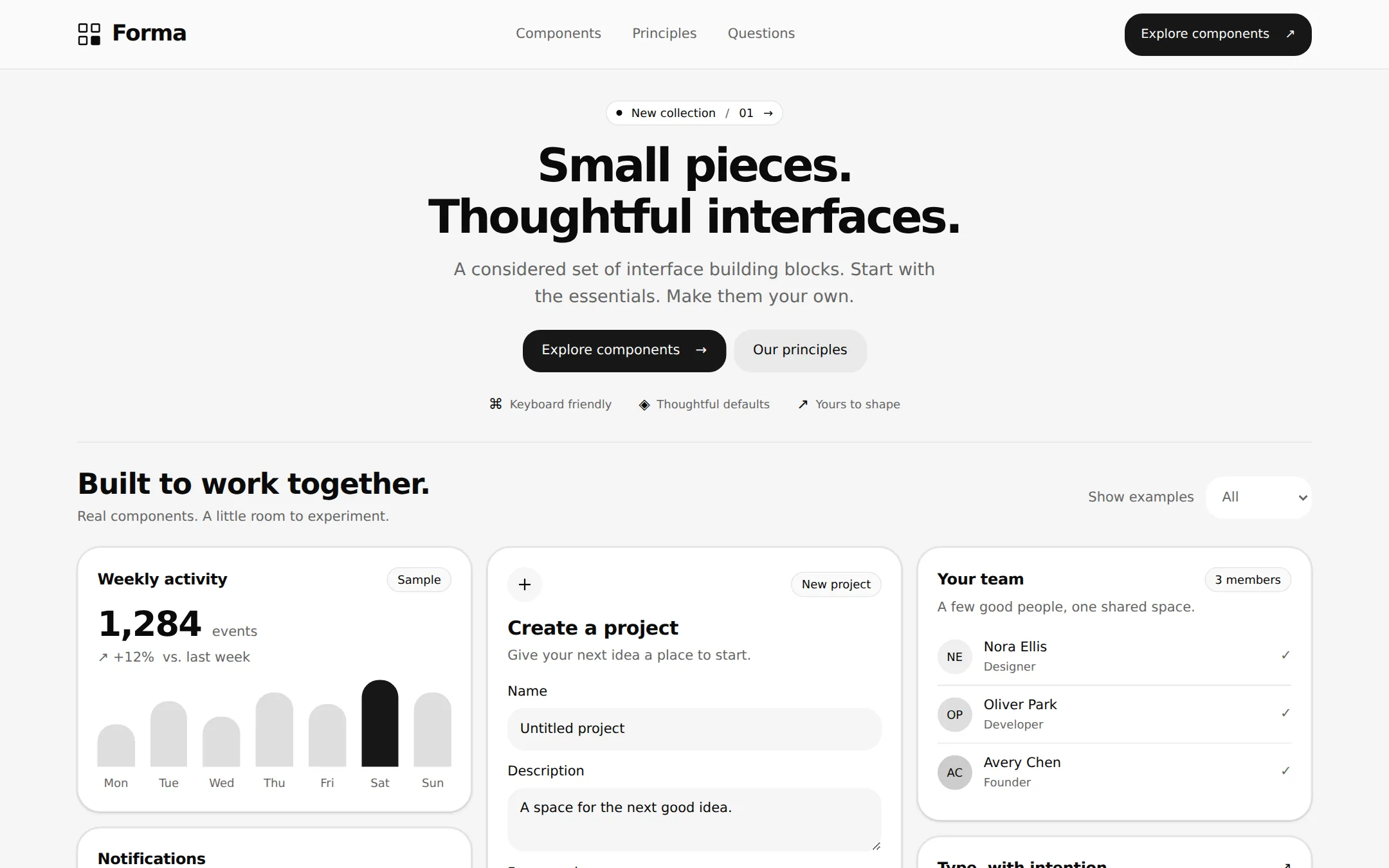
A restrained component studio on soft gray paper. A centered introduction opens into a working grid of a sample activity chart, a local project form, a team list and notification preferences. White cards, generous corners, precise type and dark pill controls let the interface itself explain the product.
- Best for
- Developers and small product teams presenting a design system, a component collection or a frontend toolkit.
- Tech stack
- Use the latest stable Next.js with the App Router, React and TypeScript. Keep existing equivalent choices if building inside an established repository. Prefer Server Components for page structure with small Client Components only for the local form, example filter and notification toggle. Use plain CSS and custom properties for design tokens; reuse equivalent accessible primitives if already installed. Native select, checkbox and details controls are sufficient. Store content, sample data and nav links in one typed site configuration. No API keys, database, authentication, analytics, paid services or external image/icon hosts are needed. Use local or system fonts; do not fetch fonts at runtime. - Next.js (App Router) - React - TypeScript - CSS custom properties - Local React state
- Tags
- components · developer · monochrome · rounded · light · design system
The creation prompt
1528 words, self-contained. Paste it into a chat session with your coding agent and it builds Ui end to end.
Build the "Ui" kickstart — A monochrome component studio with quietly rounded edges.

## Design
Build a light component-studio page with the interface itself as the visual centerpiece. Use a centered 1280px maximum content area, 32px desktop gutters (20px on small screens), 4px spacing units, 48–80px section gaps and a compact but readable three-column component grid. The 72px header has a small original four-square mark and Forma wordmark at left, three anchor links in the middle, and one dark CTA at right. Center the hero below it with a small rounded release pill, a 48px two-line headline, a short lead and two actions. At 1440px, start the showcase around 400px down the page so its real cards occupy the lower half of the first viewport.

Use #F5F5F5 for the page and secondary controls, #FFFFFF for cards, #FAFAFA for the header, #0A0A0A for primary text, #666666 for muted reading text and #E5E5E5 for hairlines. The sole primary action treatment is #171717 with #FAFAFA labels. Reserve #E7000B for validation errors on white; never use it for decorative accents. Do not add photography, illustrations, gradients, colorful charts or branded logos. Use simple functional inline SVG icons at 1.5–2px stroke weight, currentColor, with accessible labels on their parent controls.

Use self-hosted Geist or Inter if available, otherwise ui-sans-serif, system-ui, -apple-system, Segoe UI, sans-serif. Headlines are weight 600: hero 48px/1.1 with -0.05em tracking (36px on mobile); section headings 30px/1.2 with -0.025em. Body is 14px/1.5, hero lead 18px/1.56, labels 14px/500, and brief metadata may be 12px. Use tabular numbers for the data card.

Every card has 24px corners, 20px padding and a 1px #E5E5E5 border. Layer shadows 0 0 0 1px rgba(23,23,23,0.05), 0 1px 3px rgba(0,0,0,0.1), and 0 1px 2px -1px rgba(0,0,0,0.1). Buttons, inputs, badges and select boxes use 18px corners. Primary actions are dark; secondary actions use a soft gray fill; tertiary actions are text links. Inputs sit on soft gray, with persistent visible labels. Keep editable fields and touch targets at least 44px high. Use a visible 2px dark focus outline with 3px offset. Do not remove focus styling.

In the showcase, use three equal columns with 16px gaps. The left column has a weekly activity chart above a notification preference card; the middle has a project form; the right has a team list above a compact type specimen. Use monochrome chart columns and written data values, tonal initials avatars and native controls. The example filter sits in the section header. Below, add the three principles, a small JSX example, native disclosure questions and a quiet footer. On narrow screens reduce gutters and headline size, wrap navigation and actions, then stack every card to a single column. No page-level horizontal overflow.

All control transitions last at most 150ms; prefers-reduced-motion removes them. No entrance animations or hidden initial content. The primary button component rules govern the dark/light polarity, and error-only red overrides contradictory decorative-token shorthand. Darker muted text and larger touch/focus treatments are deliberate accessibility adaptations.

Typography stack: Geist, Inter, ui-sans-serif, system-ui, -apple-system, 'Segoe UI', sans-serif.

Page structure:
1. Header: original four-square Forma mark, Components, Principles and Questions anchor links, and a dark Explore components link.
2. Hero: a small release pill, the headline Small pieces. Thoughtful interfaces., a two-line introduction, dark Explore components and soft Our principles links, followed by three short capability labels.
3. Component showcase: Examples heading, short supporting copy and a native All / Inputs / Data select. A three-column desktop grid holds an activity chart and notification card at left, a taller project form at center, and a team list and typography sample at right. Stack cards without clipping on mobile.
4. Principles: three numbered statements about readable defaults, keyboard access and owning your components, followed by a small original JSX usage example.
5. Questions: three native disclosure rows explaining the sample, local-only interactions and rebranding.
6. Footer: Forma wordmark, in-page navigation and a clear fictional-demo disclosure.

## Tech stack
Use the latest stable Next.js with the App Router, React and TypeScript. Keep existing equivalent choices if building inside an established repository. Prefer Server Components for page structure with small Client Components only for the local form, example filter and notification toggle. Use plain CSS and custom properties for design tokens; reuse equivalent accessible primitives if already installed. Native select, checkbox and details controls are sufficient. Store content, sample data and nav links in one typed site configuration. No API keys, database, authentication, analytics, paid services or external image/icon hosts are needed. Use local or system fonts; do not fetch fonts at runtime.

- Next.js (App Router)
- React
- TypeScript
- CSS custom properties
- Local React state
Where the repo you are working in already has an equivalent in place, keep the repo's choice and say which one you kept.

## Everything else
Build a component-studio landing page with interactive UI examples on Next.js (App Router).

Create Forma, a fictional component studio. Header navigation links to Components (#components), Principles (#principles) and Questions (#questions). The original mark is four small outlined squares with the lower-right square filled; it must not reuse another product's logo. The release pill reads New collection · 01. Hero headline: Small pieces. Thoughtful interfaces. Lead: A considered set of interface building blocks. Start with the essentials. Make them your own. Primary action Explore components links to the showcase; secondary Our principles links to the principles. Below them show Keyboard friendly, Thoughtful defaults and Yours to shape as short text labels with small functional icons.

Showcase title: Built to work together. Supporting line: Real components. A little room to experiment. Label its native select Show examples, with All, Inputs and Data options; filtering hides unrelated cards, preserves the others, and announces the visible count. All shows five cards; Inputs shows the project form and notifications; Data shows weekly activity and the team list. Keep the type specimen only in All. The initial state is All.

Card 1, Weekly activity: show 1,284 events, +12% vs. last week, a Sample badge and seven monochrome bars for Mon–Sun with values 120, 184, 142, 208, 176, 244, 210. Provide those exact labels/values as an accessible chart description or table. Card 2, Notifications: a checked native Send weekly summary checkbox with the explanation A quiet digest, every Monday. Toggling updates a visible local status, initially Weekly summary enabled. Card 3, Create a project: supporting copy Give your next idea a place to start., a Name field initially Untitled project, a Description textarea initially A space for the next good idea., a Framework select with Next.js, React and Other, a Public preview checkbox initially checked, and a dark Create project button. Valid submission announces Created [name] in this demo only. and shows the submitted summary. An empty name produces an inline error associated with the field; trim whitespace and keep entered values. Include a Reset action to restore the initial form and clear feedback. No network requests, persistence or account creation.

Card 4, Your team: three sample people, Nora Ellis / Designer / NE, Oliver Park / Developer / OP, and Avery Chen / Founder / AC, with grayscale initial avatars and a 3 members label. No invite or more-menu button without functionality. Card 5, Type, with intention.: Aa at 48px, a sample alphabet and a small label 48 / 600 / -0.05em.

Principles: 01 Readable by default — Clear type and quiet contrast leave room for the work. 02 Ready for the keyboard — Every control has a label, a focus state and a predictable next step. 03 Yours to shape — Change the tokens. Keep the details that make things feel right. Follow with a short code example using an original ProjectCard component, explicitly marked as illustrative code, with no install/download promise. Questions use native details/summary: Is this a real service? (No; it is a component-studio demo.), Where does my project go? (Only into this browser session; reload clears it.), and Can I change the look? (Edit the local tokens and content configuration.). Footer states Forma is a fictional studio. People, projects and activity are sample content.

Build a complete responsive page, not a single-screen mock. All links reach real sections; all controls have their stated local behavior, labels and visible keyboard focus. Use semantic landmarks and status announcements. Document how to change the name, content, chart values, type and palette in a short project README. The site runs locally without credentials or external assets.

### Non-negotiables
- Responsive from 360px through desktop — no horizontal page overflow at any width. Deliberately scrollable regions stay within the viewport and remain keyboard and touch accessible.
- Every text/background pair clears WCAG AA (4.5:1 for body, 3:1 for large text); adjust a tint rather than shipping a failing pair.
- Fully keyboard operable, with a visible focus ring drawn in the accent colour.
- Honour `prefers-reduced-motion` — swap every transition for an instant state change.
- Write real copy in the voice described above; no lorem ipsum and no TODO placeholders.
- Use system or self-hosted fonts and CSS/SVG-drawn graphics — do not depend on a remote image or icon service.

Build the whole page end to end and show me the result running — not a description of it.
Pasting the prompt is step one. Fredrin runs the agent that builds it, one ticket per look.