 Fredrin
SaaS
Typeform
A publishing house meets a product dashboard: literary serif headlines on aubergine and cream, and a form that asks one question at a time.
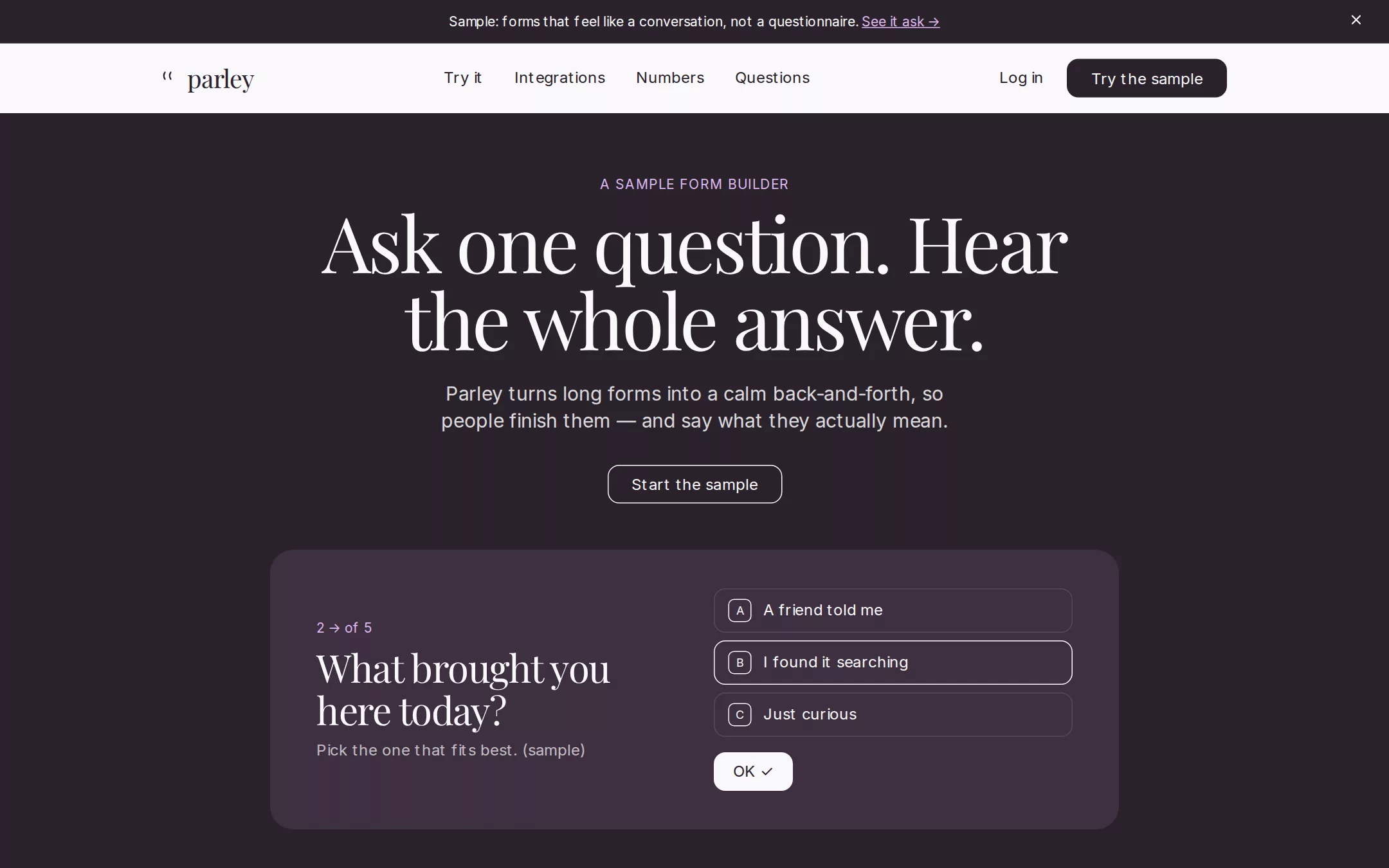
An original Parley form-builder page: an Aubergine announcement bar, a cream navigation bar, a dark centred hero with a Deep Plum card showing one sample question, a Parchment Try it band with a working three-step local form, a cream grid of generic integration pills, a dark band of sample figures, native questions and a cream footer.
- Best for
- Form and survey builders, onboarding and research tools, and any product whose pitch is a calmer conversation with its users.
- Tech stack
- - Next.js (App Router) - React - TypeScript - CSS custom properties - Native HTML disclosures Use Next.js App Router, React and TypeScript with plain CSS custom properties and original inline SVG for the wordmark glyph, integration glyphs and close icon. Preserve equivalent tools already installed in the host project. Render the page as a server component; the only client components are the announcement bar's close button and the Try it sample form, which keep local React state and submit nothing. Draw the hero preview card and the sample form in HTML and CSS — no product screenshot image. Native details and anchors need no JavaScript. Use local font stacks only — no remote font, image, logo, form backend or analytics host. Provide page metadata. Build and run the production page before capturing its preview.
- Tags
- saas · forms · editorial · serif · light · dark
The creation prompt
1811 words, self-contained. Paste it into a chat session with your coding agent and it builds Typeform end to end.
Build the "Typeform" kickstart — A publishing house meets a product dashboard: literary serif headlines on aubergine and cream, and a form that asks one question at a time.

## Design
Build a rebrandable SaaS landing page for a conversational form builder.

Create a complete landing page for Parley, a fictional form builder that asks people one question at a time — like a good interviewer — instead of showing them a wall of fields. Its core idea: a publishing house meets a product dashboard — serif headlines borrowed from a literary journal, UI chrome stripped to the bare minimum so the type owns every screen. This is a concept presentation, not a real product — no sign-up, pricing, customer logos, integration brand logos, awards, real people or real reviews. Use original branding, UI and copy throughout.

Color: warm ink on cream. Aubergine Ink #2A222B is primary text, the hero and dark-band background, and every CTA fill — never pure black. Deep Plum #3E3040 is the elevated surface inside dark sections (the product preview card in the hero). Cream Canvas #FAF9FB is the page background, the navigation and reversed text on dark. Parchment #F5F3F6 is the alternate light band. Pure White #FFFFFF is card and integration-pill surfaces. Ash #655D67 is secondary body text; Fog #837A85 is placeholder text; Mist #D4D1D5 is light borders and dividers; Slate Mid #564B58 is dividers on dark. Violet Mist #9454AB is typographic ink for uppercase section eyebrows on light bands only — never a button, link, hover or background. Lavender Whisper #DDB7F0 is the eyebrow and inline-link colour on dark surfaces and a soft tint (#F9F2FD) behind the light product card. Only #2A222B, #FAF9FB, #F5F3F6 and #FFFFFF are section backgrounds; alternate dark and light bands and never stack two of the same tone. No gradients.

Typography: display headlines in a classical editorial serif at weight 400 only — "Playfair Display", Georgia, "Times New Roman", serif — standing in for the source's Tobias, always with negative tracking: 80px/1.0 at -2.48px for the hero, 64px/1.1 at -1.98px for section headings and stat values. Everything functional — body, nav, buttons, labels — in one neo-grotesque, Inter, system-ui, -apple-system, "Segoe UI", sans-serif, at weight 400 (500 for nav only), with font-feature-settings "clig", "liga", "ss01", "ss11": 20px/1.4 subheads, 16px/1.49 body, 14px uppercase eyebrows at 0.08em tracking. Never set a headline in a heavy sans, never use the serif for body or UI. Locally installed fonts only, no remote font request. Shapes: 12px radius on every button, 24px on every card and pill container, 8px on small images; no 999px pills and no square buttons. Spacing: 8px base, 16px gaps between stacked text, 48px before a CTA, 64px vertical band padding, content in a 1200px column with 48px side padding. Elevation: none — no box-shadows anywhere; depth is a change of background, dark against light.

Announcement bar: a full-width strip in Aubergine Ink #2A222B, 12px 48px padding, centred 14px #FAF9FB text — Sample: forms that feel like a conversation, not a questionnaire. — followed by an underlined Lavender Whisper #DDB7F0 link, See it ask →, that jumps to the One question at a time section, and a 16px cream close glyph on the right that hides the bar from local state.

Navigation: a 72px Cream Canvas #FAF9FB bar, sticky. Left: an original wordmark — a small speech-mark glyph (two 1.5px Aubergine strokes) and parley in the serif at 26px weight 400. Centre: 16px weight-500 Aubergine anchor links Try it, Integrations, Numbers, Questions, each a ghost text button with 0 radius and 0 8px padding. Right: a Log in text link that jumps to Questions, and one primary button, Try the sample — #2A222B fill, #FAF9FB 16px text, 12px radius, 8px 24px padding.

Hero: full-bleed Aubergine Ink #2A222B, centred. A 14px uppercase Lavender Whisper #DDB7F0 eyebrow, A SAMPLE FORM BUILDER; an 80px Cream Canvas serif headline on two lines, Ask one question. Hear the whole answer.; a 20px #FAF9FB subhead at 85% opacity, max 560px, Parley turns long forms into a calm back-and-forth, so people finish them — and say what they actually mean.; then one button, Start the sample — #2A222B fill with a 1px #FAF9FB border and #FAF9FB text, 12px radius. Below, 48px down, a 880px-wide Deep Plum #3E3040 product preview card with 24px radius and 48px padding showing one sample question in a form: a small 14px #DDB7F0 counter 2 → of 5, a 40px serif question in #FAF9FB, What brought you here today?, a 16px #FAF9FB helper at 70% opacity, then three answer rows stacked as 12px-radius outlined choices with a 1px #564B58 border and a square key letter — A A friend told me, B I found it searching, C Just curious — the second shown selected with a #FAF9FB border, then an OK ✓ button in #FAF9FB with #2A222B text. It is drawn in HTML and CSS, no screenshot image.

One question at a time (id try): a Parchment #F5F3F6 band, two columns. Left: a 14px uppercase Violet Mist #9454AB eyebrow TRY IT, a 64px serif heading One question at a time., a 16px Ash #655D67 body at max 480px, and a primary button Reset the sample. Right: a 24px-radius tinted card (#F9F2FD) holding a white 24px-radius form card with a working three-question sample — What should we call you? (a text input with a Fog placeholder), How often do you send forms? (Weekly, Monthly, Rarely), and What would you ask first? (a short text input). Each step shows one question with a 1/3 counter and a 4px Aubergine progress line; OK advances, Back returns, the last step shows a serif Thanks — nothing was sent. line. Everything is local state; nothing is submitted or stored.

Integrations (id integrations): Cream Canvas #FAF9FB, centred. Eyebrow INTEGRATIONS in Violet Mist, a 64px serif heading Answers go where your work already is., then a 7-column grid of white #FFFFFF pills with a 1px #D4D1D5 border, 24px radius, 12px 24px padding and 8px gap, each an original monochrome Aubergine line glyph plus a generic category word — Spreadsheet, Inbox, Chat, CRM, Calendar, Webhook, Notes, Docs, Tasks, Storage, Analytics, Payments, Survey export, Zapline (a fictional connector) — no real brand names or logos. Below, a centred primary button See the sample flow that jumps to Try it.

Numbers (id numbers): Aubergine Ink #2A222B band. Eyebrow in Lavender Whisper, SAMPLE FIGURES; then three stat blocks with no card container, divided by 1px Slate Mid #564B58 rules: a 64px Cream Canvas serif value at -1.98px and a 16px #FAF9FB line at 75% — 5 questions, the median sample form; 1 at a time, what each person sees; 0 fields shown before they are needed. Every figure is labelled sample; no customer claims.

Questions (id questions): Parchment #F5F3F6, eyebrow QUESTIONS, a 64px serif heading Questions, and native details rows on 1px Mist #D4D1D5 hairlines with 20px Aubergine summaries and a thin plus that becomes a minus: Is Parley real? — no, it is a fictional concept. Does the sample send my answers anywhere? — no; everything stays on this page. Can I change the questions? — yes, in your own build.

Footer: Cream Canvas #FAF9FB, 64px padding, a 1px Mist top border, the serif wordmark, a 14px Ash line Parley is a fictional concept. Every question and figure is sample content., and 16px anchor links to Try it, Integrations, Numbers and Questions.

At 760px and below: 16px page padding, the navigation keeps the wordmark and Try the sample, the hero headline drops to 48px and section headings to 40px, the hero card and the Try it columns stack full width, the integration grid becomes three columns then two at 480px, the stats stack with horizontal rules. The page fits a 360px viewport with no horizontal page overflow. Use semantic landmarks, one h1, a skip link, visible 2px Aubergine focus outlines (Cream on dark) offset 2px on every control, labelled inputs, a live region announcing each step, and keyboard-operable choices and disclosures.

## Tech stack
- Next.js (App Router)
- React
- TypeScript
- CSS custom properties
- Native HTML disclosures

Use Next.js App Router, React and TypeScript with plain CSS custom properties and original inline SVG for the wordmark glyph, integration glyphs and close icon. Preserve equivalent tools already installed in the host project. Render the page as a server component; the only client components are the announcement bar's close button and the Try it sample form, which keep local React state and submit nothing. Draw the hero preview card and the sample form in HTML and CSS — no product screenshot image. Native details and anchors need no JavaScript. Use local font stacks only — no remote font, image, logo, form backend or analytics host. Provide page metadata. Build and run the production page before capturing its preview.
Where the repo you are working in already has an equivalent in place, keep the repo's choice and say which one you kept.

## Everything else
Keep Parley clearly fictional and rebrandable: no Typeform wordmark or product UI, customer or integration brand logos, pricing, awards, review quotes, statistics presented as real, or real people. Every question, answer and figure is labelled sample. Colour stays ink-like: Aubergine Ink #2A222B fills every CTA and dark band; Violet Mist #9454AB is only eyebrow ink on light bands and Lavender Whisper #DDB7F0 only eyebrow and link ink on dark; everything else stays in Deep Plum #3E3040, Cream Canvas #FAF9FB, Parchment #F5F3F6, Pure White #FFFFFF, Ash #655D67, Fog #837A85, Slate Mid #564B58 and Mist #D4D1D5. No box-shadows, no gradients, no pill buttons. Every link leads to a real section on the page; nothing is sent or stored. Content is initially visible — no scroll reveals, typewriter effects, marquees or parallax; hover and focus are a 150ms change of border or underline and the sample form's step change is a 200ms fade, all disabled for prefers-reduced-motion. WCAG AA contrast on every text/background pair — Violet Mist is never placed on a dark band, where it fails — keyboard-operable choices and disclosures, and a 360px layout without horizontal page overflow.

### Non-negotiables
- Responsive from 360px through desktop — no horizontal page overflow at any width. Deliberately scrollable regions stay within the viewport and remain keyboard and touch accessible.
- Every text/background pair clears WCAG AA (4.5:1 for body, 3:1 for large text); adjust a tint rather than shipping a failing pair.
- Fully keyboard operable, with a visible focus ring drawn in the accent colour.
- Honour `prefers-reduced-motion` — swap every transition for an instant state change.
- Write real copy in the voice described above; no lorem ipsum and no TODO placeholders.
- Use system or self-hosted fonts and CSS/SVG-drawn graphics — do not depend on a remote image or icon service.

Build the whole page end to end and show me the result running — not a description of it.
Pasting the prompt is step one. Fredrin runs the agent that builds it, one ticket per look.