Todoist
A sunlit paper-planner homepage on warm off-white: a quiet header with one red button, a cream announcement pill, a 55px two-word headline beside a peach-framed app window, a red button resting on a peach paper underlay, and serif press quotes over soft pastel waves.
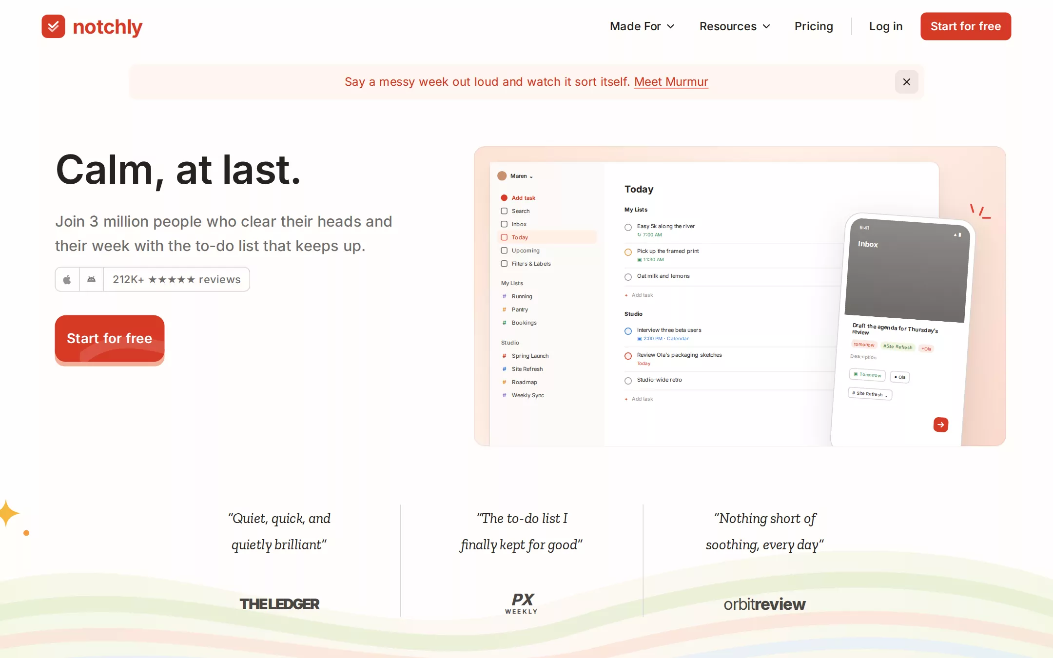
An original Notchly homepage on #FEFDFC paper: a 72px header with a red rounded-square check mark and lowercase wordmark, five quiet nav links, a hairline divider and one red Start for free button; a 1088×48 cream announcement pill in deep red; a 55px Calm, at last. headline over a 20.5px muted lede, a bordered app-store reviews chip and a 64px red button resting on a peach paper underlay; to the right a 728×410 peach-framed window holding a drawn Today view and a tilted phone; then three slab-serif press quotes split by hairlines over soft green, peach and sky waves with a gold sparkle.
- Best forTask managers, planners, habit and note apps, and any productivity tool that wants to feel warm, quiet and trustworthy rather than technical.
- Tech stack- Next.js (App Router) - React - TypeScript - CSS custom properties Use Next.js App Router, React and TypeScript with plain CSS custom properties for every colour, radius and shadow token. Render the page as a server component; the only client code is the template category tabs and the dismissible announcement. Self-host Inter (variable) and Zilla Slab Italic 400, both SIL Open Font License, as woff2 through next/font/local — no remote font request. Draw the logo, icons, product window, phone, waves and sparkles as HTML, CSS and inline SVG — never a bitmap or screenshot. Provide page metadata. Build and run the production page before capturing its preview.
The prompt. 1498 words, self-contained.
Build the "Todoist" kickstart — A sunlit paper-planner homepage on warm off-white: a quiet header with one red button, a cream announcement pill, a 55px two-word headline beside a peach-framed app window, a red button resting on a peach paper underlay, and serif press quotes over soft pastel waves.

## Design
Build a rebrandable landing page for a calm personal and team to-do list app. People capture tasks the way they would say them, see only today's work, plan the week and share lists with a team — sold on calm, clarity and staying power.

Create a complete landing page for Notchly, a fictional to-do list app. This is a concept presentation, not a real company — no real product, customer, publication, person or logo. Use original branding, illustration and copy throughout.

Color: warm paper and ink, one red. Paper #FEFDFC is the page and the header. Cream #FFF6F0 is the announcement pill, the closing band and the footer. Ink #25221E is every headline and label; body copy is Ink at 66% opacity, which renders as Pencil #6F6C69 — use #6F6C69 wherever a solid muted colour is needed. Stone #D7D6D4 is every hairline, chip border and quote divider. Ember #D63A27 fills the logo square and the one primary button per view, always with #FFFFFF labels. Deep Ember #CF3520 is announcement text, the first eyebrow and button hover. Peach #F2AE97 is only the hero button's paper underlay. Washes behind product art: peach #FDE3D6 to #FBD9CB, Mint #F0F6DF, Sky #DCEAFF; eyebrow accents Teal #497D7E and Forest #446C3D; one gold #F5B83D sparkle. Links inside copy use Cobalt #0F66AE. No other hue and no dark section.

Typography: "Inter", -apple-system, "Helvetica Neue", Arial, sans-serif for everything except the press quotes (Inter substitutes for a commercial grotesk). Hero 55px/63.25px 600 at -0.55px; section headings 38px/48.64px 700 at -0.19px; eyebrows 17px/23.8px 700 at 0.17px; lede and section body 20.5px/32.8px 475 at 66% ink; nav links 15.5px/20.925px 500 at 0.155px; header button 15.5px 600; hero button 18.5px/25.9px 600 at 0.185px; chip 14.5px/21.75px 500. Press quotes in Zilla Slab italic 400 at 20px/36px, centred, balanced over two lines.

Layout: a 1440px viewport, 57px side gutters for the header, content rows inset to x 75 (hero) and x 123 (feature rows). Radii: 8px for buttons, chips, nav links and cards; 10px for the announcement pill; 15px for the product window, image masks and the hero button. Sections breathe 64–96px apart.

Header (id top): 72px tall on Paper. At x 57, vertically centred, a 32px Ember rounded square (8px radius) holding a white double check, then notchly in Inter 700 27px at -0.6px in Ember. Right-aligned, ending at x 1383: Made For and Resources with 18px chevrons, Pricing, a 1×24px rgba(37,34,30,0.18) divider, Log in, then an 8px-radius Start for free button — every link 39px tall with 9px 14px padding.

Announcement bar: centred at y 88, 1088×48, Cream, 10px radius; centred 16px/25.6px Deep Ember text Say a messy week out loud and watch it sort itself. with Meet Murmur underlined, and a 32px close button 8px from the right edge on rgba(37,34,30,0.07).

Hero: a left column at x 75 with its headline top at y 200 — Calm, at last. — then at y 287 a 500px lede Join 3 million people who clear their heads and their week with the to-do list that keeps up. (two lines); at y 365 a 34px reviews chip (an Apple and an Android glyph in 33px cells split by Stone hairlines, then 212K+ ★★★★★ reviews); at y 431 the 64px hero button Start for free with its peach underlay showing 6px below.

Product window (id product): x 648, y 200, 728×410, 15px radius, a peach gradient frame. Inside, inset 22px, a white app panel: a 156px #FCFAF8 sidebar (avatar and name, Add task in Ember, Search, Inbox, Today highlighted on #FFEFE5, Upcoming, Filters & Labels, then My Lists and Studio groups with coloured # markers) and a Today list (13px 700 title, 7.5px rows with 10px priority rings in Ember, orange, blue or grey, green or red due-time captions, + Add task rows). Over its right edge a 178×330 white phone tilted 4°, a grey Inbox header and a task sheet with tag chips, and an Ember send button; three short Ember tick strokes sit above the phone's corner.

Press quotes: from y 658 a full-bleed band 340px tall. Behind it soft overlapping waves — a mint-to-peach wash and three wide translucent strokes in mint, peach and sky. A 44px gold four-point sparkle and an orange dot hang at the far left. Three 271px columns at x 246, 577 and 908, split by 1px Stone dividers: a two-line slab-serif quote at y 690, and 46px below an invented publication wordmark in #4A4744 (The Ledger, PX Weekly, orbitreview).

Feature rows (id features): three rows, text left at x 123 (500px column) beside a 588×548 washed panel — peach, then mint, then sky — each holding a drawn app moment (a voice capture sheet, a Today/Upcoming filter view, a shared team list). Each row: a 17px 700 eyebrow (Deep Ember, Teal, Forest), a 38px heading, a 20.5px muted body and, on the last, a Cobalt Learn more about teams › link and a small 8px-radius security note card on Cream.

Templates (id templates): a centred 38px heading Start from a list someone already perfected, a muted line, a row of 8px-radius category tabs (the active one on Mint) and five 8px-radius template cards with a tinted top band, 15px 600 title, 13px muted description and a List tag.

Trust stats (id trust): a Deep Ember eyebrow In it for the long haul, a 38px heading A list you can trust for years, a muted paragraph, and a row of four big numbers (30px 600) with 15px muted captions.

Closing call (id start): a Cream band, a centred 44px/52px two-line heading Clear your head and your week with the to-do list people keep, the reviews line in muted ink and the hero button again.

Footer: Cream with a Stone top rule; five link columns (Get started, Made for, Connect, Resources, Company) with 15px 600 Ink titles and 15px Pencil links, then the Notchly mark, a one-line tagline and © 2026 Notchly.

## Tech stack
- Next.js (App Router)
- React
- TypeScript
- CSS custom properties

Use Next.js App Router, React and TypeScript with plain CSS custom properties for every colour, radius and shadow token. Render the page as a server component; the only client code is the template category tabs and the dismissible announcement. Self-host Inter (variable) and Zilla Slab Italic 400, both SIL Open Font License, as woff2 through next/font/local — no remote font request. Draw the logo, icons, product window, phone, waves and sparkles as HTML, CSS and inline SVG — never a bitmap or screenshot. Provide page metadata. Build and run the production page before capturing its preview.
Where the repo you are working in already has an equivalent in place, keep the repo's choice and say which one you kept.

## Everything else
Keep Notchly clearly fictional and rebrandable: no real company, customer, publication, person or logo, and no source screenshot, product name or copy reproduced. One Ember button per view; red never fills a large surface; no gradient outside the drawn product washes and waves, and no shadow heavier than rgba(37,34,30,0.04) 0 1px 0 on cards. Text pairs clear WCAG AA: #25221E and #6F6C69 on #FEFDFC and #FFF6F0; #FFFFFF on #D63A27 (4.7:1); #CF3520 on #FFF6F0; #0F66AE on #FEFDFC. Waves, sparkles and the drawn app art are decorative and hidden from assistive technology, with the product window labelled as an image. Every link leads to a real anchor on the page, and the page loads no analytics or tracking script and shows no cookie banner. Content is initially visible; any wave drift stops for prefers-reduced-motion. Every control shows a 2px #25221E focus ring with a 2px offset. At 360px the nav becomes the logo, Start for free and a Menu button, the announcement wraps to two lines, the headline drops to 40px/46px, the product window moves below the copy and scales to the width, the quote columns and feature rows stack, and the page never overflows horizontally.

### Non-negotiables
- Responsive from 360px through desktop — no horizontal page overflow at any width. Deliberately scrollable regions stay within the viewport and remain keyboard and touch accessible.
- Every text/background pair clears WCAG AA (4.5:1 for body, 3:1 for large text); adjust a tint rather than shipping a failing pair.
- Fully keyboard operable, with a visible focus ring drawn in the accent colour.
- Honour `prefers-reduced-motion` — swap every transition for an instant state change.
- Write real copy in the voice described above; no lorem ipsum and no TODO placeholders.
- Use system or self-hosted fonts and CSS/SVG-drawn graphics — do not depend on a remote image or icon service.

Build the whole page end to end and show me the result running — not a description of it.