 Fredrin
E-commerce
teenage engineering
A quiet industrial catalog where one original listening object does the talking.
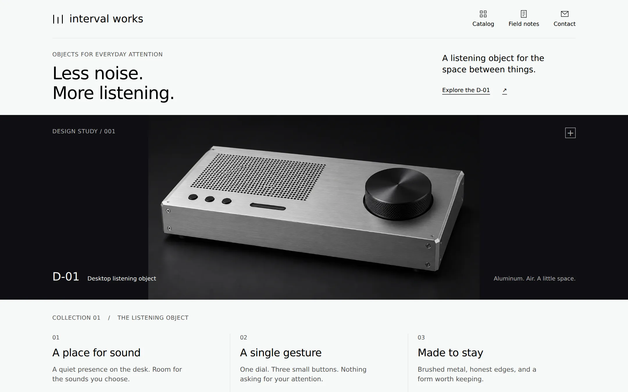
An original interval works product study: a silver listening console on carbon, a mist-white editorial introduction and three native specification disclosures. A complete fictional catalog with Field notes and sample contact.
- Best for
- Independent product designers, hardware concept studios and makers presenting one carefully considered object.
- Tech stack
- Use Next.js App Router, React and TypeScript with plain CSS custom properties and native HTML details/summary. Keep equivalent choices already present in the host repository. This page needs no client component: its navigation and disclosures work as native HTML. Use local static assets and a system font, or self-host Inter with its license if available; no remote font, icon or image hosts. No database, authentication, payments, analytics, API keys, UI kit or paid service is required. Provide dev, build and start scripts and a README for customizing identity, copy, product artwork and contact. Capture the preview after next build and next start, never from dev. Technology list: - Next.js (App Router) - React - TypeScript - CSS custom properties - Native HTML disclosures
- Tags
- industrial · product · catalog · monochrome · light
The creation prompt
1578 words, self-contained. Paste it into a chat session with your coding agent and it builds teenage engineering end to end.
Build the "teenage engineering" kickstart — A quiet industrial catalog where one original listening object does the talking.

## Design
Build a restrained industrial catalog for interval works, a fictional studio making one desktop listening object called the D-01. Use a mist-white #F6F8F7 canvas, black #000000 text, carbon #0F0E12 showcase/footer, #E5E5E5 rules, and #555555 supporting copy on light surfaces. Use #B2B2B2 only on carbon, where it remains readable. All interface surfaces are flat: no shadows, gradients, glow, rounded cards or pill buttons. Use 1px horizontal and vertical rules to organize the page. Keep interactive controls monochrome, with underlined links and visible black focus outlines on light backgrounds, mist-white outlines on carbon.

Use a locally hosted Inter Light font if available; otherwise system-ui, sans-serif. Declare the full family stack Inter, system-ui, sans-serif. Headings are weight 300: h1 40px/1.11, h2 26px/1.15, product labels 24px and lead text 19px. Body and controls are 15px/1.5 at weight 400 for legibility; metadata is 13px. Do not use large bold display type. Use 15, 22, 33 and 66px as the spacing scale. The content column is 1200px wide maximum with 33px minimum desktop gutters; at 1440px it has 120px side margins. Keep all text left aligned.

At 1440x900, begin with an 88px non-sticky navigation bar. Put an original geometric mark made of three narrow vertical strokes beside the lowercase interval works wordmark, left; Catalog, Field notes and Contact on the right. Give each navigation label a simple 20px line icon above it. A pale hairline closes the nav. Below, a 176px two-column introduction has a small OBJECTS FOR EVERYDAY ATTENTION label above the two-line h1 Less noise. / More listening. A right-aligned column contains left-aligned lead copy: A listening object for the space between things. Beneath it put a quiet underlined Explore the D-01 anchor.

The next band is full viewport width and about 424px tall, in carbon. Center a large original studio photograph of a low, wide brushed-aluminum listening console: one black dial at right, a perforated grille at left, three small black buttons and an unlit glass slot. The product is shown in three-quarter view with all its edges visible, against a dark seamless backdrop. Let the image occupy about 760px width in the middle of the band; natural shading inside the photograph is allowed, but add no UI gradient or overlay. Put DESIGN STUDY / 001 in the upper-left margin, a small outlined square with a plus in the upper-right as decoration, and D-01 / Desktop listening object in the lower-left; the lower-right reads Aluminum. Air. A little space. These captions sit outside the product silhouette. The photograph is an img with a descriptive alt, never a bitmap of the interface.

Use the bundled assets/listening-console.webp if supplied, copied into the app's local public assets. The brief must also work alone: when that asset is absent, create an original local product render from this description, or a clearly labeled local SVG concept drawing with a low rectangular metal enclosure, perforated grille, large black dial and three small buttons. Do not hotlink images or fetch source-brand product photos. Never substitute an image for the real navigation, text, specification rows or links.

Return to the light 1200px column below the band. A small COLLECTION 01 / THE LISTENING OBJECT label sits above three equal open columns separated by vertical gray hairlines and 22px gutters. Each column starts with a 13px number, then a 24px title: A place for sound; A single gesture; Made to stay. Follow with short 15px copy and a native details/summary disclosure labeled Acoustic study, Control study, and Material study respectively. These are flat editorial columns, not boxed cards. They are the product catalog's three aspects of one object, not three invented products. At 900px height, the three titles and their first copy lines should be visible. Expanded specification text flows naturally and remains readable.

Below this first viewport, add Field notes: a 26px heading and two numbered paragraphs about leaving space on a desk and using fewer controls. Then a contact section with a sample email link, followed by a carbon footer with the wordmark, the text An independent concept studio, and a clear fictional-product disclosure. Do not add pricing, buy buttons, review stars, client logos, cookie banners or signup forms.

At 760px and below, use 20px gutters, 32px h1, stacked intro columns and 33px section gaps. Keep all three navigation links visible by wrapping the nav; never hide them behind a non-working menu. Make the dark product band at least 330px high; scale the complete product image to fit above stacked captions. Stack catalog columns, replace vertical separators with horizontal rules, and allow captions and footer text to wrap. At 360px there must be no horizontal page overflow. Links and summary controls have at least 44px touch height. Use one h1, semantic landmarks, a skip link and clear focus. Keep all content server-rendered, with no entrance animation or JavaScript requirement. Respect reduced motion; native instant anchor navigation is sufficient.

## Tech stack
Use Next.js App Router, React and TypeScript with plain CSS custom properties and native HTML details/summary. Keep equivalent choices already present in the host repository. This page needs no client component: its navigation and disclosures work as native HTML. Use local static assets and a system font, or self-host Inter with its license if available; no remote font, icon or image hosts. No database, authentication, payments, analytics, API keys, UI kit or paid service is required. Provide dev, build and start scripts and a README for customizing identity, copy, product artwork and contact. Capture the preview after next build and next start, never from dev.

Technology list:
- Next.js (App Router)
- React
- TypeScript
- CSS custom properties
- Native HTML disclosures
Where the repo you are working in already has an equivalent in place, keep the repo's choice and say which one you kept.

## Everything else
Create a complete rebrandable concept-product catalog. teenage engineering is the gallery inspiration name only; the rendered site uses the original fictional interval works identity and D-01 object. Copy no source logo, name, product model, imagery, marketing sentence or URL into the page.

Use these flows and original copy. The wordmark links to #top. Catalog and Explore the D-01 link to #catalog, which starts at the product photograph. Field notes links to #notes and Contact to #contact. The sample contact address is mailto:[email protected], visibly described as a sample address. All anchors target real unique section IDs and work without JavaScript.

The hero headline is Less noise. More listening. Its lead says A listening object for the space between things. The product is labeled D-01 / Desktop listening object. The three catalog aspects read: (01) A place for sound — A quiet presence on the desk. Room for the sounds you choose. (02) A single gesture — One dial. Three small buttons. Nothing asking for your attention. (03) Made to stay — Brushed metal, honest edges, and a form worth keeping.

Each native summary opens meaningful local information with no request to a service. Acoustic study reveals: Perforated aluminum grille; front-facing listening concept; dimensions 320 x 150 x 50 mm. Control study reveals: One rotary dial; three tactile keys; unlit indicator window. Material study reveals: Brushed aluminum enclosure; visible fasteners; charcoal controls. Include a note in each disclosure that these are fictional design specifications, not measured product claims. Independent disclosures can be open at once, toggle with Enter or Space when focused, and begin closed on a fresh page.

Field notes has two sections: 01 / Leave a little room — A desk does not need to become a control room. Give an everyday object its place, then leave the rest open. 02 / Start with less — A useful control should explain itself. Turn, touch, listen. The interface can stay quiet. Contact says Have an object in mind? followed by the sample email link. The footer states interval works and D-01 are fictional. This is a design study, not a product for sale. The contact address is a sample.

Keep the page useful offline after its local assets load, and fully readable with JavaScript disabled. No audio playback, checkout, stock status, warranties or manufacturing claims are implied. Original product art may be generated, but only as an image inside the real page. Explain in the README how to replace the sample image, fictional specifications, identity and contact. Deliver the functioning page and take a real browser screenshot.

Build a rebrandable industrial concept-product catalog with native specification disclosures. Preserve this structure:
1. Light icon-and-label navigation
2. Two-column editorial introduction
3. Carbon product photograph band
4. Three native specification disclosures
5. Field notes, sample contact and fictional-product footer

### Non-negotiables
- Responsive from 360px through desktop — no horizontal page overflow at any width. Deliberately scrollable regions stay within the viewport and remain keyboard and touch accessible.
- Every text/background pair clears WCAG AA (4.5:1 for body, 3:1 for large text); adjust a tint rather than shipping a failing pair.
- Fully keyboard operable, with a visible focus ring drawn in the accent colour.
- Honour `prefers-reduced-motion` — swap every transition for an instant state change.
- Write real copy in the voice described above; no lorem ipsum and no TODO placeholders.
- Use system or self-hosted fonts and CSS/SVG-drawn graphics — do not depend on a remote image or icon service.

Build the whole page end to end and show me the result running — not a description of it.
Pasting the prompt is step one. Fredrin runs the agent that builds it, one ticket per look.