 Fredrin
SaaS
Superhuman
A warm photographic workspace landing with room to plan, pause and begin again.
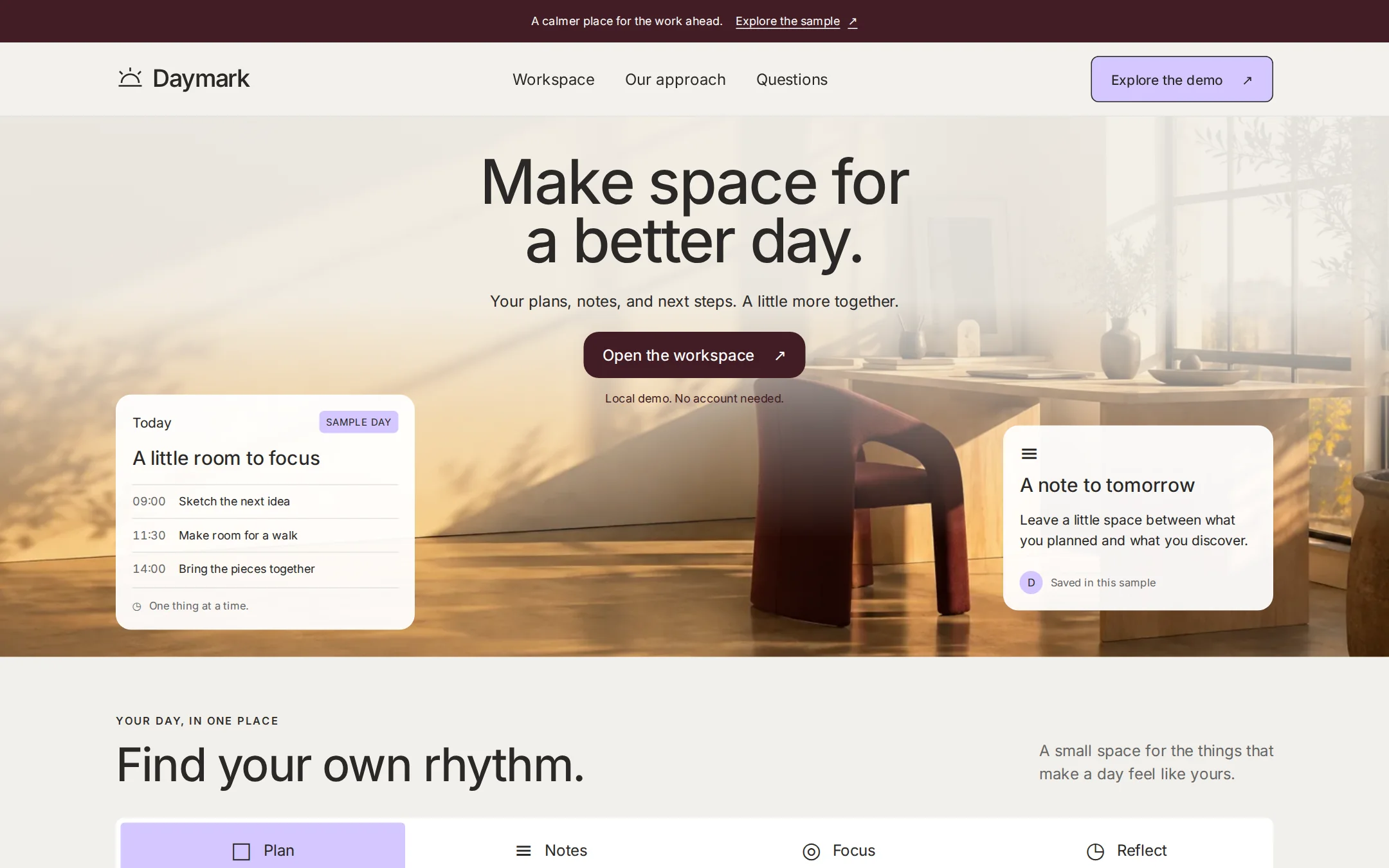
A parchment-and-maroon landing page with original golden-hour photography, translucent schedule and note cards, and a working browser-only workspace explorer.
- Best for
- Productivity tools, personal workspaces and thoughtful software launches.
- Tech stack
- Use Next.js App Router, React Server Components, TypeScript and CSS custom properties; retain equivalent tools already installed in the destination repository. Server-render the page, hero, sample cards, FAQ and footer. Use one small client component for a four-button workspace explorer, with typed local data and state only. Buttons use aria-pressed and aria-controls; announce the selected content through a polite live region. Use native details/summary for FAQs and fragment links for navigation. Keep the hero photograph and any licensed fonts local, with font licenses beside the files; use inline SVG for the original mark and small icons. No backend, real calendar, email access, authentication, analytics, database, paid service or third-party API. Include a README with development, production build/start, asset licenses and customization instructions. Named technologies: - Next.js (App Router) - React Server Components - TypeScript - CSS custom properties - Local photography and SVG
- Tags
- productivity · editorial · photography · parchment · light
The creation prompt
1551 words, self-contained. Paste it into a chat session with your coding agent and it builds Superhuman end to end.
Build the "Superhuman" kickstart — A warm photographic workspace landing with room to plan, pause and begin again.

## Design
Build a warm editorial landing page for Daymark, a fictional personal workspace for organizing a working day. Use #F2F0EB for the canvas, #FFFFFF for cards, #292827 for text, #666666 for secondary text and #E3E3E2 for hairline borders. The primary button and footer are #421D24 with white text. Use #D4C7FF for secondary controls and selected states. Reserve #714CB6 exclusively for inline links. A single full-width feature band may use #0C4243 with white text. No cold black text, drop shadows or gradients on controls.

Use the font stack Inter Variable, ui-sans-serif, system-ui, sans-serif. Self-host licensed Inter Variable when available; otherwise keep the system fallback. Headings at 28px and larger use weight 460, not bold: desktop hero 64px/0.96 with -0.028em tracking, section titles 48px/1.05, small headings 28px/1.14. Body is 16px/1.5, navigation 16px, captions 12–14px. Set body tracking to zero and use tabular numerals for sample times. Keep a 4px spacing grid, 1200px content maximum, 24px minimum desktop gutters, 64–96px section gaps, 16px card padding and 8px small gaps.

Begin with a shallow maroon announcement strip and a 76px parchment navigation row. Place an original half-sun line symbol and Daymark wordmark left, Workspace, Our approach and Questions links in the center, and a lilac outlined Explore the demo action at right. The nav can remain sticky with 12px backdrop blur. On desktop, use a full-bleed photographic hero about 560px tall below it. Its background is an original golden-hour architectural photograph: warm plaster studio, sunlit window grid, pale oak desk and burgundy chair on the right, open wall on the left. Generate an original photo or use a properly licensed local image; never borrow branded imagery or hotlink. If this repository supplies a suitable studio asset, reuse it. The photograph is decorative. Add a pale parchment scrim behind the heading to maintain text contrast, while leaving the furniture visible. Center a two-line headline near the top, followed by a short centered supporting sentence, one maroon action and a small local-demo note. Do not place long prose in centered blocks.

Compose two real HTML product cards over the lower photo, without shadows: a roughly 300px-wide Today card near the left edge of the 1200px grid, and a roughly 280px-wide note card near the right. Both have 16px corners, 16px padding, white at 94% opacity for readability and a subtle light border. Include text, small monochrome line icons, a lilac date marker, and three readable sample schedule rows; do not flatten UI text into the photo. The right card has a small circular initials marker and a short planning note. Main buttons are maroon, 16px radius and 48px high; secondary buttons use lilac with a charcoal outline and 8px radius. No pill-shaped main CTA. Provide a visible two-color focus ring and at least 44px targets.

Follow with a parchment workspace section: small eyebrow at left, a 48px title and concise introduction, then four equal-width controls in an 8px-radius white strip. The active control is lilac; icons remain charcoal. A white 16px-radius detail card below contains the selected local sample. Below this, add one two-column deep-lagoon band with translucent rectangular note artwork on the left and a white heading and short paragraph on the right. Finish with native FAQ disclosures on parchment and a maroon footer with real section links. No customer-logo strip, testimonial, adoption metrics or decorative gradient section.

Below 800px, use 40–48px hero type, wrap navigation, and move floating cards into normal document flow beneath the hero copy. The photograph can remain as the section background with stronger parchment scrims behind text. Stack the feature band and let the four workspace controls wrap into two columns. Keep 20px mobile gutters, readable text, visible focus and no horizontal page overflow from 360px upward or at 200% zoom. Render content on the server and keep it visible without JavaScript. Use only optional 150ms color transitions, disabled under prefers-reduced-motion.

Page structure, in order:
1. Maroon announcement and parchment navigation with an original Daymark mark
2. Photographic hero with an original headline and two translucent HTML sample cards
3. Four-part local workspace explorer with an accessible selected state
4. Deep-lagoon approach band with translucent note artwork
5. Native questions and a maroon footer

## Tech stack
Use Next.js App Router, React Server Components, TypeScript and CSS custom properties; retain equivalent tools already installed in the destination repository. Server-render the page, hero, sample cards, FAQ and footer. Use one small client component for a four-button workspace explorer, with typed local data and state only. Buttons use aria-pressed and aria-controls; announce the selected content through a polite live region. Use native details/summary for FAQs and fragment links for navigation. Keep the hero photograph and any licensed fonts local, with font licenses beside the files; use inline SVG for the original mark and small icons. No backend, real calendar, email access, authentication, analytics, database, paid service or third-party API. Include a README with development, production build/start, asset licenses and customization instructions.

Named technologies:
- Next.js (App Router)
- React Server Components
- TypeScript
- CSS custom properties
- Local photography and SVG
Where the repo you are working in already has an equivalent in place, keep the repo's choice and say which one you kept.

## Everything else
Build a rebrandable personal-workspace landing page with a local four-part explorer. The fictional product is Daymark. Announcement: A calmer place for the work ahead. Its Explore the sample link targets #workspace. Hero headline: Make space for a better day. Break after space for on desktop. Supporting sentence: Your plans, notes, and next steps. A little more together. The primary Open the workspace action targets #workspace; below it write Local demo. No account needed. Navigation: Workspace and Explore the demo target #workspace, Our approach targets #approach, Questions targets #questions; the wordmark and Back to top target #top.

The left hero card says Today / A little room to focus, with a small SAMPLE DAY label and three fictional entries: 09:00 / Sketch the next idea; 11:30 / Make room for a walk; 14:00 / Bring the pieces together. Its footer reads One thing at a time. The right card says A note to tomorrow, contains the sentence Leave a little space between what you planned and what you discover., and a circular D marker with Saved in this sample. These are illustrative HTML cards, not controls or real personal data.

The workspace section eyebrow is YOUR DAY, IN ONE PLACE; heading: Find your own rhythm.; introduction: A small space for the things that make a day feel like yours. Four buttons read Plan, Notes, Focus and Reflect. Plan is initially selected. Plan shows A clear place to begin. and the three schedule rows from the hero. Notes shows Keep the thought. and an example note: Try the smaller idea first. Focus shows One thing, given your attention. and a sample task: Outline the next chapter. Reflect shows Take the good parts forward. and a sample reflection: Today I made room for a new idea. Selecting a button immediately replaces the detail panel and its heading, updates aria-pressed, and announces the content without moving focus. Reload resets to Plan; nothing persists or leaves the browser. Make the controls keyboard-operable native buttons. With JavaScript off, retain the initial Plan content and explain that switching samples needs JavaScript.

The approach band says A little less noise. A little more room. Supporting copy: Keep what matters close, and let the rest wait its turn. A quiet place to plan, pause, and begin again. Its outlined Read the questions link targets #questions. Use original decorative layered note rectangles, not borrowed product imagery. FAQ questions and truthful answers: Is Daymark a real service? It is a fictional sample you can adapt. Does this connect to my calendar? No, all entries are local examples. Are my changes saved? No, selections reset on reload and no personal data is collected. Footer text: Daymark — Make room for your day. Fictional product. Local demo. No affiliation or endorsement. Repeat the actual section links; do not invent signup, purchase or download destinations.

Use one h1, semantic landmarks, a skip link, meaningful accessible names and visible focus. Decorative photo and SVGs must not add screen-reader noise. Keep all copy original and avoid fabricated proof, performance promises or borrowed identity. Explain in the README how to replace the product name, photo, palette, navigation and sample data. The copied brief must work without visiting an inspiration website.

### Non-negotiables
- Responsive from 360px through desktop — no horizontal page overflow at any width. Deliberately scrollable regions stay within the viewport and remain keyboard and touch accessible.
- Every text/background pair clears WCAG AA (4.5:1 for body, 3:1 for large text); adjust a tint rather than shipping a failing pair.
- Fully keyboard operable, with a visible focus ring drawn in the accent colour.
- Honour `prefers-reduced-motion` — swap every transition for an instant state change.
- Write real copy in the voice described above; no lorem ipsum and no TODO placeholders.
- Use system or self-hosted fonts and CSS/SVG-drawn graphics — do not depend on a remote image or icon service.

Build the whole page end to end and show me the result running — not a description of it.
Pasting the prompt is step one. Fredrin runs the agent that builds it, one ticket per look.