Streamtime
A cut-paper studio-planner homepage: a quiet two-line tagline over a giant tumbled black wordmark standing on hand-textured shapes in yellow, lime, pink and blue.
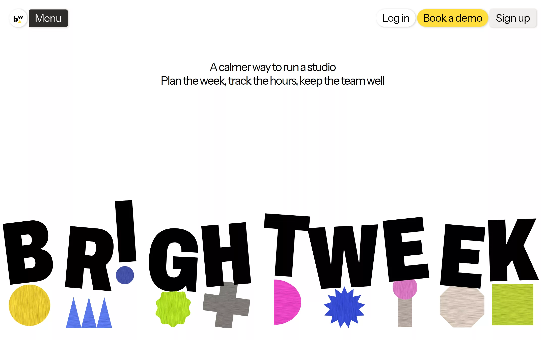
An original Brightweek page: a floating header with a round wordmark badge and a charcoal Menu button on the left and Log in, a yellow Book a demo pill and Sign up on the right; a white hero with a centred two-line 30px tagline and, across the bottom of the first screen, a giant tumbled BRIGHTWEEK wordmark whose I is an exclamation mark, standing on cut-paper shapes; then a charcoal manifesto with collage shapes, a linen product tour with an app window and five step captions, a hot-pink sign-up band and a one-line footer.
- Best forCreative-agency tools, studio software and craft-minded SaaS that want a playful, print-zine homepage — a warm cream system, one yellow pill and collage shapes — instead of a gradient tech hero.
- Tech stack- Next.js (App Router) - React - TypeScript - CSS custom properties Use Next.js App Router, React and TypeScript with plain CSS custom properties for every colour, radius, shadow and type token. Render the page as server components; only the mobile menu needs a small client island holding state in memory. Self-host Instrument Sans and Archivo (variable, with its width axis) as woff2 files through next/font/local — no remote font request. Draw the badge, wordmark letters, every cut-paper shape and its fibre texture, the collage and the app window in inline SVG, CSS and HTML from committed sample arrays — never bitmap photographs, scans or stock imagery — so the page is identical on every render. Provide page metadata. Build and run the production page before capturing its preview.
The prompt. 1330 words, self-contained.
Build the "Streamtime" kickstart — A cut-paper studio-planner homepage: a quiet two-line tagline over a giant tumbled black wordmark standing on hand-textured shapes in yellow, lime, pink and blue.

## Design
Build a rebrandable landing page for a studio planner that helps small creative teams schedule work, log hours and keep people well.

Create a complete landing page for Brightweek, a fictional studio-planning product. This is a concept presentation, not a real company — no real product, customer, person or logo. Use original branding, artwork and copy throughout.

Color: Pure White #FFFFFF is the hero canvas. Warm Linen #F1E8DE is the canvas of every light section after it. Paper White #FBF8F5 fills app windows and cards; Chalk #F1EEEB the Sign up button; Sand #EADCCE and Stone #C3B7AC are quiet shape and card fills, and Stone #C3B7AC is also the only hairline (the footer rule). Ink #000000 is all text, every wordmark letter and the structural strokes; Muted #5C554F carries secondary captions on light surfaces. Charcoal #2F2C29 is the Menu button, the one dark manifesto section and the band button. Sun Yellow #FFDE3B is the only filled call to action — Book a demo — with Ink #000000 text, and also a decorative shape. Decorative colours, used only on cut-paper shapes and the sign-up band, never on text or buttons: Hot Pink #FF4DD5, Lime Burst #C1F32B, Periwinkle #6483FF, Spring Green #C6DC3C, Bubblegum #EE84D5, Cobalt #3C55E8, Indigo #4D5BB8 and Graphite #8A8580.

Typography: every word is "Instrument Sans", "Helvetica Neue", Arial, sans-serif (the open stand-in for a tight weight-400 grotesk) at weight 400 only — never bold. Header buttons 28px/30.8px at -0.034em; hero tagline and manifesto 30px/36px at -0.06em; sign-up band heading 68px/68px at -0.034em; body 16px/19.2px at -0.06em; captions 12px/14.4px. The giant wordmark is artwork: Archivo at weight 900 and font-stretch 72%, 236px with line-height 0.74. Both faces are SIL Open Font License.

Layout: a 1440px canvas with 24px page gutters and a 1200px content column where text needs one. Radii: 96px on header pills, 160px on the band button, 5px on everything rectangular (Menu, Sign up, cards, windows, tags). Depth only on the header controls and floating windows; sections are flat.

Navigation: no bar — controls float 24px from the top. Left: a 48px white circular badge holding a tiny bw monogram with a yellow triangle, then 4px away a 103×47px Charcoal Menu button with white 28px text. Right, ending 24px from the edge with 4px gaps: Log in (white pill), Book a demo (Sun Yellow pill) and Sign up (Chalk, 5px radius), each 47px tall with 8px 16px padding and the nav shadow.

Hero (id top): a white 900px first screen. At y 160, centred, two 30px lines: A calmer way to run a studio / Plan the week, track the hours, keep the team well. Everything between is white space.

Wordmark: from y 520 to the bottom of the first screen, the word BRIGHTWEEK spans the full width from x 16 to x 1424 in a space-between flex row. Each letter is dropped 8–84px and tilted between -7 and +5 degrees so the word looks glued down by hand; the I stands tallest and becomes an exclamation mark, its dot a 52px Indigo #4D5BB8 circle below it. Under the letters, centred on each and tucked slightly behind them, sit cut-paper shapes about 110px across ending 33px above the fold: a Sun Yellow circle, three Periwinkle triangles, a Lime Burst scalloped seal, a Graphite plus, a Hot Pink half-moon, a Cobalt starburst, a Bubblegum circle on a Stone stick, a Sand octagon and a Spring Green square. Each shape carries a faint pencil-fibre texture from an SVG feTurbulence filter. The whole wordmark is one labelled image.

Manifesto (id manifesto): a single Charcoal section, 987px tall, 120px padding. A 272px column of four 30px white paragraphs starts at x 760 — We get it, margins matter. But so do the people making the work. / Brightweek is a studio planner for small creative teams who want a healthy profit and a happy crew. / So you can ship great work and still go home on time. / We call that a bright week. (underlined link). Around it, a collage of cut-paper shapes: a large tilted yellow square, a lime starburst, a white triangle, a pink octagon and stone bars, scattered left and right.

Product tour (id tour): a Warm Linen section with an 893×558px Paper White app window — icon rail, a week schedule with Mon–Fri columns and coloured job blocks, and a My items list — then a six-column caption row: the 30px heading Brightweek every step of the way, and five 16px captions in Muted with the current one in Ink.

Sign-up band (id signup): a full-width Hot Pink band, 40px 24px padding, with Ready for a bright week? at 68px on the left and a Charcoal Sign up pill at 160px radius on the right.

Footer: a Stone hairline and one centred 12px Muted line — © 2026 Brightweek · a fictional sample, not a real product.

## Tech stack
- Next.js (App Router)
- React
- TypeScript
- CSS custom properties

Use Next.js App Router, React and TypeScript with plain CSS custom properties for every colour, radius, shadow and type token. Render the page as server components; only the mobile menu needs a small client island holding state in memory. Self-host Instrument Sans and Archivo (variable, with its width axis) as woff2 files through next/font/local — no remote font request. Draw the badge, wordmark letters, every cut-paper shape and its fibre texture, the collage and the app window in inline SVG, CSS and HTML from committed sample arrays — never bitmap photographs, scans or stock imagery — so the page is identical on every render. Provide page metadata. Build and run the production page before capturing its preview.
Where the repo you are working in already has an equivalent in place, keep the repo's choice and say which one you kept.

## Everything else
Keep Brightweek clearly fictional and rebrandable: no real product, company, customer, person or logo, and no source wordmark, photograph, texture scan or copy. Weight 400 everywhere; hierarchy by size and tracking only. Sun Yellow #FFDE3B is the only filled call to action; accent colours stay on shapes and the sign-up band, never on text. Only one dark section. Text pairs clear WCAG AA: #000000 on #FFFFFF, #F1E8DE, #FFDE3B and #FF4DD5; #FFFFFF on #2F2C29; #5C554F on #FFFFFF and #F1E8DE. Every link leads to a real section on the page; nothing submits. No analytics, cookie banner or chat bubble. Content is visible at first paint: no counters, typing effects, parallax or scroll reveal; the only motion is a 1px hover lift, and it stops for prefers-reduced-motion. Every control shows a 2px #000000 focus ring with a 2px offset. Decorative shapes are hidden from assistive technology. At 360px the header keeps the badge, Menu and Book a demo, the tagline drops to 22px/26px, the wordmark scales to fit the width with its shapes shrinking beneath it, the manifesto becomes one centred column with fewer shapes, the caption row stacks, the band stacks its button below the heading, and the page never overflows horizontally.

### Non-negotiables
- Responsive from 360px through desktop — no horizontal page overflow at any width. Deliberately scrollable regions stay within the viewport and remain keyboard and touch accessible.
- Every text/background pair clears WCAG AA (4.5:1 for body, 3:1 for large text); adjust a tint rather than shipping a failing pair.
- Fully keyboard operable, with a visible focus ring drawn in the accent colour.
- Honour `prefers-reduced-motion` — swap every transition for an instant state change.
- Write real copy in the voice described above; no lorem ipsum and no TODO placeholders.
- Use system or self-hosted fonts and CSS/SVG-drawn graphics — do not depend on a remote image or icon service.

Build the whole page end to end and show me the result running — not a description of it.