 Fredrin
SaaS
Stillwell — Analytics Landing (Light)
A little less dashboard. A little more perspective.
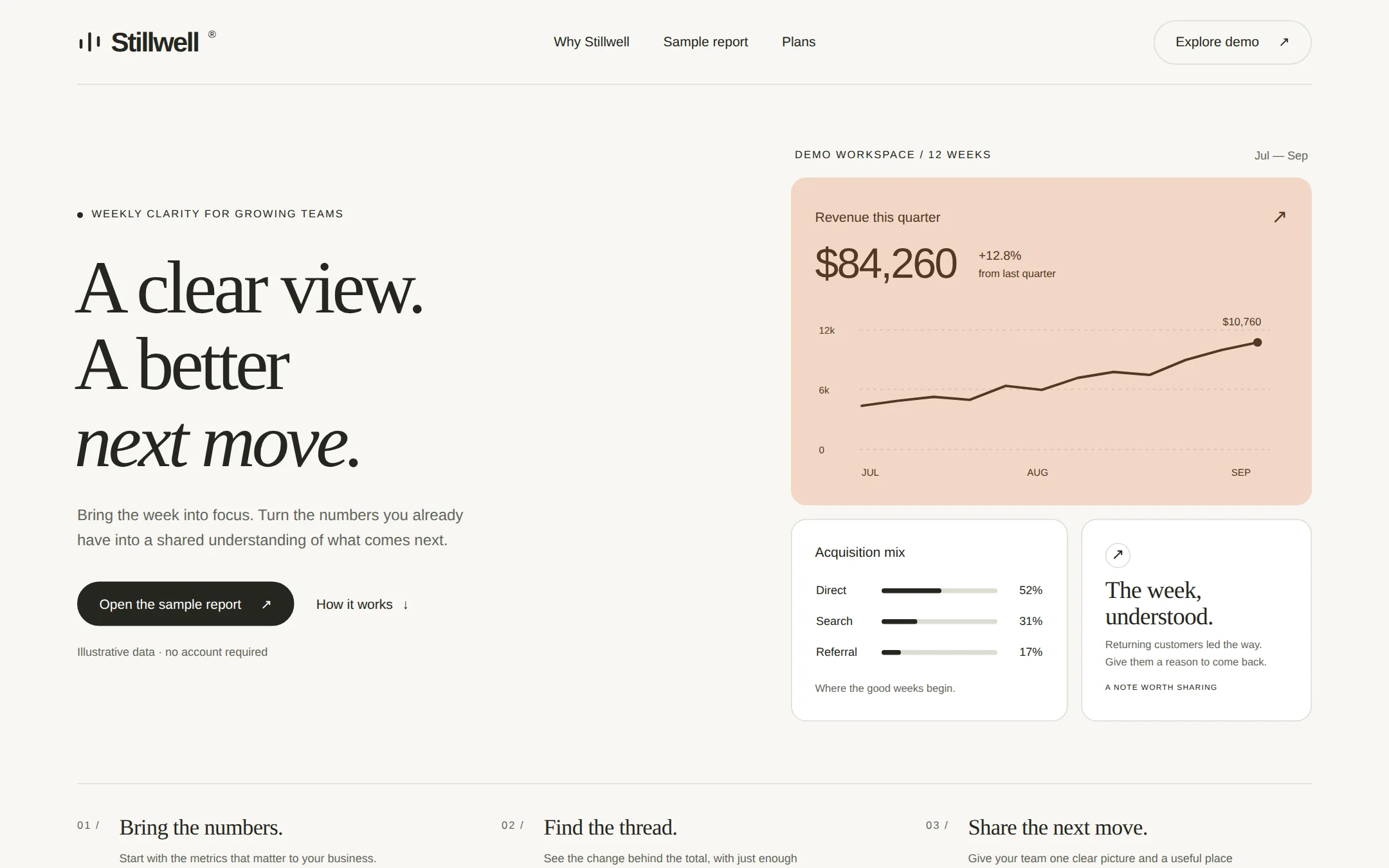
A paper-toned analytics landing page with an oversized serif promise beside a composed set of readable metric panels. A peach revenue chart, a channel breakdown and a compact weekly note make the product tangible before the page unfolds into a sample report, pricing and useful answers.
- Best for
- A small analytics or reporting team that wants to explain its product through legible sample metrics and a calm, distinctive editorial page.
- Tech stack
- - Next.js (App Router) - React Server Components - TypeScript - Plain CSS with custom properties - Inline SVG charts with accessible data tables - System fonts, no external assets Use the latest stable Next.js and App Router. Keep the page server-rendered and the data in one typed local configuration. Native links and details/summary disclosures need no client bundle. No database, chart library, paid font, remote asset host, account, API key or external service is required.
- Tags
- analytics · editorial · serif · paper · peach · light
The creation prompt
1276 words, self-contained. Paste it into a chat session with your coding agent and it builds Stillwell — Analytics Landing (Light) end to end.
Build the "Stillwell — Analytics Landing (Light)" kickstart — A little less dashboard. A little more perspective.

## Design
A considered weekly business review laid out as a contemporary editorial spread. Balance a large left-aligned serif headline against an asymmetric but aligned dashboard on the right. Warm off-white margins, ink-colored typography and one peach chart panel keep the page quiet. Use generous whitespace without scattering decorative UI fragments over the words. This is a complete product page with genuine HTML content and data, not a picture of one.

### Palette
- background: #F8F7F3
- surface: #FFFFFF
- ink: #252620
- muted: #63655C
- accent: #F2D7C6
- accentInk: #533724
- border: #DADCD3

### Typography
Headings: Georgia, 'Times New Roman', serif
Body: Arial, Helvetica, system-ui, sans-serif
Regular serif display at clamp(44px, 5.4vw, 78px), line-height 1.02 and -0.045em tracking; italicize the final short clause. Body is 16px/1.6. Metric values use 36–44px tabular sans numerals. Small labels are 12px, uppercase, tracked 0.12em.

### Page structure
1. Navigation: the Stillwell wordmark with a small three-stroke signal mark, links to Why Stillwell, Sample report and Plans, and an outlined Explore demo link.
2. Hero: a small WEEKLY CLARITY FOR GROWING TEAMS label, the headline “A clear view. A better next move.” with the final clause italic, a two-sentence lead, an Open the sample report primary link and a How it works text link; opposite, a peach revenue chart above a channel table and a white weekly-note panel.
3. Method: a hairline-separated three-column strip numbered 01, 02 and 03, explaining Bring the numbers, Find the thread and Share the next move.
4. Sample report: an accessible weekly table with Revenue, Orders and Repeat customers, current and previous values and their deltas; a plain-language note explains that all values are fictional demo data.
5. Plans: two flat columns for the illustrative Solo plan at $19/month and Studio plan at $49/month, listing concrete reporting limits and a mailto inquiry link rather than a pretend checkout.
6. FAQ and footer: native disclosure questions about data sources, sharing and setup, followed by the Stillwell wordmark, a contact email and a clear demo-data note.

### Components and layout
Use a 1280px centered container with 64–80px desktop gutters. The 88px header has a fine bottom rule. The hero has two columns in a 1.05:1 ratio and 56px gap, with about 64px vertical breathing room. On the right, a 540px-wide peach revenue panel sits above a 1.2:1 pair of white panels, with 14px gaps, 16px corners, 24px padding and a single restrained hairline border. The revenue panel carries a 12-week ink-colored SVG line chart with labeled axes and a small inline endpoint label. The channel panel uses actual table rows and three short horizontal bars; the note panel uses a small circular arrow symbol and two short sentences. Buttons are 46px-high pills; the primary is ink with white text, and peach stays a chart surface, not a low-contrast text color. Tables use row rules and right-aligned tabular numbers. No gradients, stock imagery, browser-frame decorations or fabricated customer logos.

### Motion
Only color and underline changes on hover or focus, at 140ms. No animated counters, floating cards, parallax or entrance effects. All content is present on first paint; prefers-reduced-motion removes transitions.

At 900px and below, stack the hero copy above the metric panels. At 560px and below, stack every panel and method column, use 20px gutters, wrap navigation, and let the primary link span the column. Keep chart labels readable and provide an accessible description and data table. At 360px there must be no horizontal page scrolling. All body text must clear WCAG AA, including muted labels on the peach surface. Use a visible focus outline in the dark accent-ink color.

## Tech stack
- Next.js (App Router)
- React Server Components
- TypeScript
- Plain CSS with custom properties
- Inline SVG charts with accessible data tables
- System fonts, no external assets

Use the latest stable Next.js and App Router. Keep the page server-rendered and the data in one typed local configuration. Native links and details/summary disclosures need no client bundle. No database, chart library, paid font, remote asset host, account, API key or external service is required.
Where the repo you are working in already has an equivalent in place, keep the repo's choice and say which one you kept.

## Everything else
Build an editorial analytics product landing page on the latest Next.js (App Router).

A paper-toned analytics landing page with an oversized serif promise beside a composed set of readable metric panels. A peach revenue chart, a channel breakdown and a compact weekly note make the product tangible before the page unfolds into a sample report, pricing and useful answers.

Use Stillwell as a fictional reporting product throughout. Hero copy: “Bring the week into focus. Turn the numbers you already have into a shared understanding of what comes next.” Revenue card: “Revenue this quarter”, “$84,260”, “+12.8% from last quarter”, “DEMO WORKSPACE / 12 WEEKS”, and JUL, AUG, SEP chart labels. Acquisition mix: Direct 52%, Search 31%, Referral 17%. The note reads “The week, understood.” and “Returning customers led the way. Give them a reason to come back.” Use original prose elsewhere. Show “Illustrative data · no account required” near the hero actions. The screenshot contains these real headings, navigation and panels rather than a CSS miniature.

Store the product name, contact email, plan copy, reporting dates and all demo metrics in one typed configuration. Derive the SVG plot, displayed figures and accessible table from the same dataset. The revenue chart uses twelve weekly amounts summing to $84,260: 4400, 4900, 5300, 5000, 6400, 6000, 7200, 7800, 7500, 9000, 10000, 10760; compare with a prior-quarter total of $74,700, which rounds to +12.8%. The weekly report compares revenue $10,760 with $10,000, orders 269 with 250, and repeat customers 113 with 101. Round percentage changes to one decimal. Acquisition shares total 100%. Labels must be real text, not painted into a background image.

Every header and hero link navigates to a real section. Explore demo and Open the sample report both target the sample-report table; How it works targets the method. Use native details/summary for the FAQ so it works with JavaScript disabled. Plan inquiry links use the configured contact email with an encoded plan-name subject; they must not imply payment was taken. State clearly that the metrics and prices are illustrative. Do not invent testimonials, company logos, signup success, live data integrations or checkout.

Use semantic header, nav, main, section, table and footer elements, one h1, a skip link, descriptive link text, accessible SVG titles and visible focus. Keep all content usable at 360px, at 200% zoom and without JavaScript. Add a README showing how to replace the name, sample data, colors, plans and contact address, and how to run the app locally. All artwork is native chart markup; no photos or generated images are needed.

### Non-negotiables
- Responsive from 360px through desktop — no horizontal page overflow at any width. Deliberately scrollable regions stay within the viewport and remain keyboard and touch accessible.
- Every text/background pair clears WCAG AA (4.5:1 for body, 3:1 for large text); adjust a tint rather than shipping a failing pair.
- Fully keyboard operable, with a visible focus ring drawn in the accent colour.
- Honour `prefers-reduced-motion` — swap every transition for an instant state change.
- Write real copy in the voice described above; no lorem ipsum and no TODO placeholders.
- Use system or self-hosted fonts and CSS/SVG-drawn graphics — do not depend on a remote image or icon service.

Build the whole page end to end and show me the result running — not a description of it.
Pasting the prompt is step one. Fredrin runs the agent that builds it, one ticket per look.