 Fredrin
Agency
Stellar
A midnight-black studio showcase with oversized type and a precise violet accent.
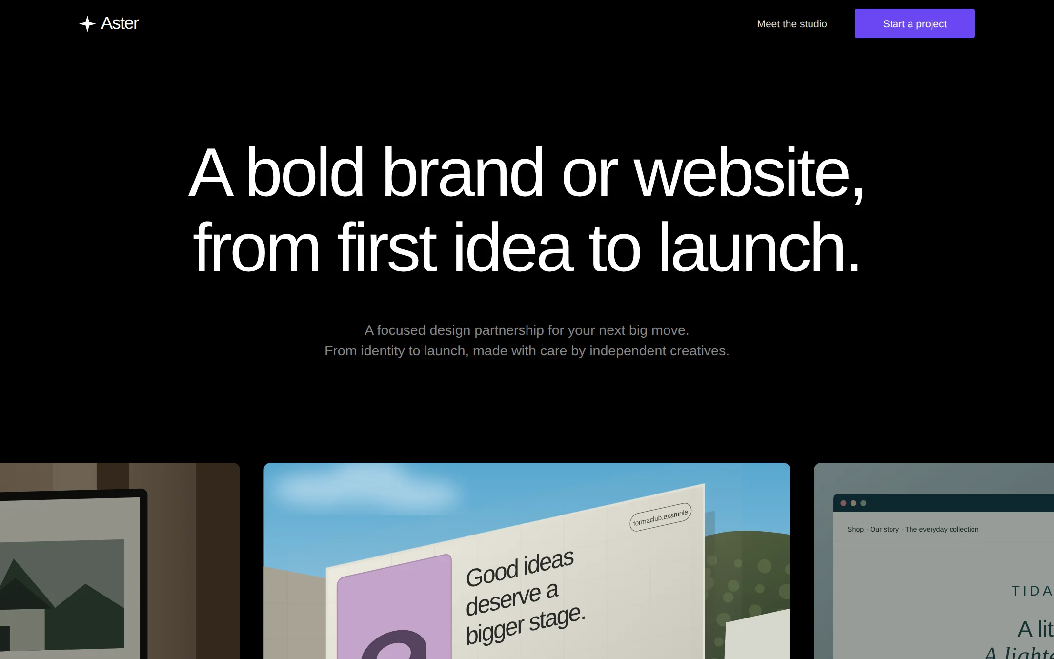
A black studio landing page with a quiet header, an oversized two-line white headline, muted supporting copy and a single violet action. A wide strip of original project artwork enters at the bottom of the first viewport, with its central billboard framed by cropped neighboring projects. Dark designer cards, a simple process and a local demo brief form complete the page.
- Best for
- Design studios, creative partnerships and independent designers presenting brand and website work.
- Tech stack
- - Next.js (App Router) - React Server Components - TypeScript - CSS custom properties - Local SVG and CSS artwork Use Next.js App Router, React Server Components, TypeScript and plain CSS custom properties. Keep content and artwork metadata in one typed site config. Use inline SVG and CSS for original local artwork, and system fonts; no remote asset hosts, icon CDN, font downloads, paid services or API keys. Render the page on the server, with small client components only for initializing the centered showcase position and the local contact-form interaction. Use native scrolling and form validation rather than an animation or form library. Keep equivalent stack choices already present in the destination repository.
- Tags
- studio · portfolio · black · violet · typography · showcase
The creation prompt
1566 words, self-contained. Paste it into a chat session with your coding agent and it builds Stellar end to end.
Build the "Stellar" kickstart — A midnight-black studio showcase with oversized type and a precise violet accent.

## Design
Build a design-studio landing page on absolute black #000000. Its identity is negative space, enormous regular-weight white typography and one restrained violet action, followed by an edge-to-edge portfolio strip. Keep the top viewport extremely spare: no eyebrow, hero button, badges, gradients behind the headline, decorative stars or dashboard chrome. The catalog is named Stellar; the sample studio is the fictional Aster. Use an original four-ray geometric mark rather than a real company's logo.

At a 1440×900 viewport the header is 64px high, with its content spanning about 1224px, centered with 90–108px outer gutters. The 24px wordmark sits at the left. On the right place one muted 14px text link, then a small violet rectangular CTA about 164×40px with 3px corners, not a pill. The background remains pure black with no header divider. The centered hero begins its headline box at about y=184px. Use two deliberate desktop lines, a 1080px maximum measure, font size 94px (104px at 1600px), weight 400, line-height 1.1 and tracking -0.035em. Place two centered lines of secondary copy 48px beneath the headline, 19px/1.5 in #888888, maximum width 760px. The first project strip starts at y≈632px (≈703px at 1600px): the blank space below the lead is essential, not an invitation to add UI.

Make the showcase overflow its section horizontally, never the whole document. The center project is 50vw wide (720px at 1440px), with a 32px gap and portions of equally sized neighboring projects visible at both viewport edges. At rest center the middle item; use a keyboard-focusable native horizontal scroll region with scroll snapping and a readable accessible label. Its imagery is 8:5, with 10px corners and no border, shadow or overlaid UI. Keep the center vivid and slightly dim the neighboring artwork. Below each image use an unobtrusive project title and discipline caption. Project artwork can contain natural sky, wood, sage or lilac colors; those are colors inside the work, never extra UI accents. Create original local CSS/SVG scenes: a dark editorial website shown on a monitor in a warm room, a cream typographic billboard with a lilac geometric emblem against blue sky, and a white household-product website framed by a muted teal browser window. Give the billboard realistic perspective, a fine paper texture and soft environmental light; do not substitute three empty gradient rectangles. No downloaded photos, brand logos or copied project screenshots.

Continue below the first viewport with an airy studio introduction, three dark designer cards, a short three-step process and a contact section. Use the same black ground throughout, 1200px content width, 80–100px section gaps, #171718 cards, #2C2C2E hairlines only where useful, 20px card padding and 10px corners. Section headings are 64–72px, weight 400 and tightly tracked. Body is 16–19px with 1.5 line height. Metadata is 14px, medium weight, with slightly open tracking. No bold display headings, boxed hero, elevation shadows, alternating light sections or glowing violet decorations.

Palette tokens: background: #000000; surface: #171718; ink: #FFFFFF; muted: #888888; accent: #6A48F2; accentInk: #FFFFFF; border: #2C2C2E.

Typography: Headings and body use 'Helvetica Neue', Helvetica, Arial, system-ui, sans-serif. Use a neutral neo-grotesque system sans throughout; use a self-hosted licensed Neue Montreal only if already supplied. Display weight is 400, never bold: 94px at 1440px and 104px at 1600px, 1.1 line height, -0.035em tracking. Section headings are 64–72px/1.1, body 19px/1.5, nav and metadata 14–15px. At narrow widths use clamp(40px, 6.5vw, 104px), natural wrapping and 24px gutters.

Page structure:
1. Transparent black header: original Aster mark and wordmark left; Meet the studio link and violet Start a project button right
2. Centered hero: two oversized regular-weight lines, a two-line muted lead and generous black space; no hero CTA
3. Wide native-scrolling showcase: the middle billboard project centered between cropped monitor and browser projects; small project captions below the artwork
4. Studio introduction: a large regular-weight title, short lead and three dark fictional designer cards
5. Process: three simple columns for Align, Explore and Launch, with small numbered labels
6. Contact: a compact labeled project brief form with explicit local demo behavior; simple black footer with the studio wordmark

Components: The only chromatic UI fill is #6A48F2 with white text. The header CTA has 3px corners, 14px medium text, 12px/22px padding and a minimum 40px height; other primary actions repeat this treatment. Hover brightens the violet subtly, with no glow. Text links use #DDDDDD, turning white on hover. Inputs use a transparent background, a 1px #2C2C2E border, 6px corners and visible labels. Focus uses a 2px violet outline at 4px offset (a white outline on violet controls). Designer cards use original local monochrome SVG portraits or initials rather than real people. Put muted text on black or #171718 only so it stays readable.

Responsive layout and accessibility: Below 768px use 24px page gutters, a compact wordmark and CTA, and move the secondary nav link below if needed. Let the headline wrap naturally at 40–56px; do not force the desktop breaks or retain the fixed desktop hero height. Use 72px hero padding and 56px below the lead. Showcase tiles become 85vw with 16px gaps, starting at the first tile, and all lower grids become a single column. The document must never scroll sideways. Use semantic landmarks, one h1, descriptive artwork alternatives and visible keyboard focus.

Motion: No automatic carousel or decorative movement. Show all hero content immediately, including without JavaScript. Optional 150ms color/opacity changes on interactive elements only. Use instant scrolling and no transitions under prefers-reduced-motion.

## Tech stack
- Next.js (App Router)
- React Server Components
- TypeScript
- CSS custom properties
- Local SVG and CSS artwork

Use Next.js App Router, React Server Components, TypeScript and plain CSS custom properties. Keep content and artwork metadata in one typed site config. Use inline SVG and CSS for original local artwork, and system fonts; no remote asset hosts, icon CDN, font downloads, paid services or API keys. Render the page on the server, with small client components only for initializing the centered showcase position and the local contact-form interaction. Use native scrolling and form validation rather than an animation or form library. Keep equivalent stack choices already present in the destination repository.
Where the repo you are working in already has an equivalent in place, keep the repo's choice and say which one you kept.

## Everything else
Build a rebrandable landing page for an independent design studio: a complete one-page site for the fictional design studio Aster. Stellar is the Kickstart's catalog name, not the studio's required branding. Use the original headline 'A bold brand or website,' on the first desktop line and 'from first idea to launch.' on the second. The lead reads 'A focused design partnership for your next big move.' then 'From identity to launch, made with care by independent creatives.' Use 'Meet the studio' for the header link to #studio and 'Start a project' for the violet button to #contact.

Seed three fictional projects: Canopy Journal (editorial website on a monitor), Forma Club (billboard identity, with the copy 'Good ideas deserve a bigger stage.' and an original lilac ring emblem), and Tidal Goods (household shop in a browser). Display the billboard in the center on desktop; native scrolling exposes the other projects, with keyboard access and no automatic movement. Artwork is illustrative and must use original local SVG/CSS, not real brands, downloaded photos or external URLs.

Below it, use the studio heading 'Small team. Expansive thinking.' and three fictional designer profiles: Morgan Vale — Brand design, Rowan Ellis — Digital design, and Avery Park — Art direction. Include a three-step process: Align (agree the brief), Explore (shape the direction) and Launch (deliver the final files). Clearly identify these projects and profiles as demo content in the footer; omit fabricated testimonials, customer counts, ratings or client claims.

The contact section is headed 'What are you imagining?' with required labeled name, email and project brief fields. Submitting validates locally and shows a polite status message: 'Demo only — your brief has not been sent.' Never imply that a reservation, payment or message occurred. Keep entered data only in component memory; no localStorage, analytics, backend, accounts or third-party services. Keep a mailto action hidden unless the owner supplies a real contact address in config. All navigation links lead to real page sections, with no dead hash-only buttons.

Put brand, navigation, headline, lead, project data, designer profiles, process copy and optional contact address in one typed config. Include a README explaining how to customize those values, replace local artwork and change palette tokens. The site must run locally without secrets or a database.

### Non-negotiables
- Responsive from 360px through desktop — no horizontal page overflow at any width. Deliberately scrollable regions stay within the viewport and remain keyboard and touch accessible.
- Every text/background pair clears WCAG AA (4.5:1 for body, 3:1 for large text); adjust a tint rather than shipping a failing pair.
- Fully keyboard operable, with a visible focus ring drawn in the accent colour.
- Honour `prefers-reduced-motion` — swap every transition for an instant state change.
- Write real copy in the voice described above; no lorem ipsum and no TODO placeholders.
- Use system or self-hosted fonts and CSS/SVG-drawn graphics — do not depend on a remote image or icon service.

Build the whole page end to end and show me the result running — not a description of it.
Pasting the prompt is step one. Fredrin runs the agent that builds it, one ticket per look.