 Fredrin
SaaS
Steep
A little perspective, set in serif and peach.
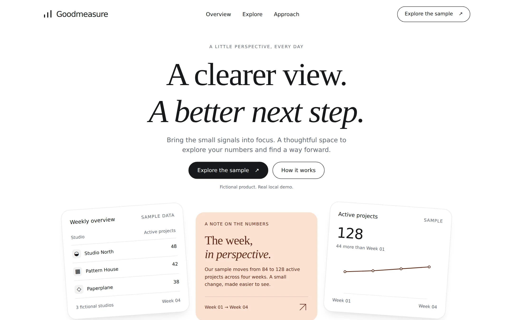
An airy analytics landing page for the fictional Goodmeasure product. A large serif introduction sits above a studio table, a peach editorial note and a line-chart card. A working local explorer lets visitors switch between two four-week sample metrics.
- Best for
- Analytics products and small software teams presenting clear metrics with a calm editorial voice.
- Tech stack
- Use Next.js App Router, React and TypeScript, with plain CSS and custom properties. Keep equivalent choices already in the user's repository. Server Components own the layout and static content; one small Client Component owns the sample metric selector. Render charts as original inline SVG and the data table as semantic HTML. Use native buttons and details/summary controls. Store copy, navigation and both datasets together in typed local configuration. No database, authentication, AI calls, tracking, API keys, paid services or remote font/image hosts. The page must build and run locally without credentials. - Next.js (App Router) - React - TypeScript - CSS custom properties - Inline SVG - Local React state
- Tags
- analytics · editorial · serif · peach · light · SaaS
The creation prompt
1563 words, self-contained. Paste it into a chat session with your coding agent and it builds Steep end to end.
Build the "Steep" kickstart — A little perspective, set in serif and peach.

## Design
Create an editorial analytics landing page with a quiet white canvas, a large centered serif headline, and three staggered product fragments underneath. Use a 1200px maximum content width, 32px desktop gutters and 20px mobile gutters. The 80px header contains an original three-stroke mark and Goodmeasure wordmark at left, three in-page navigation links in the middle, and an outlined Explore the sample pill at right. Give the hero a small uppercase eyebrow, a two-line headline, a restrained supporting paragraph and paired filled/outlined pill links. At 1440px wide the hero headline starts near 180px from the top, the action row near 450px, and the three product fragments occupy approximately 550–810px; the first screen should feel composed, not like a dashboard shell.

Use CSS custom properties: canvas #FFFFFF, soft surface #F2F2F3, alternating surface #FAFAFB, primary ink #17191C, reading-muted #626773, peach #FBE1D1, brown #5D2A1A and hairline #E6E6E8. Keep all colors neutral except the peach/brown pair. Only the middle editorial card has a peach background, once on the whole page. Brown is used for its text and chart strokes elsewhere. Dark filled controls use white labels; outlined controls have dark ink and a thin dark border. No gradients, photography, customer logos or remote imagery.

Use Georgia, Times New Roman, serif for display text, weight 400, with an italic second line. Set the desktop hero at 90px, line-height 1.15 and tracking -0.025em; section titles 44px/1.3 with -0.015em tracking. Body and UI use ui-sans-serif, system-ui, -apple-system, Segoe UI, sans-serif at 15–17px with 1.5 line-height. The hero lead is 18px. Small metadata may be 12–14px; data values use tabular numerals. These system fonts deliberately replace proprietary display/body faces; do not fetch fonts.

The hero's left white card is a small three-row studio table, slightly rotated counterclockwise. The taller center card is the single peach editorial note, upright, with a thin horizontal rule and a small week-range label. The right white card is a sample metric and original brown SVG line chart, slightly rotated clockwise. Use a three-column grid with 24px gaps, subtly different vertical offsets and no overlaps with the headline. Cards have 24px corners and 20–24px padding; only floating white artifacts receive a faint hairline and a restrained neutral shadow. The charts depict the actual sample values, include a meaningful accessible description, and never rely on color alone. Decorative marks are original SVG paths with currentColor.

After the hero, build an Explore section on a pale neutral band with a left-hand heading and explanation and a larger right-hand live metric panel. A two-button metric selector sits above the value and four-week chart, followed by a native disclosure containing an accessible data table. The Approach section has three numbered text columns divided by hairlines. Follow it with native-disclosure FAQs and a quiet footer. Use 80px section gaps and readable line lengths. Every interactive target is at least 44px high and has a visible 2px dark focus outline with 3px offset.

Below 800px, wrap the header without hiding destinations, set the hero title to a fluid 44–64px, stack product fragments without rotations, and put the explorer copy above its panel. At 320px, use a 40px headline, flexible controls and one-column sections. Allow text to wrap and keep the whole page free from horizontal overflow at narrow widths and 200% zoom. Use at most 150ms color/border transitions, disable them for reduced motion, and keep all content visible on first paint with no entrance animation.

Typography stack: Georgia, 'Times New Roman', serif.

Page structure:
1. Header with Goodmeasure mark and real section links.
2. Centered serif hero with paired pill actions and three staggered sample artifacts.
3. Explore section with a two-metric selector, line chart and accessible sample-data disclosure.
4. Three numbered approach statements.
5. Native-disclosure questions and a quiet footer with fictional-demo attribution.

## Tech stack
Use Next.js App Router, React and TypeScript, with plain CSS and custom properties. Keep equivalent choices already in the user's repository. Server Components own the layout and static content; one small Client Component owns the sample metric selector. Render charts as original inline SVG and the data table as semantic HTML. Use native buttons and details/summary controls. Store copy, navigation and both datasets together in typed local configuration. No database, authentication, AI calls, tracking, API keys, paid services or remote font/image hosts. The page must build and run locally without credentials.

- Next.js (App Router)
- React
- TypeScript
- CSS custom properties
- Inline SVG
- Local React state
Where the repo you are working in already has an equivalent in place, keep the repo's choice and say which one you kept.

## Everything else
Build an editorial analytics landing page with a local four-week metric explorer.

Build Goodmeasure, an original fictional analytics product. This is a rebrandable landing page with a local sample explorer, not a connected analytics service. Use an original mark of three short rising strokes; do not borrow another company's brand. Header links: Overview targets #overview, Explore targets #explore, Approach targets #approach. The wordmark and Back to top link target #top. Explore the sample, in both header and hero, targets #explore; the secondary How it works hero action targets #approach.

Hero eyebrow: A LITTLE PERSPECTIVE, EVERY DAY. Headline: A clearer view. A better next step. Put the second sentence on its own italic line on desktop. Supporting copy: Bring the small signals into focus. A thoughtful space to explore your numbers and find a way forward. Beneath the actions write Fictional product. Real local demo.

Left hero artifact: Weekly overview, with a SAMPLE DATA label, a Studio / Active projects table and these rows: Studio North 48; Pattern House 42; Paperplane 38. End with 3 fictional studios / Week 04. Middle artifact: A NOTE ON THE NUMBERS, heading The week, in perspective., and text Our sample moves from 84 to 128 active projects across four weeks. A small change, made easier to see. End with Week 01 → Week 04 and an original arrow icon. Right artifact: Active projects, a SAMPLE label, value 128, and 44 more than Week 01. Draw a line chart with four values 84, 96, 112, 128 and endpoint labels Week 01 and Week 04. Supply those exact values as its accessible description. These hero artifacts are static readable HTML, not fake controls.

Explore section eyebrow: FROM NUMBERS TO A NEXT STEP. Heading: Follow a little thread. Explanation: Pick a metric. See the same four weeks from a different angle. Every number here is sample data. The panel is labeled Sample workspace / Four weeks. Two buttons read Active projects and Completed reviews, with Active projects selected initially. Active projects shows 128, 44 more than Week 01, and values 84, 96, 112, 128. Completed reviews shows 86, 46 more than Week 01, and values 40, 56, 72, 86. Selecting either button immediately updates the selected aria-pressed state, metric title, value, difference text, chart and data table. Announce the selected metric and value in a polite live region without moving focus. Keep the controls keyboard-operable; nothing persists or leaves the browser. The Show sample values disclosure exposes a table of Week 01 through Week 04 and the selected dataset. With JavaScript off retain the initial Active projects panel and explain that switching metrics needs JavaScript. Reload resets the selection.

Approach heading: A little clarity goes a long way. Three numbered statements: 01 Start with a question — Give each number a reason to be here. 02 Keep the context close — A small set of shared definitions makes the view easier to read. 03 Make room for the next step — Turn a useful observation into a conversation. Avoid invented claims about real performance, adoption or outcomes.

Questions use native details/summary: Is Goodmeasure a real service? Answer: It is a fictional product and a working local sample you can adapt. Does this connect to my data? Answer: No. The numbers live in this page; no accounts or services are connected. Are selections saved? Answer: No. Reloading returns the sample to Active projects. Footer: Goodmeasure — A little perspective for the work ahead. Include Fictional product. Sample data. No affiliation or endorsement. Repeat the real section links. Do not introduce signup, sales, download or pricing actions without working destinations.

Use one h1, header/nav/main/section/footer landmarks, a skip link, meaningful labels, accessible chart descriptions, readable contrast and keyboard focus. Retain static content and native disclosures without JavaScript. Document how to run the page and replace its name, palette, copy and datasets. The copied brief is self-contained and must never require visiting an inspiration website.

### Non-negotiables
- Responsive from 360px through desktop — no horizontal page overflow at any width. Deliberately scrollable regions stay within the viewport and remain keyboard and touch accessible.
- Every text/background pair clears WCAG AA (4.5:1 for body, 3:1 for large text); adjust a tint rather than shipping a failing pair.
- Fully keyboard operable, with a visible focus ring drawn in the accent colour.
- Honour `prefers-reduced-motion` — swap every transition for an instant state change.
- Write real copy in the voice described above; no lorem ipsum and no TODO placeholders.
- Use system or self-hosted fonts and CSS/SVG-drawn graphics — do not depend on a remote image or icon service.

Build the whole page end to end and show me the result running — not a description of it.
Pasting the prompt is step one. Fredrin runs the agent that builds it, one ticket per look.