 Fredrin
SaaS
Scheduling App Landing (Forest)
A warm, confident launch page for a booking-link scheduling tool.
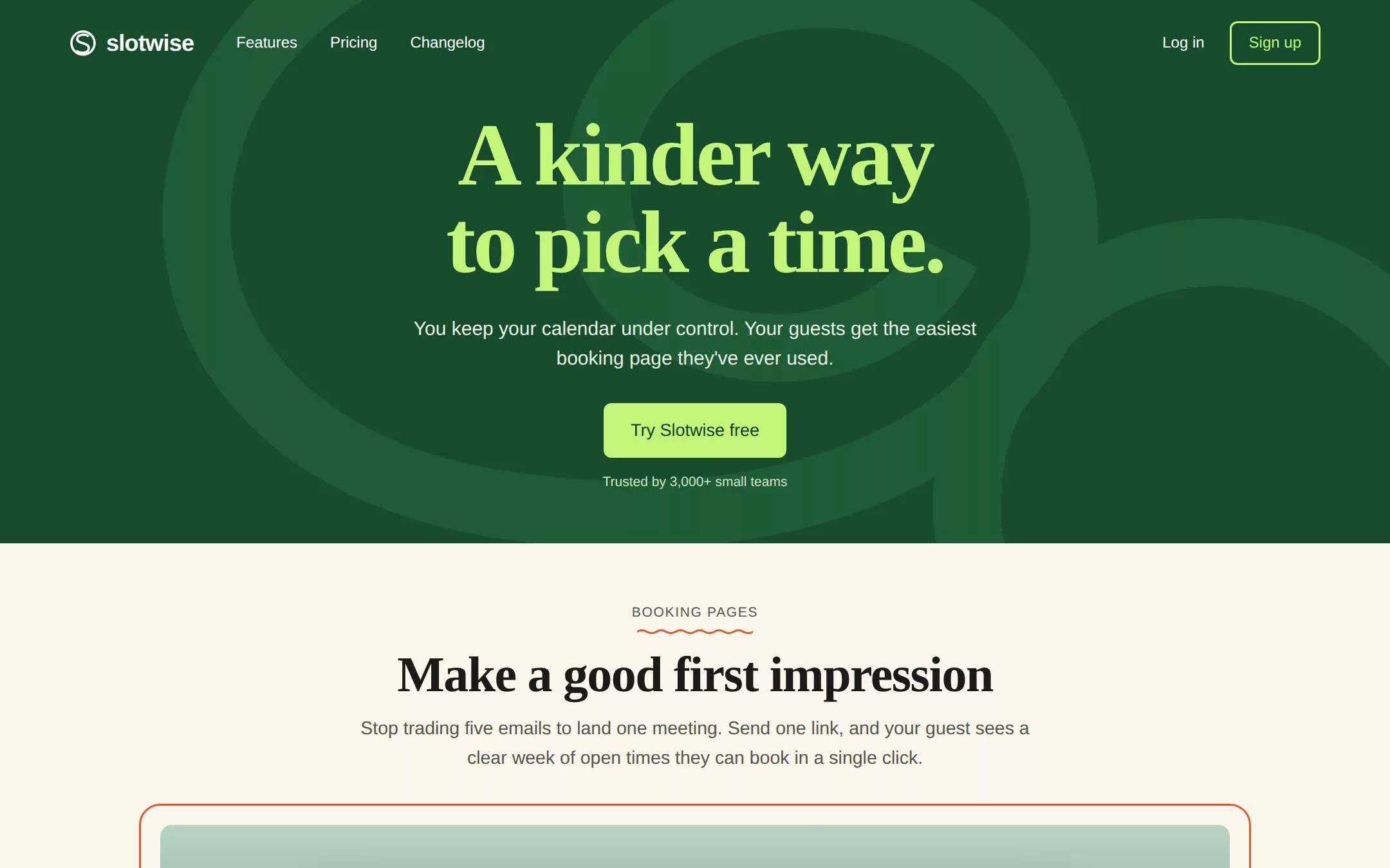
A friendly, self-assured product page that sells a scheduling tool on warmth and craft: a deep forest-green hero with an oversized lime serif promise, a looping outline mark drifting behind it, and a single lime button. Below, cream sections with wavy-underlined kickers introduce a framed week-view booking page, a three-up feature row, a testimonial wall and simple two-tier pricing.
- Best for
- A scheduling, booking or calendar product — or any friendly productivity SaaS — that wants to feel human and a little bold rather than corporate blue.
- Tech stack
- - Next.js (App Router) - React Server Components - TypeScript - Plain CSS with custom properties - Inline SVG and CSS for the calendar mockup and all artwork
- Tags
- scheduling · calendar · booking · serif · forest green · lime · cream · SaaS
The creation prompt
1323 words, self-contained. Paste it into a chat session with your coding agent and it builds Scheduling App Landing (Forest) end to end.
Build the "Scheduling App Landing (Forest)" kickstart — A warm, confident launch page for a booking-link scheduling tool.

## Design
Use https://savvycal.com/ as the visual reference: a saturated forest-green hero band, lime display type, and a warm cream page below. Reinterpret it for a fictional scheduling product without copying its brand, logo, copy, photography or product screenshots. The hero is a full-bleed #174B2B band about 620px tall; behind the headline, two or three huge concentric outline loops of the brand mark are drawn in inline SVG at #1F5A35 (a tone-on-tone line only a shade lighter than the band), cropped by the edges. The headline and the primary button in the hero are lime #C4F57A on that green — lime is used ONLY inside the green band. Everything below the hero sits on cream #FBF6EC with generous 120px section spacing and a centred 1120px column with 24px gutters. The product mockup is framed like a showcase: a 2px coral #E4572E rounded outline 20px outside a panel filled with a soft CSS dusk gradient (sage to deep teal, drawn hills as SVG silhouettes), and a white browser-chrome window floating in it. No photographs, no glow, no gradients on text.

### Colour palette (use these exact values)
- Background: #FBF6EC
- Surface / cards: #FFFFFF
- Primary text: #1A1A17
- Secondary text: #55544D
- Accent (buttons, links, active state): #1B5E34
- Text on accent: #FFFFFF
- Borders / dividers: #E7DFCD
Use exactly one accent. Everything that needs emphasis earns it through weight, scale or space instead of a second colour.

### Typography
- Headings: 'Iowan Old Style', 'Palatino Linotype', Palatino, 'Book Antiqua', Georgia, serif
- Body: 'Helvetica Neue', Helvetica, Arial, system-ui, sans-serif
- A heavy, tightly set serif for display against a plain sans for everything else. The hero h1 runs clamp(48px, 8vw, 112px) at weight 800, -0.03em tracking and 0.98 line-height, centred over two lines. Section headings are clamp(36px, 4.6vw, 64px) at weight 800, -0.02em tracking. Body is 18px/1.6 in the sans; feature titles are 20px sans at weight 600. Kickers are 14px uppercase sans with 0.08em tracking, underlined by a wavy SVG line in the coral #E4572E.

### Page structure
1. Header over the green band: a looping line-mark and lowercase wordmark on the left, three nav links (Features, Pricing, Changelog), and Log in plus a lime-outlined Sign up button on the right
2. Hero: the two-line lime serif headline centred, a two-sentence white lead (one line about the host, one about the guest), a single lime button with dark-green text, and a small pale social-proof line beneath
3. Showcase: a kicker with a wavy coral underline, a large centred serif heading and a short paragraph, then the coral-framed booking mockup — a browser window with a host panel on the left (initials avatar, meeting name, duration, location, a mini month calendar) and a seven-day week grid on the right with hatched unavailable blocks and white open slots
4. Features: three columns, each a bold sans title, two lines of body and an optional Read more link
5. Second showcase: kicker, heading and paragraph beside a smaller white card showing a ranked list of suggested times with one selected in the accent
6. Testimonials: a masonry wall of six white quote cards with a 1px border, an initials avatar, name and role
7. Pricing: two cards side by side (Basic and Premium), each with a price, a short promise and a checklist, the recommended card outlined in the accent
8. Closing band and footer: a second forest-green band repeating the lime headline style with one button, then a cream footer with the wordmark, four link columns and a small print line

### Components and detailing
The primary button is lime #C4F57A with #123D22 text inside the green bands, and the accent #1B5E34 with white text on cream — 17px weight-500 sans, 8px radius, 14px/24px padding; hover darkens it 6%. The Sign up button in the header is a 2px lime outline with lime text. Cards are white, 12px radius, a 1px #E7DFCD border and no shadow except the floating browser window, which gets 0 30px 60px rgba(0,0,0,0.25). The wavy kicker underline is an inline SVG path, 120px wide, 6px tall, stroked coral at 2px. The week grid's unavailable time uses a 45° repeating-linear-gradient hatch in #ECEAE4; open slots are white with a 1px border and turn accent-tinted on hover. Initials avatars are 36px circles in the accent with white letters. The loop mark, hills and hatch are aria-hidden. Focus rings are a 2px accent outline at 2px offset (lime inside the green bands).

### Motion
Easy and a little playful. The hero loops rotate very slowly (one turn per 120s). On load the headline rises 16px and fades in over 500ms, then the button follows after 120ms. The browser mockup lifts 24px into place as it enters the viewport via one IntersectionObserver, and its open slots fill in with a 30ms stagger. Hovering a slot shows a small time tooltip. Under prefers-reduced-motion everything renders in its final state with no rotation or movement.

## Tech stack
- Next.js (App Router)
- React Server Components
- TypeScript
- Plain CSS with custom properties
- Inline SVG and CSS for the calendar mockup and all artwork
Where the repo you are working in already has an equivalent in place, keep the repo's choice and say which one you kept.

## Everything else
Build a product landing page for a meeting-scheduling app on the latest Next.js (App Router). Use the sample brand Slotwise with the headline “A kinder way to pick a time.”, the lead “You keep your calendar under control. Your guests get the easiest booking page they've ever used.”, the button “Try Slotwise free” and the proof line “Trusted by 3,000+ small teams”. The first showcase has the kicker “Booking pages”, the heading “Make a good first impression” and a short paragraph about replacing back-and-forth emails with one link; its mockup shows the host “Priya Anand”, the meeting “Intro chat · 30 minutes · Video call”, a mini calendar for a sample month, and a week grid of Monday to Sunday from 9 am to 6 pm with hatched busy blocks and clickable open slots — clicking a slot marks it selected and shows a small confirmation line under the grid (“Tue 10:30 am — you're all set”) announced to screen readers. The three features are Your colours, Your own link and See both calendars. The second showcase has the kicker “Smart suggestions” and the heading “Offer your best times first”, with a card of four ranked time options. Seed six fictional testimonials with names and roles, and two pricing tiers: Basic at $0 and Premium at $12 per month. Keep the brand, nav, copy, calendar data, features, testimonials and prices in one typed site config so the owner can rebrand in one file. Buttons link to in-page anchors or #; there are no accounts, real bookings, payments or backend. Include a short README explaining how to change the brand, copy, palette, calendar sample data and pricing. The finished page runs locally with no API keys, no database and no external assets.

### Non-negotiables
- Responsive from 360px through desktop — no horizontal page overflow at any width. Deliberately scrollable regions stay within the viewport and remain keyboard and touch accessible.
- Every text/background pair clears WCAG AA (4.5:1 for body, 3:1 for large text); adjust a tint rather than shipping a failing pair.
- Fully keyboard operable, with a visible focus ring drawn in the accent colour.
- Honour `prefers-reduced-motion` — swap every transition for an instant state change.
- Write real copy in the voice described above; no lorem ipsum and no TODO placeholders.
- Use system or self-hosted fonts and CSS/SVG-drawn graphics — do not depend on a remote image or icon service.

Build the whole page end to end and show me the result running — not a description of it.
Pasting the prompt is step one. Fredrin runs the agent that builds it, one ticket per look.