Slite
A warm parchment knowledge-base homepage: a two-line grotesk headline with a hand-drawn ring, one ember pill and a floating product window with a verified handbook page.
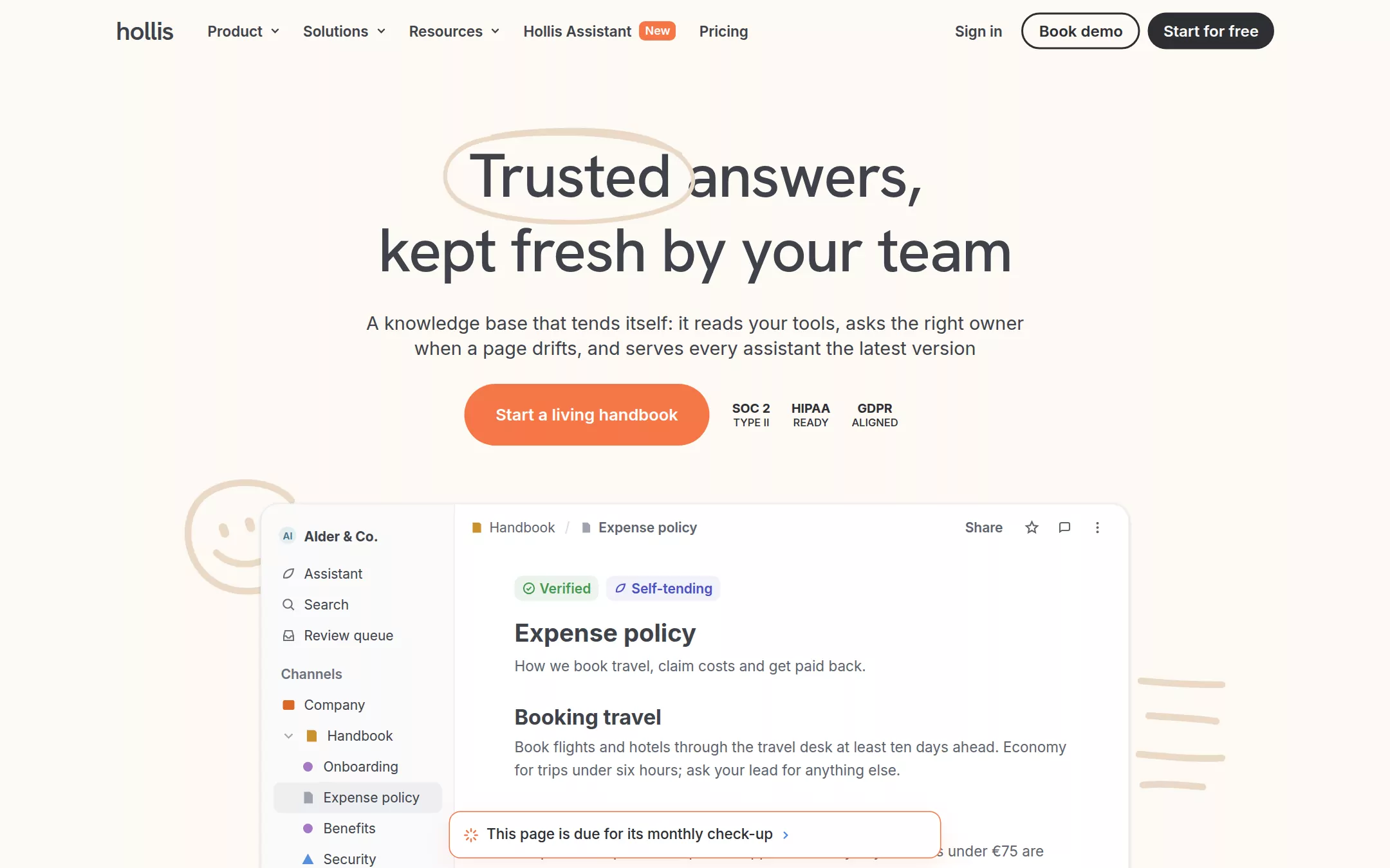
An original Hollis page: a sticky 64px parchment header with a lowercase wordmark, five ghost-pill links (one with an ember New badge), Sign in, an outlined Book demo pill and a dark Start for free pill; a centred two-line headline Trusted answers, / kept fresh by your team with a hand-drawn ring around Trusted, a two-line lede, a 64px ember pill and three compliance labels; a 900px white product window with a channel sidebar and a verified Expense policy page, overlapped by an ember-bordered check-up toast and flanked by brush doodles; then use-case chips, an invented logo strip, three 32px-radius feature cards and a one-line footer.
- Best forKnowledge, docs and internal-tool products that want a calm, human, paper-warm homepage — cream canvas, pill buttons, a real-looking product window — instead of a dark technical look.
- Tech stack- Next.js (App Router) - React - TypeScript - CSS custom properties Use Next.js App Router, React and TypeScript with plain CSS custom properties for every colour, radius, shadow and type token. Render the page as server components; only the mobile menu needs a small client island holding state in memory. Self-host Hanken Grotesk and Inter as woff2 files through next/font/local — no remote font request. Draw the wordmark, every icon, the brush ring, the doodles, the product window, the sidebar tree and the wordmark strip in inline SVG, CSS and HTML built from committed sample arrays — never bitmap screenshots, stock imagery or video — so the markup is identical on every render. Provide page metadata. Build and run the production page before capturing its preview.
The prompt. 1601 words, self-contained.
Build the "Slite" kickstart — A warm parchment knowledge-base homepage: a two-line grotesk headline with a hand-drawn ring, one ember pill and a floating product window with a verified handbook page.

## Design
Build a rebrandable landing page for an AI knowledge base that keeps a team's handbook accurate by itself — it reads connected tools, routes drifting pages to their owners and serves every assistant the current answer.

Create a complete landing page for Hollis, a fictional knowledge-base product. This is a concept presentation, not a real company — no real product, customer, person or logo. Use original branding, artwork and copy throughout.

Color: a warm, quiet page with one ember accent. Parchment #FDF9F4 is the page canvas and the header — never cold white at the page level. Star White #FFFFFF is reserved for raised surfaces: the product window and its floating toast. Dust Sand #F9EFE4 fills the use-case chips, nav hover washes and the marketing cards. Shade Ink #2D2F34 is the primary text, the dark Start for free pill and the outlined button's 2px border; Shade Charcoal #3F434A carries the headline, navigation labels and the hero lede; Shade Slate #5E646E is secondary copy, breadcrumbs and captions; Shade Dusk #6A707C small labels; Shade Fog #9DA3AF muted icons. Moon Silver #ECEDEF is the only hairline — window border, sidebar divider, footer rule. Ember #F67748 fills exactly one button per section (the hero call to action), the tiny New badge, the floating toast's 1px border and the highlighted card's 2px border; never a large background. A pale brush tone #EAD9C6 draws the hand-made ring around the first headline word and the two doodles. Inside the product mock only, Verification Green #479A53 and Tag Violet #4B51C3 mark the status pills, and Neptune Blue #74A6F1 tints one card eyebrow.

Typography: display headlines are "Hanken Grotesk", "Helvetica Neue", Arial, sans-serif (the open stand-in for a warm grotesk display face) at weight 500 — the hero h1 64px/76.8px with -0.02em tracking, section headings 40px/48px, card titles 28px/33px; never weight 700 at display sizes. Everything else is Inter, -apple-system, "Segoe UI", Roboto, sans-serif: navigation 15px/15px weight 600, header buttons 16px/16px weight 600, the hero lede 19.2px/26.88px weight 400, the call to action 17px/17px weight 600, chips 16px/16px weight 600, product-mock body 15px/24px, doc titles 25.5px/33.15px and 21.75px/28.275px weight 700, sidebar rows 14px/16px. The wordmark is lowercase hollis in the display face at 27px weight 600 with -0.03em tracking. Both faces are SIL Open Font License.

Layout: a 1440px canvas with a 1200px content column (120px side margins). Radii: 999px on every pill button and chip, 32px on marketing cards, 18px on the product window, 12px on the toast, 8px on sidebar rows, status pills and tiny icon buttons, 6px on the New badge. Depth appears only on the product window — a three-layer shadow 0 1px 3px rgba(0,0,0,.1), 0 2px 6px rgba(0,0,0,.05), 0 4px 12px rgba(0,0,0,.01) — everything else is flat.

Navigation: a sticky 64px Parchment header. At x 120 the hollis wordmark; from x 203 five 32px ghost pills with 12px side padding — Product, Solutions and Resources each with a 10px chevron, Hollis Assistant with an Ember New badge, and Pricing. Right-aligned and ending at x 1320: a Sign in text link, a 38px Book demo pill with a 2px Shade Ink border, and a 38px dark Start for free pill in #2D2F34 with near-white text.

Hero (id top): 80px top padding, centred. A 770px h1 at y 144 on two lines — Trusted answers, / kept fresh by your team — with a loose hand-drawn #EAD9C6 ellipse (5px brush stroke, open at one end) circling the word Trusted. 24px below, a 720px two-line lede in Shade Charcoal: A knowledge base that tends itself: it reads your tools, asks the right owner when a page drifts, and serves every assistant the latest version. 23px below, a 64px-tall Ember pill with 32px side padding reading Start a living handbook, and beside it a 200px row of three small stacked compliance labels (SOC 2 / TYPE II, HIPAA / READY, GDPR / ALIGNED) in 13px bold over 11px text. Two brush doodles in #EAD9C6 sit behind the window: a 150×133px smiling face at the upper left edge and four short hand-drawn lines at the right.

Product window (id product): a 900×640px Star White window starting at y 522, x 270, with a 1px Moon Silver border. A 200px sidebar on #FAFAFB: the Al / Alder & Co. workspace row, then Assistant, Search and Review queue with 16px line icons, a Channels label, and coloured-icon rows — Company, Handbook (expanded: Onboarding, Expense policy selected on rgba(104,118,146,.08), Benefits, Security), Engineering, Product, People & Ops. The document pane has a 48px bar with the Handbook / Expense policy breadcrumb, a Share label and star, comment and more icons; then, 62px in, a Verified pill in green and a Self-tending pill in violet, the doc title Expense policy, a one-line summary and three sub-sections (Booking travel, Claiming a receipt, Getting paid back) in Shade Slate. A 510px toast hangs over the window's lower edge at y 841, offset 6px left of the pane: white, a 1px Ember border, an Ember sparkle icon, This page is due for its monthly check-up, and a small blue chevron.

Use cases: centred under the window, three 38px Dust Sand chips — Self-tending page, Handbook health check, Owner-routed review.

Logo strip (id teams): 100px below, the 16px weight 600 Shade Slate line Relied on by 900+ teams as the one place answers live, then six invented wordmarks across 1150px (Fernhill, KOMBU, Larchway, orbit/9, Pellwood, tinder&co) each captioned in 13px rgba(0,0,0,.4) with where they moved from.

Feature cards (id features): the centred 40px heading Finally, a knowledge base that keeps up with you, then three 520px-tall cards in a 16px-gap grid with 48px top / 24px side / 32px bottom padding — Capture knowledge, Stay accurate (the highlighted card: Parchment fill with a 2px Ember border and an Ember eyebrow), Find answers — each with a 14px eyebrow, a 28px display title and a 32px outlined ghost pill.

Footer (id footer): a Moon Silver rule and one centred 14px Shade Dusk line — © 2026 Hollis · a fictional sample, not a real product.

## Tech stack
- Next.js (App Router)
- React
- TypeScript
- CSS custom properties

Use Next.js App Router, React and TypeScript with plain CSS custom properties for every colour, radius, shadow and type token. Render the page as server components; only the mobile menu needs a small client island holding state in memory. Self-host Hanken Grotesk and Inter as woff2 files through next/font/local — no remote font request. Draw the wordmark, every icon, the brush ring, the doodles, the product window, the sidebar tree and the wordmark strip in inline SVG, CSS and HTML built from committed sample arrays — never bitmap screenshots, stock imagery or video — so the markup is identical on every render. Provide page metadata. Build and run the production page before capturing its preview.
Where the repo you are working in already has an equivalent in place, keep the repo's choice and say which one you kept.

## Everything else
Keep Hollis clearly fictional and rebrandable: no real product, company, customer, person or logo, and no source screenshot, illustration or copy. The page reads as warm parchment with one ember spark: #F67748 fills only the hero call to action and the New badge, and outlines only the toast and the highlighted card. Display type is always Hanken Grotesk weight 500; everything else is Inter. Pills stay fully round, cards 32px, and only the product window casts a shadow. Text pairs clear WCAG AA — #2D2F34 and #3F434A on #FDF9F4, #F9EFE4 and #FFFFFF; #5E646E on #FDF9F4 and #FFFFFF — with one deliberate exception kept from the reference: the white 17px label on the #F67748 call to action measures about 2.7:1, so offer #2D2F34 as its label if the build must pass AA everywhere. Every link leads to a real section on the page; nothing submits. The page loads no analytics or tracking script and shows no cookie banner or chat bubble. Content is initially visible: no counters, typing effects, parallax or scroll reveal; the only motion is a 150ms background wash on navigation hover and a slight darkening of pill buttons, and it stops for prefers-reduced-motion. Every control shows a 2px #2D2F34 focus ring with a 2px offset. The product window is one labelled image; decorative doodles and icons are hidden from assistive technology. At 360px the navigation collapses to the wordmark, Start for free and a Menu button, the headline drops to 40px/48px, the compliance labels wrap below the call to action, the product window becomes the document pane alone, chips and wordmarks wrap, the cards stack, and the page never overflows horizontally.

### Non-negotiables
- Responsive from 360px through desktop — no horizontal page overflow at any width. Deliberately scrollable regions stay within the viewport and remain keyboard and touch accessible.
- Every text/background pair clears WCAG AA (4.5:1 for body, 3:1 for large text); adjust a tint rather than shipping a failing pair.
- Fully keyboard operable, with a visible focus ring drawn in the accent colour.
- Honour `prefers-reduced-motion` — swap every transition for an instant state change.
- Write real copy in the voice described above; no lorem ipsum and no TODO placeholders.
- Use system or self-hosted fonts and CSS/SVG-drawn graphics — do not depend on a remote image or icon service.

Build the whole page end to end and show me the result running — not a description of it.