Seline Analytics
A calm, privacy-first analytics landing page: a whisper-weight 52px headline with one cyan highlight span, pill-quiet buttons, a monochrome logo band and a floating dashboard with an ink-sticker mascot on warm stone paper.
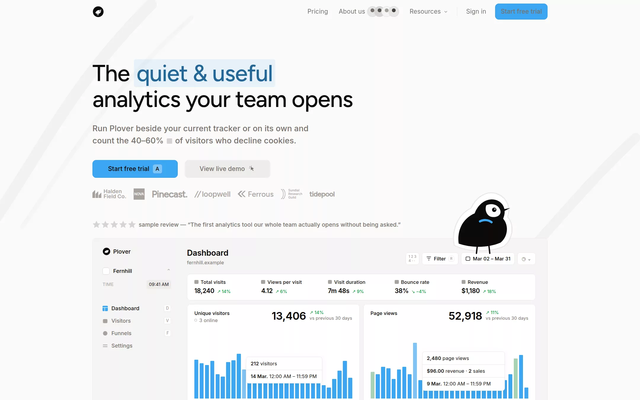
An original Plover page on Stone Canvas inside a centred 1024px column: a 52px navigation with an ink bird mark, quiet stone links, a founder avatar stack and a cyan Start free trial; a two-line 52px headline with one cyan highlight span; a two-line stone subhead; a cyan and a stone-wash button; a grey invented logo band; a star review line; a large floating dashboard preview with sidebar, KPI strip and two bar charts, peeked over by an ink-plover sticker; testimonials; a feature-card grid; principles; an install call to action; a comparison table; a founder letter; questions and answers; a closing card and a footer.
- Best forWeb analytics, monitoring and small-team SaaS tools that want to feel calm and honest, with the product's own dashboard doing the selling.
- Tech stack- Next.js (App Router) - React - TypeScript - CSS custom properties Use Next.js App Router, React and TypeScript with plain CSS custom properties for every colour, radius, shadow and spacing token. Render the page as server components; only the questions use native details elements, so no client state is needed. Self-host Figtree (weights 400 and 500) and Inter (400, 500, 600) as woff2 through next/font/local — no remote font request. Draw the plover mark, the mascot sticker, the brush swooshes, icons, invented customer wordmarks and every dashboard fragment (sidebar, KPI strip, bar charts, tooltip, funnel, heatmap, comparison marks) as HTML, CSS and inline SVG with fixed data committed in the source, so the markup is deterministic between renders. Provide page metadata. Build and run the production page before capturing its preview.
The prompt. 1734 words, self-contained.
Build the "Seline Analytics" kickstart — A calm, privacy-first analytics landing page: a whisper-weight 52px headline with one cyan highlight span, pill-quiet buttons, a monochrome logo band and a floating dashboard with an ink-sticker mascot on warm stone paper.

## Design
Build a rebrandable landing page for a privacy-first web analytics product.

Create a complete landing page for Plover, a fictional cookie-less web analytics tool for small product teams: a real-time dashboard, visitor journeys, funnels and revenue attribution from one small script. This is a concept presentation, not a real company — no real customers, people, metrics or reviews. Use original branding, artwork and copy throughout.

Color: Stone Canvas #FAFAF9 is the page background and never changes; Pure White #FFFFFF is reserved for cards, the chart panels and inputs. Ink Black #0C0A09 is every heading, the logo, the mascot and the text on the cyan button; Soot #1C1917 is dense dashboard text. Warm Gray #78716C is body copy, the subhead, nav links and the secondary button text; Ash Gray #A8A29E is the logo band, helper text and empty stars. Stone Border #E8E6E5 is every 1px hairline; Stone Muted #D6D3D1 is secondary borders and the small inline chip; Panel Stone #F5F5F4 fills the dashboard frame and tags. Cyan Signal #3BA6F1 is the one chromatic voice: the primary button fill, dashboard bars, active sidebar icon and links; Cyan Edge #3398E1 is the primary button's border; Cyan Ink #236796 is the text of the headline highlight; Sky Wash #C1E1F7 is the highlight behind one phrase in each testimonial. Growth deltas in the dashboard use a small #16A34A; nothing else adds colour — no gradients, no glass.

Typography: headings in Figtree, "Helvetica Neue", Arial, sans-serif at weight 500 only (a free stand-in for a geometric display grotesque); everything else in Inter, "Helvetica Neue", Arial, sans-serif. Hero 52px/58px, -1.1px; section headings 32px/40px, -0.8px, with a second sentence in rgba(168,162,158,.6); card titles 20px/24px, -0.1px; subhead Inter 500 18px/27px; nav and body Inter 400 14px/23px with 0.05px tracking; buttons Inter 500 14px/20px; review line Inter 500 13px/20px; testimonials 16px/27px.

Layout: one 1024px column centred at 1440px (x 208 to 1232); 96px between sections; 16px gaps in card grids. Two faint brush swooshes, #F3F2F0 strokes 22–26px wide, sweep diagonally through the top-left corner and the right edge of the hero, behind everything.

Navigation: 52px tall and sticky, no background or border. Left: a 26px circular Ink Black mark holding a white plover silhouette. Right, in one 36px row: Pricing, About us followed by a stack of four 24px stone avatar circles overlapping by 8px, Resources with a 10px caret, a 1px×20px Stone Border divider, Sign in, and an 8px-radius Start free trial button (36px, 0 12px padding).

Hero (id top): 84px below the navigation, a two-line headline 780px wide: The, then quiet & useful as the one highlight span (Cyan Ink on rgba(59,166,241,.1), 0 6px padding, 4px radius), a line break, then analytics your team opens. 24px below, a 520px two-line subhead: Run Plover beside your current tracker or on its own and count the 40–60% of visitors who decline cookies, with a 12px Stone Muted square chip after the figure. 30px below, two 192×40px buttons 16px apart: Start free trial in Cyan Signal with a 1px Cyan Edge border, Ink Black text and an A keyboard chip; View live demo in a rgba(120,114,109,.1) wash with Warm Gray text and a small cursor-click icon.

Logo band: 24px below, a 25px-tall row of seven invented wordmarks in Ash Gray, 16px apart, each in a different shape — a stacked two-line name with a bar glyph, a filled square badge, a heavy display name with a full stop, a slashed lowercase name, a chevron mark, a tiny three-line research guild, a rounded lowercase word.

Review line: 46px below, five 18px Stone Muted stars and the Warm Gray line sample review — followed by an invented one-sentence quote in curly quotes.

Dashboard preview (id dashboard): 20px below, a 1024×570px Panel Stone frame (8px radius, 1px rgba(214,211,209,.3) border) that is cut by the fold. Inside, a 198px sidebar — the small Plover mark and name, a workspace selector, a TIME row with a 09:41 AM chip, and four 28px menu rows (Dashboard active with a Cyan Signal icon, Visitors, Funnels, Settings) with 9px key hints — and a main area: Dashboard in Inter 600 18px over a sample domain, a row of white 28px toolbar chips (Filter, a date range, a clock), a white KPI strip of five metrics (Total visits, Views per visit, Visit duration, Bounce rate, Revenue) each with a green delta, and two white chart cards (Unique visitors, Page views) with a 24px figure, vs previous 30 days, 30 Cyan Signal bars with one lighter hovered bar and a white tooltip card. An original hand-inked plover sticker — a round Ink Black bird with a white face patch, an eye, a beak, thin legs, a cyan smile and a thick white die-cut outline — perches on the frame's top edge at the right, overlapping it by about 30px.

Testimonials (id reviews): two columns, each five stars, a 16px/27px Warm Gray quote with one Sky Wash highlighted phrase in Ink Black, a 40px avatar circle, a 14px name and a role, every one an invented sample.

Feature grid (id features): the heading Why Plover? Here is the short tour. with the second sentence greyed, a two-column intro in 16px/27px, then white feature cards in a 2-up then 3-up rhythm — Real-time dashboard, Journeys, Ask Plover, No cookie banners, Live view, Profiles, Funnels, Revenue attribution, Filters — each with a small cyan icon, a tag reading no setup required or optional, a 20px title, a 14px Warm Gray description, a cyan link with a north-east arrow and a cropped product fragment (a referrer list with cyan-wash bars, a journey timeline, a funnel of three cyan bars, an activity heatmap). One card is rotated 1.5deg like a pinned note.

Principles (id principles): three short white cards — Built by hand, Bot filtering, Founded on a promise — with 12px cyan icons.

Install (id cta): centred 32px heading Paste one script and see your first visitor in minutes., a 16px subline with an inline code chip, the two hero buttons and a 12px note 7-day sample trial.

Comparison (id pricing): centred heading Where Plover wins, and where it doesn't., then a table comparing Plover with two generic alternatives (A popular free suite, A self-hosted tool) on twelve rows, with Plover's column raised in a white 12px-radius card with a 1px Cyan Edge border, cyan check circles, amber partial circles and grey crosses, and a legend.

Founder letter (id letter): a white paper card with a soft shadow and a typed-letter layout — Greetings to you, wanderer, four short paragraphs, a signature line and a P.S. with a cyan link.

Questions and answers (id faq): a 32px heading and eight native details rows with cyan chevrons and 14px 600 questions.

Closing card: a white 10px-radius card with a two-tone 32px heading (Ink Black then grey), a 14px line and the two hero buttons.

Footer: on Stone Canvas, a short tagline with three small social glyphs, then Product, Company, Resources, Compare and Legal link columns in Warm Gray with Ink Black 13px headings, a green Status dot, and a bottom row with a fictional address and © Plover sample.

## Tech stack
- Next.js (App Router)
- React
- TypeScript
- CSS custom properties

Use Next.js App Router, React and TypeScript with plain CSS custom properties for every colour, radius, shadow and spacing token. Render the page as server components; only the questions use native details elements, so no client state is needed. Self-host Figtree (weights 400 and 500) and Inter (400, 500, 600) as woff2 through next/font/local — no remote font request. Draw the plover mark, the mascot sticker, the brush swooshes, icons, invented customer wordmarks and every dashboard fragment (sidebar, KPI strip, bar charts, tooltip, funnel, heatmap, comparison marks) as HTML, CSS and inline SVG with fixed data committed in the source, so the markup is deterministic between renders. Provide page metadata. Build and run the production page before capturing its preview.
Where the repo you are working in already has an equivalent in place, keep the repo's choice and say which one you kept.

## Everything else
Keep Plover clearly fictional and rebrandable: no real company, product, customer, review site, person or copy; every name, figure, date, quote and comparison is invented and labelled sample, and the comparison names no real competitor. Cyan Signal #3BA6F1 appears only on the primary button, dashboard bars, active icons and links; exactly one highlight span per headline. Primary button text is Ink Black on cyan so it clears WCAG AA. Every link leads to a real section on the page; buttons do not submit, sign anyone up or store anything; the page loads no analytics or tracking script of its own. Content is initially visible — no marquee, counters, typing, parallax or scroll reveal, and transitions stop for prefers-reduced-motion. Every control shows a 2px Cyan Edge focus ring with a 2px offset. The mascot, swooshes and dashboard art are hidden from assistive technology, with a text alternative for the dashboard as a whole. At 360px the navigation collapses to the mark, a Menu button and Start free trial, the headline drops to 36px/42px, the subhead and buttons go full width, the logo band wraps to two rows, the dashboard preview scales into a horizontally clipped frame with the mascot above it, all card grids and the comparison stack to one column, and the page never overflows horizontally.

### Non-negotiables
- Responsive from 360px through desktop — no horizontal page overflow at any width. Deliberately scrollable regions stay within the viewport and remain keyboard and touch accessible.
- Every text/background pair clears WCAG AA (4.5:1 for body, 3:1 for large text); adjust a tint rather than shipping a failing pair.
- Fully keyboard operable, with a visible focus ring drawn in the accent colour.
- Honour `prefers-reduced-motion` — swap every transition for an instant state change.
- Write real copy in the voice described above; no lorem ipsum and no TODO placeholders.
- Use system or self-hosted fonts and CSS/SVG-drawn graphics — do not depend on a remote image or icon service.

Build the whole page end to end and show me the result running — not a description of it.