Reclaim
A bright, calm AI-calendar homepage: a whisper-weight 90px Poppins headline with a violet-to-green gradient phrase, violet and outlined pill buttons, and a flat white week-calendar mockup floating over soft green and violet glows.
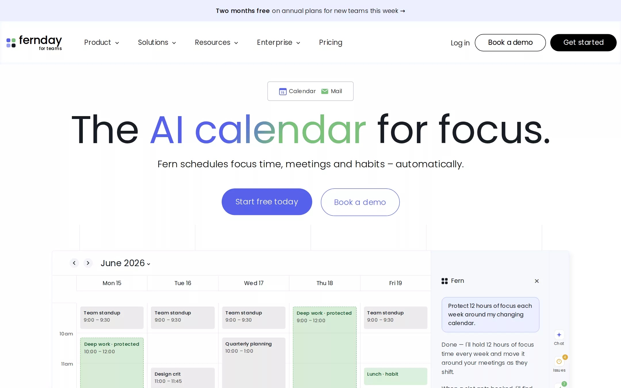
An original Fernday AI-calendar page on a white canvas: a full-width lavender announcement bar, a 100px white header with a four-square mark, five navigation items with chevrons, a quiet Log in, an outlined Book a demo pill and a black Get started pill; a centred hero with a small outlined calendar-sync badge, a one-line 90px Poppins 400 headline whose middle phrase carries a violet-to-green gradient, a 22px light lead and paired violet and outlined pills; faint vertical grid columns and soft green and violet radial glows behind a 1200px flat white week-calendar mockup with green focus blocks, grey meetings and an assistant side panel; an invented logo strip with a trust line; three coloured stat tiles; a lavender feature band with a checklist and calendar card; and a quiet footer.
- Best forCalendar, scheduling, focus-time, habit and task-planning products, and other friendly productivity SaaS that proves itself with a flat product mockup.
- Tech stack- Next.js (App Router) - React - TypeScript - CSS custom properties Use Next.js App Router, React and TypeScript with plain CSS custom properties for every colour, gradient, radius, shadow and spacing token. Render the page as server components; only the feature checklist and the mobile menu need small client islands, holding their state in memory. Self-host Poppins (300, 400 and 500, SIL Open Font License) as woff2 files through next/font/local — no remote font request. Draw the Fernday mark, the invented wordmarks, every icon and the calendar mockups as inline SVG and HTML built from committed sample arrays, never bitmap screenshots, so the markup is identical on every render. Provide page metadata. Build and run the production page before capturing its preview.
The prompt. 1581 words, self-contained.
Build the "Reclaim" kickstart — A bright, calm AI-calendar homepage: a whisper-weight 90px Poppins headline with a violet-to-green gradient phrase, violet and outlined pill buttons, and a flat white week-calendar mockup floating over soft green and violet glows.

## Design
Build a rebrandable landing page for an AI calendar and scheduling assistant: AI agents that find focus time, book meetings, place habits and schedule tasks on a team's calendars.

Create a complete landing page for Fernday, a fictional AI calendar. This is a concept presentation, not a real company — no real product, customer, person or logo. Use original branding, artwork and copy throughout.

Color: a white page with one pale lavender wash. Paper #FFFFFF is the page, the header and every card. Lavender Canvas #EBEFFF is the announcement bar, the feature band and the mockup frame's hairline. Lavender Mist #C2CAF9 tints checklist borders and the assistant's message bubble. Midnight Ink #181D25 is every headline; Pure Black #000000 is the nav Get started pill, the nav Book a demo outline and the announcement text; Charcoal #333333 is navigation; Slate #474747 is leads, body copy, captions and the trust line; Steel Edge #B8C1D1 is the calendar-sync badge outline and 1px structural rules; Mist #ECECEC is calendar gridlines. Iris Violet #5562EB is the primary pill, the outlined pill, links, the first half of the headline gradient and the stat tile on the left; it hovers to Sapphire #3451E8. Focus Green #7AC17B is focus-time blocks, checks, the second half of the headline gradient and the middle stat tile; Forest Edge #14532D is the right stat tile. Text on violet is #FFFFFF. The signature is the gradient phrase: linear-gradient(120deg, #5562EB 40%, #7AC17B 61%) clipped to text. Behind the mockup sit two soft radials — rgba(122,193,123,0.5) at 75% 35% fading out by 17%, and rgba(85,98,235,0.35) at 22% 57% fading out by 20% — and five faint 1px #ECECEC vertical column lines rising from the hero buttons to the mockup.

Typography: one family. Headings and body use "Poppins", "Plus Jakarta Sans", ui-sans-serif, system-ui, -apple-system, "Segoe UI", sans-serif. Display 90px/90px weight 400; hero lead 22px/26.4px weight 300; section headings 48px/57.6px weight 400; feature headings 40px/40px weight 400; stat numbers 100px/100px weight 400; navigation 16px/32px weight 400; hero buttons 18px/32px weight 300; nav buttons 16px/20px weight 400; announcement 14px/32px weight 300 with a weight 500 lead-in; body 16px/24px weight 300; captions 14px weight 300. Never set a headline above weight 400 — the light, large Poppins is the voice.

Layout: a 1440px canvas; the header spans x 15 to 1430, content centres in 1200px (x 120 to 1320). Spacing on an 8px base; 80px or more between sections. Radii: 100px for every button and pill, 5px for the badge and mockup frame, 16px for stat tiles, 10px for feature cards, 4px for calendar blocks.

Announcement bar: a full-width 49px #EBEFFF strip, centred 14px text — a weight 500 lead-in Two months free on annual plans followed by weight 300 for new teams this week → — linking to the pricing section.

Navigation: a 100px white header with a 1px inner #F3F6FF hairline at its top. At x 15 a 22px mark of four rounded squares (violet, green, violet, black) beside the 26px weight 500 wordmark fernday with a tiny 10px weight 500 sub-line for teams. From x 195 five items — Product, Solutions, Resources, Enterprise (each with a small chevron) and Pricing — in #333333, about 40px apart. Right: Log in at x 1046, then the 167×40px outlined Book a demo pill and the 154×40px black Get started pill ending at x 1430, all centred at y 104.

Hero (id top): centred. At y 189 the 200×45px calendar-sync badge holding two small drawn app glyphs labelled Calendar and Mail. At y 256 the one-line 90px headline The AI calendar for focus., the phrase AI calendar in the gradient and the rest #181D25. At y 368 the 22px weight 300 lead Fern schedules focus time, meetings and habits – automatically. At y 437 the 210×62px primary pill Start free today and, 20px after it, the 183×64px outlined pill Book a demo.

Calendar demo (id product): at y 580 a 1200×710px mockup frame (x 120) behind the radial glows. Inside: a 56px toolbar with round back and forward arrows and the 20px label June 2026 with a caret; a five-day week grid (Mon 15 to Fri 19) with 13px day headers, 11px hour labels from 9am to 5pm on #ECECEC gridlines, grey #EBEBEB meeting blocks and three dashed-outlined Focus Green focus blocks labelled Deep work · protected; and a 320px assistant panel on #F7F8FD at the right with the mark and Fern, a #EBEFFF user bubble Protect 12 hours of focus each week around my changing calendar, a reply from Fern in 14px weight 300 and a slim icon rail (Chat, Issues, Tasks, Agents) with small coloured badges. Draw it all in HTML; it is flat — no shadows on blocks — legible and realistic.

Logo strip (id customers): directly under the mockup, seven invented monochrome wordmarks in a single 1200px row — Larchmont, Cobbleway, Ostrich&Co, Brightfold, Tallis, Quayside, Penwright — then the centred 14px weight 300 line Trusted by 400,000 people at 50,000 companies.

Stats (id results): 160px top padding, the centred 48px heading What if your calendar planned itself?, then three equal 375×350px stat tiles with 20px gaps — 8.1h more focus time each week on #5562EB with a faint dot grid, 3.4 fewer meetings each week on #7AC17B with #181D25 text and faint diagonal lines, 52% less context switching on #14532D with a faint square grid — and a centred 16px line Teams protect deep work and meet when it matters.

Feature band (id features): a full-width #EBEFFF band with 120px padding: on the left the 40px heading Guard focus time with AI, a 16px weight 300 subline, and three stacked white checklist rows — Focus time, Habits, Tasks — each with a green check, title and one line of copy; on the right a 600px white calendar card showing a three-day MON / TUE / WED grid of grey and green blocks.

Footer: white, a 1px #ECECEC top rule, the mark and wordmark, four 14px Slate link columns (Product, Solutions, Resources, Company) and the line © Fernday sample · a fictional AI calendar. Not a real company.

## Tech stack
- Next.js (App Router)
- React
- TypeScript
- CSS custom properties

Use Next.js App Router, React and TypeScript with plain CSS custom properties for every colour, gradient, radius, shadow and spacing token. Render the page as server components; only the feature checklist and the mobile menu need small client islands, holding their state in memory. Self-host Poppins (300, 400 and 500, SIL Open Font License) as woff2 files through next/font/local — no remote font request. Draw the Fernday mark, the invented wordmarks, every icon and the calendar mockups as inline SVG and HTML built from committed sample arrays, never bitmap screenshots, so the markup is identical on every render. Provide page metadata. Build and run the production page before capturing its preview.
Where the repo you are working in already has an equivalent in place, keep the repo's choice and say which one you kept.

## Everything else
Keep Fernday clearly fictional and rebrandable: no real company, product, customer, statistic or person — every logo, stat and name in the calendar is invented. Buttons are always 100px pills: violet filled, violet outlined, black filled or black outlined — never a square button or a gradient fill. Keep the gradient to the one headline phrase. Shadows stay at or under rgba(0,0,0,0.05); separate surfaces by tone and hairlines. Text pairs clear WCAG AA: #181D25, #333333 and #474747 on #FFFFFF and #EBEFFF, #FFFFFF on #5562EB and #14532D, and #181D25 on #7AC17B — never white text on green. Every link leads to a real section on the page; Start free today scrolls to a small in-page sign-up form that sends nothing. The page loads no analytics or tracking script and shows no cookie banner. Content is initially visible: no typing effects, counters, parallax, marquees or scroll reveal; hovers take 150ms and every transition stops for prefers-reduced-motion. Every control shows a 2px #5562EB focus ring with a 2px offset. The calendar mockups are labelled figures; decorative glyphs are hidden from assistive technology. At 360px the announcement bar wraps to two lines, the navigation collapses into a Menu button, the headline drops to 44px/48px and wraps, the lead to 18px/26px, the pills stack full-width, the mockup shows two days and hides the assistant panel, the logo strip wraps into rows of three, the stat tiles stack, the feature band stacks text over card, and the page never overflows horizontally.

### Non-negotiables
- Responsive from 360px through desktop — no horizontal page overflow at any width. Deliberately scrollable regions stay within the viewport and remain keyboard and touch accessible.
- Every text/background pair clears WCAG AA (4.5:1 for body, 3:1 for large text); adjust a tint rather than shipping a failing pair.
- Fully keyboard operable, with a visible focus ring drawn in the accent colour.
- Honour `prefers-reduced-motion` — swap every transition for an instant state change.
- Write real copy in the voice described above; no lorem ipsum and no TODO placeholders.
- Use system or self-hosted fonts and CSS/SVG-drawn graphics — do not depend on a remote image or icon service.

Build the whole page end to end and show me the result running — not a description of it.