 Fredrin
SaaS
Raycast
A midnight product launch with coral light and tactile command surfaces.
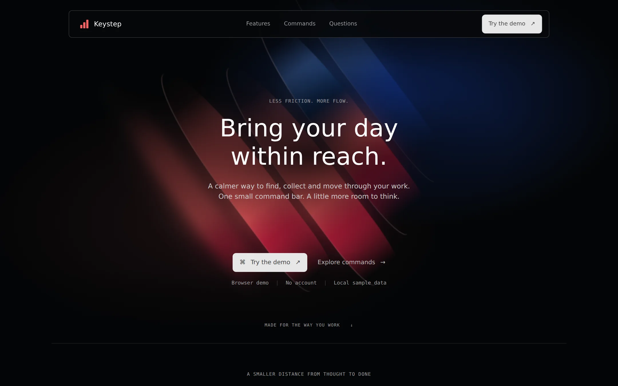
A near-black product launch page with a floating glass nav, regular-weight white headline and original coral-and-blue atmospheric artwork. Neutral actions lead to a working local command demo; inset feature cards and honest FAQ copy complete the page.
- Best for
- Desktop tools, productivity products and keyboard-first software launches.
- Tech stack
- Build with Next.js App Router, React Server Components, TypeScript and plain CSS custom properties. Keep equivalent tools already installed in the destination repository. Render the landing structure, navigation, features and FAQ on the server; use one small client component for the searchable command demo and its local state. Use semantic HTML, native details/summary disclosures and inline SVG icons; no icon CDN, animation framework or component-library dependency is necessary. Keep demo command records in a typed local array. Use next/link for local route links and fragment links for page sections. Do not add authentication, a database, analytics, payment processing or third-party APIs. Use system fonts by default; any optional self-hosted font must include its license. Document the dev, build and start commands in a README. A production build must serve the same complete content as development. Named technologies: - Next.js (App Router) - React Server Components - TypeScript - CSS custom properties - Local SVG and CSS artwork
- Tags
- productivity · launcher · dark · coral · keyboard · product-launch
The creation prompt
1501 words, self-contained. Paste it into a chat session with your coding agent and it builds Raycast end to end.
Build the "Raycast" kickstart — A midnight product launch with coral light and tactile command surfaces.

## Design
Create a dark landing page for Keystep, a fictional keyboard-first workspace launcher. Keep the entire page on Void Black #040506. Use Ink #07080A for cards, Obsidian #111214 for recessed inputs, Graphite #1B1C1E for badges, Pure White #FFFFFF for primary text, Ash #9C9C9D for readable secondary text and #363739 for borders. Primary actions are neutral Mist #E6E6E6 with Iron #454647 labels. The catalog palette's accent is the neutral action color, not the decorative brand color. Reserve Coral Pulse #FF6363 for the original brand mark, abstract hero artwork and one warm-tinted #452324 demo selection. Keep Electric Sky #63A1FF, Cobalt Edge #143CA3 and Deep Space #02193B inside the hero artwork only. Never use coral or blue as general body-link colors or filled action buttons. Use Ash instead of #6A6B6C for small text to preserve contrast; put text over a dark scrim, not bright artwork.

Use Inter when licensed local files are available, otherwise the source-approved system-ui, -apple-system, Helvetica Neue, Arial, sans-serif stack. Use a system monospace stack for technical captions and keyboard hints. The hero is 56px, weight 400, line-height 1.17, with positive 0.22px tracking; never heavy weight or negative tracking. Section headings are 32px/1.15, feature titles 20px/1.2, body 16px/1.5 and navigation 13–14px/500. The longer body line-height is a readability adaptation. Keep the main content within 1200px and use an 8px spacing base, 80–120px section gaps, 24px card padding and 8–16px internal gaps.

At 1440×900, set a floating glass navigation bar 24px from the top, centered at 1120px wide and 64px high. Give it an 8px radius, a 1px #363739 edge, a translucent black fill and backdrop-filter blur(48px). Put an original coral three-step mark and Keystep wordmark left; Features, Commands and Questions links center; a neutral Try the demo action right. The hero is about 800px tall, with a centered two-line headline starting near y=240, a short two-line supporting paragraph and generous breathing room. Its background is an original full-bleed composition of diagonal coral ribbons and blue edge light, created in CSS or local SVG. Let broad blurred coral beams cross from upper-left to lower-right; use sparse crisp inner edges, a blue radial wash on the right and soft black masking toward every outer edge. This is intentional abstract artwork, not a stock image, a brand logo or a substitute screenshot. Keep the text area subdued and legible. Below the lead, place a neutral Try the demo button beside a quiet Explore commands link, then a 12px monospace row reading Browser demo | No account | Local sample data. A hairline transition introduces the next section near the bottom of the first viewport.

Continue with a centered feature introduction and three equal cards: Find your next move, Keep the useful bits and Make room to focus. Use original monochrome line icons in dark circular wells. Cards have 16px corners and the tactile key shadow stack: inset 0 1px 0 rgba(255,255,255,.05), 0 0 0 1px rgba(255,255,255,.25), inset 0 -1px 0 rgba(0,0,0,.2). Never add floating drop shadows or bright section backgrounds. Follow with a two-column Commands section: short explanation left, a working dark search/result demo right. The demo window has a 12px outer radius, 8px input and row radii, a labeled search field, keyboard hints and four sample actions. Use the warm tint only for the selected result. Finish with three native FAQ disclosures and a compact wordmark/footer with an explicit fictional-product notice.

Buttons and inputs use 8px corners; badges use the source's named 6px radius token, resolving its conflicting generic 8px guideline. Make targets at least 44px high and keep action labels readable. Links are Ash and turn white on hover; focus uses a clearly visible neutral Mist outline. At widths below 768px, wrap the nav without a hidden menu, use 20–24px gutters and a 40px hero heading, stack feature cards and demo columns, and keep every page element within the viewport. Scale the artwork within a clipped decorative layer; never hide page overflow to conceal a broken layout. Keep every heading and content block visible without JavaScript. Use only 150ms hover/focus color transitions; disable them for prefers-reduced-motion. No entrance reveal, automatic carousel, looping animation, photography or remote assets.

Font stack: Inter, system-ui, -apple-system, Helvetica Neue, Arial, sans-serif.

Page structure, in order:
1. Floating glass navigation with an original Keystep mark and neutral demo action
2. Full-height atmospheric hero with a two-line headline, coral ribbons and blue edge light
3. Three tactile feature cards on an uninterrupted dark canvas
4. Two-column command section with a working local search and action demo
5. Native FAQ disclosures and a fictional-product footer

## Tech stack
Build with Next.js App Router, React Server Components, TypeScript and plain CSS custom properties. Keep equivalent tools already installed in the destination repository. Render the landing structure, navigation, features and FAQ on the server; use one small client component for the searchable command demo and its local state. Use semantic HTML, native details/summary disclosures and inline SVG icons; no icon CDN, animation framework or component-library dependency is necessary. Keep demo command records in a typed local array. Use next/link for local route links and fragment links for page sections. Do not add authentication, a database, analytics, payment processing or third-party APIs. Use system fonts by default; any optional self-hosted font must include its license. Document the dev, build and start commands in a README. A production build must serve the same complete content as development.

Named technologies:
- Next.js (App Router)
- React Server Components
- TypeScript
- CSS custom properties
- Local SVG and CSS artwork
Where the repo you are working in already has an equivalent in place, keep the repo's choice and say which one you kept.

## Everything else
Build a rebrandable product landing page with a local command demo for the fictional Keystep launcher. Hero headline: Bring your day / within reach. Supporting copy: A calmer way to find, collect and move through your work. One small command bar. A little more room to think. Keep the language practical and quiet. Do not claim a downloadable native app exists: every Try the demo action leads to #demo. Explore commands and Commands lead to the same section, Features to #features and Questions to #questions. No dead links, fake downloads, borrowed company logos, testimonials or invented adoption metrics.

Use the three feature titles from the Design prompt. Describe finding a useful starting point, keeping reusable snippets and protecting one task from distraction. The command demo contains four fictional local actions: Open project notes, Copy a sample snippet, Start a focus session and View keyboard shortcuts. A labeled search input filters by title and keywords without network calls, with a clear empty state and a Reset search button. Results remain buttons in ordinary tab order; Enter or Space activates the focused result. Opening notes shows a short local note, the snippet action reveals selectable sample text (copy with an explicit success/failure message only if the Clipboard API is used), the focus action shows a local focus view with a Back to commands button, and the shortcuts action opens a small inline help panel. Announce result counts and action outcomes politely. Escape clears the current action and returns focus to the search. Do not hijack global operating-system shortcuts. Demo state is local and resets on reload. With JavaScript disabled, retain the static result list and explain that interactive filtering needs JavaScript.

FAQ questions: Is this a real desktop app? What happens to my data? Can I make this my own? Answer honestly: this is a fictional product website with a browser-only demo, sample interactions remain in the tab and nothing is transmitted, and all branding, copy and commands are editable local data. The footer must say Fictional product. Interactive browser demo. Include a Back to top link. Provide a skip link, one h1, navigation and main landmarks, visible labels, keyboard focus and accessible names for every action. Decorative artwork is aria-hidden. The page must remain usable from 360px through desktop and at 200% zoom. Write a README explaining how to replace the product name, hero copy, colors, features and demo command data; no reference-site access is needed to build the page.

### Non-negotiables
- Responsive from 360px through desktop — no horizontal page overflow at any width. Deliberately scrollable regions stay within the viewport and remain keyboard and touch accessible.
- Every text/background pair clears WCAG AA (4.5:1 for body, 3:1 for large text); adjust a tint rather than shipping a failing pair.
- Fully keyboard operable, with a visible focus ring drawn in the accent colour.
- Honour `prefers-reduced-motion` — swap every transition for an instant state change.
- Write real copy in the voice described above; no lorem ipsum and no TODO placeholders.
- Use system or self-hosted fonts and CSS/SVG-drawn graphics — do not depend on a remote image or icon service.

Build the whole page end to end and show me the result running — not a description of it.
Pasting the prompt is step one. Fredrin runs the agent that builds it, one ticket per look.