 Fredrin
SaaS
Ramp
A black-and-white finance journal with one neon highlighter, marking only the places money moves.
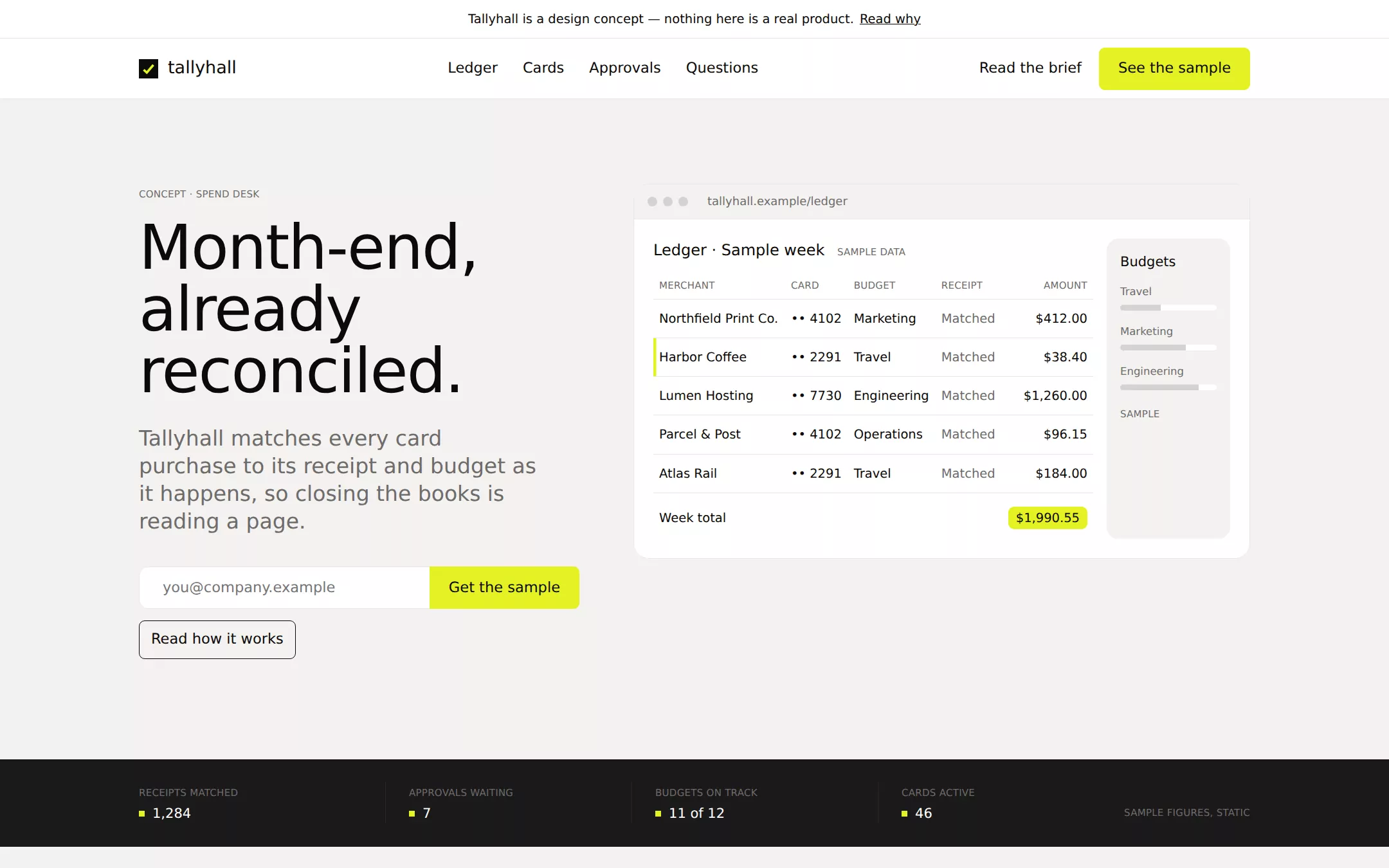
An original Tallyhall spend-desk page on warm Bone: an announcement strip above a white hairline navigation, a left-aligned 64px weight-400 hero with an email-plus-button composite beside an HTML dashboard in a browser frame, an Obsidian sample-counter strip, two text-left / visual-right feature pairs, a card grid and native questions. Highlighter yellow appears only where money moves.
- Best for
- Finance software, expense and card products, B2B dashboards and any product that wants to read like an editorial desk.
- Tech stack
- - Next.js (App Router) - React - TypeScript - CSS custom properties - Native HTML disclosures Use Next.js App Router, React and TypeScript with plain CSS custom properties and original inline SVG. Preserve equivalent tools already installed in the host project. Implement this as a server-rendered page; the dashboard is a static HTML table with sample rows, the email field does not submit anywhere, and native details and anchors need no client component or dependency. Use system font stacks only — no remote font, image, logo, icon or analytics host. Provide page metadata. Build and run the production page before capturing its preview.
- Tags
- fintech · editorial · monochrome · b2b · product
The creation prompt
1566 words, self-contained. Paste it into a chat session with your coding agent and it builds Ramp end to end.
Build the "Ramp" kickstart — A black-and-white finance journal with one neon highlighter, marking only the places money moves.

## Design
Build a rebrandable spend-management product landing page.

Create a complete landing page for Tallyhall, a fictional finance desk that puts company cards, receipts and approvals in one ledger. Its core idea: every purchase arrives already matched to a receipt and a budget, so month-end is a read, not a chase. This is a concept presentation, not a real financial service — no signup, no card issuing, no savings figures and no customer claims. Use original branding and copy throughout.

Color: the canvas is Bone #F4F2F0, a warm off-white. Paper #FFFFFF is the card, navigation and panel surface. Ink #0C0A08 carries all text and headings. Obsidian #1A1919 is the only dark surface — the counter strip and the footer; never use Ink as a large background. Ash #6D6C6B is secondary text and captions; Hairline #E5E7EB draws every card border and divider; Smoke #D3D3D3 is for skeleton bars inside the dashboard. Highlighter Yellow #E4F222 is the only chromatic color in the page: the primary button fill (with Ink text), the active row and totals in the dashboard, and the counter values' small marker — never a background wash, never text on a light surface. No gradients, no illustrations, no photography and no drop shadows: elevation is 1px Hairline borders on Paper over Bone.

Typography: one family and one weight. Use Inter, "IBM Plex Sans", ui-sans-serif, system-ui, -apple-system, "Segoe UI", Roboto, Helvetica, Arial, sans-serif at weight 400 for everything — a locally installed neo-grotesque stands in for the source's licensed face, with no remote font request — and set font-feature-settings: "ss01" on the body. Never use bold or semibold; hierarchy is size and tracking. Display 64px/1.0 with -0.02em tracking; section headings 40px/1.05; subheads 24px/1.17 in Ash; card titles 20px/1.3; body 16px/1.5; buttons and nav 14–16px; micro-labels 10px uppercase, line-height 2.2, 0.018em tracking. Everything is left-aligned inside a centered 1200px column with 24px gutters; 8px element gaps, 20–24px card padding and 96–128px between sections. Radii: buttons and tags 6px, inputs 10px, wash cards 12px, content cards and the dashboard frame 16px — never pills, never 4px.

Announcement strip and sticky navigation: a 40px Paper strip with a centered 13px Ink line Tallyhall is a design concept — nothing here is a real product. and an underlined Read why link to the questions. Beneath it a 62px Paper navigation, sticky, with a 1px Hairline bottom border and an inset white highlight rgba(255,255,255,0.6) 0 0 2px. Left: an original mark — a 20px Ink square with a Highlighter Yellow diagonal tick, drawn as inline SVG — and the word tallyhall in 18px Ink. Center: ghost links Ledger, Cards, Approvals, Questions (Bone background on hover). Right: a ghost Read the brief link and the Highlighter Yellow button See the sample. Every link is an anchor to a real section.

Typographic hero with an HTML dashboard: two columns, 5/7. Left: a 10px uppercase Ash micro-label CONCEPT · SPEND DESK, then the h1 Month-end, already reconciled. in 64px Ink over two lines, then a 24px Ash subhead Tallyhall matches every card purchase to its receipt and budget as it happens, so closing the books is reading a page. Under it the composite action: a Paper email input (10px radius, 1px rgba(33,33,33,0.1) border, 24px left padding, placeholder [email protected]) fused to a 44px Highlighter Yellow button Get the sample — marked as a non-submitting demo — and beneath, an outlined 6px button Read how it works. Right: a 16px-radius Paper browser frame with a 1px Hairline border, a 36px Bone title bar with three 10px Smoke traffic-light dots and a 12px Ash address tallyhall.example/ledger. Inside, a real HTML table titled Ledger · Sample week: columns Merchant, Card, Budget, Receipt, Amount; five rows of invented vendors (Northfield Print Co., Harbor Coffee, Lumen Hosting, Parcel & Post, Atlas Rail) with receipts shown as Matched in Ash, one row highlighted by a 3px Highlighter Yellow left bar, and a totals row whose amount sits on a small Highlighter Yellow 6px tag. Beside the table, a narrow Bone wash card Budgets with three labelled Smoke bars. Label the frame Sample data in a 10px micro-label.

Obsidian sample-counter strip (id counters): a full-bleed Obsidian band, 24px vertical padding, four columns separated by 1px #2A2828 rules. Each has a 10px uppercase Ash label (RECEIPTS MATCHED, APPROVALS WAITING, BUDGETS ON TRACK, CARDS ACTIVE) and a 14px Paper value (1,284 / 7 / 11 of 12 / 46) preceded by a 6px Highlighter Yellow square. A 10px Ash caption at the right reads Sample figures, static. No scrolling ticker.

Two text-and-visual feature pairs (id ledger and id approvals): each a two-column row, text left and visual right, 96px apart. First: 40px heading Receipts find their purchase. and 16px Ash body, with a Paper card showing a receipt thumbnail made of Smoke skeleton lines and a Matched to Harbor Coffee · Travel line. Second: 40px heading Approvals that read like a sentence. with a Paper card holding three request rows, each with an outlined Decline and a Highlighter Yellow Approve 6px button — the only yellow in that section.

Card grid of how it works (id cards): a 40px heading Three rules the desk keeps. then three 16px-radius Paper content cards with 1px Hairline borders and 24px padding, each with a 10px micro-label (RULE 01–03), a 20px title and 16px Ash body: Every card has a budget. / Spend is scoped before it happens, not after.; Every purchase wants a receipt. / The ledger asks once, at the moment of purchase.; Every close is a read. / Month-end is a finished page, not a task list. Below them one 12px-radius Bone wash card spanning the width with a 24px Ink line A quiet desk is the point.

Native questions (id questions): a 40px heading Plain answers. and four full-width details elements on Paper with 1px Hairline dividers, 20px Ink summaries and a + glyph: Is Tallyhall real? — no, it is a fictional design study. Are the figures real? — no, every number is sample data for layout. Can my company sign up? — there is no account, card or waitlist. Who is it for? — finance teams who want month-end to be a read. Answers are server-rendered with a visible 2px Ink focus ring.

Obsidian footer: Obsidian background, 64px top and 40px bottom padding, the tallyhall wordmark in Paper, three columns of 14px Paper links (Ledger, Cards, Approvals, Questions, Back to top) that resolve to real anchors, and a 12px Ash line Tallyhall is a fictional product concept. Not a bank, card issuer or financial service, and not affiliated with any finance company. No app badges, customer logos, testimonials, ratings or pricing.

At 760px and below: 16px gutters, a 40px hero h1, 32px section headings, the dashboard under the hero with the table scrolling horizontally inside its frame, a stacked email input and full-width button, a two-by-two counter grid, one-column feature pairs and cards, and navigation links collapsed to Questions and See the sample. The page fits a 360px viewport with no horizontal page overflow. Use semantic landmarks, one h1, a skip link, visible focus, a real table with caption and headers, WCAG AA contrast (yellow only as a fill under Ink text) and keyboard-operable details. Everything works without JavaScript.

## Tech stack
- Next.js (App Router)
- React
- TypeScript
- CSS custom properties
- Native HTML disclosures

Use Next.js App Router, React and TypeScript with plain CSS custom properties and original inline SVG. Preserve equivalent tools already installed in the host project. Implement this as a server-rendered page; the dashboard is a static HTML table with sample rows, the email field does not submit anywhere, and native details and anchors need no client component or dependency. Use system font stacks only — no remote font, image, logo, icon or analytics host. Provide page metadata. Build and run the production page before capturing its preview.
Where the repo you are working in already has an equivalent in place, keep the repo's choice and say which one you kept.

## Everything else
Keep Tallyhall clearly fictional and rebrandable: no source wordmark, product screenshots or copy, no real company, bank or card-network names, no customer logos, testimonials, user counts, savings claims or pricing. Every figure is labelled sample and the email field collects nothing. Every link leads to a real section on the page. Deliver initially visible content, WCAG AA contrast on every text/background pair, 300ms color transitions only with prefers-reduced-motion respected, keyboard-operable questions and a 360px layout without horizontal page overflow.

### Non-negotiables
- Responsive from 360px through desktop — no horizontal page overflow at any width. Deliberately scrollable regions stay within the viewport and remain keyboard and touch accessible.
- Every text/background pair clears WCAG AA (4.5:1 for body, 3:1 for large text); adjust a tint rather than shipping a failing pair.
- Fully keyboard operable, with a visible focus ring drawn in the accent colour.
- Honour `prefers-reduced-motion` — swap every transition for an instant state change.
- Write real copy in the voice described above; no lorem ipsum and no TODO placeholders.
- Use system or self-hosted fonts and CSS/SVG-drawn graphics — do not depend on a remote image or icon service.

Build the whole page end to end and show me the result running — not a description of it.
Pasting the prompt is step one. Fredrin runs the agent that builds it, one ticket per look.