 Fredrin
E-commerce
ORYZO AI
A single object, warm darkness and cream typography.
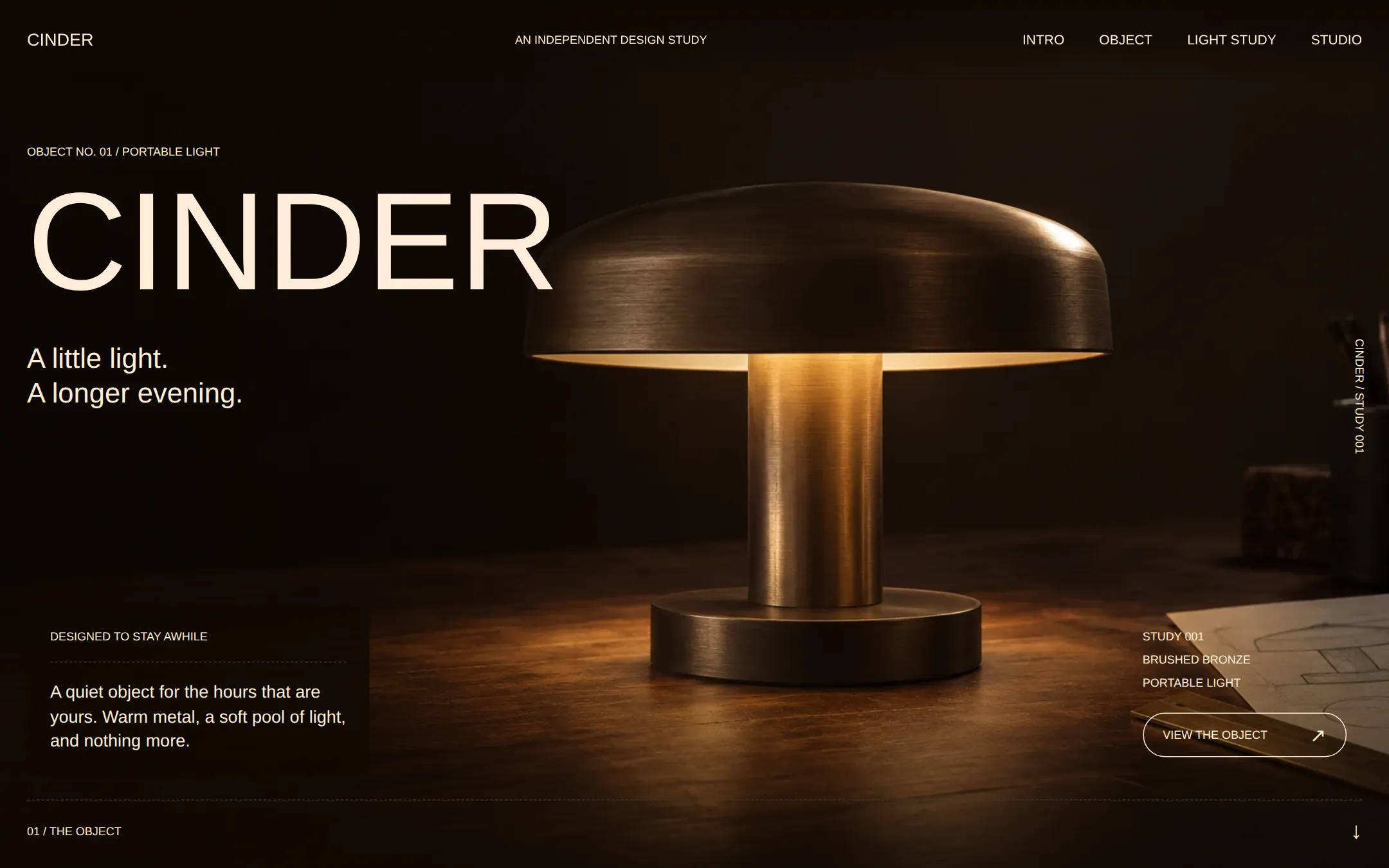
An original Cinder lamp study with full-bleed workshop photography, warm cream labels, viewport-sized product reveals and a local three-level light explorer.
- Best for
- Independent product designers and studios presenting one carefully considered object.
- Tech stack
- Use Next.js App Router, React and TypeScript with plain CSS custom properties. Keep equivalent choices already present in the repository. Server Components render the static content; one small Client Component owns the local light-level choices. Native HTML handles links and disclosure questions. Keep all sample copy and specifications in local typed data. Use local images and self-hosted or system fonts. No WebGL, remote image/font services, database, sign-in, payment, analytics, API keys or paid dependencies are necessary. Production build and start must run without credentials. - Next.js (App Router) - React - TypeScript - CSS custom properties - Local React state
- Tags
- dark · editorial · product · bronze · photography · design studio
The creation prompt
1708 words, self-contained. Paste it into a chat session with your coding agent and it builds ORYZO AI end to end.
Build the "ORYZO AI" kickstart — A single object, warm darkness and cream typography.

## Design
Build a warm-dark, full-bleed industrial-design editorial page. Let one original product photograph carry the visual depth; keep the interface flat, sparse and precise. Define CSS variables for Walnut Shadow canvas #100904, Bark Brown surface and neutral action #382416, Warm Cream text and action labels #FFEDD7, Cork Border #40372E and readable muted text #C8B69F. Keep Driftwood #6C5F51 for structural marks only. Ember #DC5000 appears only in a large studio credit on the darkest canvas, never on controls, buttons or form states. No pure-white text, pure-black canvas, card shadows, bright action colors or decorative gradients outside the photographic lighting.

Use Inter, Arial, Helvetica, sans-serif as the heading and body stack. Prefer self-hosted Inter at 400/500; this is the documented substitute for the licensed display face. Font files must be local. Keep letter spacing normal. Use uppercase weight 500 for headings, navigation, labels and controls: display 51px/0.9, section heading 41px/0.9, small heading 24px/1.09, navigation 14px and metadata 12px/1.3. Use sentence case weight 400 for descriptive body at 29px/1.26. The original fictional wordmark may grow to 144px on desktop as the source's oversized 51px-plus identity treatment. Use 12px minimum metadata rather than the reference's 8px legal labels. Do not tighten tracking or center body paragraphs.

The page has no max-width shell. Use 24px desktop outer padding and 18px grid gutters; section rhythm is one viewport per product statement. Use min-height: 100svh, never a fixed height that clips content, for the hero and reveal. Buttons have a 36px radius for the single neutral filled action and 22.5px for outlined controls; editorial panels use 12px. Inputs are square with an underline only. Dashed 1px #40372E separators divide metadata. Cream outlines identify actionable controls, all at least 44px tall. Draw a 2px cream focus outline offset 4px.

At 1440 by 900 CSS pixels, the opening photograph fills the first viewport. Fixed navigation sits at the top with the CINDER wordmark at left and four section links at right. Keep a dark scrim beneath the navigation for legibility while scrolling. The left hero lockup starts around 150px down: OBJECT NO. 01 / PORTABLE LIGHT, then a large CINDER h1. The original lamp occupies the middle/right with enough dark space around it to breathe. Place a 29px two-line statement beneath the wordmark; all copy remains live HTML. Add a rotated 12px CINDER / STUDY 001 label along the right edge, hidden on narrow screens. At the bottom left, an unshadowed translucent dark editorial panel contains a 12px heading, dashed rule and a short description. A lower-right area holds material/model metadata and a neutral outlined View the object link. Bottom numbering reads 01 / THE OBJECT with an arrow to the next section. No fake player or inactive purchase buttons.

Use a local original photographic product image: a small unbranded bronze mushroom table lamp, thick circular shade, short cylindrical stem and disk base, casting warm amber light onto a walnut workbench. Shoot a three-quarter view in warm near-black studio darkness; a subtle sketch sheet and a brass ruler give workshop context. Keep left 30% and top 20% dark for live text. No embedded words, logos, interface or borrowed product design. If assets/lamp.webp accompanies this brief, copy it into public and use it. Otherwise create or source an appropriately licensed original local photograph matching this description; do not hotlink, reproduce a reference site's photo or replace the object with a CSS mock. The picture is decorative with empty alt text when the adjacent copy describes the object. Apply a dark scrim behind overlaid text to meet WCAG AA, without hiding the lamp.

The second viewport is a three-column reveal: heading left, a large crop of the same original lamp centered, description right. Blend its dark backdrop into the canvas; the artwork supplies depth without a card frame. Below it, show a dashed line and three factual labels explicitly marked CONCEPT SPECIFICATION. The third section is a local light study with a large product crop, one row of three native outlined buttons and a polite status line. Selecting a level changes only a local image overlay and text, never a real device; the active choice uses Bark and Cream. Keep normal text outside the image overlay. Finish with two studio-note columns, native details/summary questions and one studio-credit line.

At widths below 900px, stack the reveal columns and allow the hero content to flow around the image. Below 600px use 18px gutters, a 72px wordmark, 41px display, 32px headings and 20px/1.4 descriptive body. Keep all four nav links visible and wrapped. Put the info panel and model metadata in normal flow below the lockup. The mobile hero may exceed one viewport. Support 360px and 200% zoom without page overflow. Use semantic landmarks, one h1, a skip link and native links to existing IDs. Static first paint, no hidden reveal animation, parallax, autoplay or timed changes. Optional 150ms color transitions become instant for prefers-reduced-motion.

Page structure:
1. Full-viewport workshop photograph with fixed navigation, oversized identity and an editorial information panel.
2. Full-viewport product reveal with a centered object, flanking heading and descriptive copy.
3. Local light study with three brightness choices and a readable sample specification.
4. Studio notes, native questions and a quiet closing credit.

## Tech stack
Use Next.js App Router, React and TypeScript with plain CSS custom properties. Keep equivalent choices already present in the repository. Server Components render the static content; one small Client Component owns the local light-level choices. Native HTML handles links and disclosure questions. Keep all sample copy and specifications in local typed data. Use local images and self-hosted or system fonts. No WebGL, remote image/font services, database, sign-in, payment, analytics, API keys or paid dependencies are necessary. Production build and start must run without credentials.

- Next.js (App Router)
- React
- TypeScript
- CSS custom properties
- Local React state
Where the repo you are working in already has an equivalent in place, keep the repo's choice and say which one you kept.

## Everything else
Build an industrial-design product showcase with a local light study. The original fictional studio is Cinder and the concept is a portable bronze table lamp, Study 001. This is an editorial concept page, not a shop or a connected product. Use original identity, copy and imagery; do not claim awards, endorsements, customer relationships, available stock or tested product performance.

Navigation: CINDER links to #top; Intro to #top, Object to #object, Light study to #light-study and Studio to #studio. The skip link targets #main. Hero eyebrow: OBJECT NO. 01 / PORTABLE LIGHT. Main heading: CINDER. Supporting statement: A little light. A longer evening. Put each sentence on its own desktop line. Small top-right edition label: AN INDEPENDENT DESIGN STUDY. The lower-left panel reads DESIGNED TO STAY AWHILE, followed by: A quiet object for the hours that are yours. Warm metal, a soft pool of light, and nothing more. Right-side metadata: STUDY 001 / BRUSHED BRONZE / PORTABLE LIGHT. View the object links to #object. The bottom link is 01 / THE OBJECT with a downward arrow. The hero uses real HTML text over the original local photograph.

Object section heading: LIGHT WHERE LIFE LANDS. Supporting body: From the last page to the late conversation. One small object, made to move with the evening. Center a large crop of the original lamp image. Under a dashed separator show CONCEPT SPECIFICATION and three values: FORM / CIRCULAR SHADE; FINISH / BRUSHED BRONZE; LIGHT / WARM DIFFUSION. These describe the fictional design intent, not manufactured specifications or certified measurements.

Light study heading: FIND YOUR KIND OF QUIET. Description: Explore three moods of the same object. This visual study changes only the page. Three native buttons: Low, Medium, Full. Medium is selected initially. Selecting a button sets aria-pressed and updates a polite status to Light study: Low, Light study: Medium or Light study: Full, keeping focus on the button. Change only the dark overlay on the lamp photo: 0.48 opacity for Low, 0.24 for Medium, 0 for Full. All text and controls stay outside that overlay. There is no automatic motion, real device control, network call, timer or persistence. Reload resets Medium. Include LOCAL VISUAL DEMO — NO DEVICE CONNECTED. With JavaScript off the initial Medium image and static copy remain visible; a noscript note explains that changing levels requires JavaScript.

Studio heading: LESS, WITH INTENTION. Two notes: 01 / A SINGLE MATERIAL — Let brushed metal, honest edges and warm light do the work.; 02 / ROOM FOR THE EVENING — Keep the object useful and the rest of the table open. Native questions: Is this lamp for sale? — No. Cinder is a fictional design study, ready to adapt to an original product.; Does the light study control a device? — No. The buttons change a local visual only; nothing is sent or saved.; Can I replace the object? — Yes. Replace the photograph, name, copy and concept specifications with your own. Closing credit: AN ORIGINAL CINDER STUDIO STUDY. Make it 24px Ember on Walnut with no interactive behavior. Footer: FICTIONAL PRODUCT CONCEPT. NO AFFILIATION OR ENDORSEMENT. Include a Back to top link. Use readable Cream for the small footer text.

Document local build/start commands and the configuration points for identity, product photo and light levels. Keep the entire brief usable without an inspiration website. All links and controls must work; never add a dead contact, video, checkout or subscription action.

### Non-negotiables
- Responsive from 360px through desktop — no horizontal page overflow at any width. Deliberately scrollable regions stay within the viewport and remain keyboard and touch accessible.
- Every text/background pair clears WCAG AA (4.5:1 for body, 3:1 for large text); adjust a tint rather than shipping a failing pair.
- Fully keyboard operable, with a visible focus ring drawn in the accent colour.
- Honour `prefers-reduced-motion` — swap every transition for an instant state change.
- Write real copy in the voice described above; no lorem ipsum and no TODO placeholders.
- Use system or self-hosted fonts and CSS/SVG-drawn graphics — do not depend on a remote image or icon service.

Build the whole page end to end and show me the result running — not a description of it.
Pasting the prompt is step one. Fredrin runs the agent that builds it, one ticket per look.