Nuxt
A near-black framework homepage: a two-line Outfit headline with its second line in electric green, a green Get started beside a copyable command, and a live-looking code editor bleeding off the right edge.
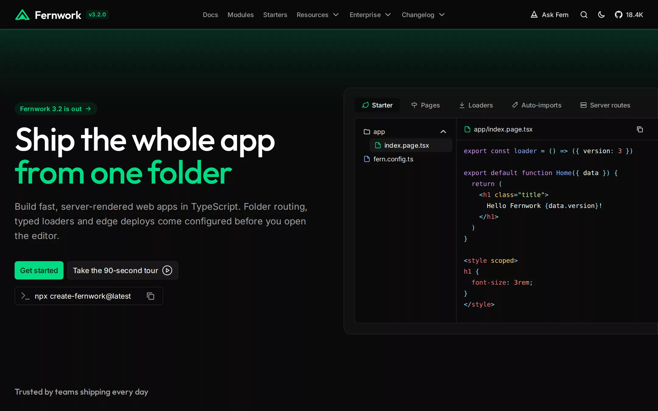
An original Fernwork framework page on Ink Black: a 64px blurred header with a green fern mark, version badge, centred docs navigation and utility icons; a hero with a release pill, a two-line 72px Outfit headline whose second line is electric green, an Ash subline, a green Get started and a ringed tour button, and a copyable install command; a code editor with tabs, a file tree and highlighted code that bleeds off the right edge; an invented logo row; a borderless four-column feature grid; a testimonial band; three joined Built on cards; a closing call and a footer.
- Best forOpen-source frameworks, SDKs, CLIs and other developer tools whose homepage sells with a code sample, an install command and a feature grid.
- Tech stack- Next.js (App Router) - React - TypeScript - CSS custom properties Use Next.js App Router, React and TypeScript with plain CSS custom properties for every colour, radius and spacing token. Render the page as server components; only the mobile menu, the editor tabs and the copy buttons need small client islands, holding their state in memory. Self-host Outfit and Inter (both SIL Open Font License) as variable woff2 files through next/font/local — no remote font request. Draw the Fernwork mark, the invented wordmarks, the ecosystem glyphs and every icon as inline SVG; render the editor's syntax highlighting from committed token arrays so the markup is identical on every render. All sample content is committed in the source. Provide page metadata. Build and run the production page before capturing its preview.
The prompt. 2045 words, self-contained.
Build the "Nuxt" kickstart — A near-black framework homepage: a two-line Outfit headline with its second line in electric green, a green Get started beside a copyable command, and a live-looking code editor bleeding off the right edge.

## Design
Build a rebrandable landing page for a full-stack TypeScript web framework: folder routing, typed data loaders, server routes and one-command deploys.

Create a complete landing page for Fernwork, a fictional open-source framework for building server-rendered web apps in TypeScript. This is a concept presentation, not a real project — no real framework, company, customer, logo, person, quote or star count. Use original branding, artwork and copy throughout.

Color: a flat, near-black documentation-marketing canvas with one electric green. Ink Black #0A0A0A is the page, the header field, every input and the inner editor body. Graphite #171717 is the raised surface: the secondary button, the selected file row, the editor frame (at 50% opacity), the testimonial band and the closing card, and it is also the dark text on green. Seam #262626 is every 1px ring, card outline, header and section divider. Ash #A1A1A1 is the default secondary text — inactive navigation, the hero subline, feature copy, the logo row, inactive editor tabs. Smoke #E5E5E5 is high-emphasis utility text: right-hand header controls, the secondary button label, the file tree. Dim #737373 is only for the terminal glyph and small metadata. Pure White #FFFFFF is display headings, feature titles and selected tab labels. Fern Signal #00DC82 is the brand and the only saturated fill: the Get started buttons, the logo mark, the version badge and release pill text (each on a 10% #00DC82 wash), the feature icons and the second line of the hero headline. Depth comes from 1px #262626 rings and one-step surface changes — never a drop shadow. The only gradient is a soft green glow, rgba(0,220,130,.16) fading to transparent, that sits in the 160px band directly under the header, plus a #171717-at-40%-to-#0A0A0A wash at the top of each section after the hero. Three small ecosystem link colours appear only in the Built on cards: Sprig green #42B883, Kiln violet #A156FE and Ember coral #FB848E, each also tinting its card at 10% in the top-left corner.

Typography: two families. Headings use "Outfit", ui-sans-serif, system-ui, -apple-system, "Segoe UI", sans-serif — Outfit, a geometric sans, at weight 500 with tight negative tracking. Body uses "Inter", ui-sans-serif, system-ui, -apple-system, "Segoe UI", Roboto, sans-serif. Hero headline 72px/72px weight 500, letter-spacing -1.8px, two lines, line one #FFFFFF and line two #00DC82; section headings 48px/48px weight 500, -1.2px; the logo-row label 18px/28px weight 500 Outfit in Ash. Hero subline 20px/32px weight 400 Ash in a 656px measure; section sublines 18px/28px Ash. Navigation 14px/20px weight 500; buttons 16px/24px weight 500; the release pill 14px/20px weight 600; the version badge 12px/12px weight 600. Feature titles 16px/24px weight 600 white; feature copy 15px/22.5px Ash; Built on card titles 18px/28px weight 600. Code is ui-monospace, SFMono-Regular, Menlo, monospace at 14px/24px.

Layout: a full-bleed 1440px canvas with 32px side gutters (content from x 32 to 1408); controls take a 6px radius, cards and the editor's outer frame 8–16px, the release pill 9999px. Spacing is built on 4px: 8px gaps between controls, 16px card padding, 40px column gaps, 128px section padding.

Navigation: a 64px header, #0A0A0A at 75% with a 4px backdrop blur and a 1px #262626 bottom border. Left at x 32: the Fernwork mark — a 34×24px green SVG peak — an open triangle outline with a solid inner triangle at its base — then the wordmark Fernwork in Outfit 24px weight 600 white, and 6px after it a version badge v3.2.0 (12px weight 600 #00DC82 on a 10% green wash, 4px radius, 4px 6px padding). Centre, from x 444: Docs, Modules, Starters, Resources, Enterprise and Changelog in 14px weight 500 Ash, 20px apart, the last three followed by a 20px chevron. Right: a sparkle-face icon with Ask Fern in 14px weight 500 Smoke, a search icon, a moon icon, and a repository glyph with 18.4K — all 20px icons in Smoke, 18px apart, ending at x 1402.

Hero: under the header a 160px green glow fades into the canvas. Left column, 656px wide from x 32: at y 224 a release pill Fernwork 3.2 is out with a 16px arrow (14px weight 600 #00DC82 on a 10% wash, 9999px radius, 4px 12px padding); at y 268 the headline Ship the whole app / from one folder; at y 436 the subline Build fast, server-rendered web apps in TypeScript. Folder routing, typed loaders and edge deploys come configured before you open the editor.; at y 572 an action pair — Get started (108×40px, #00DC82 fill, #171717 16px weight 500 text, 6px radius, 8px 12px padding) and 8px to its right Take the 90-second tour with a 24px play-circle icon (#171717 fill, Smoke text, a 1px inset #262626 ring, the same size rules); at y 628 a 325×40px command field reading npx create-fernwork@latest (#0A0A0A, 1px inset #262626 ring, 6px radius, 44px left padding for a 24px Dim terminal glyph at x 44, a 20px Ash copy icon at the right). Right: the editor demonstration — an outer frame from x 752 to the right edge of the viewport (it bleeds off the page), 540px tall at y 192, #171717 at 50% with a 1px #262626 ring and a 16px radius on its left corners only. Inside it at y 214 a tab row from x 776: Starter (selected — a 110×32px #0A0A0A 6px-radius chip, white label, green leaf icon), Pages, Loaders, Auto-imports and Server routes, each a 16px Ash icon and a 14px weight 500 Ash label about 24px apart. Below at y 258 the editor body: #0A0A0A, 1px #262626 border, a 6px radius on the left corners, split into a 222px file tree and the code pane. The tree shows an open app folder with a chevron, an indented selected row index.page.tsx (a #171717 6px-radius row, white label, a green file glyph) and fern.config.ts below. The code pane has a 48px header (the file path app/index.page.tsx in 14px Smoke, a 28px copy button on the right, a 1px #262626 rule) and, from y 330, fifteen lines of 14px/24px monospace code with a calm syntax palette — punctuation #89DDFF, keywords #C792EA, tag names #F07178, attributes #FFCB6B, strings #C3E88D, numbers #F78C6C, plain text #EEFFFF — reading an exported loader that returns a version, a default Home component returning an h1 with Hello Fernwork and the version, and a scoped style block setting the h1 to 3rem.

Logo row (id showcase): at y 844 the label Trusted by teams shipping every day in Outfit 18px/28px weight 500 Ash, then at y 908 eight invented monochrome wordmarks in Ash, 24px tall and spread evenly across 32–1408px — Northvale, quarry&co, PEAKLINE, oakfield, Brightwater, Lumen, tallis and OTTO.

Features (id docs): a 1px #262626 top border, the section wash, a 48px heading Everything in the box, nothing to bolt on and an 18px Ash line Fernwork owns the plumbing so you can work on the product., then from 96px below a four-column grid of borderless cells (314px columns, 40px gaps, rows 166px apart): a 20px #00DC82 outline icon, 10px gap, a 16px weight 600 white title and a 15px/22.5px Ash description — Zero config, Rendering modes, Folder routing, Typed loaders, Error boundaries, Transitions, Assets and fonts, Head and meta, Plugins, Middleware and End-to-end types. The twelfth cell is a #171717-at-50% card with 16px padding, the 18px weight 600 title Read the guide and a small Start reading docs button (14px, 6px 10px padding, #00DC82, #171717 text, an arrow).

Testimonial (id community): a full-width 220px #171717-at-50% band with one centred 18px #D4D4D4 quote between large Ash quotation marks — a fictional maintainer saying the loaders and folder routing let a three-person team ship like ten — then a 40px avatar circle, the name Ines Marlowe (sample) in 16px weight 500 and the role Staff engineer, sample company in 14px Ash.

Built on (id modules): a centred 48px heading Built on tools you already like and an 18px Ash line Sprig for components. Ember for the server. Kiln for the bundle., then three joined 459×228px cards inside one 1px #262626 ring with an 8px outer radius and shared 1px dividers; each card has 24px padding, a 24px logo glyph, an 18px weight 600 white title (Components with Sprig, Bundling with Kiln, Server with Ember), a 15px Ash paragraph and a 16px link in its own ecosystem colour.

Closing call (id start): centred — a 48px heading Start with one command, the command field again and the Get started button.

Footer (id footer): a 1px #262626 top rule, the mark and wordmark on the left, three 14px Ash link columns and one 13px Dim line — © Fernwork sample · a fictional framework. Not a real project.

## Tech stack
- Next.js (App Router)
- React
- TypeScript
- CSS custom properties

Use Next.js App Router, React and TypeScript with plain CSS custom properties for every colour, radius and spacing token. Render the page as server components; only the mobile menu, the editor tabs and the copy buttons need small client islands, holding their state in memory. Self-host Outfit and Inter (both SIL Open Font License) as variable woff2 files through next/font/local — no remote font request. Draw the Fernwork mark, the invented wordmarks, the ecosystem glyphs and every icon as inline SVG; render the editor's syntax highlighting from committed token arrays so the markup is identical on every render. All sample content is committed in the source. Provide page metadata. Build and run the production page before capturing its preview.
Where the repo you are working in already has an equivalent in place, keep the repo's choice and say which one you kept.

## Everything else
Keep Fernwork clearly fictional and rebrandable: no real framework, company, customer, logo, person, quote, package name or star count — the wordmarks, the 18.4K count, Sprig, Kiln and Ember are invented, and the testimonial is labelled sample. #00DC82 is the only filled button colour and is used for Get started, Start reading docs and nothing else; secondary buttons are #171717 with a 1px #262626 ring. Controls keep a 6px radius; only the release pill is fully rounded. No drop shadows and no gradient fills beyond the header glow and the section washes. Text pairs clear WCAG AA: white, Smoke and Ash on #0A0A0A and #171717; #171717 on #00DC82; Dim #737373 is only for the terminal glyph and 13px metadata. Every link leads to a real section on the page; the command field is read-only, the copy buttons copy the command to the clipboard and nothing is submitted or stored; the page loads no analytics or tracking script and shows no cookie banner. Content is initially visible: no typing effects, counters, parallax or scroll reveal; editor tabs swap their code instantly, buttons and links take their hover colour over 150ms, and every transition stops for prefers-reduced-motion. Every control shows a 2px #00DC82 focus ring with a 2px offset. The editor demonstration is a labelled region whose code is real text; decorative icons are hidden from assistive technology. At 360px the centre navigation collapses into a Menu button, the headline drops to 40px/44px, the action pair and command field stack full-width, the editor moves below the hero copy at full width with the file tree hidden, the logo row wraps, the feature grid becomes one column, the Built on cards stack and the page never overflows horizontally.

### Non-negotiables
- Responsive from 360px through desktop — no horizontal page overflow at any width. Deliberately scrollable regions stay within the viewport and remain keyboard and touch accessible.
- Every text/background pair clears WCAG AA (4.5:1 for body, 3:1 for large text); adjust a tint rather than shipping a failing pair.
- Fully keyboard operable, with a visible focus ring drawn in the accent colour.
- Honour `prefers-reduced-motion` — swap every transition for an instant state change.
- Write real copy in the voice described above; no lorem ipsum and no TODO placeholders.
- Use system or self-hosted fonts and CSS/SVG-drawn graphics — do not depend on a remote image or icon service.

Build the whole page end to end and show me the result running — not a description of it.