 Fredrin
SaaS
Notion
A warm, illustrated workspace landing page that gives good ideas a place to grow.
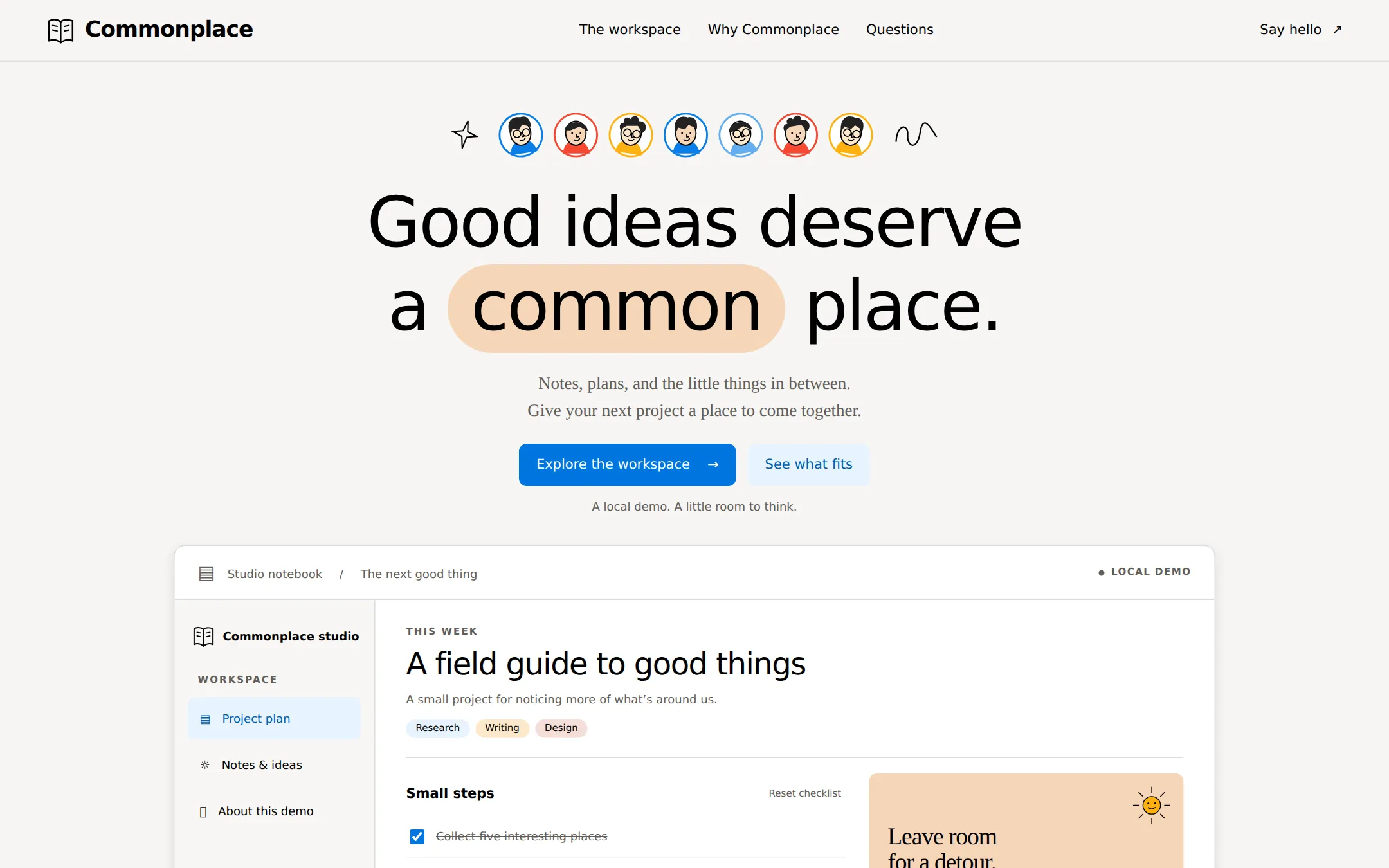
An illustrated workspace page for fictional Commonplace, pairing warm paper, a peach headline highlight and a working project checklist. Original character marks, colorful feature panels and native FAQ make it easy to adapt without a backend.
- Best for
- Small creative teams, independent studios and lightweight planning products.
- Tech stack
- Use Next.js App Router, React and TypeScript with plain CSS custom properties and locally authored inline SVG. Keep equivalent tools already present in an existing repository. Server-render the page and all sample text; isolate the checklist counter and Reset behavior in one small client component using React state. Use native anchors, checkboxes and details/summary, no UI library or animation dependency required. Use system fonts and Georgia with no font CDN or network asset dependency. No authentication, database, remote API, analytics or paid service. The checklist is tab-memory only; do not add localStorage or claim collaboration. Supply working dev, build and start scripts, and validate through a production build before taking the preview screenshot. - Next.js (App Router) - React - TypeScript - CSS custom properties - Local SVG artwork
- Tags
- paper · editorial · workspace · illustration · light
The creation prompt
1622 words, self-contained. Paste it into a chat session with your coding agent and it builds Notion end to end.
Build the "Notion" kickstart — A warm, illustrated workspace landing page that gives good ideas a place to grow.

## Design
Build a light workspace landing page for Commonplace, a fictional product for small creative teams. The visual idea is a shared paper notebook: warm #F6F5F4 across the page, crisp #FFFFFF on cards, #000000 headings and #615D59 secondary text. Use #DEDDDC for quiet edges and rgba(0,0,0,.08) for card hairlines. The single filled primary action uses #0075DE with white text. A secondary action uses #E6F3FE with #005DAF text for readable contrast. Reserve #F6D5B8 peach for a highlighted word, #FFB110 amber, #F64932 coral and #62AEF0 sky for decorative accents and panels, and #02093A midnight for a dark feature panel. No gradients, stock photography or remote images. Content cards have no shadow; only the large workspace demo may have 0 4px 12px rgba(0,0,0,.1).

Use system-ui, -apple-system, BlinkMacSystemFont, Segoe UI, sans-serif for headings, navigation and body. Use Georgia, Times New Roman, serif for the hero lead and occasional editorial sentences. These locally available fonts are explicit substitutes for licensed faces. The desktop hero is 72px/1.21, weight 500, letter-spacing -2px. Section titles use 48px/1.08 with -1.9px tracking; feature titles 22px/1.27 at 700; body 16px/1.5; navigation 14px/500; captions 12px/1.33. Editorial lead copy is 18px/1.56. Use a 4px spacing grid, 24px card padding, 80px section gaps and a 1440px outer maximum. The main desktop content is 1160px wide. Buttons have 8px corners, content cards 12px, task rows 8px, status labels and the headline highlight fully rounded. The named 8px control rule wins over a conflicting pill-button example. Actions and checkbox labels have at least 44px touch targets.

At 1440×900, start with a 64px warm navigation bar with a subtle bottom hairline. Place an original open-notebook line mark and Commonplace wordmark at left; The workspace, Why Commonplace and Questions in the middle; a quiet Say hello mailto link at right. Keep the navigation in normal document flow. The hero starts with seven original illustrated face medallions around y=120, each about 44px across with a white center and a 2px amber, blue or coral ring. Vary hair, glasses and simple expressions; they are decorative, not customer avatars. Include small original sparkle and squiggle marks. No animation or borrowed character artwork.

Set one centered two-line h1: Good ideas deserve / a common place. Wrap only common in a peach rounded highlight with about 8px vertical and 24px horizontal padding. Leave enough line-height that the highlight never collides with the first line. Below, use the two-line serif lead: Notes, plans, and the little things in between. / Give your next project a place to come together. Then a blue Explore the workspace anchor and a pale-blue See what fits anchor. A quiet caption says A local demo. A little room to think. The hero is spacious but brings the live demo into the first viewport around y=520.

The demo is a large white workspace panel about 1080px wide with a 12px radius, thin border and the one permitted restrained shadow. A 56px top strip reads Studio notebook / The next good thing on the left and LOCAL DEMO on the right. Below, a 208px warm sidebar holds an original notebook icon, Commonplace studio, a small workspace label, and real anchor links Project plan, Notes & ideas and About this demo. Highlight Project plan with a pale-blue background. The main paper area has a small THIS WEEK label, the 32px title A field guide to good things, a one-line explanation and three rounded category labels Research, Writing and Design. Beneath a divider, use a two-column interior: a native checklist called Small steps, plus a peach note card with a tiny original sun drawing and the words Leave room / for a detour. A working completed-count label and quiet Reset checklist action sit alongside the list heading. The three items are Collect five interesting places, Write a first little story and Sketch the cover. Initially only the first is checked. A live status reads 1 of 3 steps complete. The second column's note says The best ideas rarely arrive in a straight line. Keep the white panel readable and fully populated with real HTML, never a raster product mockup. A note below the panel explains that checklist changes stay in this tab and reset on reload.

Continue below with a centered heading A place for the whole idea. and three equal 12px feature cards: amber A thought worth keeping with an original folded-page drawing; sky A plan with room to move with an original three-step path; and midnight A calmer kind of together with original overlapping circles. Use dark text on amber and sky, white text on midnight. Each has two short sentences, no invented metrics or customer logos. Finish with a quiet two-column Questions section containing three native details disclosures, then a hairline footer with the notebook wordmark, a real mailto contact and a fictional-product notice.

At 768px and below, use 20px gutters, 40px hero text and smaller highlight padding; wrap the visible navigation rather than hiding it behind a menu. Allow the character row to shrink or wrap. Stack the sidebar above the paper area, both demo interior columns and the feature cards; avoid fixed minimum widths and keep all content inside a 320px viewport. Keep one h1, semantic landmarks, a skip link, labeled native checkboxes and visible 2px dark-blue focus outlines. Decorative SVGs are aria-hidden. Use only 200ms hover/focus color transitions and disable them for prefers-reduced-motion. All prose and sections must be visible in server HTML without JavaScript; native checkbox and FAQ controls remain usable, with a noscript note explaining that the live counter and Reset need JavaScript.

Page structure:
1. Compact notebook-wordmark navigation
2. Centered character row and peach-highlight hero
3. Interactive studio project checklist
4. Three colorful feature panels
5. Native FAQ and fictional-product footer

## Tech stack
Use Next.js App Router, React and TypeScript with plain CSS custom properties and locally authored inline SVG. Keep equivalent tools already present in an existing repository. Server-render the page and all sample text; isolate the checklist counter and Reset behavior in one small client component using React state. Use native anchors, checkboxes and details/summary, no UI library or animation dependency required. Use system fonts and Georgia with no font CDN or network asset dependency. No authentication, database, remote API, analytics or paid service. The checklist is tab-memory only; do not add localStorage or claim collaboration. Supply working dev, build and start scripts, and validate through a production build before taking the preview screenshot.

- Next.js (App Router)
- React
- TypeScript
- CSS custom properties
- Local SVG artwork
Where the repo you are working in already has an equivalent in place, keep the repo's choice and say which one you kept.

## Everything else
Build a rebrandable workspace landing page with an interactive local project checklist.

Create an original, rebrandable landing page for the fictional Commonplace workspace. Navigation and hero actions must work: The workspace and Explore the workspace go to #workspace; Why Commonplace and See what fits go to #features; Questions goes to #questions; Say hello and the footer contact use mailto:[email protected], explicitly identified as a sample address in the footer. Do not add signup, payment, live team, download or AI claims.

Render the field-guide sample workspace from local data. Each native checkbox updates a polite live completed-count announcement. Start with Collect five interesting places checked and the other two unchecked. Reset checklist restores precisely that starting state. The sidebar anchors go to #project-plan, #idea-note and #demo-note. Notes & ideas targets the peach detour note; About this demo targets the honest local-only explanation. Do not add dead toolbar controls, fake collaborators or decorative buttons. With JavaScript off, render the initial state and native checkboxes, and show a note that the counter and reset require JavaScript.

Feature text: A thought worth keeping explains that a loose note can become a useful starting point; A plan with room to move explains that a short checklist makes the next step visible; A calmer kind of together explains the shared-notebook visual metaphor without claiming a real shared service. FAQ: Is this a live workspace? explains this is a local interactive sample; Are my changes saved? explains that reloading restores the starting checklist; Can I make it my own? explains that identity, sample tasks, palette and artwork are editable. Leave the FAQ closed initially and use native disclosures.

Every illustrated face, notebook, sun and feature drawing must be original inline SVG, not a brand logo or licensed reference asset. Include a clear footer note Commonplace is a fictional product. This page is a local demo. Use no reference-site URLs or source identity inside the built page. Write a README with run instructions and the exact places to change the name, contact address, hero copy, task data, colors and illustrations. Deliver a responsive page with no horizontal page overflow at 320px or 200% zoom, keyboard-operable controls, reduced-motion support and content visible without JavaScript.

### Non-negotiables
- Responsive from 360px through desktop — no horizontal page overflow at any width. Deliberately scrollable regions stay within the viewport and remain keyboard and touch accessible.
- Every text/background pair clears WCAG AA (4.5:1 for body, 3:1 for large text); adjust a tint rather than shipping a failing pair.
- Fully keyboard operable, with a visible focus ring drawn in the accent colour.
- Honour `prefers-reduced-motion` — swap every transition for an instant state change.
- Write real copy in the voice described above; no lorem ipsum and no TODO placeholders.
- Use system or self-hosted fonts and CSS/SVG-drawn graphics — do not depend on a remote image or icon service.

Build the whole page end to end and show me the result running — not a description of it.
Pasting the prompt is step one. Fredrin runs the agent that builds it, one ticket per look.