mymind
A private-memory homepage: an orange-to-blush bloom ringing a white circle, a two-line 128px transitional serif headline, a sentence of colour-coded keyword pills and a quiet product window peeking from the fold.
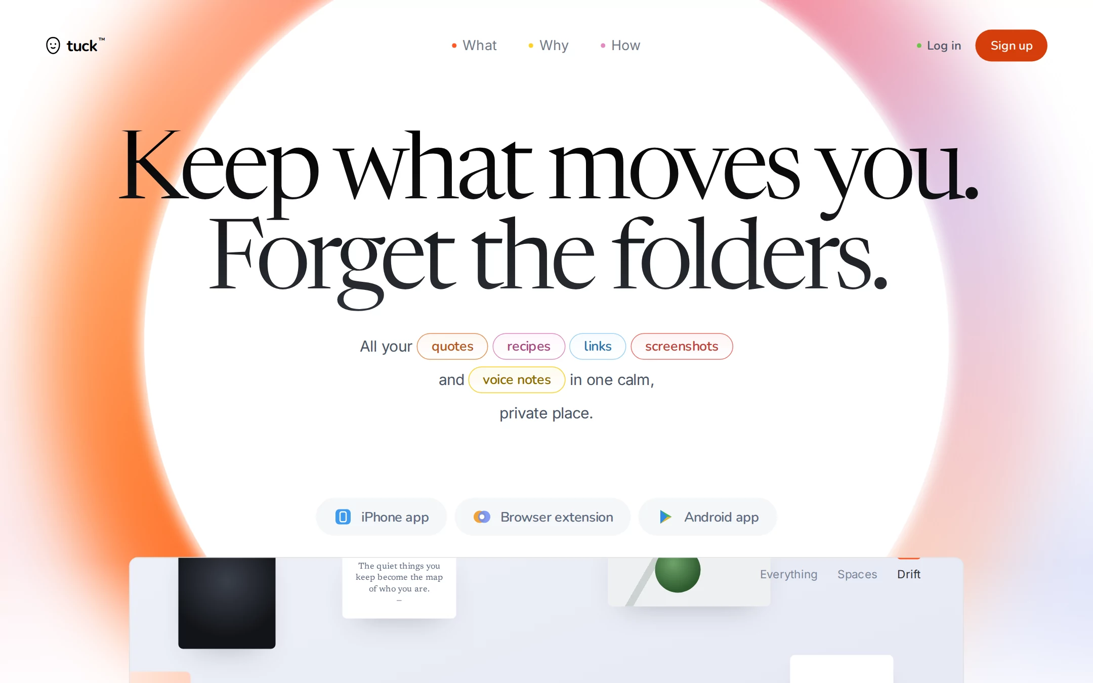
An original tuck homepage: a white hero ringed by a blurred orange, coral, blush and lavender bloom around a 1060px white circle; a floating nav with colour-dotted links and one ember Sign up pill; a centred two-line 128px serif headline; a 520px lead whose keywords sit in five colour-coded outlined pills; three soft grey install pills; and a 1100px product window of saved cards peeking in at the fold. Below: a serif manifesto, a NO promise list, an orange Welcome bloom, an install row, pastel feature cards and a near-black footer.
- Best forPrivate note, bookmark, read-later and personal-knowledge apps — any calm consumer tool that wants an editorial, warm first screen instead of a dashboard pitch.
- Tech stack- Next.js (App Router) - React - TypeScript - CSS custom properties Use Next.js App Router, React and TypeScript with plain CSS custom properties for every colour, gradient, radius and spacing token. Render the page as a server component; only the product tabs need a small client island holding the active tab in memory. Self-host Newsreader (variable, optical size 6–72, weights 300–500, roman and italic), Inter (400–600) and Nunito (600–800), all under the SIL Open Font License, as woff2 files through next/font/local — no remote font request. Draw the bloom with CSS gradients and a blur filter, the mark, dots and install glyphs as inline SVG, and every saved card as HTML and CSS, never an image or canvas, so every render is identical. Provide page metadata. Build and run the production page before capturing its preview.
The prompt. 1479 words, self-contained.
Build the "mymind" kickstart — A private-memory homepage: an orange-to-blush bloom ringing a white circle, a two-line 128px transitional serif headline, a sentence of colour-coded keyword pills and a quiet product window peeking from the fold.

## Design
Build a rebrandable landing page for a private bookmarking and personal-memory app: save anything in one tap, never file it, and find it again by describing it — with no feeds, followers or ads.

Create a complete landing page for tuck, a fictional private-memory app. This is a concept presentation, not a real company — no real product, customer, person or logo. Use original branding, artwork and copy throughout.

Color: a white page whose only strong colour is one bloom. Paper #FFFFFF is the hero and page ground; Mist #F9FAFC is the page behind sections. Ghost #F5F7F9 fills the install pills. Ink #24272D is navigation emphasis and body headings; display type is a gradient from #000000 to #2F343C. Muted #4A5465 is the hero lead and body copy; Slate #5E6B80 is install-pill labels and product tabs. Hairline #E2E2E2 is the product window border. Ember Deep #D63E0B is the only call-to-action fill — Sign up and Try tuck free — always with #FFFFFF text, and the eyebrow colour. Ember #FF5924 is decoration only: the first nav dot, the product tab marker and the heart of the bloom. The bloom runs from #FF5A1F through #FF9550, coral #FF8C6E, rose #F7727C and blush #F294A6 to lavender #DCCBEA and peach #FBD3BE. Keyword pills use hue borders #E98F53, #E48ABF, #99D2FB, #EA726B and #FFCF27 with text #B4561A, #A8457F, #2C74AA, #BC3F37 and #8C6A00. Feature cards use Slate Blue #E5EAF2, Parchment #F3F0E7 and Sage #DDE9D3.

Typography: headings use "Newsreader", "Iowan Old Style", "Palatino Linotype", Georgia, serif at optical size 72 and weight 360 — the hero headline 128px/119px with -6.4px letter-spacing, centred, filled with the #000000 to #2F343C gradient through background-clip text; section headings 52px/52px at -2px; the Welcome bloom line 84px/74px italic at -1.9px; the manifesto 24px/33px. Reading copy uses "Inter", ui-sans-serif, system-ui, -apple-system, "Segoe UI", sans-serif: navigation 18px/20px, the hero lead 20px/44px at -0.4px, body 16px/26px. Every pill and button label uses "Nunito", ui-rounded, system-ui, sans-serif at weight 600: keyword pills 18px (-0.18px), install pills 18px (-0.4px), buttons 16px; eyebrows are Nunito 700 13px uppercase with 1.6px tracking. Self-host all three families.

Layout: a 1440px viewport; content is centred, the product window and feature grid are 1100px wide from x 170. Radii: 100px for install pills, 36px for keyword pills, 30px for buttons, 16px for feature cards, 12px for the product window, 6px for saved cards. No hard section dividers and no shadows except the saved cards' soft drop.

Navigation: floating over the hero, 42px tall with its top at y 39 and 60px side insets. Left: the mark — a 20×24px outlined pebble with two dot eyes and a small smile — and the lowercase wordmark tuck in Nunito 700 21px. Centre: What, Why and How, 42px apart, each led by a 6px dot in #FF5924, #FFCF27 and #E48ABF. Right: a #6CC24A dot and Log in in Nunito 600 16px #4A5465, then the 95×42px Ember Deep Sign up pill ending at x 1380.

Hero (id top): a 1000px white band. Behind everything a 1330px conic bloom, blurred 46px, centred at x 720, y 450 — orange on the left, coral and rose across the top right, lavender low on the right — covered by a 1060px #FFFFFF circle at the same centre with an 18px white feathered edge, so the colour reads as a halo; faint lavender and blush washes sit in the bottom corners and the band fades to white at its foot. The headline Keep what moves you. / Forget the folders. starts at y 172. At y 434 the 520px lead reads All your [quotes] [recipes] [links] [screenshots] and [voice notes] in one calm, private place., each bracketed word a keyword pill. At y 656 three install pills, 10px apart: iPhone app, Browser extension and Android app, each with an original 24px glyph.

Product preview: from y 734 a 1100×781px window with a 1px #E2E2E2 border and 12px radius rises past the fold, its interior a lavender-to-white gradient. Inside, tilted saved cards drawn in CSS — a dark object study, a white serif quote card The quiet things you keep become the map of who you are., a pale tile holding a green sphere, a peach swatch and a blank note — float at different depths, and at the top right the tabs Everything, Spaces and Drift in Inter 15px with the active Drift marked by a 4px #FF5924 tab from above.

Manifesto (id manifesto): on white, an Ember Deep eyebrow Why we made tuck above a 580px serif paragraph: Everything you save today lives in someone else's feed, ranked by someone else's goals. We think the things that move you deserve a quieter shelf.

Promise list (id promise): a centred serif list at 30px/38px, each line led by NO in Nunito 800 Ember Deep — followers, streaks, tracking, ads.

Welcome bloom: a 620px band whose orange-to-peach radial bloom rises from its bottom edge, holding the white italic line Make room / …for your own mind. and a Try tuck free pill.

Install row (id install): five equal columns split by #E2E2E2 hairlines — iOS, Android, Chrome, Edge, Safari — each an original 32px glyph, a 20px serif name and an 11px Ember Deep uppercase action.

Feature cards (id features): a 52px serif heading One shelf for everything you keep. above a two-column grid of feature cards, 20px apart — Save it, then let go. on #E5EAF2 and Find it by feel. on #F3F0E7, then a full-width Sage #DDE9D3 card Yours, and only yours. — each with a 16px #4A5465 paragraph and a CSS-drawn vignette.

Footer: a #000000 to #2F343C gradient band, 80px padding, the white mark and wordmark, three columns of 14px links and © 2026 tuck studio.

## Tech stack
- Next.js (App Router)
- React
- TypeScript
- CSS custom properties

Use Next.js App Router, React and TypeScript with plain CSS custom properties for every colour, gradient, radius and spacing token. Render the page as a server component; only the product tabs need a small client island holding the active tab in memory. Self-host Newsreader (variable, optical size 6–72, weights 300–500, roman and italic), Inter (400–600) and Nunito (600–800), all under the SIL Open Font License, as woff2 files through next/font/local — no remote font request. Draw the bloom with CSS gradients and a blur filter, the mark, dots and install glyphs as inline SVG, and every saved card as HTML and CSS, never an image or canvas, so every render is identical. Provide page metadata. Build and run the production page before capturing its preview.
Where the repo you are working in already has an equivalent in place, keep the repo's choice and say which one you kept.

## Everything else
Keep tuck clearly fictional and rebrandable: no real company, app, person or store badge — every glyph is original and no platform logo is reproduced. Keep one call-to-action colour: Ember Deep #D63E0B fills only Sign up and Try tuck free and always carries #FFFFFF text; Ember #FF5924 is decorative only. Text pairs clear WCAG AA: #24272D and #4A5465 on #FFFFFF, #5E6B80 on #F5F7F9, #FFFFFF on #D63E0B, and every keyword pill's deepened text on white. Every link leads to a real anchor on the page, and the page loads no analytics or tracking script and shows no cookie banner. Content is initially visible; buttons brighten over 150ms on hover and every transition stops for prefers-reduced-motion. Every control shows a 2px #D63E0B focus ring with a 2px offset. The bloom, product window and decorative cards are hidden from assistive technology. At 360px the nav keeps the mark, Sign up and a Menu button, the headline drops to 48px/46px at -2px, the keyword pills wrap naturally inside the lead, the install pills stack full width, the bloom scales to the viewport, the product window becomes a 4:3 frame, feature cards stack in one column, and the page never overflows horizontally.

### Non-negotiables
- Responsive from 360px through desktop — no horizontal page overflow at any width. Deliberately scrollable regions stay within the viewport and remain keyboard and touch accessible.
- Every text/background pair clears WCAG AA (4.5:1 for body, 3:1 for large text); adjust a tint rather than shipping a failing pair.
- Fully keyboard operable, with a visible focus ring drawn in the accent colour.
- Honour `prefers-reduced-motion` — swap every transition for an instant state change.
- Write real copy in the voice described above; no lorem ipsum and no TODO placeholders.
- Use system or self-hosted fonts and CSS/SVG-drawn graphics — do not depend on a remote image or icon service.

Build the whole page end to end and show me the result running — not a description of it.