Monarch
A warm, editorial money-app landing page: a full-bleed sunlit living-room scene with frosted stat cards, a serif hero card, ember-orange pills and a laurel awards strip on chalk paper.
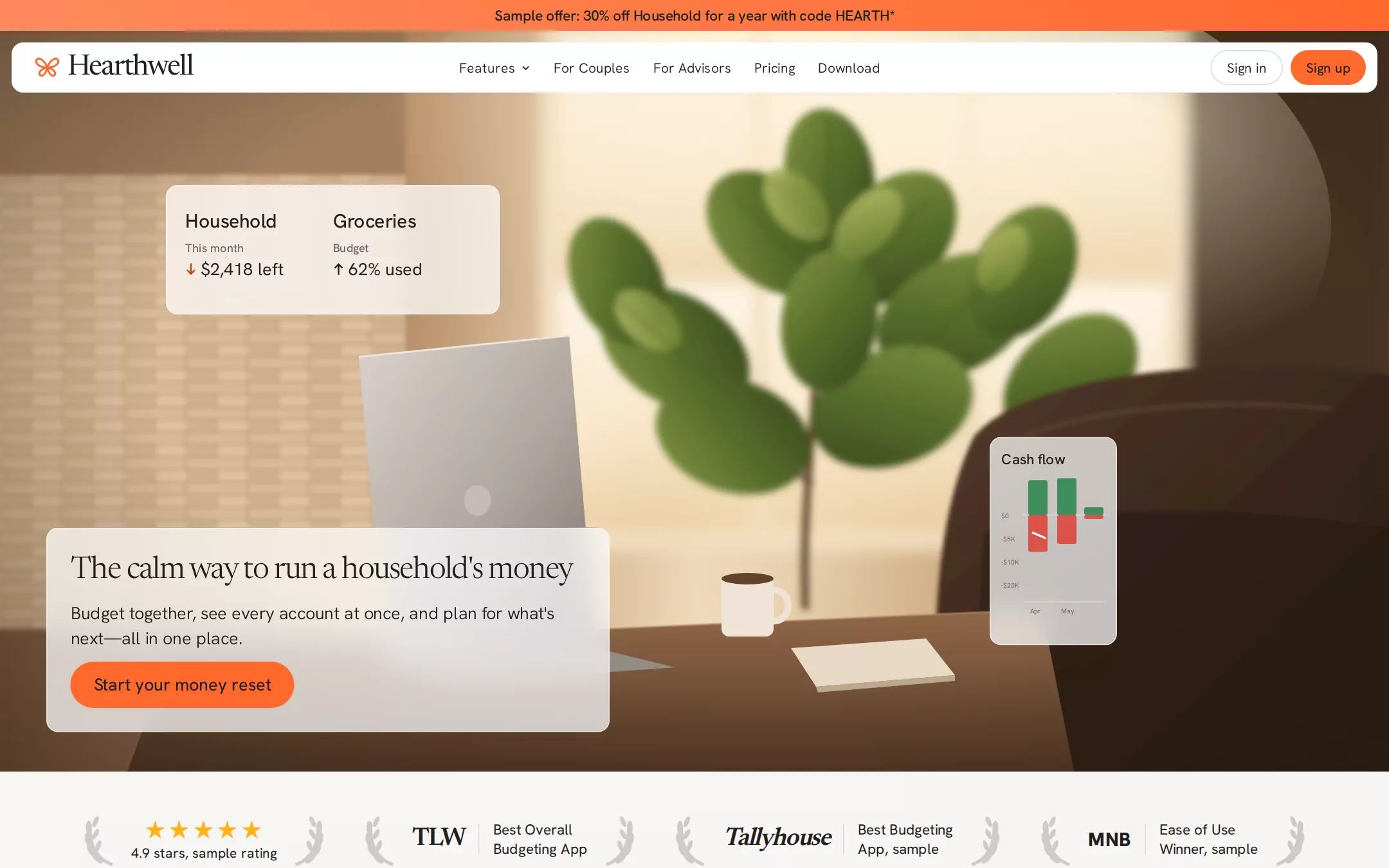
An original Hearthwell page on Chalk: a Coral-to-Ember promo bar; a floating white navigation card with an orange leaf mark, a serif wordmark, centred pill links and Sign in / Sign up pills; a full-bleed illustrated living room in soft focus with a frosted two-figure stat card, a frosted cash-flow chart and a frosted bottom-left hero card holding a 32px serif headline, a two-line lede and an orange pill; a laurel awards strip of invented publications; a centred overview; a Linen feature panel with four callouts; six alternating feature rows with screenshot cards; connections; testimonials; pricing; an orange closing banner and a footer.
- Best forPersonal-finance, budgeting and household apps that want to feel calm, warm and trustworthy rather than corporate, with a lifestyle hero and the product UI as proof.
- Tech stack- Next.js (App Router) - React - TypeScript - CSS custom properties Use Next.js App Router, React and TypeScript with plain CSS custom properties for every colour, radius, shadow and spacing token. Render the page as server components; no client state is needed. Self-host Newsreader (variable, weights 300–500 with the opsz axis) and Hanken Grotesk (variable, 300–600) as woff2 through next/font/local — no remote font request. Draw the living-room scene, the leaf mark, the laurels, icons, invented publication marks and every product fragment (stat card, cash-flow chart, dashboard, transaction list, bill calendar, flow diagram, goal rings, device pair) as HTML, CSS and inline SVG with fixed data committed in the source, so the markup is deterministic between renders. Use backdrop-filter for the frosted overlays with a solid rgba(255,255,255,.9) fallback. Provide page metadata. Build and run the production page before capturing its preview.
The prompt. 1797 words, self-contained.
Build the "Monarch" kickstart — A warm, editorial money-app landing page: a full-bleed sunlit living-room scene with frosted stat cards, a serif hero card, ember-orange pills and a laurel awards strip on chalk paper.

## Design
Build a rebrandable landing page for a household money and budgeting app.

Create a complete landing page for Hearthwell, a fictional personal-finance app that brings a household's accounts, budget, recurring bills and goals into one calm view that two partners share. This is a concept presentation, not a real company — no real banks, publications, customers, people, ratings or figures. Use original branding, artwork and copy throughout.

Color: Chalk #F6F5F3 is the page background; Linen #EFECEA fills the large rounded feature panel and alternating section bands; Paper #FFFFFF is reserved for the navigation card, product screenshot cards, inputs and the Sign in button. Ink #22201D is every heading, body copy, nav link, icon stroke and the text on orange buttons — a warm near-black, never #000000. Graphite #6A6865 is helper text, captions, chart labels and the footer's small print. Stone #DCD9D6 is every 1px hairline, divider, card border and the Sign in outline. Ember Orange #FF692D is the one chromatic voice: the filled pill buttons, the logo mark, the promo bar and active states; Kiln #C2410C is the uppercase eyebrow labels and the outlined Learn more buttons' text, so small orange text clears AA. The promo bar alone runs a horizontal gradient from Coral #FF8A5B to Ember Orange. Smoke #CCCCCC is the laurel wreaths; the five rating stars are #FFB31A; the cash-flow chart uses a muted #3F8F5A for income and #D9534A for spending. Nothing else adds colour.

Typography: headings in Newsreader, Georgia, "Times New Roman", serif at weight 350 with optical size 48 (a free stand-in for a warm book serif); everything else in "Hanken Grotesk", "Helvetica Neue", Arial, sans-serif (a free stand-in for a soft grotesque). The serif is strictly for headings, the sans strictly for everything else. Hero card heading 32px/38.4px, -1px; overview heading 48px/57.6px, -3.2px; section headings 40px/48px, -2.4px; lede and hero body 18px/25.2px weight 350, -0.18px; body 16px/24px weight 400; nav links 14px/20px weight 350; eyebrows 14px/18.2px weight 500 uppercase with 0.7px tracking; promo bar 15px/20px weight 500, -0.18px; wordmark 30px serif weight 400, -1.1px.

Layout: a 1296px max container with 24px gutters; content sections sit 96–120px apart; feature rows are inset 125px each side inside it. Radii: 9999px on every button and nav link, 12px on cards, panels and the hero overlays. Shadows: buttons rgba(34,32,29,.05) 0 1px 2px; screenshot cards rgba(34,32,29,.1) 0 10px 15px -3px plus rgba(34,32,29,.1) 0 4px 6px -4px — never heavier.

Promo bar: full width, 32px tall, the Coral-to-Ember gradient, one centred line in Ink — Sample offer: 30% off Household for a year with code HEARTH*.

Navigation: a floating Paper card 52px tall, 12px from the left, right and the promo bar, 12px radius, the button shadow, overlapping the top of the hero. Left: an Ember Orange outlined four-petal leaf mark (26×24px, 2px stroke) and the Hearthwell wordmark in the serif. Centre: pill links Features with a 10px chevron, For Couples, For Advisors, Pricing, Download — 36px tall, 8px 12px padding. Right, 8px apart: Sign in as a Paper pill with a 1px Stone border and Sign up as an Ember Orange pill with Ink text, both 36px tall with 0 16px padding.

Hero (id top): full bleed from the promo bar to 800px, an original illustrated warm living-room scene drawn as inline SVG — a sunlit window wall glowing cream behind a soft-focus fiddle-leaf plant, a lit brick wall on the left, diagonal light beams, a dark leather armchair on the right, and on a wooden table the back of an open silver laptop, a ceramic mug and a notebook; heavy Gaussian blur on the background layers for photographic depth of field, a warm vignette and a faint peach grade. Three frosted overlays float over it, all white at 72% with a 1px rgba(255,255,255,.55) edge, a 16px backdrop blur and 12px radius. A stat card (346×134px at x 172, y 192): two columns, Household and Groceries in 20px weight 500, a 12px Graphite label (This month, Budget) and an 18px figure with a small arrow ($2,418 left, 62% used). A cash-flow card (132×216px at x 1026, y 453): Cash flow in 15px weight 500 over a tiny two-month bar chart with green income bars above a hairline and red spending bars below, axis labels in 7px Graphite. The hero card (584px wide at x 48, bottom edge about 32px above the hero's end, 24px padding): The calm way to run a household's money as the 32px serif heading, a two-line 18px body — Budget together, see every account at once, and plan for what's next—all in one place. — and a 48px Ember Orange pill, Start your money reset, in 18px weight 450 Ink with 0 24px padding.

Awards strip: on Chalk, 40px below the hero, four centred groups 40px apart, each framed by a pair of Smoke laurel wreaths (36×60px, mirrored): five gold stars over 4.9 stars, sample rating; then three invented publications — a serif TLW, an italic serif Tallyhouse and a heavy sans MNB — each followed by a 1px×32px Stone rule and a two-line 15px caption such as Best Overall Budgeting App.

Overview (id features): centred, 912px wide, 72px below — the eyebrow What is Hearthwell?, the 48px heading Your kitchen table for money, and a two-line 18px lede.

Feature panel: a Linen panel inset 16px from the viewport edges with a 12px radius and 56px 72px 72px padding: the centred 40px heading Everything a household needs, in one app, a lede, a large Paper screenshot card of an original dashboard (net worth line, account list, budget bars), and four corner callouts — Track, Together, Budget, Plan — each an eyebrow over an 18px line.

Feature rows: six alternating two-column rows, text left then right, 120px apart — Net worth (All your accounts, in one place), Transactions (Every transaction in one list), Recurring (Bills and subscriptions, handled), Reports (See where the money goes), Goals (Your goals, on track) and Apps (On every device, always in sync). Each has an eyebrow, a 40px heading, a 4-line 18px lede and an outlined Learn more pill (1.5px Ember Orange border, Kiln text, 8px 20px padding); the other column is a Paper screenshot card with a cropped original product fragment — a net-worth area chart, a transaction list with category chips, a calendar of upcoming bills, a Sankey-style flow, goal progress rings, and a phone beside a laptop.

Connections (id connections): a two-column block, the eyebrow Syncing and Best-in-class data connections, a lede, and a Paper card listing three invented data partners with green status dots.

Testimonials: three Paper cards with a 12px radius and Stone border, each five stars, a 16px quote, an initials avatar and a name — all labelled sample.

Pricing (id pricing): two Paper plan cards side by side, Household and Household + Advisor, each with a serif price, a Graphite billing line, six check rows and an orange pill; the code HEARTH is noted under them.

Closing banner: an Ember Orange panel inset 16px with a 12px radius and 64px 72px padding, a 40px Ink serif heading Start your money reset, an 18px Ink line and a Paper pill button.

Footer: on Chalk, the wordmark, four Graphite link columns (Product, Company, Resources, Legal) with Ink 14px headings, a Stone rule, and a bottom line © Hearthwell sample with a fictional address.

## Tech stack
- Next.js (App Router)
- React
- TypeScript
- CSS custom properties

Use Next.js App Router, React and TypeScript with plain CSS custom properties for every colour, radius, shadow and spacing token. Render the page as server components; no client state is needed. Self-host Newsreader (variable, weights 300–500 with the opsz axis) and Hanken Grotesk (variable, 300–600) as woff2 through next/font/local — no remote font request. Draw the living-room scene, the leaf mark, the laurels, icons, invented publication marks and every product fragment (stat card, cash-flow chart, dashboard, transaction list, bill calendar, flow diagram, goal rings, device pair) as HTML, CSS and inline SVG with fixed data committed in the source, so the markup is deterministic between renders. Use backdrop-filter for the frosted overlays with a solid rgba(255,255,255,.9) fallback. Provide page metadata. Build and run the production page before capturing its preview.
Where the repo you are working in already has an equivalent in place, keep the repo's choice and say which one you kept.

## Everything else
Keep Hearthwell clearly fictional and rebrandable: no real company, bank, publication, award, customer, person or copy; every name, figure, rating, date and quote is invented and labelled sample. Ember Orange #FF692D is used only for filled buttons, the logo mark, the promo bar and active states — never for body text or as a background wash; small orange text uses Kiln #C2410C. Text on orange is Ink #22201D so it clears WCAG AA; Graphite on Chalk clears AA too. Every button is a 9999px pill. Every link leads to a real section on the page; buttons do not submit, sign anyone up or store anything; the page loads no analytics or tracking script and shows no cookie banner. Content is initially visible — no marquee, counters, typing, parallax or scroll reveal; links and buttons only darken slightly over 150ms on hover, and transitions stop for prefers-reduced-motion. Every control shows a 2px Ink focus ring with a 2px offset. The hero scene and chart art are hidden from assistive technology, with a text alternative for the figures. At 360px the promo bar wraps to two lines, the navigation card collapses to the mark, a Menu button and Sign up, the hero scene crops to its centre with the hero card full width at the bottom and the stat overlays hidden, the awards wrap two by two, every two-column row stacks with the screenshot below the text, and the page never overflows horizontally.

### Non-negotiables
- Responsive from 360px through desktop — no horizontal page overflow at any width. Deliberately scrollable regions stay within the viewport and remain keyboard and touch accessible.
- Every text/background pair clears WCAG AA (4.5:1 for body, 3:1 for large text); adjust a tint rather than shipping a failing pair.
- Fully keyboard operable, with a visible focus ring drawn in the accent colour.
- Honour `prefers-reduced-motion` — swap every transition for an instant state change.
- Write real copy in the voice described above; no lorem ipsum and no TODO placeholders.
- Use system or self-hosted fonts and CSS/SVG-drawn graphics — do not depend on a remote image or icon service.

Build the whole page end to end and show me the result running — not a description of it.