Milanote
A slate-and-paper creative-workspace homepage: a heavy serif headline, one orange sign-up button and a floating product board crowded with notes, swatches and drawn photographs.
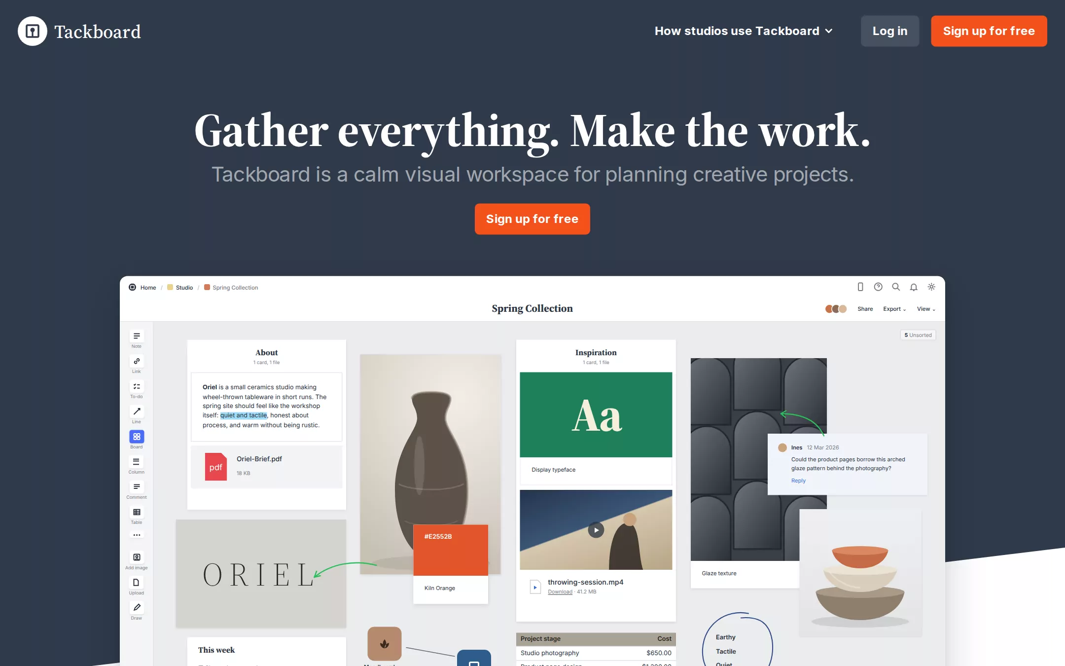
An original Tackboard page: an 84px slate navigation bar with a white circular mark, a mega-menu link, a Mid Slate Log in and an orange Sign up for free; a centred slate hero with a one-line 64px serif headline, a 28px grey lead and one orange button, ending in a white diagonal; a 1116px floating product board drawn in HTML — tool rail, breadcrumbs, and an overlapping collage of note columns, swatches, a typeface card, a video card, drawn ceramics photographs, a comment and hand-drawn arrows; four white editorial bands each pairing a 40px serif heading with a large board; a slate band with a scrolling row of discipline cards; a device band; a shadowed sign-up panel; and a four-column slate footer.
- Best forMoodboard and whiteboard tools, creative project planners, note-taking apps and other products that prove themselves with a busy, tactile board screenshot.
- Tech stack- Next.js (App Router) - React - TypeScript - CSS custom properties Use Next.js App Router, React and TypeScript with plain CSS custom properties for every colour, radius, shadow and spacing token. Render the page as server components; only the navigation mega-menu, the mobile menu, the discipline carousel and the sign-up form need small client islands, holding their state in memory. Self-host Inter (SIL Open Font License) and Source Serif 4 (SIL Open Font License) as woff2 files through next/font/local — no remote font request; use Tiempos Headline only if the project holds a licence. Draw the Tackboard mark, every icon, every board and every 'photograph' on the boards as inline SVG and HTML built from committed sample arrays, never bitmap screenshots or stock photos, so the markup is identical on every render. Provide page metadata. Build and run the production page before capturing its preview.
The prompt. 1934 words, self-contained.
Build the "Milanote" kickstart — A slate-and-paper creative-workspace homepage: a heavy serif headline, one orange sign-up button and a floating product board crowded with notes, swatches and drawn photographs.

## Design
Build a rebrandable landing page for a visual board tool for creative projects, where people collect references, write notes and plan work on free-form boards.

Create a complete landing page for Tackboard, a fictional visual board tool for creative projects. This is a concept presentation, not a real company — no real product, customer, person or logo. Use original branding, artwork and copy throughout.

Color: an editorial gallery of slate walls and white exhibit space with one warm signal. Slate Canvas #303B4B is the navigation, the hero, the dark Disciplines and Device bands and the footer, and it is the colour of every heading on white. Charcoal Ink #28323F is deep text inside the product boards and form fields. Paper White #FFFFFF is the page canvas between dark bands, every card and every board frame, and the headline colour on slate. Gallery Gray #EBEDEE is the board canvas inside product screenshots and the 2px section divider rules. Body Slate #5D6673 is lead and body copy on white. Mist Gray #A2A7AF is the hero lead and footer links on slate, never on white. Silver Gray #BBBEC3 is the 1px inset outline of form fields and provider buttons. Ash Gray #8D929A is legal copy. Steel Gray #767C86 is quiet icons and labels inside boards. Mid Slate #46505F is the Log in button. Studio Orange #F4511C fills only the Sign up for free buttons — never a band, a banner, a link colour or a status. No gradients on the page itself and no neon accents; the saturated colours on the boards belong to the sample content (a #E2552B swatch, a #1E7F5C typeface card, a #2DBE5A arrow), not to the site.

Typography: two families. Headings use "Tiempos Headline", "Source Serif 4", Georgia, "Times New Roman", serif; Tiempos Headline is commercial, so a build without a licence uses Source Serif 4 (SIL OFL) at weight 700 to match Tiempos 600's colour. Body and controls use "Inter", ui-sans-serif, system-ui, -apple-system, "Segoe UI", sans-serif. Hero display 64px/85.3px weight 600 (700 on Source Serif 4), 0 tracking, white. Section headings 40px/53.3px weight 700, #303B4B. Card titles 20px/26.6px weight 700. The hero lead is Inter 28px/35px weight 400 at -0.5px in Mist Gray; section leads are Inter 24px/30px weight 400 in Body Slate, 22px below their heading, in an 893px measure. Navigation labels and buttons Inter 16px/21.3px weight 700. Footer column headings Inter 16px weight 700 white, links Inter 16px weight 400 Mist Gray. The wordmark is the serif at 25px weight 500.

Layout: a 1440px canvas; content is centred rather than gridded. Sections are separated by roughly 155px of air, with a centred 120px × 2px slate rule between white bands. Radii: 6px buttons, 4px fields and provider buttons, 10.26px board frames and discipline cards, 16px the sign-up panel; never round them into pills. The default local gap is 10px.

Navigation: an 84px #303B4B bar with 24px side padding. At x 24 a 40px white circle holding a slate pin-board glyph, 9px gap, the white serif wordmark Tackboard. Right side: How studios use Tackboard with a 13px chevron (opens a white mega-menu of three columns — By project type, By technique, Resources — with 12px/600 Mist Gray uppercase-free column labels and 16px slate links), 37px gap, the Mid Slate Log in button and, 16px after it, the Studio Orange Sign up for free button ending 24px from the right edge; both 41px tall with 10px 16px padding.

Hero (id top): #303B4B, centred. The one-line headline Gather everything. Make the work. with 48px top padding, its 85px line box ending at y 217; at y 218 the Mist Gray lead Tackboard is a calm visual workspace for planning creative projects.; at y 275 the 157×41px Sign up for free button. The hero's slate field ends in a diagonal: a white wedge rises from the bottom-left corner to 175px higher at the right edge, so the slate meets white on a slope behind the lower half of the board.

Board showcase: at y 373 a centred 1116×630px Paper White board frame, 10.26px radius, unpadded, shadow rgba(0,0,0,0.16) 0px 16px 56px 4px, rgba(0,0,0,0.08) 0px 2px 10px 0px, overlapping the slope. Inside, drawn in HTML and SVG at small product scale (7–10px text): a 62px top bar with breadcrumbs Home / Studio / Spring Collection (each with a tiny coloured square), five outline utility icons at the right, the centred serif board title Spring Collection, collaborator avatars and Share, Export and View; a 46px tool rail (Note, Link, To-do, Line, Board — selected in blue — Column, Comment, Table, more, Add image, Upload, Draw); and a #EBEDEE canvas holding overlapping white cards: an About column with a note about Oriel, an invented ceramics studio (with one highlighted phrase) and an Oriel-Brief.pdf file row; a pale ORIEL wordmark tile; a tall drawn photograph of a dark stoneware vase with a #E2552B Kiln Orange swatch card overlapping its corner; an Inspiration column with a green Aa display-typeface card and a video card with a play button and a throwing-session.mp4 file row; a tall arched-glaze texture tile; a pale-blue comment card from an invented teammate with a Reply link; a drawn stack of three bowls; a This week to-do card; two board icons joined by a connector line; a Project stage / Cost table; green hand-drawn arrows and a blue hand-circled word list Earthy, Tactile, Quiet. A 5 Unsorted chip sits top right.

Collect section (id collect): a centred 2px rule, then the heading Collect every reference and the lead Drop notes, images, swatches, files and links onto one board, and arrange them the way you think., then a full-width 1116px moodboard frame with the same shadow: overlapping drawn photographs, three colour swatch cards with hex labels, a type-specimen card and a linked sub-board.

Notes section (id notes): the same stack — Write it down beside the pictures, with a lead about simple text editing and one-click web capture — over a research board of note cards, a clipped article, link previews and an interview column.

Organize section (id organize): Plan the project where you can see it, over a planning board of columns, to-dos, a timeline strip and a budget table.

Collaborate section (id collaborate): Share boards with clients and your team, over a board with live cursors, comment cards and an approval to-do list.

Disciplines (id uses): a #303B4B band with the white 64px heading Made for every kind of making. and a horizontally scrolling row of 248px-wide white discipline cards (10.26px radius, no padding, the board shadow): an illustrated board crop on top, then a 20px serif #303B4B title — Filmmaking, Writing, Design & illustration, Photography, Marketing, Interior design, Game development, Art, Fashion design, Craft — and a 16px Body Slate line, with a 48px white circular next-arrow control overlapping the right edge. Under it a centred 16px #BBBEC3 line Used by creative people at: above a row of invented monochrome studio wordmarks.

Device band: still slate — a 40px white heading Easy to use on any device beside drawn phone, tablet and laptop frames showing the same board.

Sign-up (id signup): on white, a centred 400px Paper White panel with 16px radius, 32px 40px padding and the shadow rgba(27,37,54,0.08) 0px 12px 28px 0px, rgba(27,37,54,0.03) 0px 8px 8px -2px, rgba(27,37,54,0.04) 0px 3px 3px -1.5px: the 24px serif heading Try Tackboard today, two white provider buttons (14px/600 system-ui #5D6673, 4px radius, 1px inset #BBBEC3), an or divider, first and last name fields side by side, email and password fields (transparent, 4px radius, 10px 14px padding, 1px inset #BBBEC3), two checkboxes and a full-width 40px Studio Orange Sign up for free button.

Footer: #303B4B with four columns — Getting started, Downloads, Support, Company — 16px/700 white headings over 16px Mist Gray links spaced 40px apart, then the wordmark and the line © Tackboard sample · a fictional creative workspace. Not a real company. in Ash Gray.

## Tech stack
- Next.js (App Router)
- React
- TypeScript
- CSS custom properties

Use Next.js App Router, React and TypeScript with plain CSS custom properties for every colour, radius, shadow and spacing token. Render the page as server components; only the navigation mega-menu, the mobile menu, the discipline carousel and the sign-up form need small client islands, holding their state in memory. Self-host Inter (SIL Open Font License) and Source Serif 4 (SIL Open Font License) as woff2 files through next/font/local — no remote font request; use Tiempos Headline only if the project holds a licence. Draw the Tackboard mark, every icon, every board and every 'photograph' on the boards as inline SVG and HTML built from committed sample arrays, never bitmap screenshots or stock photos, so the markup is identical on every render. Provide page metadata. Build and run the production page before capturing its preview.
Where the repo you are working in already has an equivalent in place, keep the repo's choice and say which one you kept.

## Everything else
Keep Tackboard clearly fictional and rebrandable: no real company, product, customer, person or photograph — the studio Oriel, its teammates and every wordmark are invented. Studio Orange #F4511C stays on the Sign up for free buttons alone; Log in stays Mid Slate. Headings stay serif: never set the hero or a section heading in Inter. Buttons keep 6px radii, fields 4px, board frames 10.26px; nothing becomes a pill. Every board frame keeps its two-layer shadow. Body Slate copy never sits on slate; on #303B4B use white headings and Mist Gray supporting text. Text pairs clear WCAG AA: #303B4B and #5D6673 on #FFFFFF, #FFFFFF and #A2A7AF on #303B4B, #FFFFFF on #46505F; white on Studio Orange is 3.5:1, so its labels stay 16px weight 700 or larger, as the reference does. Every link leads to a real section on the page; the sign-up form validates in place and sends nothing. The page loads no analytics or tracking script and shows no cookie banner. Content is initially visible: no typing effects, counters, parallax or scroll reveal; hovers take 150ms, the carousel scrolls only when its arrow is pressed, and every transition stops for prefers-reduced-motion. Every control shows a 2px #F4511C focus ring with a 2px offset. Boards are labelled figures; decorative glyphs are hidden from assistive technology. At 360px the navigation collapses to the mark, Log in and a Menu button, the headline drops to 40px/48px and wraps, the lead to 20px/26px, the hero button goes full-width, boards scale down inside a horizontally scrollable frame of their own, section leads drop to 18px/26px, the discipline row scrolls by touch, the sign-up panel becomes full-width with 24px padding, footer columns stack, and the page never overflows horizontally.

### Non-negotiables
- Responsive from 360px through desktop — no horizontal page overflow at any width. Deliberately scrollable regions stay within the viewport and remain keyboard and touch accessible.
- Every text/background pair clears WCAG AA (4.5:1 for body, 3:1 for large text); adjust a tint rather than shipping a failing pair.
- Fully keyboard operable, with a visible focus ring drawn in the accent colour.
- Honour `prefers-reduced-motion` — swap every transition for an instant state change.
- Write real copy in the voice described above; no lorem ipsum and no TODO placeholders.
- Use system or self-hosted fonts and CSS/SVG-drawn graphics — do not depend on a remote image or icon service.

Build the whole page end to end and show me the result running — not a description of it.