 Fredrin
SaaS
Mercury
A wider perspective in graphite, ivory and cobalt.
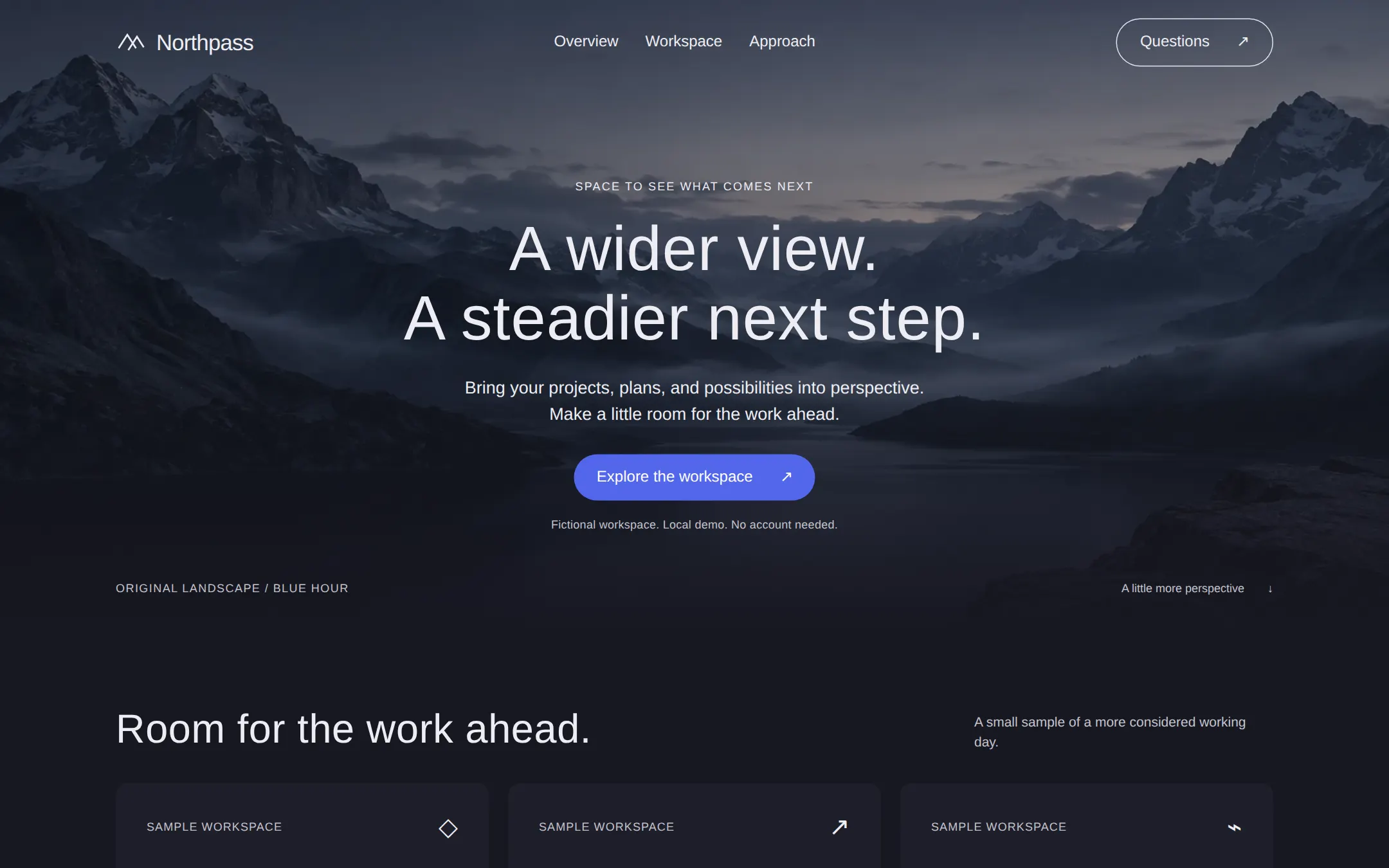
An original Northpass workspace landing: misty alpine photography, quiet graphite cards, one cobalt action and a working local project explorer.
- Best for
- Founders and small teams presenting a calm workspace with an atmospheric landscape and readable sample projects.
- Tech stack
- Use Next.js App Router, React and TypeScript with plain CSS custom properties. Keep equivalent choices already in the repository. Server Components render the static layout; one small Client Component owns the two-view explorer. Keep sample records in typed local configuration. Use native semantic HTML, inline SVG for the original mark and tiny icons, and the local landscape image. No database, authentication, analytics, API keys, paid services or remote fonts/assets. Production build and start must work locally without credentials. - Next.js (App Router) - React - TypeScript - CSS custom properties - Local React state
- Tags
- dark · landscape · graphite · cobalt · workspace · SaaS
The creation prompt
1538 words, self-contained. Paste it into a chat session with your coding agent and it builds Mercury end to end.
Build the "Mercury" kickstart — A wider perspective in graphite, ivory and cobalt.

## Design
Create a spacious dark landing page with a photographic alpine hero, ivory typography and quiet graphite content surfaces. Define CSS variables for canvas #171721, card #1E1E2A, secondary control #272735, structural border #70707D, muted text #C3C3CC, light outline #E2E3ED, primary text #EDEDF3, primary action #5266EB and action text #FFFFFF. Reserve cobalt for exactly one filled hero action; selected local controls use ivory on graphite. Do not use bright decorative colors, card shadows or bold headings.

Typography stack: Arial, Helvetica, sans-serif. This local system stack is an explicit substitute for licensed display and body faces. Headings use weight 400 with 0.01em tracking: hero 65px/1.1, section heading 42px/1.15, card heading 28px/1.2. Body is 16px/1.5, hero lead 18px/1.5, small labels 12px/1.4 with 0.06em tracking. Controls are 16px. Use a 4px spacing unit, a 1200px content width, 72px section gaps, 32px card padding, 12px card radii and 32px pill radii for buttons. Keep all targets at least 44px tall and provide an ivory 2px focus outline with 4px offset.

At 1440px, make the entire hero including its header 660px high. Place a wide, locally stored, original photo of layered alpine ridges and a misty lake at blue hour behind it. There are no people, furniture, logos or words in the photograph. Frame the ridges around a quiet central sky; crop with object-fit: cover. Add an onyx overlay strong enough for WCAG AA text contrast and a bottom fade into the canvas. The image is decorative with empty alt text. Use the accompanying assets/alpine.webp when available, copying it into the built app's public folder. When only this prompt is supplied, create an original locally stored landscape matching this description or use an appropriately licensed local photo; never hotlink or draw a CSS mountain placeholder. The exact asset-generation prompt is a cinematic wide photograph of an alpine valley, dark lake, silver mist and slate-blue twilight; high peaks at both edges leave the center open for a headline, no people, buildings, furniture, text, logos or watermark. Do not copy another site's photo.

Place a transparent header inside the 1200px wrapper, 88px tall. At left, show an original mark of two open ascending chevrons beside Northpass. Center Overview / Workspace / Approach links; at right put an ivory outlined Questions pill. All links go to real sections. Center the hero copy in a 720px column starting around 185px from the page top: small uppercase eyebrow, a two-line headline, a two-line supporting sentence, the one cobalt Explore the workspace action, then a short local-demo note. At the bottom place a small left-aligned ORIGINAL LANDSCAPE / BLUE HOUR caption and right-aligned scroll link within the same wrapper.

Below the hero, create a section heading row and three equal graphite cards. Each card contains a small sample-data label, a 28px title and a short explanation, with a tiny original monochrome line icon. Cards are informational articles, not dead links. Follow with a workspace section: heading and short explanation at left; at right, a graphite panel with two native pill buttons and the selected content. The initial view is Projects. Use thin muted separators between rows, no shadows and no bright status colors. Put the view count in a polite status region. Follow with three numbered approach columns, then native details/summary questions and a restrained footer.

Below 900px let the header wrap, keep navigation visible, change the hero height to auto with at least 600px, and stack the workspace introduction and panel. Below 600px use 20px gutters, a 42px hero heading, 32px section headings and single-column cards. Controls wrap without page overflow at 320px and 200% zoom. Keep text in normal flow; never clip content to disguise overflow. Static first paint, no entry animation or parallax. Only 150ms color transitions on hover; remove them for prefers-reduced-motion. Use semantic landmarks, one h1, a skip link and keyboard-operable controls.

Page structure:
1. Transparent header and centered landscape hero with one cobalt action.
2. Three graphite overview cards with clearly labeled sample data.
3. Local workspace explorer with Projects and Next steps views.
4. Three approach statements, native questions and a quiet footer.

## Tech stack
Use Next.js App Router, React and TypeScript with plain CSS custom properties. Keep equivalent choices already in the repository. Server Components render the static layout; one small Client Component owns the two-view explorer. Keep sample records in typed local configuration. Use native semantic HTML, inline SVG for the original mark and tiny icons, and the local landscape image. No database, authentication, analytics, API keys, paid services or remote fonts/assets. Production build and start must work locally without credentials.

- Next.js (App Router)
- React
- TypeScript
- CSS custom properties
- Local React state
Where the repo you are working in already has an equivalent in place, keep the repo's choice and say which one you kept.

## Everything else
Build a founder-workspace landing page with a local project explorer. The fictional product is Northpass: a calm place to review sample projects and their next steps. This is a local demonstration, not a bank, connected service or collaborative product. All identity, copy and sample records are original. Do not imply affiliation or endorsement, invent customer logos or add unsupported financial claims.

Hero eyebrow: SPACE TO SEE WHAT COMES NEXT. Headline: A wider view. A steadier next step. Break between the sentences on desktop. Lead: Bring your projects, plans, and possibilities into perspective. Make a little room for the work ahead. Action: Explore the workspace, linked to #workspace. Note: Fictional workspace. Local demo. No account needed. The header Overview targets #overview; Workspace targets #workspace; Approach targets #approach; Questions targets #questions. The wordmark and Back to top target #top. The bottom hero link A little more perspective targets #overview; the skip link targets #main.

Overview heading: Room for the work ahead. Lead: A small sample of a more considered working day. Three cards labeled SAMPLE WORKSPACE: 3 projects in view — Keep the moving pieces in one readable place.; 2 next steps — See what is ready for your attention.; 1 shared direction — Give the next conversation a clear starting point. These numbers describe this static demonstration, not real usage or product performance.

Workspace eyebrow: A CLEARER PLACE TO BEGIN. Heading: Keep the next step close. Description: Explore a small, fictional workspace. Switch between the projects and the next actions that connect them. The panel header is Northpass studio with LOCAL SAMPLE below it. Two native buttons: Projects, selected initially, and Next steps. Projects shows three records: Field notes / Shape the research / In progress; Studio website / Refine the first page / In review; Autumn collection / Gather the early ideas / Planning. Next steps shows two records: Review the opening page / Studio website / Thursday; Choose three directions / Autumn collection / Friday. Each row has title, description and textual status or day. Selecting a button immediately changes the visible rows, selected aria-pressed state and count; announce 3 sample projects or 2 sample next steps in a polite status region, keeping focus on the button. Reload resets Projects. No network calls, storage, timers or real dates. With JavaScript off keep the initial projects readable and explain that changing views needs JavaScript. Do not add edit, transfer, payment, sign-in or save controls.

Approach heading: A little distance. A clearer direction. Three numbered statements: 01 See the whole picture — Start with the projects already in motion.; 02 Find the useful detail — Keep the next decision close to its context.; 03 Make room for what follows — Leave enough space for an idea to change. These are process suggestions, not promises of shipped integrations.

Native questions: Is Northpass a real service? — It is a fictional workspace and a local sample you can adapt.; Is this connected to my accounts? — No. Every project and next step is a static example. Nothing is sent or saved.; What happens when I reload? — The explorer returns to Projects. Footer: Northpass — Perspective for the work ahead. Include Fictional product. Sample data. No affiliation or endorsement. Repeat real section links and Back to top.

Retain static content and disclosures with JavaScript disabled. Use meaningful link names, visible focus, readable contrast and clear text statuses. Document local build/start commands and how to replace the name, landscape, palette and local records. The three prompts are self-contained; building never requires an inspiration website.

### Non-negotiables
- Responsive from 360px through desktop — no horizontal page overflow at any width. Deliberately scrollable regions stay within the viewport and remain keyboard and touch accessible.
- Every text/background pair clears WCAG AA (4.5:1 for body, 3:1 for large text); adjust a tint rather than shipping a failing pair.
- Fully keyboard operable, with a visible focus ring drawn in the accent colour.
- Honour `prefers-reduced-motion` — swap every transition for an instant state change.
- Write real copy in the voice described above; no lorem ipsum and no TODO placeholders.
- Use system or self-hosted fonts and CSS/SVG-drawn graphics — do not depend on a remote image or icon service.

Build the whole page end to end and show me the result running — not a description of it.
Pasting the prompt is step one. Fredrin runs the agent that builds it, one ticket per look.