 Fredrin
Blog
Medium
A cream-colored broadsheet at golden hour: a whisper-weight serif, one pill of black ink and a hand-drawn illustration.
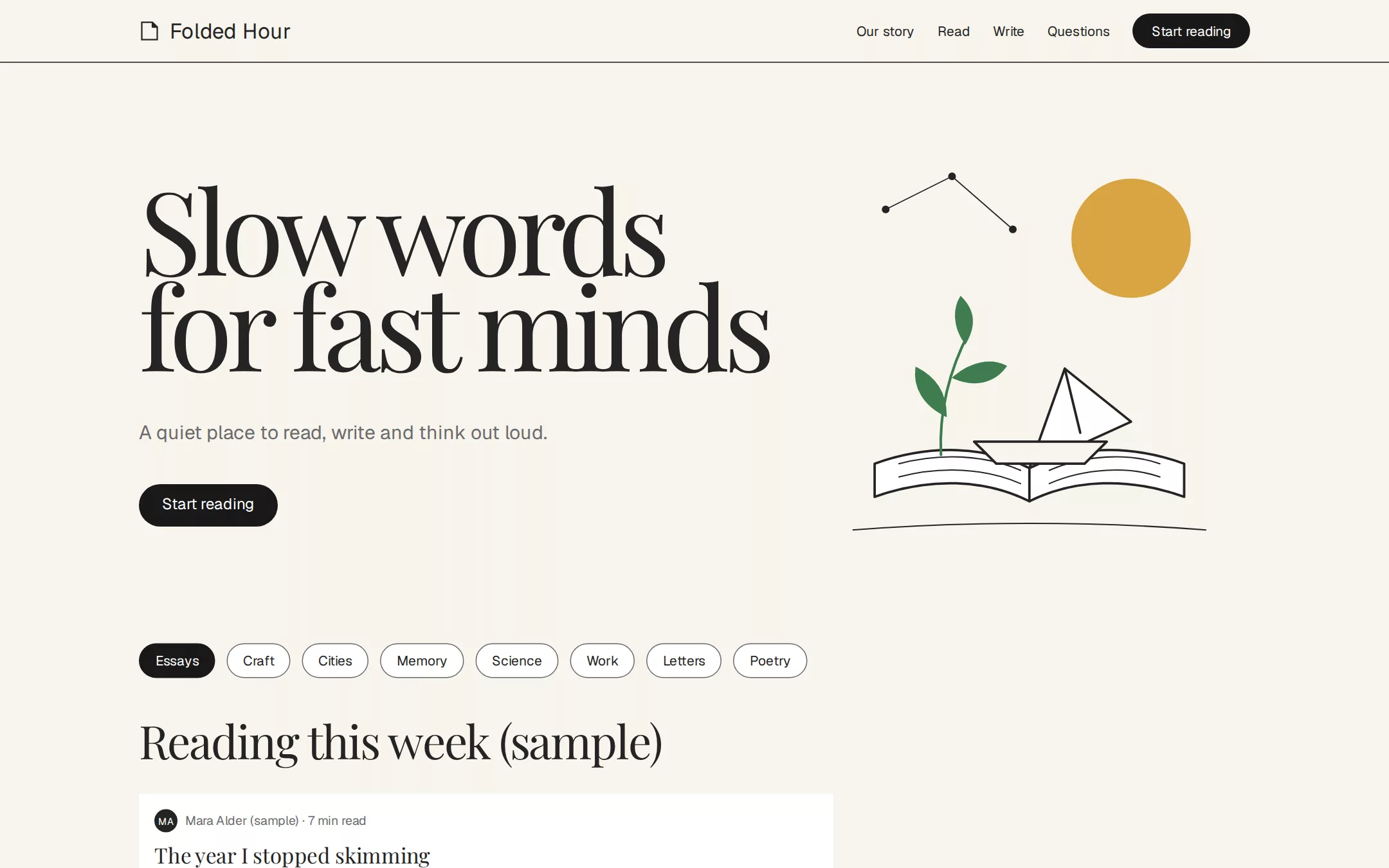
An original Folded Hour reading-and-writing page: a cream masthead with a wordmark and one black pill, a left-aligned split hero whose 120px whisper-weight serif headline sits beside a hand-drawn book-and-paper-boat illustration, a local topic-tag filter over a single-column list of sample stories on white rows, a writer's desk with a static draft mockup, a serif pull quote, a sharp-cornered letters form, native questions and a centred footer link bar.
- Best for
- Publishing and newsletter platforms, essay collections, writing tools, literary magazines and any reading-first product that should feel printed rather than built.
- Tech stack
- - Next.js (App Router) - React - TypeScript - CSS custom properties - Native HTML disclosures Use Next.js App Router, React and TypeScript with plain CSS custom properties and original inline SVG for the mark and the hero illustration. Preserve equivalent tools already installed in the host project. Render the page as a server component; the only client components are the topic-tag filter and the letters form guard, each keeping local React state and sending nothing. Native details and anchors need no JavaScript. Use local font stacks only — no remote font, image, photo, logo, icon, video or analytics host. Provide page metadata. Build and run the production page before capturing its preview.
- Tags
- blog · editorial · light · serif · minimal
The creation prompt
1629 words, self-contained. Paste it into a chat session with your coding agent and it builds Medium end to end.
Build the "Medium" kickstart — A cream-colored broadsheet at golden hour: a whisper-weight serif, one pill of black ink and a hand-drawn illustration.

## Design
Build a rebrandable long-form reading and writing platform landing page.

Create a complete landing page for Folded Hour, a fictional place where people read and publish long essays. Its core idea: a cream-colored broadsheet at golden hour — a warm printed page where one enormous whisper-weight serif headline, a single pill of black ink and a hand-drawn editorial illustration do all the talking. This is a concept presentation, not a real service — no sign-up, accounts, membership prices, follower or clap counts, real authors, publication logos, testimonials or ratings. Use original branding, artwork and copy throughout.

Color: the whole interface is warm grayscale. Newsprint Cream #F7F4ED is the page canvas, the hero and every full-width band. Paper White #FFFFFF is only for cards, the story list rows and the input — surfaces that lift off the cream by value alone. Ink #242424 is headlines, body copy, links and the wordmark. Body Gray #333333 is secondary body text. Button Black #191919 is the ONLY filled surface: pill buttons and the dark rule under the masthead. Marginalia Gray #6B6B6B is subtext, bylines, reading times, footer links and hairline dividers. No chromatic UI colour anywhere — no blue links, no green buttons, no red errors; links are typographic, underlined on hover. The single exception is the hero illustration, which may use one muted editorial green #3F7D4E and a warm ochre #D9A441 as artwork only, never in UI.

Typography: display is a transitional book serif — "GT Super", "Playfair Display", "Libre Caslon Text", Georgia, serif — at weight 400 only, never bold: the hero h1 at 120px with line-height 0.83 and letter-spacing -0.055em, font-feature-settings "lnum" on, "pnum" on; section headlines 48px/1.0 at -0.03em in the same serif. UI text is a humanist grotesque — Söhne, Inter, "IBM Plex Sans", system-ui, sans-serif — at weight 400: navigation and buttons 14px/1.43, captions and bylines 13px/1.54, hero subtext and subheadings 20px/1.4 or 22px/1.27. Reading text in story excerpts is Charter, Georgia, "Source Serif Pro", serif at 18px/1.58. All fonts are installed locally, no remote font request. Shapes: 9999px pill radius on every button and topic tag; 0px radius on everything else — cards, inputs, images, the illustration panel. Spacing: 8px base, 16–24px element gaps, 16px card padding, 64px between sections, content inside a 1200px column. Elevation: none. No shadows, no blur — surfaces separate by value shifts only (cream → paper → ink).

Top navigation: on the cream canvas, 64px tall, no border or shadow, then a full-width 1px Button Black rule beneath it. Left: the wordmark Folded Hour in the grotesque at 22px weight 400 Ink, beside a tiny original inline-SVG mark (a folded page corner). Right, 24px apart: Our story, Read, Write, Questions as 14px Ink links, each an anchor to a real section, then a filled Button Black pill Start reading with white 14px text and 8px 20px padding.

Split hero: two columns on the cream canvas, left-aligned, not centred. Left ~58%: the h1 Slow words for fast minds at 120px in the display serif, weight 400, rendered as a tight two-line block that breaks after words (Slow words / for fast minds) and never wraps to a third line; below it, 48px down, a 20px Marginalia Gray line A quiet place to read, write and think out loud. and a 44px-tall Button Black pill Start reading. Right ~42%: a square illustration panel with 0px radius — an original inline-SVG editorial drawing in loose ink lines: an open book whose pages fold into a paper boat, a single leaf-green sprig and an ochre sun disc, with thin constellation lines connecting three stars. The illustration is the only colour on the page and carries a text alternative.

Topic tags: a quiet row of eight white pill tags (14px, 8px 16px padding, 1px Marginalia Gray border, Ink text) — Essays, Craft, Cities, Memory, Science, Work, Letters, Poetry — as a local filter: the selected tag becomes a filled Button Black pill and narrows the story list below from local state. It sends nothing.

Story list (id read): a 48px serif headline Reading this week (sample), then a single left-aligned reading column of five Paper White rows with 0px radius and 16px padding, separated only by 24px of cream. Each row: a 13px grotesque byline in Marginalia Gray (a fictional initials avatar in a 24px Ink circle, the sample author name, then · 7 min read), a 22px serif title in Ink, an 18px Charter excerpt clamped to two lines in Body Gray, and a 13px topic tag as plain text. Every author and title is fictional and labelled sample.

Writer's desk (id write): a two-column band on Paper White. Left: a 48px serif headline Write like nobody is refreshing. and a 20px Marginalia Gray paragraph. Right: a static editor mockup built in HTML — a title line in the 42px display serif, a body paragraph in Charter, a blinking-free caret, and a minimal row of grotesque formatting labels (B, i, Quote, Link) — sharp corners, no shadow, labelled Sample draft.

Pull quote: a full-width cream band holding one 64px serif quotation at weight 400, left-aligned to the reading axis, attributed in 13px Marginalia Gray to a fictional sample author — never a real person or testimonial.

Letters signup (id letters): a Paper White card with 0px radius and 16px padding: a 22px grotesque heading A letter on Sundays (sample), a sharp-cornered white input with a 1px Marginalia Gray border and placeholder [email protected], and a Button Black pill Send me letters; the form prevents submission and says Nothing is sent — this is a sample. in 13px Marginalia Gray.

Questions (id questions): a 48px serif headline Questions, then native details elements on 1px Marginalia Gray hairlines with 20px grotesque summaries in Ink and a thin chevron that rotates when open: Is Folded Hour real? — no, it is a fictional concept. Who wrote these stories? — no one; every author is invented for this page. Does the page store anything? — no; it sends and stores nothing.

Footer link bar: a single centred row of 13px grotesque Marginalia Gray links, 16px apart, on the cream canvas with no border above — Help, About, Read, Write, Letters, Questions, Rules, Privacy — each an anchor to a real section, then a 13px line Folded Hour is a fictional concept. Not a real product or service.

At 760px and below: 16px gutters, the navigation keeps only the wordmark and the pill, the h1 drops to 64px (line-height stays 0.83), the hero stacks text above the illustration, the tag row scrolls horizontally inside its own container, the writer's desk stacks, the pull quote drops to 36px, and the footer wraps. The page fits a 360px viewport with no horizontal page overflow. Use semantic landmarks, one h1, a skip link, visible 2px Ink focus rings offset 2px on every control, text alternatives for the illustration and mark, and keyboard-operable tags and disclosures.

## Tech stack
- Next.js (App Router)
- React
- TypeScript
- CSS custom properties
- Native HTML disclosures

Use Next.js App Router, React and TypeScript with plain CSS custom properties and original inline SVG for the mark and the hero illustration. Preserve equivalent tools already installed in the host project. Render the page as a server component; the only client components are the topic-tag filter and the letters form guard, each keeping local React state and sending nothing. Native details and anchors need no JavaScript. Use local font stacks only — no remote font, image, photo, logo, icon, video or analytics host. Provide page metadata. Build and run the production page before capturing its preview.
Where the repo you are working in already has an equivalent in place, keep the repo's choice and say which one you kept.

## Everything else
Keep Folded Hour clearly fictional and rebrandable: no source wordmark, screenshots or illustrations, no sign-up flow, membership prices, follower, clap or read counts, real authors, publications, testimonials or endorsements. Every author, title, excerpt and quote is labelled sample. The interface is warm grayscale only: Button Black #191919 is the one filled surface, links are Ink and underline on hover, and the illustration's green and ochre never leave the artwork. The display serif stays at weight 400 with line-height 0.83 on the hero — never bold, never loosened. Buttons and tags are full pills; cards, inputs, images and panels keep 0px corners. No shadows or blur anywhere. Body text and long-form content are left-aligned to the reading axis, never centred. Every link leads to a real section on the page; nothing is sent or stored. Deliver initially visible content with no scroll reveals, marquees, parallax or auto-advancing anything; hover and focus are a 150ms colour or underline change, disabled for prefers-reduced-motion. WCAG AA contrast on every text/background pair, keyboard-operable controls and disclosures, and a 360px layout without horizontal page overflow.

### Non-negotiables
- Responsive from 360px through desktop — no horizontal page overflow at any width. Deliberately scrollable regions stay within the viewport and remain keyboard and touch accessible.
- Every text/background pair clears WCAG AA (4.5:1 for body, 3:1 for large text); adjust a tint rather than shipping a failing pair.
- Fully keyboard operable, with a visible focus ring drawn in the accent colour.
- Honour `prefers-reduced-motion` — swap every transition for an instant state change.
- Write real copy in the voice described above; no lorem ipsum and no TODO placeholders.
- Use system or self-hosted fonts and CSS/SVG-drawn graphics — do not depend on a remote image or icon service.

Build the whole page end to end and show me the result running — not a description of it.
Pasting the prompt is step one. Fredrin runs the agent that builds it, one ticket per look.