 Fredrin
E-commerce
Magic Spoon
A candy-coloured cereal shelf: electric grape, lilac aisles, chunky pills and packaging you want to collect.
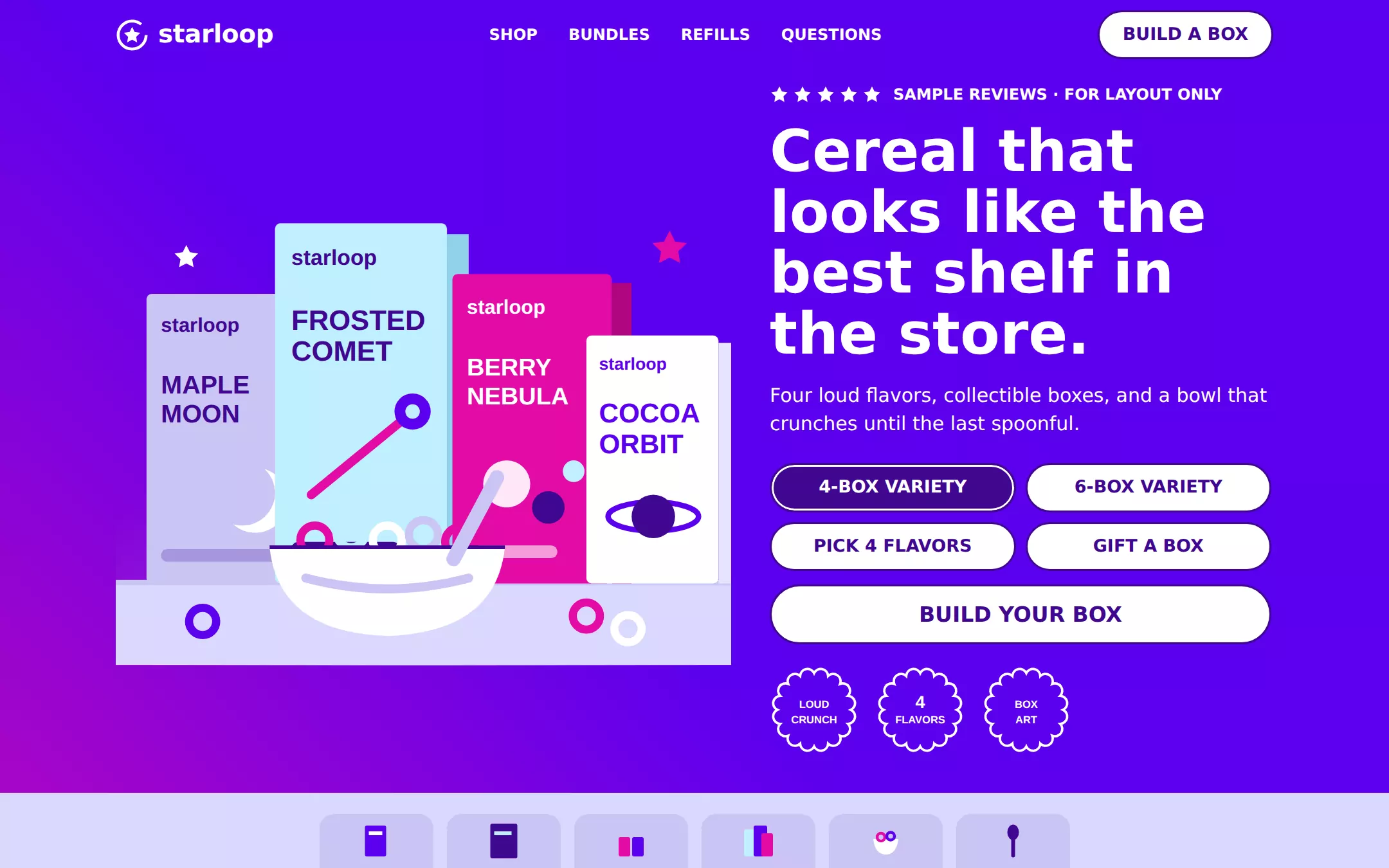
An original Starloop cereal-shop page: a compact Electric Grape navigation, a split hero with an illustrated packaging still life beside a white headline, a 2-by-2 grid of outlined bundle pills and scalloped seals, a lilac category rail, a Sky Scoop refill band with a cut-corner image frame, a four-tile merchandise grid, native questions and a black footer with an inert signup.
- Best for
- Snack and cereal brands, candy and beverage start-ups, playful DTC shops and any product whose packaging is the hero.
- Tech stack
- - Next.js (App Router) - React - TypeScript - CSS custom properties - Native HTML disclosures Use Next.js App Router, React and TypeScript with plain CSS custom properties and original inline SVG for every box, bowl, star and seal. Preserve equivalent tools already installed in the host project. Render the page as a server component; the only client component is the 2-by-2 bundle selector, which keeps its choice in local React state and sends nothing. Native details and anchors need no JavaScript. Use local font stacks only — no remote font, image, logo, icon or analytics host. Provide page metadata. Build and run the production page before capturing its preview.
- Tags
- e-commerce · playful · colorful · food · packaging
The creation prompt
1812 words, self-contained. Paste it into a chat session with your coding agent and it builds Magic Spoon end to end.
Build the "Magic Spoon" kickstart — A candy-coloured cereal shelf: electric grape, lilac aisles, chunky pills and packaging you want to collect.

## Design
Build a rebrandable direct-to-consumer snack shop landing page.

Create a complete landing page for Starloop, a fictional cereal shop that sells four loud, cartoon-bright flavors in collectible boxes. Its core idea: breakfast should look like the best shelf in the store. This is a concept presentation, not a real store — no checkout, no accounts, no real prices, no nutrition or health claims and no real reviews. Use original branding, packaging art and copy throughout.

Color: the default canvas is Lilac Aisle #DAD9FF. Electric Grape #5B00ED is the hero and promotional field; the hero may use the Electric Grape gradient linear-gradient(45deg, #E30BA6, #5B00ED) with the magenta only as the far endpoint. Deep Concord #3F0791 is the brand ink — every heading on a light field, body text, 2px outlines, product-link text and every filled conversion button. Sky Scoop #BFEFFF and the Sky Scoop gradient linear-gradient(0deg, #D4BEFF 50%, #BFEDFE) are the cool promotional band. Soft Grape #CAC4F4 fills category tabs and is the hairline colour on light fields. Marshmallow #FFFFFF is cards, selector pills, reversed text and product grounds. Midnight Cereal #000000 is only the footer. Bubblegum Flash #E30BA6 is decoration only (gradient endpoint, a star, a packaging stripe) and never carries text. Never replace Deep Concord with black for headings or buttons, and never flatten the page into one purple: alternate Electric Grape, Lilac Aisle, Sky Scoop, Marshmallow and black in broad full-bleed bands.

Typography: one family for everything — Poppins, Montserrat, "Avenir Next", ui-sans-serif, system-ui, -apple-system, "Segoe UI", Roboto, Helvetica, Arial, sans-serif — installed locally, with no remote font request; heavy, blunt geometric forms like the type printed on a cereal carton. Display headings are weight 700 only, normal tracking: hero h1 60px/63px in Marshmallow, section headings 64px/64px in Deep Concord, a centered uppercase grid heading 48px/1.0, product names 32px/40px uppercase 700, prices 24px/1.25 700, body 16px/1.5 400, selector labels 18px/27px 600, navigation 16px/16px 700 uppercase. Review proof stamps use "Mabry Pro", "Arial Black", Poppins, ui-sans-serif, system-ui, sans-serif at weight 900, 16px uppercase — a denser, stamped face. Radii: 52px for outlined selector pills and the navigation button, 20px for filled Deep Concord conversion buttons, 25px for cards, 15px for category tabs, 30px for the footer input, and the cut corner 25px 25px 25px 0 (square lower-left) only for image frames and translucent overlay cards. Never 4, 8 or 12px button radii. Shadows only on elevated white panels: 0 20px 60px rgba(0,0,0,0.1); basic merchandise tiles stay flat.

Compact navigation over Electric Grape: a 72px bar on the Electric Grape field, content max 1280px. Left: an original mark — a five-point star inside a looping ring, inline SVG in Marshmallow — and the word starloop in 26px Marshmallow weight 700. Center: SHOP, BUNDLES, REFILLS, QUESTIONS as Marshmallow 16px 700 uppercase links, 32px apart, underlined on hover and focus. Right: a Marshmallow pill button BUILD A BOX with a 2px Deep Concord outline, a 2px inset white ring, 52px radius, 10px 24px padding and Poppins 600 18px Deep Concord text. Every link is an anchor to a real section.

Split bundle hero with a packaging still life: the hero continues the Electric Grape field (gradient allowed) at about 640px tall, split 55/45. Left: an original packaging still life drawn in inline SVG — four upright cereal boxes of different heights overlapping on a lilac tabletop line under a pale Sky Scoop horizon glow, each box a flat illustrated package in its own colourway (Sky Scoop with Deep Concord type, Bubblegum Flash with white type, Marshmallow with Electric Grape type, Soft Grape with Deep Concord type) carrying the starloop wordmark, a big flavor name — FROSTED COMET, COCOA ORBIT, BERRY NEBULA, MAPLE MOON — a drawn bowl of ring-shaped pieces, and a few loose rings and a bowl with a spoon in front. No photographs. Right: a review-proof stamp — a row of five solid Marshmallow SVG stars and SAMPLE REVIEWS · FOR LAYOUT ONLY in the stamp face; the h1 Cereal that looks like the best shelf in the store. in Marshmallow; a 20px Marshmallow sentence Four loud flavors, collectible boxes, and a bowl that crunches until the last spoonful.; then a 2-by-2 grid of Marshmallow selector pills with 2px Deep Concord outlines, 52px radius, 10px 24px padding, 10px gaps and 18px/27px 600 Deep Concord labels — 4-BOX VARIETY, 6-BOX VARIETY, PICK 4 FLAVORS, GIFT A BOX — where the first is selected (Deep Concord fill, white text) and every pill is a real button with aria-pressed; then a large Marshmallow conversion pill BUILD YOUR BOX. Under the buttons, three scalloped seals drawn in SVG — a Marshmallow scalloped edge with short stacked uppercase Marshmallow text: LOUD / CRUNCH, 4 / FLAVORS, BOX / ART — decorative claims only, never nutrition.

Product category rail (id shop): directly under the hero, a Lilac Aisle strip with a centered row of six Soft Grape tabs, 15px radius, 10px 15px padding, each a small SVG box or bowl thumbnail above a Deep Concord 14px 600 label: Cereal, Big boxes, Minis, Bundles, Bowls, Spoons. Tabs are links to the grid.

Subscription band (id refills): a full-bleed Sky Scoop gradient band with 120px vertical padding. Left: the eyebrow REFILLS in the stamp face, the 64px/64px Deep Concord heading Refills that land before the bowl runs dry., three benefit rows each with a 28px solid Deep Concord circle icon holding a white glyph and a 16px Deep Concord line — Pick flavors, change them any week.; Skip or pause from one screen.; Ships in a box worth keeping. — and a Deep Concord 20px-radius button START A REFILL with white 22px 700 text. Right: an Elevated panel — a Marshmallow card, 25px radius, 50px padding, 0 20px 60px rgba(0,0,0,0.1) — containing an image frame clipped to 25px 25px 25px 0 that holds an original SVG tabletop scene (a single box, a bowl and a spoon on a Bubblegum Flash-to-Electric Grape set) and, overlapping its lower edge, a translucent overlay card rgba(255,255,255,0.25) with the same cut corner reading EVERY 4 WEEKS · SAMPLE CADENCE.

Four-column merchandise grid (id bundles): Lilac Aisle background, 100px vertical padding, a centered uppercase 48px Deep Concord heading SHOP THE SHELF, then four Marshmallow tiles, 25px radius, 20px padding, flat: an SVG packshot of one box on a white ground, a Deep Concord price line in the 24px price style reading SAMPLE PRICE, the 32px/40px uppercase product name (FROSTED COMET, COCOA ORBIT, BERRY NEBULA, MAPLE MOON), a stamp-face review proof with five small Deep Concord stars and SAMPLE, and a full-width Deep Concord 20px-radius SHOP button.

Native questions (id questions): a Marshmallow band with a 64px Deep Concord heading Questions, answered. and four details elements divided by 2px Soft Grape hairlines, 24px 700 Deep Concord summaries with a drawn + that turns into a − when open: Is Starloop real? — no, it is a fictional design study. Can I buy these boxes? — no; there is no store, checkout or shipping. Are the reviews and prices real? — no, every figure is labelled sample. Is there a nutrition claim anywhere? — no, the seals are decoration.

Black footer with a sample signup: Midnight Cereal #000000 background, 80px padding, the starloop wordmark in Marshmallow, three columns of 16px Marshmallow links (Shop, Refills, Bundles, Questions, Back to top) that resolve to real anchors, and a signup row: a transparent input with a Marshmallow 2px border and 30px radius, 0 20px padding, labelled Email for launch news (sample), beside a Marshmallow 52px-radius button with Deep Concord text; the form has no action, the button is type=button and nothing is sent or stored. A 13px line: Starloop is a fictional concept. Not a real store, product or brand.

At 760px and below: 16px gutters, a 40px hero h1, 40px section headings, the still life above the hero copy at 280px tall, selector pills in one column at full width, the category rail scrolling horizontally inside its own box, the merchandise grid in one column (two from 761px to 1100px), and navigation links collapsed to QUESTIONS plus BUILD A BOX. The page fits a 360px viewport with no horizontal page overflow. Use semantic landmarks, one h1, a skip link, visible 3px Deep Concord or Marshmallow focus rings, decorative SVG hidden from assistive technology with the packaging still life given one short text alternative, WCAG AA contrast on every text pair (Bubblegum Flash never carries text) and keyboard-operable details and selector pills.

## Tech stack
- Next.js (App Router)
- React
- TypeScript
- CSS custom properties
- Native HTML disclosures

Use Next.js App Router, React and TypeScript with plain CSS custom properties and original inline SVG for every box, bowl, star and seal. Preserve equivalent tools already installed in the host project. Render the page as a server component; the only client component is the 2-by-2 bundle selector, which keeps its choice in local React state and sends nothing. Native details and anchors need no JavaScript. Use local font stacks only — no remote font, image, logo, icon or analytics host. Provide page metadata. Build and run the production page before capturing its preview.
Where the repo you are working in already has an equivalent in place, keep the repo's choice and say which one you kept.

## Everything else
Keep Starloop clearly fictional and rebrandable: no source wordmark, packaging, photography, flavor names or copy, no real brand, retailer or influencer names, no logos, testimonials, real reviews, prices, discounts or nutrition and health claims. Every figure and review is labelled sample; the seals are decorative words only. Every link leads to a real section on the page, and the signup sends and stores nothing. Deliver initially visible content with no scroll reveals or autoplay; hover and focus states are a 150ms colour or transform change of at most 2px lift, disabled for prefers-reduced-motion. WCAG AA contrast on every text/background pair, keyboard-operable selector pills and questions, and a 360px layout without horizontal page overflow.

### Non-negotiables
- Responsive from 360px through desktop — no horizontal page overflow at any width. Deliberately scrollable regions stay within the viewport and remain keyboard and touch accessible.
- Every text/background pair clears WCAG AA (4.5:1 for body, 3:1 for large text); adjust a tint rather than shipping a failing pair.
- Fully keyboard operable, with a visible focus ring drawn in the accent colour.
- Honour `prefers-reduced-motion` — swap every transition for an instant state change.
- Write real copy in the voice described above; no lorem ipsum and no TODO placeholders.
- Use system or self-hosted fonts and CSS/SVG-drawn graphics — do not depend on a remote image or icon service.

Build the whole page end to end and show me the result running — not a description of it.
Pasting the prompt is step one. Fredrin runs the agent that builds it, one ticket per look.