Lithic
A black, rounded hero vault inset in a white page: dark payment cards marching diagonally through fine bronze concentric arcs, a centred 64px two-line white headline, a glass pill beside one orange pill, then warm-cream bento cards, a mint developer strip and a lavender processing panel.
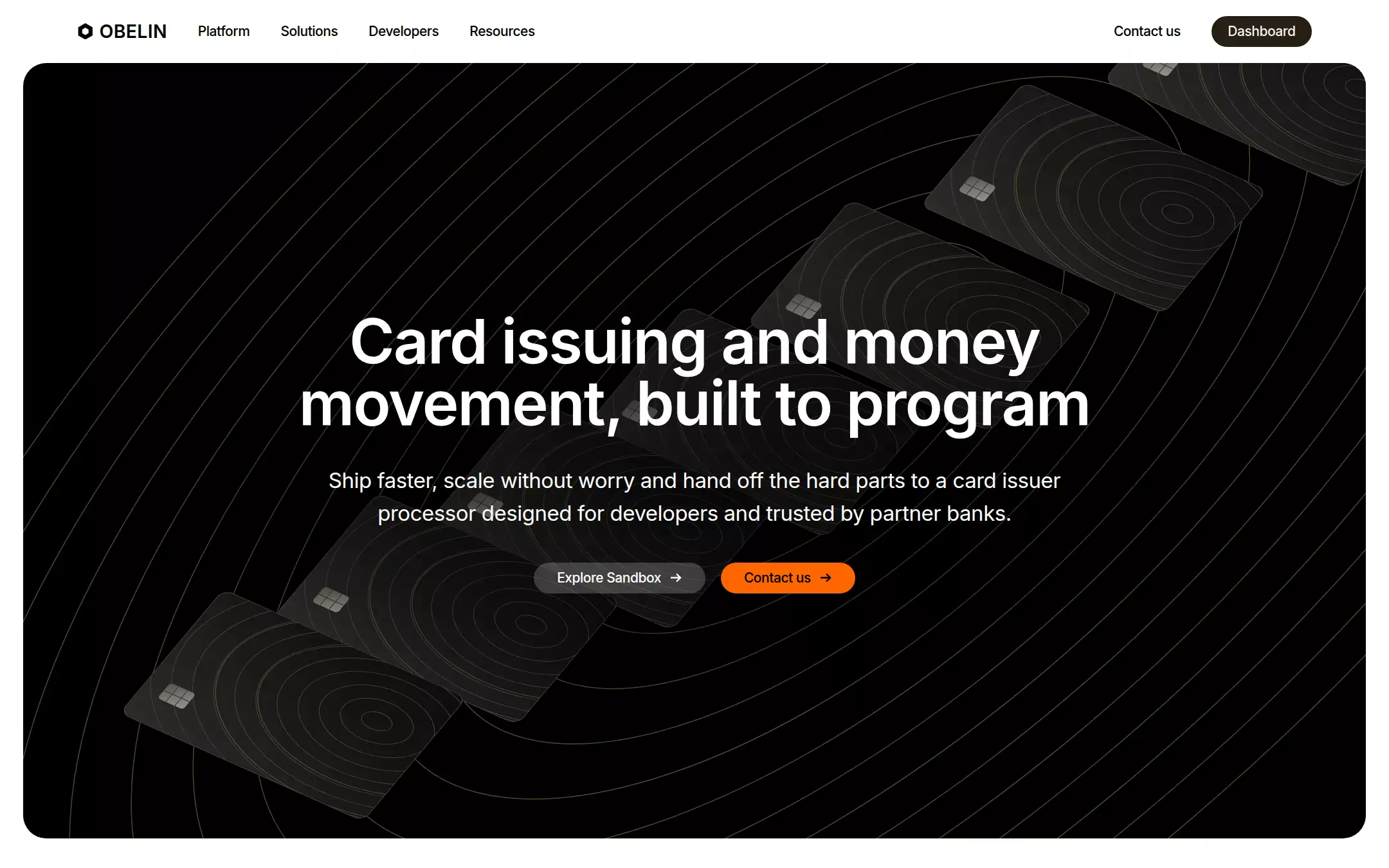
An original Obelin homepage: a white 65px header with a hexagon OBELIN mark, four links, Contact us and an umber Dashboard pill; a 1392×804 black hero vault with a 24px radius, inset 24px, where seven dark contour-lined payment cards march diagonally through fifteen fine bronze concentric ellipses; a centred two-line 64px white headline, a 22px subline and a glass Explore Sandbox pill beside an orange Contact us pill; then a customer wordmark strip, a warm-cream bento of platform cards, a mint developer strip, a lavender processing panel with floating status cards, a second black services vault, a closing call and a five-column footer.
- Best forCard issuing and payments APIs, banking-as-a-service, ledger and money-movement platforms, and any developer fintech that wants a calm, premium black-and-cream page with one orange action.
- Tech stack- Next.js (App Router) - React - TypeScript - CSS custom properties Use Next.js App Router, React and TypeScript with plain CSS custom properties for every colour, radius and spacing token. Render the page as a server component; the only client code is the processing panel's tab list and the customer strip's pause-on-hover. Self-host Inter (variable, SIL Open Font License) as woff2 through next/font/local — no remote font request. Draw the logo, arcs, cards, chip, seal, phone, charts and icons as HTML, CSS and inline SVG — never a bitmap or screenshot. Provide page metadata. Build and run the production page before capturing its preview.
The prompt. 1640 words, self-contained.
Build the "Lithic" kickstart — A black, rounded hero vault inset in a white page: dark payment cards marching diagonally through fine bronze concentric arcs, a centred 64px two-line white headline, a glass pill beside one orange pill, then warm-cream bento cards, a mint developer strip and a lavender processing panel.

## Design
Build a rebrandable landing page for a card-issuing and money-movement platform for developers. Fintech teams use it to issue debit, credit and prepaid cards, move money and run a card program through one API — sold on reliability, direct network access and a sandbox you can try today.

Create a complete landing page for Obelin, a fictional card issuer processor. This is a concept presentation, not a real company — no real bank, card network, customer, investor, person or logo. Use original branding, illustration and copy throughout.

Color: one black vault, warm neutrals and a single orange action. Obsidian #000000 is the hero vault, the services vault and all primary text. Paper #FFFFFF is the page. Warm cream #F6F3EE is every feature card. Muted #6B665E is secondary copy and captions (never a lighter grey for text). Ember #FF6600 fills the one primary button per view, always with #000000 label text (8.0:1) — never orange text, icons or borders. Smoke #E5E5E5 is every hairline. Umber #261E12 fills the header Dashboard pill, with #F6F3EE text. Section accents, each in its own zone and never mixed with Ember in a component: Architect violet #5C2999 with Lavender mist #F6F1FE for the processing panel; Lichen green #00CC88 with Mint whisper #EBFEF6 for the developer strip and status dots; Sandstone #AA8855, Bark #665233 and Honey #EEC07A only as thin decorative arc strokes and dark-card accents.

Typography: "Inter", -apple-system, "Helvetica Neue", Arial, sans-serif for everything (it stands in for a commercial grotesque). Tracking is -0.02em at every size and never loosens. Hero 64px/64px 600 at -1.28px; section headings 32px/38.4px 600 at -0.64px; card headings 24px/28.8px 600 at -0.48px; hero subline 22px/34px 400; body 16px/1.4 400; nav, buttons and labels 14px 500. Display leading is 1.0 and never wider.

Layout: a 1440px viewport. Below the hero a centred 1184px container. Radii: 24px for the vaults and every card, 160px pills for buttons, 100px for the Dashboard pill. Major sections sit at least 80px apart; cards pad 40px and gap 24px.

Header (id top): 65px tall, white, not sticky. At x 80 a 17px hexagon mark (black hexagon with a white inner hexagon) then OBELIN in 19px 600 caps. 32px later the links Platform, Solutions, Developers, Resources in 14px 500 with 32px gaps. Right-aligned, ending at x 1360: a text link Contact us (8px 16px padding), then 16px later a 32px Umber Dashboard pill.

Hero (id top): an Obsidian vault inset 24px from both sides, starting directly under the header at y 65, 1392×804 with a 24px radius and overflow hidden. Behind the copy, fifteen concentric ellipses (rx 160px growing by 78px, ry 0.46× rx) rotated -40° around (820, 360), 1px Sandstone strokes at 50% opacity. Seven dark payment cards (240×380, 16px radius, a #2E2C28 to #0C0C0B diagonal gradient, a 1px #4A453E edge, eleven nested contour ellipses in #45403A, two Sandstone ellipses at 45%, a grey chip) march in a diagonal line from the lower left (280, 666) to beyond the top right (1300, 10), each rotated -50°, skewed 16° and scaled to 0.7 so they read as cards lying in perspective. A soft black radial pool behind the copy keeps the text legible. The copy block is 960px wide and centred, the headline top at y 321: Card issuing and money movement, built to program in two white lines; 32px below a 780px white 22px/34px subline Ship faster, scale without worry and hand off the hard parts to a card issuer processor designed for developers and trusted by partner banks.; 34px below, two 32px pills 16px apart — Explore Sandbox on rgba(255,255,255,0.2) with white text and a 14px arrow, and Contact us in Ember with #000000 text and arrow.

Customer strip (id customers): white, 80px top padding; a centred 32px heading 120+ fast-growing teams, billions processed, then a 56px-lower row of eight invented monochrome wordmarks (Halden, NORTHWIRE, fernly, Quaypoint, orbit., Tessa Pay, KINDRED, Marlo) 64px apart that scroll slowly sideways and fade at both edges.

Platform bento (id platform): a 12-column grid with 24px gaps of Warm cream cards: Direct to banks and card networks (7 columns, two plain network glyphs, Bark concentric arcs bleeding off the top right), Secure and compliant at scale (5 columns, a Bark 16px 500 line Audited every year, encrypted end to end, segmented by design. and a drawn round seal), 99.99%+ uptime (4 columns, No scheduled downtime), Backed by patient, payments-native investors (8 columns, four invented investor wordmarks, Sandstone arcs top right).

Developer strip (id developers): 80px lower, a Mint whisper card with 24px radius, 40px 120px padding, Lichen green vertical arc lines in the background, 18px 500 Want to skip straight to the metal? on the left and three 16px text links with arrows on the right: Explore Sandbox, Read the docs, View the changelog.

Processing panel (id solutions): a centred 32px heading Fast, flexible and fail-safe? Not a problem., then a Lavender mist card (96px 64px padding) with violet concentric arcs behind it in three columns. Left: 24px Reliable and fast at scale, a 16px paragraph, three 14px 500 violet list items each led by an 18px filled violet check circle (Multi-currency, Rich commercial data, Transaction grouping) and a white pill Learn more in violet. Centre: three stacked white 22px-radius cards with a 1px rgba(0,0,0,0.1) border — a status list (Processing, Webhooks, API Gateway, each with a green dot and Available), Blended Interchange · Last 30 days with a 38px green 2.64%, and a bar chart of 20 green bars labelled 1hr, 30m, Now. Right: a right-aligned 22px 600 tab list — Processor Gateway in violet, then Card Issuing, Fraud Controls and Accounts in a pale lilac.

Services vault (id resources): a second Obsidian vault inset 24px with a 24px radius and 120px 104px padding, Sandstone arc lines and a drawn dark phone holding a honey-gold card in the top right. A left-aligned 32px white two-line heading Payments are complicated. Your program doesn't have to be., then two #1A1A1A cards with a 24px radius — Processor Client and Obelin Program Management — each a 24px white heading led by a 20px Honey icon, a 16px #B3ADA4 paragraph that opens with a white 500 lead sentence, and a Honey Learn more link.

Closing call (id contact): white, 120px padding, a centred 32px heading Issue your first card this week, a 16px muted line Spin up a sandbox in minutes, or talk to the team about launching., and one Ember pill Explore Sandbox.

Footer: a Smoke top rule, 64px 80px padding, a five-column grid — the wordmark with © 2026 Obelin, then Platform, Solutions, Developers and Company columns with 14px 500 black titles and 14px muted links.

## Tech stack
- Next.js (App Router)
- React
- TypeScript
- CSS custom properties

Use Next.js App Router, React and TypeScript with plain CSS custom properties for every colour, radius and spacing token. Render the page as a server component; the only client code is the processing panel's tab list and the customer strip's pause-on-hover. Self-host Inter (variable, SIL Open Font License) as woff2 through next/font/local — no remote font request. Draw the logo, arcs, cards, chip, seal, phone, charts and icons as HTML, CSS and inline SVG — never a bitmap or screenshot. Provide page metadata. Build and run the production page before capturing its preview.
Where the repo you are working in already has an equivalent in place, keep the repo's choice and say which one you kept.

## Everything else
Keep Obelin clearly fictional and rebrandable: no real bank, card network mark, customer, investor, person or logo, and no source screenshot, product name or copy. One Ember button per view and its label is always #000000; Ember never colours text, icons or borders; violet and Ember never share a component. Text pairs clear WCAG AA: #FFFFFF on #000000, #000000 on #FF6600 (8.0:1), #000000 and #6B665E on #FFFFFF and #F6F3EE, #F6F3EE on #261E12, #5C2999 on #F6F1FE, #B3ADA4 on #1A1A1A. The only shadow is 0 16px 32px rgba(92,41,153,0.08) under the floating status cards. Arcs, cards and seals are decorative and hidden from assistive technology. Every link leads to a real anchor on the page; the page loads no analytics or tracking script and shows no cookie banner. Content is visible without JavaScript; the customer strip's scroll and any arc drift stop for prefers-reduced-motion. Every control shows a 2px focus ring (#FFFFFF on black, #000000 on light) with a 2px offset. At 360px the header collapses to the mark, Dashboard and a Menu button, the vault inset drops to 12px, the headline drops to 40px/40px, the subline to 18px, the cards in the art shrink to a single line along the top, the bento stacks to one column, the processing panel stacks, and the page never overflows horizontally.

### Non-negotiables
- Responsive from 360px through desktop — no horizontal page overflow at any width. Deliberately scrollable regions stay within the viewport and remain keyboard and touch accessible.
- Every text/background pair clears WCAG AA (4.5:1 for body, 3:1 for large text); adjust a tint rather than shipping a failing pair.
- Fully keyboard operable, with a visible focus ring drawn in the accent colour.
- Honour `prefers-reduced-motion` — swap every transition for an instant state change.
- Write real copy in the voice described above; no lorem ipsum and no TODO placeholders.
- Use system or self-hosted fonts and CSS/SVG-drawn graphics — do not depend on a remote image or icon service.

Build the whole page end to end and show me the result running — not a description of it.