 Fredrin
SaaS
Linear
A quiet release workspace with one bright next step.
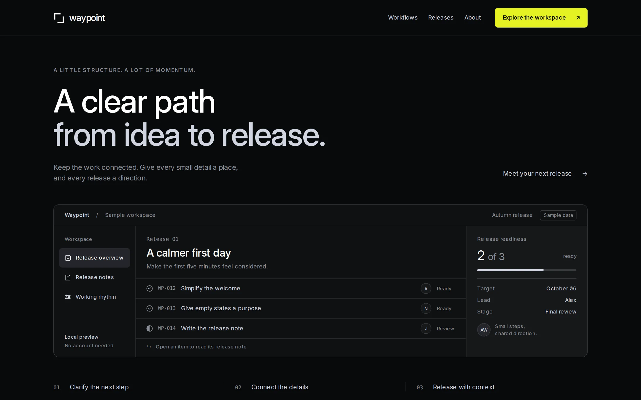
An original Waypoint release-planning page with precise dark typography, a lime action and a real HTML sample workspace. Native release disclosures explain the work behind a small launch.
- Best for
- Small product teams and independent software makers presenting a focused planning tool.
- Tech stack
- Use the latest stable Next.js App Router, React and TypeScript, with CSS custom properties and a small global stylesheet. Keep equivalent technologies already present in the project. Technology list: - Next.js (App Router) - React - TypeScript - CSS custom properties Render the sample as semantic server components. Use native details/summary for the release notes and working agreement, native progress with an accessible label for readiness, and fragment anchors for on-page navigation. Use next/link only for application routes. No custom client runtime is needed. Host an openly licensed Inter font locally when available, with a system-ui fallback; ui-monospace replaces licensed monospace faces. Build the original geometric mark as a small inline decorative SVG. No paid services, database, analytics, cookies, API keys, external asset hosts or accounts are needed. Never use an image of the workspace in place of the actual HTML.
- Tags
- product · releases · dark · workspace · minimal
The creation prompt
1594 words, self-contained. Paste it into a chat session with your coding agent and it builds Linear end to end.
Build the "Linear" kickstart — A quiet release workspace with one bright next step.

## Design
Build a rebrandable release-planning landing page with an explorable sample workspace. Use the font stack Inter, system-ui, sans-serif.

Build Waypoint, a fictional release-planning product. Use the following design tokens: canvas #08090A, first surface #0F1011, nested surface #161718, structural borders #23252A and #383B3F, headings #FFFFFF, body #D0D6E0, supporting text #8A8F98. Reserve #E4F222 with #08090A text for one primary action. Local Inter with system-ui fallback is the sole proportional family; set cv01, ss03 and zero font features. Display is 72px, weight 510, line-height 1.04 and tracking -0.022em. Body is 16px/1.5; metadata 13px; monospace appears only in identifiers. Use a 1200px content width, 96px section rhythm, 24px panel padding and a 4px spacing base. Panel corners are 12px; controls 6px; compact tags 4px. Separate surfaces with fine borders rather than outer shadows. Adaptation: use readable Fog for all small supporting text rather than darker Ash, and keep tap targets at least 44px. No gradients, illustrations or decorative glow are needed for this original sample.

Original composition at 1440×900: center the page in 1200px with 120px side gutters. The 80px navigation has a white original waypoint mark (two offset, open square corners, not a borrowed logo), the lowercase wordmark at left and Workflows / Releases / About anchors toward the right. A single lime Explore the workspace anchor ends the row. Separate navigation from the canvas with a subtle full-width rule. Keep the logo around 20px and navigation around 13px.

Start the introduction 68px below the navigation. Put the small overline A LITTLE STRUCTURE. A LOT OF MOMENTUM. above a left-aligned two-line headline, A clear path / from idea to release. Use real selectable HTML text, with the first line white and second line #D0D6E0. After 24px, put the lead Keep the work connected. Give every small detail a place, and every release a direction. in a 520px column. To its right align the quiet text link Meet your next release with an arrow. Leave 48px before the workspace, whose upper edge should be around y=456.

The workspace is a real explorable HTML section, never a flattened screenshot asset. Its 1200×344px initial frame has a 12px outline, a 48px top bar and three areas underneath. The top bar reads Waypoint / Sample workspace on the left, and Autumn release with an outlined Sample data tag on the right. Use a 184px left rail, a flexible center and a 272px right overview. The left rail labels Workspace and contains actual anchors: Release overview (selected with a neutral #23252A surface), Release notes, Working rhythm. Give each a simple local outline icon and a clear text label. A small footer says Local preview / No account needed. Do not add pretend dropdowns, search boxes or menu dots.

The center begins with Release 01 and a 24px heading, A calmer first day, followed by a one-line release purpose. A thin divider precedes three native details/summary release rows. Each row shows a monospace identifier, a task title, a small owner initial, and a textual Ready or Review status. Two Ready rows use an outlined checked circle; Review uses a half-filled circle, all grayscale. Each row must expand into its original release note on click or keyboard activation; expanded notes increase the frame height naturally. Every task, identifier and status is HTML text. The right overview uses the nested surface with a small Release readiness label, large 2 of 3 count, a grayscale native progress element, a rule and three definition rows: Target / October 06; Lead / Alex; Stage / Final review. Finish with a muted circular AW avatar and a short note, Small steps, shared direction. The readiness count is sample task data, not a marketing result.

Below the workspace leave 56px, then place a narrow horizontal band of three numbered phrases separated by fine vertical rules: 01 / Clarify the next step; 02 / Connect the details; 03 / Release with context. These are plain text, not cards. Below the first viewport, the Working rhythm section uses a 48px heading, Make room for the work that matters, and a two-column explanation. Pair it with a native Working agreement disclosure explaining the sample's local-only behavior. The About and footer section has a small Original product study label, one restrained sentence about the fictional sample, and a Back to top anchor. Do not add pricing, customer marks, testimonials, a form or signup flows.

Under 760px, keep all navigation links in a wrapping row and stack the primary action without clipping. Use 20px gutters and clamp the headline between 40px and 72px. Convert the workspace to one column: rail links become a wrapping row, release records remain vertical and the overview follows them. Stack the three workflow phrases and the working-rhythm columns. Under 400px use 16px gutters and wrap release-row metadata beneath each title. The document must have no horizontal overflow at 320px. Keep the initial content visible with JavaScript disabled, use one h1 and landmarks, offer a skip link, and provide visible white focus rings with offset on every interactive element. All text must meet WCAG AA. Avoid sticky overlays, scroll-jacking, hidden animations and timed content.

## Tech stack
Use the latest stable Next.js App Router, React and TypeScript, with CSS custom properties and a small global stylesheet. Keep equivalent technologies already present in the project. Technology list:
- Next.js (App Router)
- React
- TypeScript
- CSS custom properties

Render the sample as semantic server components. Use native details/summary for the release notes and working agreement, native progress with an accessible label for readiness, and fragment anchors for on-page navigation. Use next/link only for application routes. No custom client runtime is needed. Host an openly licensed Inter font locally when available, with a system-ui fallback; ui-monospace replaces licensed monospace faces. Build the original geometric mark as a small inline decorative SVG. No paid services, database, analytics, cookies, API keys, external asset hosts or accounts are needed. Never use an image of the workspace in place of the actual HTML.
Where the repo you are working in already has an equivalent in place, keep the repo's choice and say which one you kept.

## Everything else
Create a rebrandable product page for the fictional Waypoint release-planning tool. Use the original headline A clear path from idea to release. The lead is Keep the work connected. Give every small detail a place, and every release a direction. The sample should feel useful and considered without inventing real customers, performance statistics or commercial availability. Page sections in order:
1. Compact navigation
2. Release-planning introduction
3. Explorable release workspace
4. Working rhythm
5. About and footer

Use these exact sample records. Release 01 is called A calmer first day and its purpose is Make the first five minutes feel considered. WP-012 / Simplify the welcome / owner Alex / Ready: A short introduction replaces the long setup tour. People can find the next step without reading a manual. WP-013 / Give empty states a purpose / owner Noor / Ready: Each empty view explains what belongs there and suggests one small next action. WP-014 / Write the release note / owner Jules / Review: Explain what changed, who it helps and where to begin. Keep the language clear and the promises small. Readiness is 2 of 3, derived from these two Ready records; the target label is October 06, the lead is Alex and the stage is Final review. All names and records are fictional.

Workflows and Working rhythm link to the working-rhythm section. Releases, Explore the workspace and Meet your next release link to the workspace. About links to the footer. In the workspace, Release overview links to the readiness block and Release notes links to the task list. Each task summary opens its full release note and can be closed again, without JavaScript. Keep the native disclosure semantics, keyboard handling and focus indication intact.

Under Make room for the work that matters, write two paragraphs: Clarify the next step — A useful plan starts small. Give the work a name, a reason and someone to carry it forward. Keep the context close — A release is more than a list of changes. Let the decisions travel with the details, so the next person can pick up the thread. The Working agreement disclosure says: This is a local, fictional workspace. Open a release note to explore the sample; nothing is saved or sent. Real collaboration and publishing are outside this demo. The footer says: Waypoint is an original product study for thoughtful software teams. Sample content only. Do not imply that an account can be created or data submitted. End with Back to top. Set the document title to Waypoint — A clear path to release.

### Non-negotiables
- Responsive from 360px through desktop — no horizontal page overflow at any width. Deliberately scrollable regions stay within the viewport and remain keyboard and touch accessible.
- Every text/background pair clears WCAG AA (4.5:1 for body, 3:1 for large text); adjust a tint rather than shipping a failing pair.
- Fully keyboard operable, with a visible focus ring drawn in the accent colour.
- Honour `prefers-reduced-motion` — swap every transition for an instant state change.
- Write real copy in the voice described above; no lorem ipsum and no TODO placeholders.
- Use system or self-hosted fonts and CSS/SVG-drawn graphics — do not depend on a remote image or icon service.

Build the whole page end to end and show me the result running — not a description of it.
Pasting the prompt is step one. Fredrin runs the agent that builds it, one ticket per look.