LaunchDarkly
A runtime-control homepage: a black gridded stage cut by carbon header tabs, an 80px geometric headline, one lime Book a demo button and a strip of dark product widgets rising from the fold.
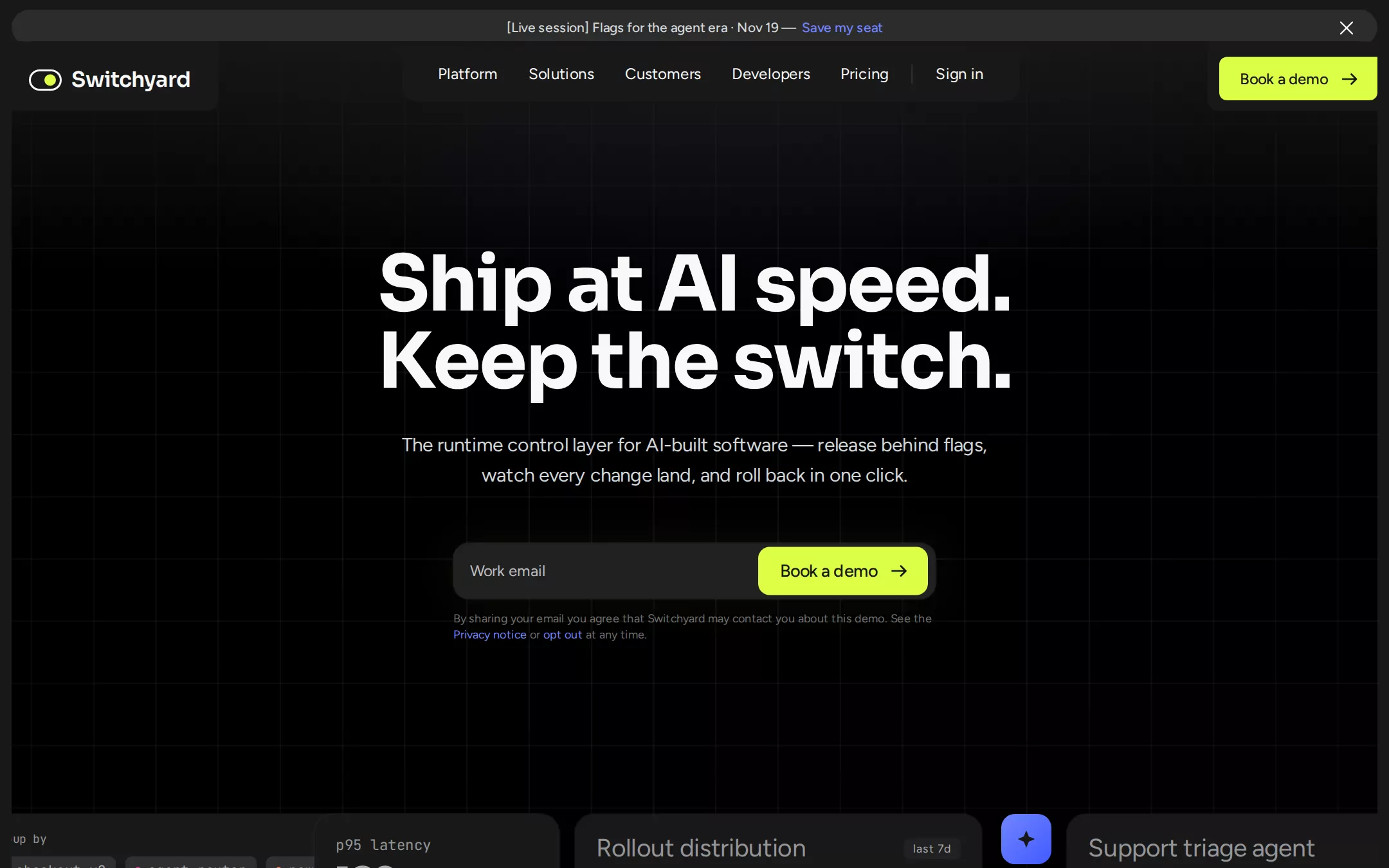
An original Switchyard homepage: a 37px announcement pill, #191919 header tabs cut into the top of a black 1060px stage — a logo tab, a centred 640px nav tab with inverse fillets and a lime Book a demo button — a faint 64.5px grid, a centred two-line 80px headline, a 20px lead and a 500px email form with an inset lime button, then a strip of dark product widgets rising from the fold. Below: a wall of light customer tiles, a light capability panel with numbered tabs and a five-row gradient accordion, and a carbon footer.
- Best forFeature flags, progressive delivery, experimentation, AI-agent guardrails and other release-control tools that want a dark, confident first screen with one email capture.
- Tech stack- Next.js (App Router) - React - TypeScript - CSS custom properties Use Next.js App Router, React and TypeScript with plain CSS custom properties for every colour, gradient, radius and spacing token. Render the page as a server component; only the announcement dismiss and the capability accordion need small client islands holding their state in memory. Self-host Sora (variable, 600–700), Figtree (variable, 400–500) and JetBrains Mono (400), all under the SIL Open Font License, as woff2 files through next/font/local — no remote font request. Draw the logo mark, arrows, dismiss cross, badges and icon tiles as inline SVG, and build every widget and product panel as HTML and CSS, never a screenshot or canvas, so every render is identical. Provide page metadata. Build and run the production page before capturing its preview.
The prompt. 1628 words, self-contained.
Build the "LaunchDarkly" kickstart — A runtime-control homepage: a black gridded stage cut by carbon header tabs, an 80px geometric headline, one lime Book a demo button and a strip of dark product widgets rising from the fold.

## Design
Build a rebrandable landing page for a feature-flag and runtime-control platform: release behind flags, watch every change land, guide AI agents in production and roll back in one click, for teams whose coding agents ship faster than people can review.

Create a complete landing page for Switchyard, a fictional runtime-control platform. This is a concept presentation, not a real company — no real product, customer, person or logo. Use original branding, artwork and copy throughout.

Color: a near-black page with one black stage. Carbon #191919 is the page canvas, the header tabs and every widget card. Stage #000000 is the hero card. Surface #212121 is the hero form and small pill buttons. Smoke #2C2C2C is the announcement pill and every hairline or card border. Chip #2E2E2E fills mono chips and progress tracks. Paper #F8F8F8 is the logo, the headlines and the navigation. Ash #D1D6D9 is the hero lead and announcement text. Fog #A7A9AC is secondary copy, widget numbers and the footer; Steel #939598 is widget labels; Slate #6D6E71 is the consent line; Placeholder #BCBEC0 is the email placeholder. Lime #DDFF46 is the only call-to-action fill — every Book a demo button — always with #191919 text. Signal Violet #7084FF is reserved for inline links. The capability section switches to a light panel: Paper #F8F8F8 ground with #191919 type and five gradient icon tiles — lime #DDFF46 to #7BE08A, violet #7084FF to #405BFF, ember #FF7955 to #FF35A2, orchid #F07AE0 to #FFB3EC and amber #FFE14D to #FFB800.

Typography: headings use "Sora", ui-sans-serif, system-ui, -apple-system, "Segoe UI", sans-serif — the hero headline 80px/80px weight 700 with -2px letter-spacing, centred; the capability heading 64px/64px weight 700 (-2px); accordion titles 32px/40px weight 700 (-1px); widget numbers 38px/38px weight 600 (-0.76px). Reading copy uses "Figtree", ui-sans-serif, system-ui, -apple-system, "Segoe UI", sans-serif: navigation 16px/24px weight 400, the hero lead 20px/31px (-0.3px) in #D1D6D9, buttons 16px/16px weight 500 (-0.16px) and the hero form button 18px/18px weight 500, widget titles 26px/31px, body copy 16px/24px, the consent line 12px/16.8px. Widget labels, chips and metric deltas use "JetBrains Mono", ui-monospace, SFMono-Regular, Menlo, monospace at 13–15px with 0.26–0.5px tracking. Self-host all three families.

Layout: a 1440px viewport. The page has a 12px gutter on every side, so the stage spans x 12 to 1428. Radii: 999px for the announcement pill, 24px for the stage and section panels, 20px for widget cards, 16px for the hero form and nav tab corners, 12px for the hero button and logo tab, 8px for the header button, 6px for chips. No drop shadows; depth comes from 1px rgba(255,255,255,0.05) rings and the black-on-carbon contrast.

Announcement bar: at y 10, a 37px pill across the full width in #2C2C2C, centred 14px/21px weight 500 #D1D6D9 text [Live session] Flags for the agent era · Nov 19 — followed by Save my seat in #7084FF; a 16px dismiss cross sits 24px from the right edge.

Navigation: the header is cut out of the stage's top edge as #191919 tabs. At the left a 214×72px logo tab with a 12px bottom-right radius holds the mark — a 32×20px outlined pill switch with a 12px lime knob on its right — and the wordmark Switchyard in 22px weight 600 (-0.4px). In the centre a 640×56px tab from x 417, with 16px bottom radii and 16px inverse fillets where it meets the band above, holds Platform, Solutions, Customers, Developers and Pricing at 16px side padding, a 1px #3A3A3A divider and Sign in. At the right a 164×45px Lime Book a demo button with an arrow, 8px radius and a square top-right corner, its top at y 59.

Hero (id top): the stage is a 1060px black card with a faint 64.5px grid of rgba(255,255,255,0.055) lines, masked so it fades toward the edges, a #191919 wash over its top 22% and a soft rgba(112,132,255,0.10) glow at top centre. The headline Ship at AI speed. / Keep the switch. starts at y 255; the 608px lead The runtime control layer for AI-built software — release behind flags, watch every change land, and roll back in one click. starts at y 446; at y 563 a 500×58px #212121 form with a 16px radius and a 1px white-alpha ring holds a Work email field and, inset 4px, a 176×50px Lime Book a demo button with a 12px radius; 12px below, the 500px consent line with two #7084FF links.

Widget strip: from y 844 a row of dark #191919 widget cards rises into the bottom of the stage and runs off both edges — a Group by card of mono chips each led by a 6px coloured dot (checkout-v2, agent-router, new-pricing, search-ai), an Error rate 0.2% card and a p95 latency 182ms card each with a -6.0% / -13.7% mono delta chip, a Rollout distribution card with a last 7d pill and two progress bars (checkout-v2 50%, agent-router 35%), a Support triage agent card with two variation swatches and an All variations pill, and two 52px gradient badges — lime and violet — between them. A 120px gradient to rgba(0,0,0,0.65) fades the strip's foot.

Customer wall (id customers): a row of six #F8F8F8 tiles 120px tall and 272px wide on the #191919 page, 10px apart, with mixed radii — 24px, a 60px pill, a 24px card with one 80px corner — each holding an original black text wordmark (Pinegrove, kilnworks, NORTHBEAM, Orla & Co, tessel, Hartwell).

Capability tabs (id platform): a #F8F8F8 panel with a 24px radius and 64px padding. On the left, sticky, the 64px heading Control every / change in / production. and below it five 48px numbered pills 01–05 in 16px type with 1px #191919 borders, the active one filled with its row's gradient. On the right, from x 618, five accordion rows between 1px #191919 rules: a 40px gradient icon tile beside a 32px title — Ship agent-written code with confidence., Guide AI agents in production., Tune model cost and quality., Heal regressions automatically., Experiment without pausing. The open row shows a 16px #191919 paragraph at 250px width, a 50px outlined Learn more button with an arrow and a 12px radius, and a 420×290px card whose gradient ground carries a white grid and a #191919 product panel — Rollout schedule rows 5% for 6 hours and 25% for 12 hours in #2C2C2C fields.

Footer: on #191919, a 1px #2C2C2C top rule, the mark and wordmark, four columns of 14px #A7A9AC links (Platform, Solutions, Developers, Company) and © 2026 Switchyard Labs in 12px JetBrains Mono #6D6E71.

## Tech stack
- Next.js (App Router)
- React
- TypeScript
- CSS custom properties

Use Next.js App Router, React and TypeScript with plain CSS custom properties for every colour, gradient, radius and spacing token. Render the page as a server component; only the announcement dismiss and the capability accordion need small client islands holding their state in memory. Self-host Sora (variable, 600–700), Figtree (variable, 400–500) and JetBrains Mono (400), all under the SIL Open Font License, as woff2 files through next/font/local — no remote font request. Draw the logo mark, arrows, dismiss cross, badges and icon tiles as inline SVG, and build every widget and product panel as HTML and CSS, never a screenshot or canvas, so every render is identical. Provide page metadata. Build and run the production page before capturing its preview.
Where the repo you are working in already has an equivalent in place, keep the repo's choice and say which one you kept.

## Everything else
Keep Switchyard clearly fictional and rebrandable: no real company, flag product, customer, statistic or person — every name and wordmark is invented. Keep one call-to-action colour: Lime #DDFF46 fills only Book a demo buttons, the logo knob, the active first tab and the first icon tile, and its text is always #191919; Signal Violet #7084FF is only for inline links. Text pairs clear WCAG AA: #F8F8F8 and #D1D6D9 on #000000 and #191919, #A7A9AC on #191919, #191919 on #DDFF46 and on #F8F8F8. Every link leads to a real anchor on the page, and the page loads no analytics or tracking script and shows no cookie banner. The email form sends nothing: submitting it shows an inline thank-you note held in memory. Content is initially visible; the accordion opens and closes over 200ms and the widget strip is static — every animation and transition stops for prefers-reduced-motion. Every control shows a 2px #7084FF focus ring with a 2px offset. Widgets and decorative badges are hidden from assistive technology. At 360px the header keeps the logo, Book a demo and a Menu button, the headline drops to 40px/42px, the form stacks its field above a full-width button, the widget strip scrolls horizontally inside its own frame, the customer tiles wrap two per row, the capability heading sits above the accordion, and the page never overflows horizontally.

### Non-negotiables
- Responsive from 360px through desktop — no horizontal page overflow at any width. Deliberately scrollable regions stay within the viewport and remain keyboard and touch accessible.
- Every text/background pair clears WCAG AA (4.5:1 for body, 3:1 for large text); adjust a tint rather than shipping a failing pair.
- Fully keyboard operable, with a visible focus ring drawn in the accent colour.
- Honour `prefers-reduced-motion` — swap every transition for an instant state change.
- Write real copy in the voice described above; no lorem ipsum and no TODO placeholders.
- Use system or self-hosted fonts and CSS/SVG-drawn graphics — do not depend on a remote image or icon service.

Build the whole page end to end and show me the result running — not a description of it.