 Fredrin
Blog
Kinfolk
An editorial broadsheet on bone-white linen: ink-black serif at one weight, quiet photographic plates and a single sage-paper band.
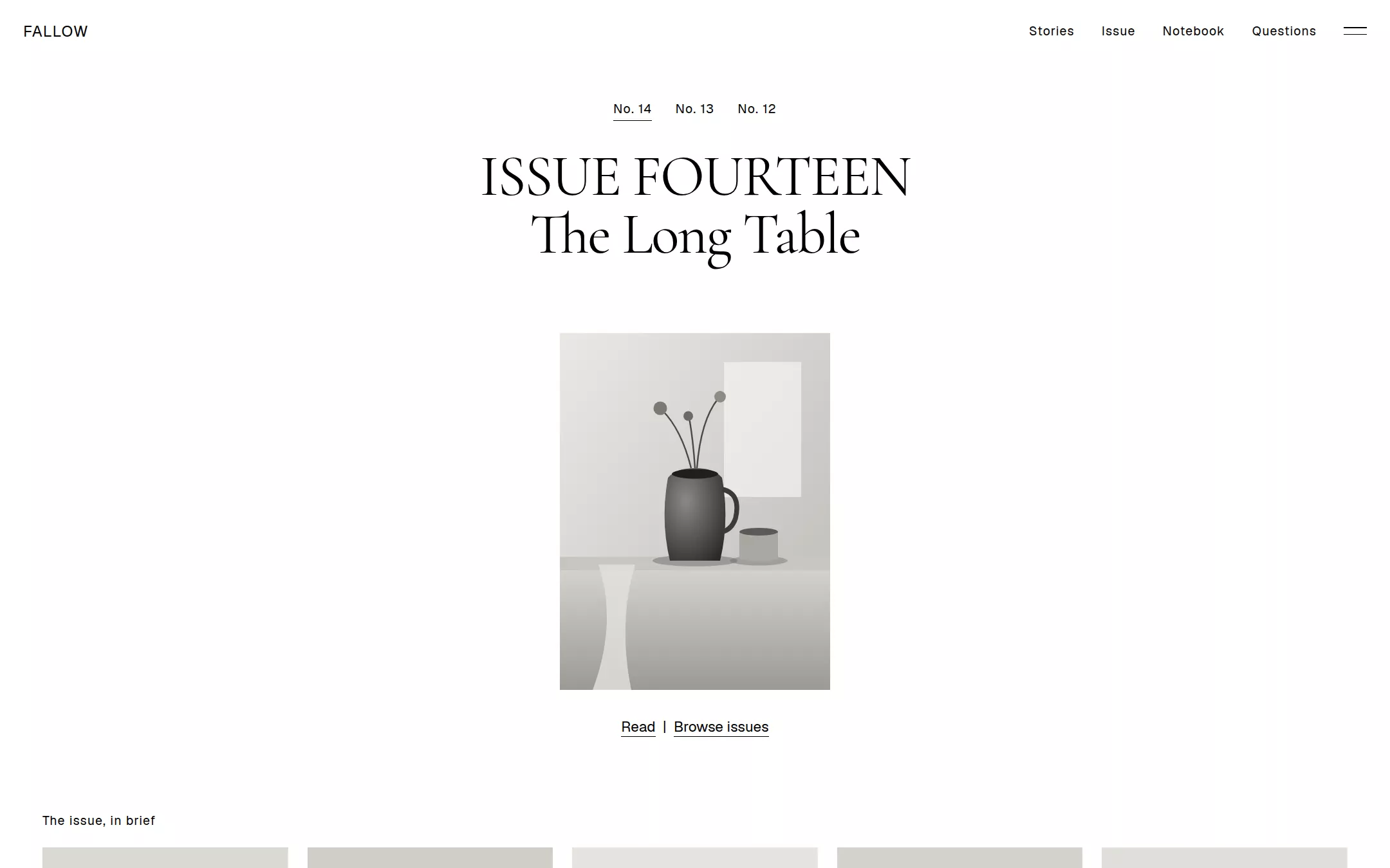
An original Fallow Quarterly magazine page: a white header with a tracked wordmark and a two-line hamburger, a centred issue cover with a local No. 14 / 13 / 12 switcher and a Read | Browse issues link pair, a five-up story grid of photographic SVG plates, a full-bleed interior feature with white serif type, the single sage-paper band holding a feature title block and a Latest stories list, native questions and a black colophon bar with an outlined Subscribe button.
- Best for
- Independent magazines, quarterly journals, lifestyle and interiors publications, studio lookbooks and any slow, image-led brand that should feel like a printed spread rather than an app.
- Tech stack
- - Next.js (App Router) - React - TypeScript - CSS custom properties - Native HTML disclosures Use Next.js App Router, React and TypeScript with plain CSS custom properties and original inline SVG for the wordmark-free plates and glyphs. Preserve equivalent tools already installed in the host project. Render the page as a server component; the only client components are the issue switcher and the subscribe reveal, each keeping local React state and sending nothing. Native details and anchors need no JavaScript. Use local font stacks only — no remote font, image, photo, logo, icon, video or analytics host. Provide page metadata. Build and run the production page before capturing its preview.
- Tags
- blog · magazine · editorial · light · serif · minimal
The creation prompt
1731 words, self-contained. Paste it into a chat session with your coding agent and it builds Kinfolk end to end.
Build the "Kinfolk" kickstart — An editorial broadsheet on bone-white linen: ink-black serif at one weight, quiet photographic plates and a single sage-paper band.

## Design
Build a rebrandable independent print-magazine landing page.

Create a complete landing page for Fallow Quarterly, a fictional independent magazine about slow living, home, craft and the people who make them. Its core idea: an editorial broadsheet on bone-white linen — generous margins, ink-black serif at a single weight, and one warm sage-paper band for section breaks, so the page reads less like a website than a gallery wall where the pictures and headlines are the exhibits. This is a concept presentation, not a real publication — no shop, checkout, subscription prices, accounts, real contributors, photographers, stockists, testimonials or press quotes. Use original branding, artwork and copy throughout.

Color: the palette is monochromatic. Bone White #FFFFFF is the canvas and every card. Ink Black #000000 is ALL type, every border, every icon stroke and every 1px hairline — the only foreground colour. Paper Mist #F4F4F4 is only for the input field and small inset blocks. Sage Paper #DBDED5 is the single chromatic moment and appears ONLY as one full-bleed section band — never on small surfaces, badges or icons — and it never sits directly next to a Paper Mist surface. Reverse type (#FFFFFF on #000000) appears only in the colophon bar and over the full-bleed feature plate. No accent colour, no gradients in the UI, no filled buttons.

Typography: every family uses weight 400 only — never bold, medium or italic. Display is a carved book serif — "Kinfolk Serif Display", "Cormorant Garamond", "Playfair Display", "EB Garamond", Georgia, serif — with font-feature-settings "liga" on, "dlig" on: the hero issue title 60px, line-height 1.0, letter-spacing -0.025em; section titles and article headlines 50px/1.04 at -0.01em; decks 32px/1.16 at -0.005em; 25px/1.19 for list headlines. Reading text is a text serif — "Kinfolk Serif Text", "Cormorant Garamond", Lora, Georgia, serif — at 20px/1.33 for lead paragraphs and 15px/1.5 for excerpts; never set serif below 15px. UI is a quiet grotesque — "Kinfolk Sans", Inter, "Söhne", system-ui, sans-serif — for navigation, labels, metadata and buttons: 13px/1.2 with 0.06em tracking for labels and captions, 15–16px/1.5 for navigation and card headlines; never track anything wider than 0.06em. All fonts are installed locally, no remote font request. Shapes: 0px radius on every card, button, input and image; a 2px radius only on the focus outline of inline text links. Spacing: 4px base, 20px element gaps and card padding, 80px between sections, 120px around the cover, content inside a 1400px column with 24px page padding. Elevation: none — no shadows or blur; hierarchy is typographic scale, whitespace and the Sage band alone.

Imagery: the source relies on full-bleed, desaturated editorial photography. Recreate it as original inline-SVG plates — quiet still lifes and interiors (a linen-covered table with a stoneware jug, a window with a chair in soft light, folded blankets, a wooden bowl of pears, a dim hallway) drawn in flat, film-like grays from #1A1A1A to #E9E9E4 with soft tonal steps. Plates are 0px radius, no border, no overlay tint, and each carries a text alternative. No stock photos, remote images or illustrations with outlines; the plates should read as photographs at a glance.

Header bar: white, 64px tall, no border, no shadow. Left, with 24px page padding: the wordmark FALLOW in the grotesque at 16px with 0.06em tracking. Right: 13px grotesque links Stories, Issue, Notebook, Questions — each an anchor to a real section — and a two-line hamburger glyph drawn as two 1px black strokes 24px wide that opens nothing and is labelled Menu (sample).

Issue cover: a centred, symmetrical composition on white. A two-line serif title in the display face at 60px — ISSUE FOURTEEN on the first line (all caps) and The Long Table on the second (title case) — then, 120px below, a single magazine-cover plate at about 280×370px with 0px corners and no shadow, showing an original still life. Beneath the cover, a centred Cover link pair in 15px grotesque: Read | Browse issues, the pipe a plain print separator and each word underlined by a 1px black line. Above the title, a local issue switcher of three 13px grotesque labels — No. 14, No. 13, No. 12 — as plain text buttons with a 1px underline on the selected one; choosing one swaps the title and cover plate from local state and sends nothing.

Story grid (id stories): a 13px grotesque label The issue, in brief, then five equal columns with 20px gaps on white. Each card has no background, border or shadow: a full-column-width 4:5 plate with 0px radius, 20px below it a 13px grotesque category label (Home, Craft, Travel, Food, Essay) with 0.06em tracking, 8px gap, a 16px grotesque headline, 10px gap, then a 15px serif excerpt at line-height 1.5 clamped to two lines. Every headline is fictional and labelled sample.

Full-bleed feature (id issue): an edge-to-edge 100vw plate about 640px tall — a dim interior with a single window of light — with no radius, no border and no tint. White type sits in the lower-left negative space with 32px padding: a 13px grotesque category label Feature · Sample, then a 50px serif headline in #FFFFFF at weight 400, A House That Keeps Its Own Time, and a 15px grotesque link Read the feature underlined in white.

Sage band (id notebook): the one full-bleed #DBDED5 band, 80px vertical padding. Left two-thirds: a centred feature title block — a 25px grotesque eyebrow Words by a sample contributor, a 50px serif title On Mending, Slowly, a 32px serif deck Notes from a winter spent repairing what we already own, with 60px of rhythm between the lines, then a 20px serif lead paragraph. Right third: a Latest stories list — a 13px all-caps grotesque label LATEST STORIES with 0.06em tracking, then five items, each a 13px grotesque category label over a 15px serif title, preceded by a hyphen glyph in black, 20px apart, no fills or borders.

Questions (id questions): white, a 50px serif headline Questions, then native details elements divided by 1px black hairlines, 20px serif summaries and a thin plus glyph that turns to a minus when open: Is Fallow Quarterly real? — no, it is a fictional concept. Who are the contributors? — no one; every name and story is invented for this page. Can I subscribe? — no; the form below is a sample and sends nothing.

Colophon bar: a full-width #000000 strip about 48px tall pinned to the bottom of the page flow (not sticky over content). Left: 13px grotesque #FFFFFF helper text A quiet magazine, four times a year (sample). Right: a ghost text link Letters and the outlined Subscribe button — 1px #FFFFFF hairline border, 0px radius, 9px 13px padding, 13px grotesque label with 0.06em tracking, no fill — which reveals an inline Paper Mist email input and says Nothing is sent — this is a sample. Beneath the strip, a 13px line on white: Fallow Quarterly is a fictional concept. Not a real publication.

At 760px and below: 16px page padding, the header keeps only the wordmark and hamburger, the hero title drops to 40px, the cover plate shrinks to 220px wide, the story grid becomes a two-column grid then one column at 480px, the feature headline drops to 32px, the Sage band stacks the title block above the Latest stories list, and the colophon wraps. The page fits a 360px viewport with no horizontal page overflow. Use semantic landmarks, one h1, a skip link, visible 2px Ink focus outlines offset 2px on every control, text alternatives for every plate, and keyboard-operable switcher, disclosures and form.

## Tech stack
- Next.js (App Router)
- React
- TypeScript
- CSS custom properties
- Native HTML disclosures

Use Next.js App Router, React and TypeScript with plain CSS custom properties and original inline SVG for the wordmark-free plates and glyphs. Preserve equivalent tools already installed in the host project. Render the page as a server component; the only client components are the issue switcher and the subscribe reveal, each keeping local React state and sending nothing. Native details and anchors need no JavaScript. Use local font stacks only — no remote font, image, photo, logo, icon, video or analytics host. Provide page metadata. Build and run the production page before capturing its preview.
Where the repo you are working in already has an equivalent in place, keep the repo's choice and say which one you kept.

## Everything else
Keep Fallow Quarterly clearly fictional and rebrandable: no source wordmark, covers or photography, no shop, prices, subscription counts, real contributors, photographers, stockists, testimonials or press quotes. Every headline, contributor and story is labelled sample. The system is monochrome: Ink Black #000000 is the only foreground colour, Sage Paper #DBDED5 is used once as a full-bleed band and never on small surfaces, and Paper Mist #F4F4F4 never touches the Sage band. Every family is weight 400 — never bold or italic — with negative tracking at display sizes and at most 0.06em at 13px. Every action is a text link or a 1px hairline-bordered button; nothing is filled. 0px corners everywhere, no shadows or blur. Plates are original inline SVG with text alternatives. Every link leads to a real section on the page; nothing is sent or stored. Deliver initially visible content with no scroll reveals, marquees, parallax or auto-advancing anything; hover and focus are a 150ms underline change, disabled for prefers-reduced-motion. WCAG AA contrast on every text/background pair, keyboard-operable controls and disclosures, and a 360px layout without horizontal page overflow.

### Non-negotiables
- Responsive from 360px through desktop — no horizontal page overflow at any width. Deliberately scrollable regions stay within the viewport and remain keyboard and touch accessible.
- Every text/background pair clears WCAG AA (4.5:1 for body, 3:1 for large text); adjust a tint rather than shipping a failing pair.
- Fully keyboard operable, with a visible focus ring drawn in the accent colour.
- Honour `prefers-reduced-motion` — swap every transition for an instant state change.
- Write real copy in the voice described above; no lorem ipsum and no TODO placeholders.
- Use system or self-hosted fonts and CSS/SVG-drawn graphics — do not depend on a remote image or icon service.

Build the whole page end to end and show me the result running — not a description of it.
Pasting the prompt is step one. Fredrin runs the agent that builds it, one ticket per look.