Jeton
A full-bleed signal-red wallet homepage: stacked glossy discs tumbling down the top right, a 106px two-line white headline in the lower left, outlined store badges, a frosted audience dock, then quiet white sections with 110px red headings.
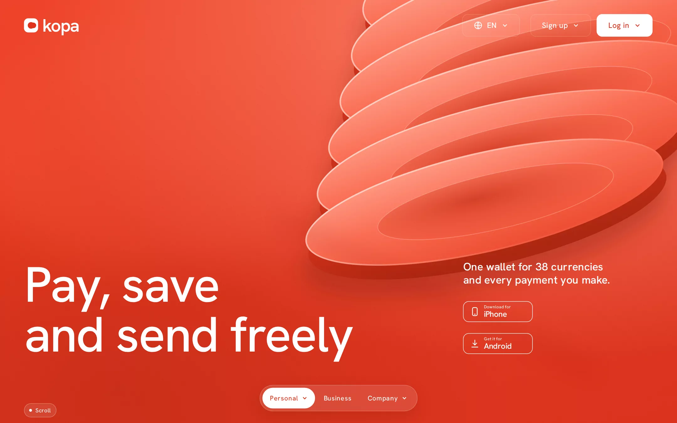
An original Kopa homepage: a 930px full-bleed #E0321A hero with a peach glow top right, six glossy stacked discs with thick dark rims tumbling diagonally behind the nav, a white kopa wordmark at (51, 38), three 48px 12px-radius header buttons ending in a white Log in, a 106px Pay, save / and send freely headline at (51, 553), a 23px side line and two outlined 148×44 store badges at x 985, a Scroll pill and a frosted 84px-radius Personal / Business / Company dock; then white sections with 110px red headings, colour-coded wallet categories, an app band, a card showcase, a currency converter, testimonials, a closing call and a blush footer.
- Best forDigital wallets, neobanks, payment and remittance apps, and any consumer fintech that wants one bold colour and huge type instead of dashboards and stock photos.
- Tech stack- Next.js (App Router) - React - TypeScript - CSS custom properties Use Next.js App Router, React and TypeScript with plain CSS custom properties for every colour, radius and shadow token. Render the page as a server component; the only client code is the dock's scroll state and the converter's amount field. Self-host Hanken Grotesk (variable, SIL Open Font License) as woff2 through next/font/local — no remote font request. Draw the logo, hero discs, tunnel, phone, card, flags and icons as HTML, CSS and inline SVG — never a bitmap or screenshot. Provide page metadata. Build and run the production page before capturing its preview.
The prompt. 1469 words, self-contained.
Build the "Jeton" kickstart — A full-bleed signal-red wallet homepage: stacked glossy discs tumbling down the top right, a 106px two-line white headline in the lower left, outlined store badges, a frosted audience dock, then quiet white sections with 110px red headings.

## Design
Build a rebrandable landing page for a multi-currency digital wallet app. People top up, send money to friends, convert between currencies and pay with one card — sold on simplicity, one app instead of five.

Create a complete landing page for Kopa, a fictional digital wallet. This is a concept presentation, not a real company — no real bank, customer, person or logo. Use original branding, illustration and copy throughout.

Color: one red and warm ink. Ember #E0321A is the hero sheet, every red heading and the one filled button per view (#FFFFFF on #E0321A is 4.5:1). Signal #F73B20 appears only inside the drawn hero art and tints: tinted cards and inputs are rgba(247,59,32,0.05). Paper #FFFFFF is every section below the hero and all cards. Blush #FDEDEA is the closing call and footer. Ink #360802 is body text — never pure black. Muted #86625C is captions and secondary copy. Sand #E7DCDB is every hairline and input border. Category accents, used only on their own icon tile and word: Top up green #34C771 tile with #1E9E55 text, Send blue #477EE9 tile with #3A6FD8 text, Convert coral #FB2D54 tile with #E0264B text. Hero art colours: discs face #FFA08A to #FA6A4F to #EE4A2E, rims #E53C21 to #A9220C, rim light #FFE3DB, shadows #8F1A07 at 40%.

Typography: "Hanken Grotesk", -apple-system, "Helvetica Neue", Arial, sans-serif for everything (it stands in for a commercial geometric grotesque). Weights 400, 450 and 500 only; never 600 or bolder. Hero 105.75px/1 500 at -0.022em; section display 110px/1 500 at -0.01em; category words 72px/1 500 at 0.01em; card headings 44px/1.2 500; hero side line 23px/1.2 500 at 0.01em; nav 16px 450 at 0.03em; dock and button labels 14px/1.4 450 at 0.03em; body 16px/1.5 450 at 0.03em; captions 12px/1.5 400 at 0.03em. Display leading never exceeds 1.0.

Layout: a 1440px viewport with 51px left and 52px right gutters; below the hero a centred 1200px container. Radii: 12px for buttons and badges, 16px for cards and inputs, 60–84px for pills. Sections are white and separate by whitespace alone, 120px apart.

Header (id top): absolutely over the hero, 109px tall, transparent. At (51, 38) the white logo — a 30px rounded square (9px radius) holding a red coin dot, then kopa in 38px 600 at -0.045em (the only heavier weight, as a drawn wordmark). Right-aligned, ending at x 1388, 48px buttons with 12px radius: a 130px globe + EN language button, then 22px later a 134px Sign up with chevron, then 12px later a 120px solid white Log in in Ember.

Hero: 930px tall, a #E0321A sheet with a 165° gradient from #EE3F24 to #D82F17, a soft peach radial glow at the top right and a darker pool at the bottom left, plus a 5% film grain. Six glossy elliptical discs (about 880×256 shrinking to 780×212) tilted -13° tumble from (1200, -70) down-left to (1030, 430), each with a thick dark rim 30px below its face, a pale rim light along the top-left edge, a recessed inner ellipse and a blurred maroon shadow. A faint blurred diagonal streak runs under them. Headline at x 51, top y 553, two lines: Pay, save / and send freely in white. At x 985, y 554, a 330px side line One wallet for 38 currencies and every payment you make. then, 32px below, two outlined 148×44 badges 24px apart: Download for iPhone (phone glyph) and Get it for Android (download glyph). At (51, 858) the Scroll pill.

Audience dock: centred, top y 819, a frosted 56px pill holding Personal (active, solid white, chevron), Business and Company (chevron); it stays fixed at the bottom of the viewport while scrolling.

Wallet categories (id wallet): a centred 110px Ember heading Keep it all / in one place, then three centred 72px words 56px apart, each led by a 44px rounded tile: Top up, Send, Convert in their category colours, with a 16px muted line under each.

App band (id app): a full-width 16px-radius panel inset 24px, a drawn warm tunnel of concentric coral arcs behind a white 300×620 phone mock (Individual / Corporate segmented control in Ember, a balance of €4,280.12, four transaction rows). Left: 72px/1 white heading All of it / in one app., a 16px line Join 1.2M people who moved their money to Kopa., a white 12px-radius Get started button and the two badges.

Card (id card): a 12px Ember eyebrow Kopa Card, a centred 44px/1.2 Ember three-line heading Tap to pay? Yes. Spending caps? Set. Freeze it? Done., a 680×340 tinted panel holding a tilted CSS-drawn coral card on three stacked coral pedestals, a 72px Ember heading One card for every purchase and an Ember Learn more button.

Exchange (id exchange): a 12px Ember eyebrow Convert, a 72px Ember heading Switch currencies / in a tap., a 16px muted paragraph, and a 360px converter: two tinted 16px-radius inputs (EUR € 10 above GBP £ 8.58) with flag dots, a 12px Sand swap arrow between them, and a 12px muted rate caption.

Testimonials (id stories): a dark-warm band #360802 with a centred 72px white heading Heard from our members and three white 16px-radius cards lifted by rgba(0,0,0,0.05) 0 -4px 16px, each a 23px quote, an initial avatar and a 14px muted name.

Closing call (id start): a Blush #FDEDEA band, a centred 110px Ember heading Open your / wallet today, a 16px muted line and the Ember button Get started plus both badges outlined in Ember.

Footer: Blush with a Sand top rule; the red wordmark, four link columns (Personal, Business, Company, Help) with 14px 450 Ink titles and 14px muted links, a row of 12px muted legal lines and © 2026 Kopa.

## Tech stack
- Next.js (App Router)
- React
- TypeScript
- CSS custom properties

Use Next.js App Router, React and TypeScript with plain CSS custom properties for every colour, radius and shadow token. Render the page as a server component; the only client code is the dock's scroll state and the converter's amount field. Self-host Hanken Grotesk (variable, SIL Open Font License) as woff2 through next/font/local — no remote font request. Draw the logo, hero discs, tunnel, phone, card, flags and icons as HTML, CSS and inline SVG — never a bitmap or screenshot. Provide page metadata. Build and run the production page before capturing its preview.
Where the repo you are working in already has an equivalent in place, keep the repo's choice and say which one you kept.

## Everything else
Keep Kopa clearly fictional and rebrandable: no real bank, card network, app-store mark, person or logo, and no source screenshot, product name or copy. One filled Ember button per view; red never shares a heading with another hue; no drop shadows on text or buttons — the only elevation is rgba(0,0,0,0.05) 0 -4px 16px on cards. Text pairs clear WCAG AA: #FFFFFF on #E0321A (4.5:1) — keep hero text over the darker lower-left of the sheet, never over the bright discs; #360802 and #86625C on #FFFFFF and #FDEDEA; #E0321A on #FFFFFF; category words only at 72px. The discs, tunnel and grain are decorative and hidden from assistive technology, and the phone mock is labelled as an image. Every link leads to a real anchor on the page, and the page loads no analytics or tracking script and shows no cookie banner. Content is initially visible; disc drift and dock transitions stop for prefers-reduced-motion. Every control shows a 2px focus ring (#FFFFFF on red, #360802 on white) with a 2px offset. At 360px the header keeps the logo and Log in behind a Menu button, the headline drops to 56px/1, the side line and badges move under it, the discs shrink to the top half, display headings drop to 52px, the dock shrinks to three 36px pills, and the page never overflows horizontally.

### Non-negotiables
- Responsive from 360px through desktop — no horizontal page overflow at any width. Deliberately scrollable regions stay within the viewport and remain keyboard and touch accessible.
- Every text/background pair clears WCAG AA (4.5:1 for body, 3:1 for large text); adjust a tint rather than shipping a failing pair.
- Fully keyboard operable, with a visible focus ring drawn in the accent colour.
- Honour `prefers-reduced-motion` — swap every transition for an instant state change.
- Write real copy in the voice described above; no lorem ipsum and no TODO placeholders.
- Use system or self-hosted fonts and CSS/SVG-drawn graphics — do not depend on a remote image or icon service.

Build the whole page end to end and show me the result running — not a description of it.