 Fredrin
SaaS
Intercom
A warm editorial support page with light typography and a working sample inbox.
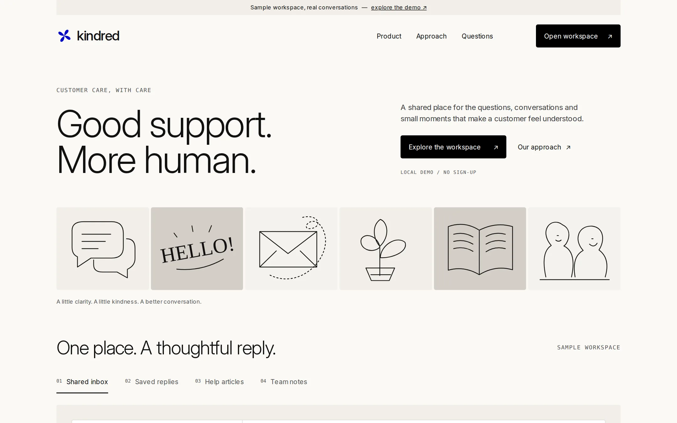
A cream customer-support landing page with restrained violet details, airy light-weight type and six original editorial illustrations. A working local sample inbox demonstrates the product without accounts or remote services.
- Best for
- Support tools, shared inboxes and service-focused software products.
- Tech stack
- Use Next.js App Router, React, TypeScript and plain CSS custom properties, retaining equivalent tools already installed in the destination repo. Server-render the navigation, hero, illustration strip, editorial sections and native details/summary FAQ. Isolate the local workspace interactions in one small client component. Keep conversation examples, saved replies, articles and notes in typed local data. Draw original illustrations with inline SVG; no image services or icon CDN. Use self-hosted open-license Inter with its license included, or the documented system fallbacks. No external asset calls at runtime, accounts, backend, analytics, database or paid services. Fragment links connect page sections; use next/link for any internal routes. Include local dev, build and start instructions and verify the production build renders the complete page. Named technologies: - Next.js (App Router) - React - TypeScript - CSS custom properties - Local SVG artwork
- Tags
- support · editorial · cream · light · workspace
The creation prompt
1495 words, self-contained. Paste it into a chat session with your coding agent and it builds Intercom end to end.
Build the "Intercom" kickstart — A warm editorial support page with light typography and a working sample inbox.

## Design
Build a warm, editorial landing page for Kindred, a fictional shared customer-support workspace. Use #FAF9F6 canvas, #F1EEE9 section surrounds, #D3CEC6 illustration fields, #FFFFFF product panels, #111111 ink, #414141 supporting copy, #585858 small readable text and #DEDBD6 control edges. Filled actions are #000000 with #FFFFFF labels; the palette accent records this action color. Use #0007CB violet only for a small original brand symbol and one functional emphasis per screen. No gradients, shadows or pill corners. All controls and panels use 4px radii; section breaks use space or a warm surface change rather than horizontal rules.

Use locally hosted, openly licensed Inter as a substitute for Saans, with system-ui and Arial fallbacks. Set the desktop hero at 80px/0.95, weight 300, tracking -2.4px; section titles at 54px/1, weight 300, tracking -1.62px; smaller headings at 32px, weight 300. Body is 16px/1.5, weight 400; navigation is 14px. Labels use a system monospace at 12px with 1.2px tracking. An optional below-the-fold editorial note may use Georgia as a system serif adaptation; keep the first screen to sans and mono. Use a 1200px centered content column, a 4px spacing unit, 64–96px section gaps and 24–32px panel padding.

At 1440×900, begin with a quiet 32px linen announcement strip inside the content width: Sample workspace, real conversations — explore the demo. Under it, place an 88px non-sticky navigation row: an original four-petal violet mark and Kindred wordmark at left, Product, Approach and Questions in the middle, and Open workspace in a black button at right. The announcement and action link to #workspace. Keep all page content within the centered container.

Give the hero 64px of top space and a 60/40 split. On the left, place a small mono label CUSTOMER CARE, WITH CARE above a two-line 80px heading: Good support. / More human. On the right, align a narrow paragraph with the headline: A shared place for the questions, conversations and small moments that make a customer feel understood. Under it, place Explore the workspace as a black link button and Our approach as a quiet text link with an arrow. A small label beneath says LOCAL DEMO / NO SIGN-UP. Leave 64px below the hero.

Create a six-tile horizontal illustration strip, 4px gaps, about 176px tall. Draw six original, flat local SVG compositions: two overlapping speech bubbles on linen; a typographic HELLO! on stone; an envelope and looping line on cream; a tiny sprouting plant on linen; an open book on stone; two friendly abstract profiles on cream. Use thin ink strokes, warm flat surfaces, and no source images, photography, customer logos or third-party icons. These are editorial illustrations within the real page, not substitutes for the page screenshot. Beneath the strip, add one quiet caption: A little clarity. A little kindness. A better conversation.

Start the workspace section after 64px, so its title and four product controls enter the first desktop viewport. On one line pair the 40px light heading One place. A thoughtful reply. with SAMPLE WORKSPACE in mono. Below, use four native buttons: Shared inbox, Saved replies, Help articles, Team notes. The selected button gets a 2px ink underline; inactive labels use #585858 for contrast. Put the selected view in a linen surround with 32px padding and a white 4px-radius product panel. The initial view shows a short message list beside an open conversation, with real HTML text, a labeled reply field and a local save action. No fake window chrome or raster UI stand-in.

Below the demo, add two alternating 50/50 editorial sections under #approach: Keep the context close. with a compact case-note illustration, then Make a little room for care. with a large line-drawn open hand. Use 54px headings, narrow 16px paragraphs and generous vertical spacing. Finish with three native FAQ disclosures under #questions and a compact footer with an explicit fictional-product/sample-data notice. No social-proof band, ratings, pricing or fabricated performance numbers.

At 900px, reduce the hero to 54px and stack its columns. Below 600px, use a 40px hero, 32px section titles and 20px gutters; wrap the navigation and controls, arrange illustration tiles in two columns, and stack the inbox/detail and editorial layouts. Support 320px without horizontal page scrolling. Use visible focus outlines, readable contrast, meaningful labels and at least 44px interaction targets. Keep content visible before JavaScript. Use only 150ms color transitions; prefers-reduced-motion disables them. No entrance animations, parallax or autoplay.

Font stack: Inter, system-ui, Arial, sans-serif.

Page structure, in order:
1. Quiet announcement and navigation with a workspace action
2. Split editorial hero with an oversized light headline
3. Six original ink-and-paper illustrations
4. Four-view sample workspace with an editable local inbox
5. Two alternating editorial approach sections
6. Native FAQ and fictional-product footer

## Tech stack
Use Next.js App Router, React, TypeScript and plain CSS custom properties, retaining equivalent tools already installed in the destination repo. Server-render the navigation, hero, illustration strip, editorial sections and native details/summary FAQ. Isolate the local workspace interactions in one small client component. Keep conversation examples, saved replies, articles and notes in typed local data. Draw original illustrations with inline SVG; no image services or icon CDN. Use self-hosted open-license Inter with its license included, or the documented system fallbacks. No external asset calls at runtime, accounts, backend, analytics, database or paid services. Fragment links connect page sections; use next/link for any internal routes. Include local dev, build and start instructions and verify the production build renders the complete page.

Named technologies:
- Next.js (App Router)
- React
- TypeScript
- CSS custom properties
- Local SVG artwork
Where the repo you are working in already has an equivalent in place, keep the repo's choice and say which one you kept.

## Everything else
Build a rebrandable customer-support landing page and local workspace demo for an original support-product concept called Kindred. Use the exact headline, paragraph, navigation and section names in the Design prompt. All content is fictional and clearly marked as sample data. Do not copy an existing product's branding, testimonials, customer identities or prose. Open workspace and Explore the workspace link to #workspace, Product also links there, Approach and Our approach go to #approach, and Questions goes to #questions. All links have real destinations; there is no sign-up or trial claim.

Build a working local workspace with four ordinary buttons using aria-pressed to expose the active view; keep them in normal Tab order. Shared inbox initially shows three sample conversations: Maya Chen / Moving our workshop, Luca Bell / A copy of my receipt, and Ellis Park / Updating a delivery address. Choosing a conversation updates the subject, sender and message. Maya asks to move a booked workshop to next Thursday; Luca asks for an emailed receipt; Ellis asks how to correct a delivery address. Each view offers a labeled textarea and Save draft button. Save drafts only in component memory per conversation, announce Draft saved in this demo via a polite live region, and preserve drafts when switching views. Nothing is sent or persisted after reload. Show an inline error when saving an empty draft. Do not use Send or imply network delivery.

Saved replies contains three selectable replies with a Use reply action that fills the selected conversation's draft and returns to Shared inbox. Help articles contains three native disclosures about rescheduling, receipts and delivery details. Team notes shows two static handoff notes with fictional authors. Explain near the controls that this is sample data and drafts reset on reload. Without JavaScript, leave the initial conversation readable and show a noscript notice that local switching and drafting need JavaScript; the rest of the page remains usable.

For the approach sections, explain that an answer improves when the conversation and its context stay together, and that reusable replies should leave room for a personal sentence. Do not promise AI automation, integrations or backend functionality that this demo does not provide. FAQ answers cover what the demo does, where drafts live, and how to adapt the page for a real product. The footer says Kindred is a fictional product. All conversations are sample data. Build a complete responsive page, not only the captured first screen.

### Non-negotiables
- Responsive from 360px through desktop — no horizontal page overflow at any width. Deliberately scrollable regions stay within the viewport and remain keyboard and touch accessible.
- Every text/background pair clears WCAG AA (4.5:1 for body, 3:1 for large text); adjust a tint rather than shipping a failing pair.
- Fully keyboard operable, with a visible focus ring drawn in the accent colour.
- Honour `prefers-reduced-motion` — swap every transition for an instant state change.
- Write real copy in the voice described above; no lorem ipsum and no TODO placeholders.
- Use system or self-hosted fonts and CSS/SVG-drawn graphics — do not depend on a remote image or icon service.

Build the whole page end to end and show me the result running — not a description of it.
Pasting the prompt is step one. Fredrin runs the agent that builds it, one ticket per look.