Increase
An institutional fintech landing page: a two-tone 40px grotesque headline, a voltage pill, a mint primary button and faceted chartreuse-to-blue prisms between two hairline column rules on a white canvas.
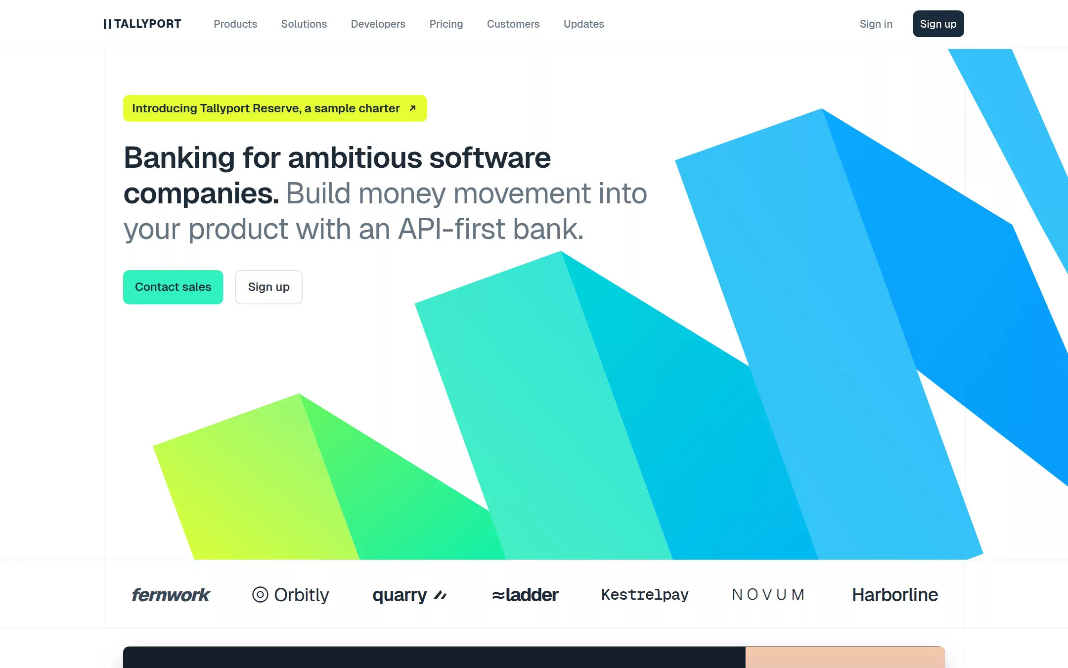
An original Tallyport page on Paper White inside a 1160px frame bounded by two hairline column rules: a sticky 64px navigation with a tally-bar wordmark; a Voltage pill over a three-line two-tone headline and Mint / outlined buttons, with three faceted gradient prisms rising behind; a monochrome logo band; a Midnight announcement card; a Panel Mist bento with a code card and receipt; a voltage-washed quote, sample stats, a Midnight architecture band, a timeline of updates and a Midnight footer.
- Best forBanking, payments and financial-infrastructure APIs that want to read as calm and institutional, with developer credibility carried by code cards rather than illustration.
- Tech stack- Next.js (App Router) - React - TypeScript - CSS custom properties Use Next.js App Router, React and TypeScript with plain CSS custom properties for every colour, radius and spacing token. Render the whole page as server components; nothing on it needs client state. Self-host Geist and Geist Mono (variable) as woff2 through next/font/local — no remote font request. Draw the prisms, the wordmark, rail icons, invented customer wordmarks, the dusk mountain and every product card (code, receipt, card, chart) as HTML, CSS and inline SVG with fixed data committed in the source, so the markup is deterministic between renders. Provide page metadata. Build and run the production page before capturing its preview.
The prompt. 1586 words, self-contained.
Build the "Increase" kickstart — An institutional fintech landing page: a two-tone 40px grotesque headline, a voltage pill, a mint primary button and faceted chartreuse-to-blue prisms between two hairline column rules on a white canvas.

## Design
Build a rebrandable landing page for an API-first bank for software companies.

Create a complete landing page for Tallyport, a fictional API-first bank that lets software companies move, store and lend money from their own product: ACH, wires, real-time payments, checks, push-to-card and card issuing behind one API. This is a concept presentation, not a real company — no real customers, people, metrics, charters or awards. Use original branding, artwork and copy throughout.

Color: Paper White #FFFFFF is the page canvas and every card face. Panel Mist #F5F6F7 fills the product tiles. Heading Navy #1D2A36 is every heading and the text on the mint and voltage fills; Inkwell Navy #1A2B3B fills the Sign up button and draws the wordmark; Slate 600 #314352 is body text. Graphite #657482 is the second, regular-weight half of every headline and secondary copy; Nav Slate #687887 is navigation links, Sign in and line numbers. Rule Mist #EDF1F5 is every 1px hairline — the two vertical column rules, band borders and card borders; Control Silver #D5DEE5 is the outlined button border and icon-chip border. Mint Signal #31F2BF fills the primary Contact sales button, the active rail chip, status dots and links on dark; Voltage #E4FF33 is the announcement pill and one pending dot only. Abyss #0D1726 is the code card; Midnight #151E29 is the announcement card, the architecture band and the footer, with Steel #C0C9D1 copy on it; Sky Cyan #34BCFF is code keywords. The hero art uses three gradient pairs and nothing else does: #DEFF34 to #8CF97C, #65F75F to #12F0AA, #45F4BC to #33DFDF, #01D3D8 to #02B7F1, and cyan-blue faces from #33C9F4 to #079BF9.

Typography: everything in Geist, "Helvetica Neue", Arial, sans-serif (a free stand-in for a geometric grotesque); code, dates and attributions in "Geist Mono", ui-monospace, monospace. Headlines are one sentence in Heading Navy weight 600 followed by a sentence in Graphite weight 400 at the same size, in the same element. Hero headline 40px/48px, -0.8px; section headings 32px/38.4px, -0.32px; tile titles 500 24px/28.8px; announcement title 600 24px/32px with 400 20px/28px copy; navigation 500 14px/20px; buttons 500 16px/20px; pill 600 16px/24px; body 400 16px/24px; rail labels 500 18px/20px; code 14px/20px.

Layout: a 1160px frame centred at 1440px (x 140 to 1300) bounded by two full-height 1px Rule Mist vertical rules; content sits 25px inside them (x 165, 1110px wide). Bands are separated by 1px Rule Mist horizontal rules, never shadows. Radii: 8px buttons, pill, chips and the announcement card; 12px code and receipt cards; 16px product tiles.

Navigation: 64px tall, sticky, Paper White at 95% with a 1px rgba(0,0,0,.05) bottom rule. Left: the TALLYPORT wordmark in Geist 800 15px, 0.05em tracking, led by two 3px Inkwell Navy tally bars. Then six links 16px apart with 4px 8px padding and 8px radius — Products, Solutions, Developers, Pricing, Customers, Updates. Right: Sign in as a text link and Sign up as a 36px Inkwell Navy button with white text, 8px 10px padding.

Hero (id top): 689px tall. 63px below the navigation, a Voltage pill (6px 12px, 8px radius) reading Introducing Tallyport Reserve, a sample charter with a 16px north-east arrow. 24px below, a 768px-wide three-line headline: Banking for ambitious software companies. in weight 600, then Build money movement into your product with an API-first bank. in Graphite 400. 32px below, two 46px buttons 16px apart: Contact sales in Mint Signal with Heading Navy text and Sign up in Paper White with a 1px Control Silver border, both 12px 16px padding. Behind and right of the copy, bottom-aligned and bleeding off the right edge and under the right rule: three faceted prisms rising left to right like a bar chart — each a lighter front parallelogram and a darker side face, flat linear gradients with hard angular edges, no blur, no shadow — chartreuse to green, then mint to teal, then cyan to blue, with a fourth sliver entering at the top right.

Logo band: 93px tall between Rule Mist rules, seven invented monochrome wordmarks in Heading Navy at about 25px, each in a different weight or style (italic heavy, light ring logo, mono, wide tracked caps), spread across the frame.

Announcement (id announce): 24px below, a 1110×217px Midnight card (8px radius, 32px 301px 32px 32px padding, a soft navy shadow) with Announcing Tallyport Reserve in white, a two-line Steel paragraph and a Mint Signal Read the announcement link with an arrow; the right 269px is an original flat-vector dusk mountain illustration in peach, mauve and slate.

Infrastructure grid (id rails): 96px top padding, the two-tone 32px heading Comprehensive infrastructure to move, store and lend money. Tallyport supports sample companies processing invented volumes every day. Then a bento of Panel Mist tiles with 24px gaps: a full-width tile titled Bare metal payments on every rail with a two-column list of rails, each a 32px icon chip (Rule Mist fill, Control Silver border; ACH active in Mint Signal) beside an 18px label, and on its right an Abyss code card showing an invented tallyport.transfers.create call with line numbers, overlapped by a white receipt card: $816.34 in 500 28px, Sample debit transfer, and a status list with Mint Signal dots and Geist Mono times, the last dot Voltage. Below, two tiles: Full stack card issuing with an invented card and a decision log, and Flexibly titled accounts with an invented balance and a thin cyan area chart.

Customer quote (id customers): a full-width card with a pale voltage wash (linear-gradient(110deg, #FBFEE6, #F2FDC4)), an 18px/28px invented quote and a Geist Mono attribution row labelled as a fictional customer.

Stats (id stats): three centred figures in Geist 400 40px/48px with 14px Graphite labels, every one prefixed sample.

Architecture (id architecture): a Midnight band where the frame rules turn #232E3B, a white-and-Steel two-tone heading and a 36px Mint Signal Read the docs button.

Latest updates (id updates): a 32px heading Latest updates, then four columns on a 1px Rule Mist timeline with 8px square nodes (the first Mint Signal), each with a 16px 500 title, a 14px Graphite summary and a Geist Mono date, then an outlined Read more button.

Footer: a Midnight footer with the white wordmark, four link columns (Products, Developers, Solutions, Company) in Steel with white headings, a #2A3644 rule and a legal line saying Tallyport is a fictional sample company that is not a bank.

## Tech stack
- Next.js (App Router)
- React
- TypeScript
- CSS custom properties

Use Next.js App Router, React and TypeScript with plain CSS custom properties for every colour, radius and spacing token. Render the whole page as server components; nothing on it needs client state. Self-host Geist and Geist Mono (variable) as woff2 through next/font/local — no remote font request. Draw the prisms, the wordmark, rail icons, invented customer wordmarks, the dusk mountain and every product card (code, receipt, card, chart) as HTML, CSS and inline SVG with fixed data committed in the source, so the markup is deterministic between renders. Provide page metadata. Build and run the production page before capturing its preview.
Where the repo you are working in already has an equivalent in place, keep the repo's choice and say which one you kept.

## Everything else
Keep Tallyport clearly fictional and rebrandable: no real company, bank, charter, regulator, logo, customer, person, volume or copy; every name, figure, date and quote is invented and labelled sample, and the footer states Tallyport is not a bank and offers no financial products. Mint Signal is used only for the primary button, the active chip, status dots and links on dark; Voltage only for the announcement pill and one pending dot. The prism gradients appear only in the hero. Every link leads to a real section on the page; buttons do not submit, sign anyone up or store anything. Content is initially visible — no marquee, typing animation, counters, parallax or scroll reveal, and transitions stop for prefers-reduced-motion. Every control shows a 2px Heading Navy focus ring with a 2px offset; on Midnight the ring is Mint Signal. Body text pairs clear WCAG AA; Graphite on Paper White is for 20px-and-larger text or secondary labels only, and decorative art is hidden from assistive technology. At 360px the column rules disappear, the navigation collapses to the wordmark, a Menu button and Sign up, the headline drops to 30px/36px, the buttons stack full width, the prisms scale down beneath the copy, the logo band becomes a two-row wrap, the announcement illustration moves above its copy, bento tiles and update columns stack to one column, and the page never overflows horizontally.

### Non-negotiables
- Responsive from 360px through desktop — no horizontal page overflow at any width. Deliberately scrollable regions stay within the viewport and remain keyboard and touch accessible.
- Every text/background pair clears WCAG AA (4.5:1 for body, 3:1 for large text); adjust a tint rather than shipping a failing pair.
- Fully keyboard operable, with a visible focus ring drawn in the accent colour.
- Honour `prefers-reduced-motion` — swap every transition for an instant state change.
- Write real copy in the voice described above; no lorem ipsum and no TODO placeholders.
- Use system or self-hosted fonts and CSS/SVG-drawn graphics — do not depend on a remote image or icon service.

Build the whole page end to end and show me the result running — not a description of it.