 Fredrin
SaaS
HEY
Chunky, cheerful and opinionated: a black-weight rounded headline, a violet-to-rose gradient, mint buttons and white sheets floating on warm paper.
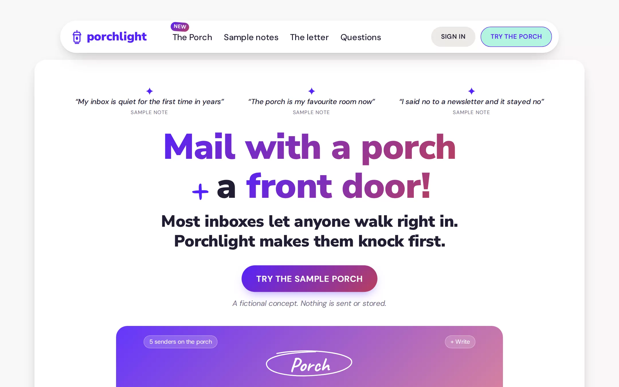
An original Porchlight email-app page: a floating white capsule navigation, a white hero sheet with sample notes, a weight-900 gradient headline interrupted by a handwritten plus, a bold two-line statement, a gradient call to action, and a gradient-washed HTML inbox frame; then a working local porch where sample senders are let in or turned away, sky-tinted sample notes, a square-cornered paper letter, native questions and a paper footer.
- Best for
- Email and messaging apps, calendars, consumer productivity tools, and any product that wins by having a strong opinion and saying it out loud.
- Tech stack
- - Next.js (App Router) - React - TypeScript - CSS custom properties - Native HTML disclosures Use Next.js App Router, React and TypeScript with plain CSS custom properties and original inline SVG for the lantern wordmark glyph, the sparkle glyphs, the hand-drawn ellipse and the play triangle. Preserve equivalent tools already installed in the host project. Render the page as a server component; the only client component is The Porch list, which keeps local React state and sends nothing. Draw the hero product frame and its inbox in HTML and CSS — no product screenshot, video or image file. Native details and anchors need no JavaScript. Use local font stacks only — no remote font, image, avatar, mail backend or analytics host. Provide page metadata. Build and run the production page before capturing its preview.
- Tags
- saas · email · productivity · playful · light · gradient
The creation prompt
2068 words, self-contained. Paste it into a chat session with your coding agent and it builds HEY end to end.
Build the "HEY" kickstart — Chunky, cheerful and opinionated: a black-weight rounded headline, a violet-to-rose gradient, mint buttons and white sheets floating on warm paper.

## Design
Build a rebrandable SaaS landing page for an opinionated email app.

Create a complete landing page for Porchlight, a fictional email app built on one opinion: nobody gets into your inbox until you say so. First-time senders wait on the porch; you let them in or turn them away once, and that decision sticks. The page should feel loud, warm and opinionated, like a manifesto pinned to a fridge — big chunky rounded type does the shouting, a violet-to-rose gradient lights a few words, and mint buttons keep the asks friendly. This is a concept presentation, not a real product — no sign-up, pricing, star ratings, press quotes, real reviews or real people. Use original branding, UI and copy throughout.

Color: Paper #F9F7F5 is the warm page canvas — never cool gray, never bright white. White Sheet #FFFFFF is for the floating navigation, the hero sheet, cards, the letter and the play pill. Ink #231C33 is every headline, nav link, body line and dark label — never pure black. Quiet Gray #736C83 is fine print and low-emphasis supporting text only. Blurple #5522FA is links, emphasised words and small interface details. Mint Note #B3F4E0 is the repeated filled button: always with Blurple #5522FA text and a 1.5px Blurple border — never convert it to a violet fill. Stone #EDEAE6 is the quiet sign-in pill, hairline dividers and subdued fills. Sky Wash is a 135deg gradient from #B6DBFF to #EEF8FF for sample-note cards; Canary Note #FFF5CA is an occasional warm highlight behind one short phrase. The signature gradient runs 135deg from Blurple #5522FA to Rosewood #B8405E, and appears only on highlighted headline words, the hero call-to-action pill and the small New chip; the softer Blurple #5522FA to Salmon Glow #EC8580 wash is reserved for the product frame behind white UI, never under text. Main white panels carry a layered ink shadow — 0 1px 2px rgba(35,28,51,0.06), 0 8px 24px -8px rgba(35,28,51,0.18), 0 24px 48px -24px rgba(35,28,51,0.22) — instead of a 1px gray outline.

Typography: display in a heavy rounded sans — "Nunito Sans", Nunito, "Arial Rounded MT Bold", system-ui, sans-serif — standing in for the source's Really Sans Large: 83px/1.10 at weight 900 for the hero headline, 40px/1.20 at 900 for the bold supporting statement, 48px/1.10 at 850 for section headings, letter-spacing normal. Everything functional in one compact grotesque — "DM Sans", system-ui, -apple-system, "Segoe UI", sans-serif — standing in for Moniker, always with negative tracking between -0.012em and -0.019em: 20px weight-500 nav, 18px/1.4 body, 21px/1.60 quotes, 24px/1.45 letter copy, 17.6px Quiet Gray fine print, 16px weight-600 uppercase button labels at 0.02em. One handwritten face, Caveat, cursive, appears only twice: as the single plus sign inside the hero headline and as the circled word Porch in the product frame — never on paragraphs, nav or buttons. Radii: 38px navigation capsule, 26px hero sheet, frames and cards, 44px buttons and pills, 2.4px for the letter sheet only. Spacing: 10–12px inside nav and control groups, 19px inside components, 45px between blocks inside a section, 96px between sections; content in a 1280px column with 32px side padding.

Navigation: a floating White Sheet capsule 24px from the top, 1160px wide and centred, 38px radius, the layered ink shadow, 14px 16px 14px 24px padding, sticky. Left: an original wordmark — a small lantern glyph drawn in 2px Blurple strokes beside porchlight set in the display face at 26px weight 900 in Blurple. Centre: 20px weight-500 Ink links with 11px gaps — The Porch, Sample notes, The letter, Questions — and above The Porch a tiny 12px white New chip on the signature gradient, fully rounded, tilted 4deg. Right: a Stone #EDEAE6 Sign in pill (Ink, 15px weight-600 uppercase, 44px radius, 12px 22px padding) that jumps to Questions, and the Mint Note #B3F4E0 button Try the porch with Blurple #5522FA uppercase text and a 1.5px Blurple border.

Hero (id top): a White Sheet panel, 26px radius, the layered ink shadow, 1280px wide, sitting 40px below the navigation on Paper, with 72px top padding and everything centred. First a row of three sample notes, 56px apart: a small Blurple four-point sparkle glyph above an italic 18px Ink line — “My inbox is quiet for the first time in years”, “The porch is my favourite room now”, “I said no to a newsletter and it stayed no” — each followed by a 12px Quiet Gray sample label. Then the 83px headline on two lines, Mail with a porch / + a front door!, where Mail with a porch and front door! carry the signature gradient as clipped text, the plus is Caveat at 83px weight 700 in Blurple, and the rest is Ink. Under it the 40px weight-900 Ink statement, max 1040px, on two lines: Most inboxes let anyone walk right in. / Porchlight makes them knock first. Then the call to action: a gradient pill (signature gradient, white 20px weight-600 uppercase text, 57px radius, 17px 32px padding) reading Try the sample porch, linking to the porch section, with 17.6px italic Quiet Gray fine print beneath: A fictional concept. Nothing is sent or stored. Below, 40px down, a 900px product frame with 26px top corners only, overflow hidden, whose background is the Blurple-to-Salmon Glow wash at 90% opacity over a pale HTML inbox: a Stone toolbar chip 5 senders on the porch at the top left and a + Write chip at the top right in translucent white, the word Porch in Caveat 44px circled by an original hand-drawn ellipse in 2px white, a NEW FOR YOU rule, and three sample rows (a round monogram, a bold sender, a subject in translucent white). A White Sheet pill centred on the frame, 21px radius, Ink 20px weight-500 text with a small triangle glyph, reads Take the tour and links to the porch. No screenshot image and no video.

The Porch (id porch): Paper, centred, a 48px weight-850 Ink heading Who's knocking?, an 18px Ink body line New senders wait here. Decide once and it sticks., then a 720px White Sheet card, 26px radius, the layered shadow, holding a working local list of five sample senders — Garden Club Bulletin, Unknown Recruiter, Aunt Maribel, Weekly Coupon Blast, Dr. Okafor's Office. Each row: a 40px round monogram on a Sky Wash or Canary Note fill, a bold 18px sender, a 15px Quiet Gray first line of their sample message, and two buttons — a Mint Note Let in and a Stone Turn away. Deciding removes the row from the porch list with a 200ms slide, and a live counter above the list (5 waiting · 0 let in · 0 turned away) updates; a Reset the porch Blurple text link restores it. Everything is local state; nothing is sent or stored.

Sample notes (id notes): Paper, a 48px heading Notes from the porch., then a loose cluster of four Sky Wash cards, 26px radius, 32px padding, slightly rotated (-2deg, 1deg, -1deg, 2deg) and overlapping by 12px, each with a 48px round monogram avatar of initials on a White Sheet ring overlapping the card's top edge by 24px, an Ink 21px/1.60 quote and a 14px Quiet Gray name line ending sample. Names are clearly invented (Rowan P., Ines T., Kofi A., Mae L.); one short phrase in one card sits on a Canary Note #FFF5CA highlight.

The letter (id letter): a tall, narrow White Sheet letter, 760px wide, 2.4px radius, 90px vertical and 96px horizontal padding, the layered shadow, with a faint offset Stone #EDEAE6 page peeking 10px behind it at a -1.5deg tilt. A 48px Ink heading Dear inbox, then four paragraphs of Ink 24px/1.45 letter copy about why Porchlight asks senders to knock — no rules or decorative dividers, just paragraph spacing — and a Caveat sign-off — The Porchlight team (a fictional team). One sentence is a Blurple underlined link back to the porch.

Questions (id questions): Paper, a 48px heading Questions?, native details rows on 1px Stone hairlines in a 760px column with 22px weight-600 Ink summaries and a thin plus that becomes a minus: Is Porchlight real? — no, it is a fictional concept. Does the porch read my mail? — no; the sample senders are made up and stay in your browser. Can I change my mind about a sender? — yes, reset the porch.

Footer: Paper, a 1px Stone top border, 64px padding, the lantern wordmark, a 15px Quiet Gray line Porchlight is a fictional concept. Every sender, note and letter is sample content., and 15px Ink anchor links to The Porch, Sample notes, The letter and Questions.

At 760px and below: 16px page padding, the navigation capsule keeps the wordmark and Try the porch while the links scroll horizontally inside it, the hero headline drops to 46px and the statement to 24px, the three hero notes stack, section headings drop to 34px, the product frame's rows simplify to sender and monogram, porch rows wrap their buttons under the sender, the note cards stop rotating and stack, and the letter sheet's padding drops to 40px 24px. The page fits a 360px viewport with no horizontal page overflow. Use semantic landmarks, one h1, a skip link, visible 3px Blurple #5522FA focus outlines offset 2px on every control, a polite live region announcing each porch decision, and keyboard-operable disclosures.

## Tech stack
- Next.js (App Router)
- React
- TypeScript
- CSS custom properties
- Native HTML disclosures

Use Next.js App Router, React and TypeScript with plain CSS custom properties and original inline SVG for the lantern wordmark glyph, the sparkle glyphs, the hand-drawn ellipse and the play triangle. Preserve equivalent tools already installed in the host project. Render the page as a server component; the only client component is The Porch list, which keeps local React state and sends nothing. Draw the hero product frame and its inbox in HTML and CSS — no product screenshot, video or image file. Native details and anchors need no JavaScript. Use local font stacks only — no remote font, image, avatar, mail backend or analytics host. Provide page metadata. Build and run the production page before capturing its preview.
Where the repo you are working in already has an equivalent in place, keep the repo's choice and say which one you kept.

## Everything else
Keep Porchlight clearly fictional and rebrandable: no HEY wordmark or product UI, maker credit, star ratings, pricing, press quotes, review counts, statistics presented as real, or real people. Every note is labelled sample and every sender is made up. Colour stays disciplined: Paper #F9F7F5 is the canvas and White Sheet #FFFFFF the floating panels; Ink #231C33 carries the type; Mint Note #B3F4E0 with Blurple #5522FA text is the repeated filled button; the Blurple #5522FA to Rosewood #B8405E gradient appears only on a few headline words, the hero call to action and the New chip; Salmon Glow #EC8580 only in the product-frame wash behind white UI. Panels lift with the layered ink shadow, never a gray outline, and only the letter has near-square corners. Every link leads to a real section on the page; nothing is sent or stored. Content is initially visible — no scroll reveals, typewriter effects, marquees, autoplaying media or parallax; hover and focus are a 150ms change and a porch decision is a 200ms slide, all disabled for prefers-reduced-motion. WCAG AA contrast on every text/background pair (white text sits only on the darker gradient, never on Salmon Glow), keyboard-operable porch buttons and disclosures, and a 360px layout without horizontal page overflow.

### Non-negotiables
- Responsive from 360px through desktop — no horizontal page overflow at any width. Deliberately scrollable regions stay within the viewport and remain keyboard and touch accessible.
- Every text/background pair clears WCAG AA (4.5:1 for body, 3:1 for large text); adjust a tint rather than shipping a failing pair.
- Fully keyboard operable, with a visible focus ring drawn in the accent colour.
- Honour `prefers-reduced-motion` — swap every transition for an instant state change.
- Write real copy in the voice described above; no lorem ipsum and no TODO placeholders.
- Use system or self-hosted fonts and CSS/SVG-drawn graphics — do not depend on a remote image or icon service.

Build the whole page end to end and show me the result running — not a description of it.
Pasting the prompt is step one. Fredrin runs the agent that builds it, one ticket per look.