Graphite
A near-black developer homepage: a tight 60px headline, pale glowing buttons, hairline graphite borders and a luminous stack of rounded hexagons.
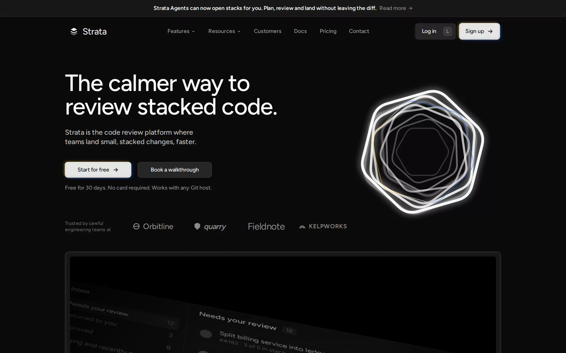
An original Strata page: a 43px Charcoal announcement bar, a 74px navigation with a stacked-layers mark, grey links, a Log in button with a keyboard chip and a pale Sign up button, then an asymmetric hero — a tight two-line 60px headline, an 18px lead, a pale glowing Start for free button beside a graphite Book a walkthrough, a note and a row of invented grey wordmarks — opposite a luminous stack of rounded hexagon outlines; below, a framed black product stage with the review inbox tilted in perspective and a row of feature tabs, then customer story cards, a feature tour, a bordered feature mosaic, a developer-infrastructure panel, a closing call to action and a link-column footer.
- Best forCode review, CI, merge queue and other developer tools sold to engineering teams who live in pull requests.
- Tech stack- Next.js (App Router) - React - TypeScript - CSS custom properties Use Next.js App Router, React and TypeScript with plain CSS custom properties for every colour, radius, spacing and type token. Render the page as server components; only the customer-stories carousel, the feature tour and the mobile menu need small client islands holding state in memory. Self-host Figtree (SIL Open Font License) as woff2 files through next/font/local — no remote font request. Draw the mark, every icon, the hexagon artwork, the tilted review inbox, the customer logo panels and the invented wordmarks as inline SVG and HTML built from committed sample arrays, never bitmap screenshots, video or stock photos, so the markup is identical on every render. Provide page metadata. Build and run the production page before capturing its preview.
The prompt. 1901 words, self-contained.
Build the "Graphite" kickstart — A near-black developer homepage: a tight 60px headline, pale glowing buttons, hairline graphite borders and a luminous stack of rounded hexagons.

## Design
Build a rebrandable landing page for a code review platform built around stacked pull requests — stacks, a focused review page, an AI reviewer, a stack-aware merge queue and an inbox in one tool.

Create a complete landing page for Strata, a fictional code review platform. This is a concept presentation, not a real company — no real product, customer, person or logo. Use original branding, artwork and copy throughout.

Color: a near-black developer workspace. Obsidian #0A0A0A is the uninterrupted page canvas, card interiors and the footer. True Black #000000 fills the product stage and demo tabs. Charcoal #171717 is the announcement bar, the product frame, round icon buttons and the text on pale buttons. Graphite Edge #262626 is every 1px module border and divider, the navigation shell border and the fill of secondary buttons. Steel #393939 is the 1px edge of the secondary button. Cloud #FAFAFA is headlines, high-emphasis text and icons. Paper #E5E5E5 fills the one high-emphasis button style. Fog #A1A1A1 is navigation labels, secondary copy and quiet icons. Ash #737373 is tertiary labels and the trusted-by caption. Signal Orange #FF8833 is only for inline text links with a small arrow, never a fill. A spectral line — #FFB931 to #FFFFFF to #2E73FC — appears only as a faint glow on the Paper buttons and a thin accent stroke in the hero artwork. No broad white or coloured sections.

Typography: one family for everything, "Figtree", "Inter", ui-sans-serif, system-ui, -apple-system, "Segoe UI", sans-serif (Figtree is SIL OFL), with "clig" 0, "liga" 0. Hero display 60px/60px weight 500 with -1.5px tracking in a 620px measure, two lines. Section headings 36px/40px weight 500, centred. Feature-card headings 24px/28px weight 600. Feature-tour titles 20px/28px weight 500. Hero lead 18px/24px weight 500 at 75% Cloud in a 372px measure. Body and links 16px/20px weight 400 (relaxed copy 16px/24px). Navigation, buttons and the announcement 14px/20px weight 500 (the announcement text weight 600). Captions 12px/16px; demo tab labels 12px/12px weight 500.

Layout: a 1440px canvas with a centred 1152px container (16px inner padding); the hero copy starts at x 165. Sections flow on the same Obsidian with roughly 224px between major sections and 8px gaps between related controls. Radii: 10px for cards, frames and the navigation shell; 8px for rectangular buttons; 4px for demo tabs; 9999px for round icon buttons and chips. Borders, not shadows, separate modules.

Announcement bar: 43px, full width, Charcoal with a 1px Graphite Edge bottom border; centred 14px weight 600 Cloud text Strata Agents can now open stacks for you. Plan, review and land without leaving the diff. followed by Read more → at 50% Cloud.

Navigation: a 74px row in the 1152px container. At x 176 a 24px mark — three stacked chevron layers, the top one filled Cloud, the lowest at 55% — and the 23px weight 500 wordmark Strata. From x 410: Features and Resources with 12px carets, then Customers, Docs, Pricing, Contact, each 14px weight 500 at 60% Cloud with 8px 16px padding and an 8px radius. Right: a 104×42px Log in button (Graphite Edge fill, 8px radius, 8px 8px 8px 16px padding) holding a 24px keyboard chip L at 10% Paper with a 6px radius, then an 8px gap and a 104×42px Paper Sign up → button.

Hero (id top): asymmetric. Left, at y 181, the 60px headline The calmer way to / review stacked code.; at y 325 the lead Strata is the code review platform where teams land small, stacked changes, faster.; at y 413 two 40px buttons with 0 32px padding and a 16px gap — Paper Start for free → (#171717 text, 8px radius, an inset white top highlight, a 1px rgba(255,255,255,0.1) edge and a faint #FFB931-left / #2E73FC-right glow) and Graphite Edge Book a walkthrough with a 1px Steel border; at y 469 the 14px note Free for 30 days. No card required. Works with any Git host. at 55% Cloud. At y 553 a 120px two-line 12px Ash caption Trusted by careful engineering teams at, then four invented 144×48px grey wordmarks (Orbitline, quarry, Fieldnote, KELPWORKS) drawn in #8A8A8A. Right, a 440×440px drawing at x 855, y 167: seven rounded hexagons (30px corner radius) in Cloud strokes 7px wide, each slightly rotated and shrinking toward a hollow centre with falling opacity, under a 9px blurred white glow duplicate and one thin spectral stroke — an SVG drawing, never an image.

Product demo (id product): at y 641, a 1110px Charcoal frame with a 1px Graphite Edge border, 10px radius, 12px padding and the inset shadow rgba(101,129,128,0.15) 0 0 2px 2px, rgba(32,47,46,0.15) 0 0 4px 4px. Inside, a 611px True Black stage holding the Strata review inbox drawn in HTML and tilted in perspective (rotateX about 52°, rotateZ about 17°): an icon rail, an Inbox sidebar (Needs your review 12, Returned to you, Approved, Merging and recently merged, Drafts, Waiting on CI) and rows of invented pull requests with stack position, author, a green check or amber running state and +/− line counts; black fades at the edges, a centred 60% white Play pill, the 40px caption Meet Strata at the bottom left, and a row of seven True Black 4px-radius tabs with 12px icons — Stacks, Review page, AI reviewer, Chat, Merge queue, Inbox, Insights.

Customer stories (id stories): a carousel of 360px cards with 10px gaps. Each card: 10px radius, 1px Graphite Edge border, a 140px logo panel (an invented mark on a pale Paper, white or single saturated band), then an Obsidian body with a 12px outlined chip such as Orbitline × Strata and a 16px/24px line at 75% Cloud (How Orbitline cut review time in half with stacks). Below, two 32px round Obsidian icon buttons with a Graphite Edge border for previous and next.

Feature tour (id tour): a bordered 10px panel; left, a square True Black frame with small corner crosses showing the active feature drawn in HTML; right, five 20px weight 500 titles stacked in 1px Graphite Edge rows — The reviewer you can talk to, Review faster, land sooner, Merge without conflicts, Stay unblocked with stacks, A focused review page. Inactive titles sit at #393939; the active one is Cloud with an 18px/22.5px Fog description and an orange Learn more → link.

Everything you need (id features): centred 36px heading Everything you need to ship faster and a 16px Fog line One tool to plan, review and land every change, then a bordered mosaic of 10px-radius Obsidian cards with 16px padding, 24px weight 600 headings, 16px Fog copy and orange links: a wide Never wait on review card with a Paper Start stacking button, A review inbox built for teams beside Never miss a mention, Smarter CI beside One platform for every review step with a column of pill chips (Insights, Protections, Merge queue, Reviewer assignment, Automations), and a wide The AI reviewer inside your pull request card; then a centred Read more about every feature → link.

Developer infrastructure (id infrastructure): centred 36px heading Developer infrastructure built for your team with a 16px Fog line, then a 10px-radius tile holding a drawn hexagon mark on the left and three 20px weight 500 items with 16px Fog copy on the right — Where change happens, Synced with your Git host, Built on top of Git.

Closing call to action (id cta): centred 36px two-line heading Built for careful engineering teams, / now open to everyone. with a Graphite Edge Book a walkthrough and a Paper Start free trial → button side by side.

Footer (id footer): Obsidian, a 1px Graphite Edge top rule, the mark on the left and four 14px link columns with Cloud headings and Fog links — Features (CLI, Merge queue, Insights, Inbox, AI reviews), Company (Blog, Customers, Careers, Privacy, Terms), Resources (Docs, Pricing, Status, Guides), Connect (Contact, Community, Changelog) — and © Strata sample · a fictional product. Not a real company. in 12px Ash.

## Tech stack
- Next.js (App Router)
- React
- TypeScript
- CSS custom properties

Use Next.js App Router, React and TypeScript with plain CSS custom properties for every colour, radius, spacing and type token. Render the page as server components; only the customer-stories carousel, the feature tour and the mobile menu need small client islands holding state in memory. Self-host Figtree (SIL Open Font License) as woff2 files through next/font/local — no remote font request. Draw the mark, every icon, the hexagon artwork, the tilted review inbox, the customer logo panels and the invented wordmarks as inline SVG and HTML built from committed sample arrays, never bitmap screenshots, video or stock photos, so the markup is identical on every render. Provide page metadata. Build and run the production page before capturing its preview.
Where the repo you are working in already has an equivalent in place, keep the repo's choice and say which one you kept.

## Everything else
Keep Strata clearly fictional and rebrandable: no real company, product, customer, person or logo. The only filled high-emphasis control is the Paper #E5E5E5 button; secondary buttons are Graphite Edge #262626; Signal Orange #FF8833 is text-only. Display text never exceeds weight 600, and the 60px headline keeps its 60px line height. Never place broad white or coloured sections on the canvas, never exceed a 10px radius on cards or frames, and never replace the 1px #262626 borders with floating borderless cards. Text pairs clear WCAG AA: #FAFAFA and #A1A1A1 on #0A0A0A and #171717, #171717 on #E5E5E5; #737373 is used only for 12px captions that also carry no essential information. Every link leads to a real section on the page; nothing submits. The page loads no analytics or tracking script and shows no cookie banner. Content is initially visible: the product demo never autoplays, and there are no typing effects, counters, parallax or scroll reveal. Hovers take 150ms (buttons brighten, links move to Cloud), the hexagon glow may breathe slowly over 6s, and every animation and transition stops for prefers-reduced-motion. Every control shows a 2px #FAFAFA focus ring with a 2px offset. The product demo and feature-tour frames are labelled figures; decorative strokes are hidden from assistive technology. At 360px the navigation collapses to the mark, Sign up and a Menu button, the announcement bar wraps to two lines, the hero stacks with the artwork below the copy at 280px, the headline drops to 40px/42px, the buttons go full-width, the demo stage becomes a 4:5 crop, cards and mosaic modules become one column, and the page never overflows horizontally.

### Non-negotiables
- Responsive from 360px through desktop — no horizontal page overflow at any width. Deliberately scrollable regions stay within the viewport and remain keyboard and touch accessible.
- Every text/background pair clears WCAG AA (4.5:1 for body, 3:1 for large text); adjust a tint rather than shipping a failing pair.
- Fully keyboard operable, with a visible focus ring drawn in the accent colour.
- Honour `prefers-reduced-motion` — swap every transition for an instant state change.
- Write real copy in the voice described above; no lorem ipsum and no TODO placeholders.
- Use system or self-hosted fonts and CSS/SVG-drawn graphics — do not depend on a remote image or icon service.

Build the whole page end to end and show me the result running — not a description of it.