Grafana Labs
A light observability-cloud homepage under a peach-to-aqua sunrise wash: a centred two-line Poppins headline, paired plan buttons, a wide Ask AI field and pastel-framed dark dashboard captures.
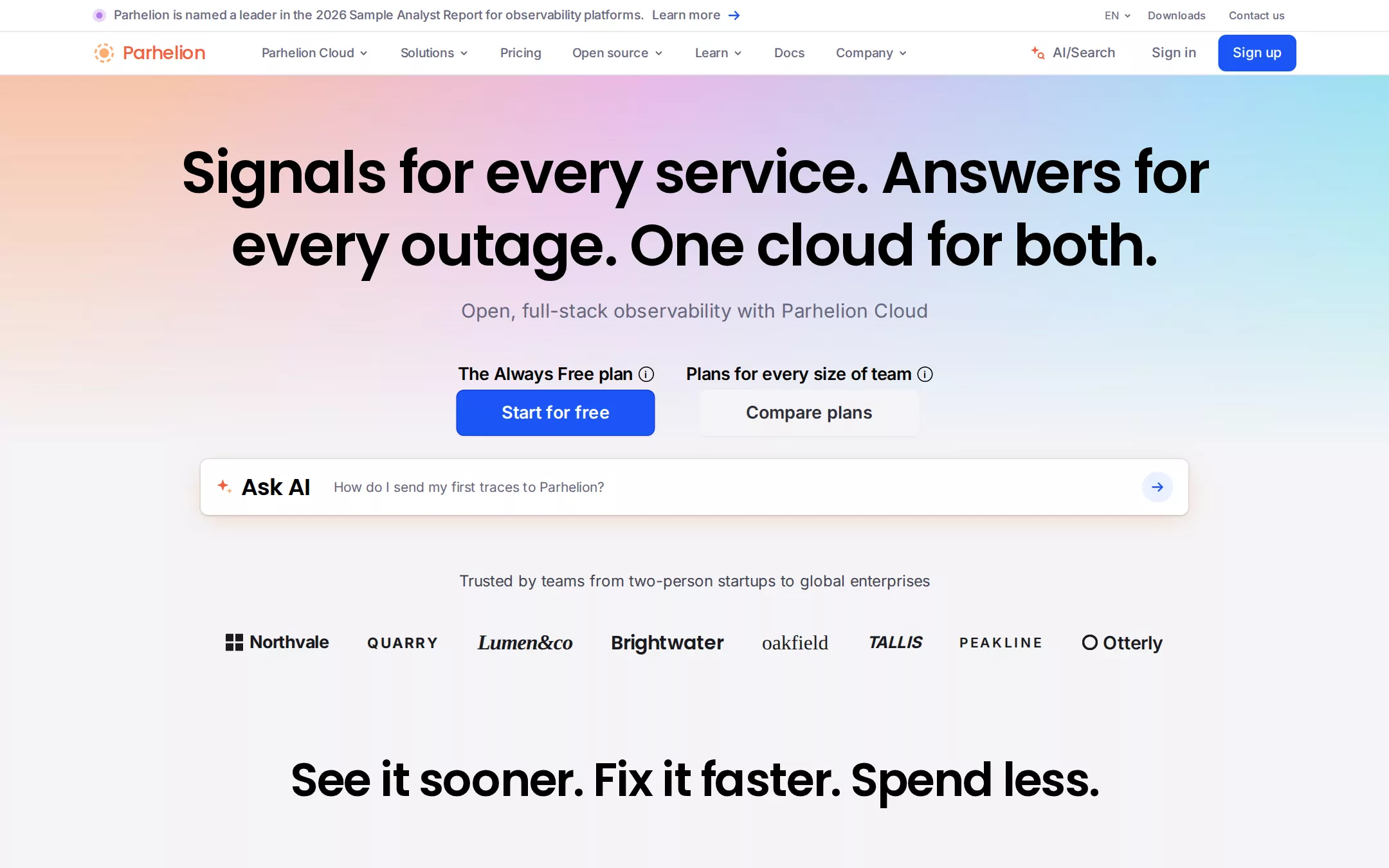
An original Parhelion observability page on Cloud Canvas: a 33px white announcement strip and a 44px white header with an orange halo mark, Slate navigation and a blue Sign up; a centred hero over a four-colour Horizon Wash with a two-line 60px Poppins headline, a Slate subline and two labelled plan buttons; a 1024px Ask AI field with a warm glow; a monochrome invented logo row; a 48px section statement leading into three alternating text-and-dashboard rows framed in 24px pastel cards; an orbit of integration discs on faint rings; a products-and-telemetry chip panel; a closing call and a footer.
- Best forObservability, monitoring, data and infrastructure platforms that sell a free tier beside paid plans and prove themselves with product screenshots.
- Tech stack- Next.js (App Router) - React - TypeScript - CSS custom properties Use Next.js App Router, React and TypeScript with plain CSS custom properties for every colour, gradient, radius and spacing token. Render the page as server components; only the mobile menu and the Ask AI field need small client islands, holding their state in memory. Self-host Poppins (500, 600) and Inter (400–700), both SIL Open Font License, as woff2 files through next/font/local — no remote font request. Draw the Parhelion halo, the invented wordmarks, the integration glyphs, every icon and every dashboard capture as inline SVG and HTML — the dashboards are built from committed sample arrays, never bitmap screenshots — so the markup is identical on every render. All sample content is committed in the source. Provide page metadata. Build and run the production page before capturing its preview.
The prompt. 1960 words, self-contained.
Build the "Grafana Labs" kickstart — A light observability-cloud homepage under a peach-to-aqua sunrise wash: a centred two-line Poppins headline, paired plan buttons, a wide Ask AI field and pastel-framed dark dashboard captures.

## Design
Build a rebrandable landing page for an open, full-stack observability cloud: logs, metrics, traces and profiles in one place, an AI assistant for on-call, and cost controls for telemetry.

Create a complete landing page for Parhelion, a fictional observability cloud. This is a concept presentation, not a real company — no real product, customer, award, analyst firm, person or logo. Use original branding, artwork and copy throughout.

Color: a quiet light canvas with one sunrise gradient and one electric blue. Cloud Canvas #F4F4F6 is the page and every section background. White Surface #FFFFFF is the announcement strip, the header, the Ask AI field, logo discs and product chips. Divider Ash #E6E6EA is every 1px structural rule — under the strip, under the header, around the products panel and above the footer. Input Steel #D8D8DF is the outline of inputs and the faint integration rings. Ink #000000 is every heading and plan label. Graphite Copy #454554 is body copy and the logo-row lead-in. Slate Navigation #67677E is navigation, utility links, the hero subline and placeholders — never black navigation. Electric Signal #1B55F5 is the only saturated interface colour: filled buttons (a #1440E1 border on the hero size), text links and arrows; it never fills a section. Blue Mist #EAF0FF is the Ask AI submit circle and one card field. Charcoal Panel #2B2D32 is the inside of every dashboard capture. The pastel card system: Lilac Wash #F9E8FF framed by Orchid Edge #EEAAFD, Blue Mist #EAF0FF framed by Sky Edge #8EC0FF, and Peach Paper #F4E5D9 framed by Tangerine Edge #FFAE70; Apricot Fill #FAD8AC is an alternate warm field. Horizon Wash is the hero atmosphere — linear-gradient(120deg, #F7BFA3 10%, #E6B3E6 40%, #A3D8F7 75%, #7BE7E7) — a 420px full-width band directly under the header at 90% opacity, masked from opaque at its top through 55% at 42% to transparent by 92%, so it melts into #F4F4F6 before the Ask AI field. The brand mark alone uses a #FFAE70 to #F55F3E halo, and Flare #F55F3E also colours the wordmark and the Ask AI sparkle. No drop shadows on cards; the only shadows are the 0 1px 2px rgba(0,0,0,.05) on buttons and the Ask AI field's ring and warm glow.

Typography: two families. Headings use "Poppins", "Manrope", ui-sans-serif, system-ui, -apple-system, "Segoe UI", sans-serif at weight 600 — never set a heading of 24px or more in Inter. Body uses "Inter", ui-sans-serif, system-ui, -apple-system, "Segoe UI", Roboto, Arial, sans-serif. Hero headline 60px/75px, letter-spacing -1.5px, centred in a 1152px measure so it sets on exactly two lines; section statements 48px/54px at -1.2px; narrative row headings 30px/37.5px at -0.75px; the integrations heading 36px/45px; panel headings and the Ask AI label 24px/30px. Hero subline Inter 20px/28px #67677E in a 672px measure; body 16px/24px; plan labels 18px/28px weight 600 at -0.45px; hero buttons 18px/28px weight 600; navigation 13px/19.5px weight 500 at -0.13px; header controls 14px/20px weight 500; strip message 13px/19.5px weight 500; strip utilities 11px/16.5px.

Layout: a 1440px canvas with content in a centred 1280px container with 16px inner padding (content from x 96 to 1344). Spacing is built on 4px: 12px element gaps, 64px section padding. Radii: 24px cards and panels, 12px icon tiles and screenshot insets, 8px buttons, inputs and chips, 6px menu buttons, 4px plain nav links, fully round for icon circles.

Announcement strip: a 33px white bar with a 1px #E6E6EA bottom rule. Left at x 96: a 14px lilac dot, the message Parhelion is named a leader in the 2026 Sample Analyst Report for observability platforms. in Slate, then Learn more with a 16px #1B55F5 arrow. Right, ending at x 1344: EN with a chevron, Downloads and Contact us in 11px weight 500 Slate, each with 8px 12px padding.

Navigation: a 44px white header with a 1px #E6E6EA bottom rule. At x 96 the Parhelion mark — a 24px halo, a solid gradient disc inside a dashed gradient ring — and the wordmark Parhelion in Poppins 19px weight 500 #F55F3E, 143px wide together. From x 255: Parhelion Cloud, Solutions, Pricing, Open source, Learn, Docs and Company, each 0 16px padding, the menus with a 12px chevron. Right: AI/Search with a 16px orange sparkle-and-magnifier glyph, Sign in, and the 83×36px Signal button Sign up ending at x 1344.

Hero (id plans): the Horizon Wash starts at the header's bottom edge (y 78); the content has 64px top padding. At y 142 the headline Signals for every service. Answers for every outage. One cloud for both. — two centred lines. At y 308 the subline Open, full-stack observability with Parhelion Cloud. At y 374 two centred columns 32px apart, each a plan label above its 48px button 2px below: The Always Free plan over a 206px Signal button Start for free, and Plans for every size of team over a 229px quiet button Compare plans.

Ask AI (id ask): 24px vertical padding; a centred 1024×58px white field at y 476 with 16px inner padding: an 18px Flare sparkle, the label Ask AI, the placeholder How do I send my first traces to Parhelion? 24px after it, and the 32px Blue Mist circle with a #1B55F5 arrow at the right.

Logo row: 32px padding; at y 590 the centred lead-in Trusted by teams from two-person startups to global enterprises in 16px Graphite Copy, then at y 646 a 40px row of eight invented monochrome #1A1A1F wordmarks spread across x 242–1198, 40px apart, each in a different lettering — Northvale (a four-square glyph), QUARRY (spaced caps), Lumen&co (italic serif), Brightwater (Poppins bold), oakfield (lowercase serif), TALLIS (black italic), PEAKLINE (wide-tracked caps) and Otterly (a ring glyph). Never tint them blue.

Narrative rows (id features): 64px section padding; at y 782 the centred statement See it sooner. Fix it faster. Spend less. Then, 80px below, three rows of two 600px columns at x 96 and x 744, each about 493px tall, alternating sides. The text column: a 48px icon tile, 16px gap, the 30px heading, an 8px gap, 16px Graphite Copy with inline underlined #1B55F5 links, and a weight-600 #1B55F5 link with an arrow. The other column: a 600×428px pastel showcase card holding a dark Charcoal dashboard capture inset 32px from its top and inner edge and bleeding off the other two. Row one, lilac card, text left: AI for modern on-call — ask Parhelion Copilot what changed, open an Investigation, watch your own agents with Agent Monitoring — the capture is an assistant screen with a prompt box and an error-rate chart. Row two, blue card on the left, text right: Cut costs. Keep only the data that earns its place. — Smart Retention trims storage bills by up to 70% — the capture is a billing screen with three deep-blue KPI tiles ($1.2k total, $812 metrics, $31.6 logs) over a cost table. Row three, warm card, text left: Join up your data. Find the cause first. — the capture is a root-cause timeline with service rows and red, amber and blue spans.

Integrations (id integrations): a 640px band with three faint 1px #D8D8DF elliptical rings centred behind the copy and about twenty 52px white discs on them, each holding a generic, multicolour 24px integration glyph (database, container, queue, cloud, chart, bell). Centre: Plug in, never lock in in Poppins 36px, a 16px Graphite Copy paragraph about open standards like OpenTelemetry and Prometheus, and a See integrations link.

Products (id products): the centred two-line statement Watch everything. / Solve anything. at 48px, a 16px Graphite Copy lede, then a 1280px panel — #E9E9EE, 1px #E6E6EA, 24px radius, 40px 24px 24px padding — with the 24px heading Products and solutions over a four-column grid of white chips (12px gaps): yellow-keyed AI-assisted observability, Full-stack observability, Cost controls and Native OpenTelemetry, orange-keyed Incident response, Kubernetes monitoring, Frontend monitoring and Synthetic checks; then Telemetry over blue-keyed Logs, Metrics, Traces and Profiles.

Closing call (id close): 96px padding, the centred 48px heading Start observing in minutes, a Graphite Copy line listing the free plan's sample allowances and the 48px Start for free button.

Footer (id footer): a 1px #E6E6EA top rule on #F4F4F6, the mark and wordmark, four 14px Slate link columns and one line — © Parhelion sample · a fictional observability cloud. Not a real company.

## Tech stack
- Next.js (App Router)
- React
- TypeScript
- CSS custom properties

Use Next.js App Router, React and TypeScript with plain CSS custom properties for every colour, gradient, radius and spacing token. Render the page as server components; only the mobile menu and the Ask AI field need small client islands, holding their state in memory. Self-host Poppins (500, 600) and Inter (400–700), both SIL Open Font License, as woff2 files through next/font/local — no remote font request. Draw the Parhelion halo, the invented wordmarks, the integration glyphs, every icon and every dashboard capture as inline SVG and HTML — the dashboards are built from committed sample arrays, never bitmap screenshots — so the markup is identical on every render. All sample content is committed in the source. Provide page metadata. Build and run the production page before capturing its preview.
Where the repo you are working in already has an equivalent in place, keep the repo's choice and say which one you kept.

## Everything else
Keep Parhelion clearly fictional and rebrandable: no real company, product, customer, analyst firm, award, integration logo or person — the logo row, product names, award line and dashboard numbers are invented. #1B55F5 is the only filled button colour and the only link colour; it never fills a section. Cards keep 24px corners and no shadow; buttons and inputs keep 8px. Navigation stays Slate, never black. Do not compress sections below 64px vertical padding or turn the page into a dense dashboard grid. Text pairs clear WCAG AA: Ink, Graphite Copy and Slate on #F4F4F6 and #FFFFFF, white on #1B55F5; the headline over the Horizon Wash is pure black. Every link leads to a real section on the page; the Ask AI field accepts typing but sends nothing and stores nothing; the page loads no analytics or tracking script and shows no cookie banner or promotional overlay. Content is initially visible: no typing effects, counters, parallax, marquees or scroll reveal; hovers take 150ms and every transition stops for prefers-reduced-motion. Every control shows a 2px #1B55F5 focus ring with a 2px offset. Dashboard captures are labelled figures; decorative glyphs are hidden from assistive technology. At 360px the navigation collapses into a Menu button, the announcement strip keeps only its message, the headline drops to 36px/44px, the two plan columns stack full-width, the Ask AI field fills the width, the logo row wraps into two lines, narrative rows stack text above card, the integration discs thin to a ring of eight, the chip grid becomes one column, and the page never overflows horizontally.

### Non-negotiables
- Responsive from 360px through desktop — no horizontal page overflow at any width. Deliberately scrollable regions stay within the viewport and remain keyboard and touch accessible.
- Every text/background pair clears WCAG AA (4.5:1 for body, 3:1 for large text); adjust a tint rather than shipping a failing pair.
- Fully keyboard operable, with a visible focus ring drawn in the accent colour.
- Honour `prefers-reduced-motion` — swap every transition for an instant state change.
- Write real copy in the voice described above; no lorem ipsum and no TODO placeholders.
- Use system or self-hosted fonts and CSS/SVG-drawn graphics — do not depend on a remote image or icon service.

Build the whole page end to end and show me the result running — not a description of it.