Gocardless
A calm, centred fintech homepage: a heavy grotesk headline, ink pill buttons, a wide rounded photo-style stage and soft sky-blue product cards on pale grey.
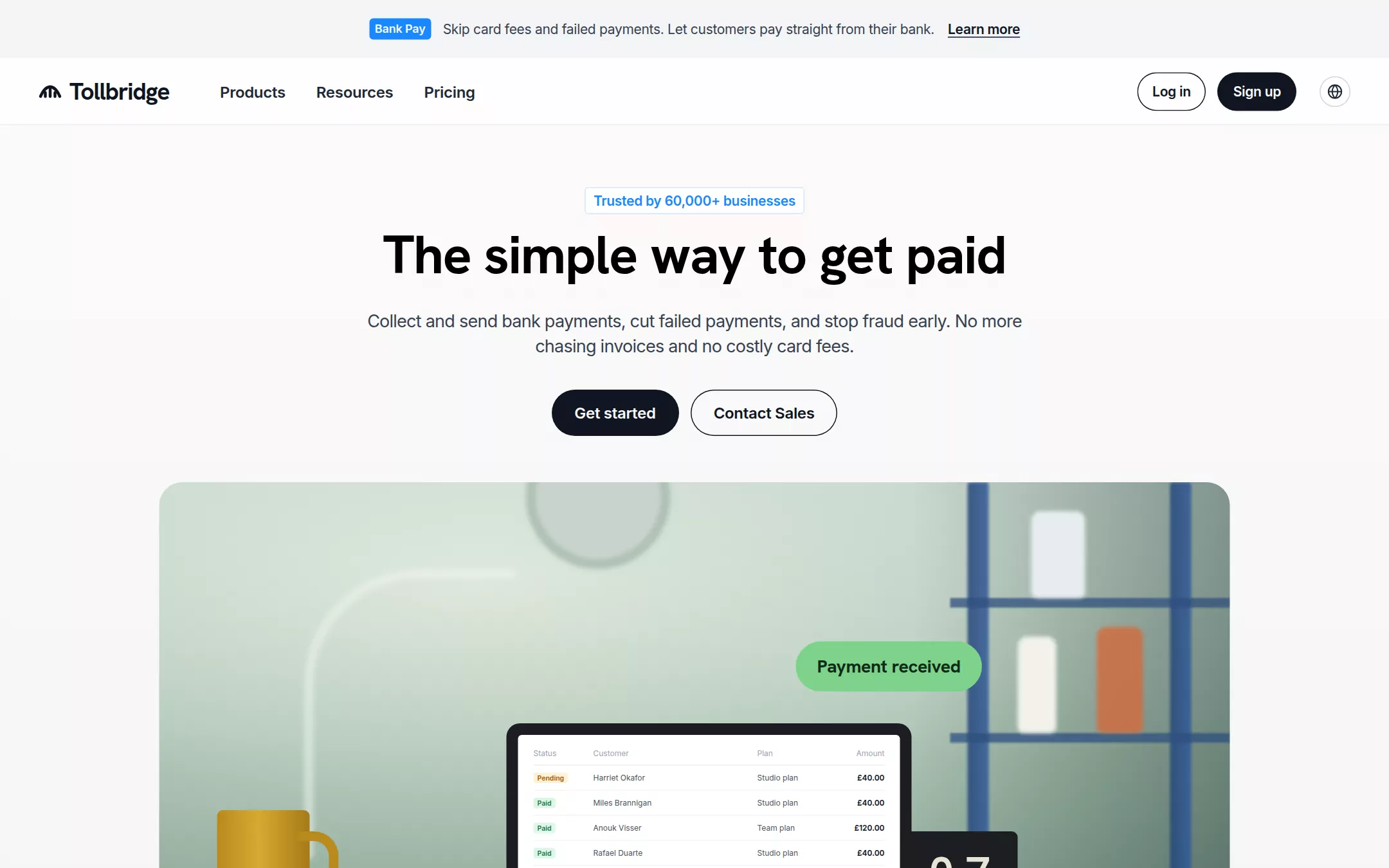
An original Tollbridge page: a 60px pale-grey announcement bar with a blue chip, a 70px navigation with a bridge mark, three bold links, an outlined Log in pill, an ink Sign up pill and a region globe, then a centred hero — a blue-outlined trust tag, a one-line 56px headline, an 18px lead and two 48px pills — above a 1110px rounded stage drawing a sunlit desk with a laptop of payments and a green Payment received bubble; below, a bordered customer wordmark strip, three sky-blue product cards, four white benefit cards, a feature bento, an ink payment-builder panel with a yellow Begin button, customer quotes, an ink closing call to action and a night-navy footer with stat tiles.
- Best forPayments, billing, invoicing and other fintech products sold to small and mid-sized businesses who want a trustworthy, plain-spoken homepage.
- Tech stack- Next.js (App Router) - React - TypeScript - CSS custom properties Use Next.js App Router, React and TypeScript with plain CSS custom properties for every colour, radius, spacing and type token. Render the page as server components; only the customer quotes carousel and the mobile menu need small client islands holding state in memory. Self-host Hanken Grotesk and Inter (both SIL Open Font License) as woff2 files through next/font/local — no remote font request. Draw the bridge mark, every icon, the desk-scene stage, the laptop payments table, the product widgets, the bento charts and the invented wordmarks as inline SVG, CSS and HTML built from committed sample arrays, never bitmap photos, stock imagery or video, so the markup is identical on every render. Provide page metadata. Build and run the production page before capturing its preview.
The prompt. 1683 words, self-contained.
Build the "Gocardless" kickstart — A calm, centred fintech homepage: a heavy grotesk headline, ink pill buttons, a wide rounded photo-style stage and soft sky-blue product cards on pale grey.

## Design
Build a rebrandable landing page for a bank-payments platform that collects one-off and recurring payments without cards — instant payments, bank debit subscriptions, payouts, retries and fraud checks in one dashboard.

Create a complete landing page for Tollbridge, a fictional bank-payments company. This is a concept presentation, not a real company — no real product, customer, person or logo. Use original branding, artwork and copy throughout.

Color: a calm, light fintech page. Mist #F3F4F6 is the page canvas and the announcement bar; the canvas warms toward #FDFBF8 across the top 240px and settles into Mist by 1200px. Paper #F9FAFB is text on dark fills. White #FFFFFF fills cards, the trust tag and quote cards. Ink #0F1521 is headings, primary pills, outline rings, icon tiles and the dark panels. Slate #1F2937 is navigation links and the footer stat tiles. Graphite #374151 is body copy and the hero lead. Grey #6B7280 and Fog #9CA3AF are captions and quiet metadata. Line #E5E7EB is every 1px divider and the customer-strip rules. Signal Blue #1A88FF is only the announcement chip and the trust-tag text, with Sky #D3E5FE fading to #EFF6FE behind product-card art. Electric Yellow #FFE500 appears only on Ink panels — the Begin and Get started pills and the New chip — never on the light canvas. Night #111827 is the footer. A soft Mint #7ED38A fills the Payment received bubble in the hero art. Nothing else is coloured.

Typography: display in "Hanken Grotesk", "Inter", ui-sans-serif, system-ui, -apple-system, "Segoe UI", sans-serif (SIL OFL), everything else in "Inter", ui-sans-serif, system-ui, -apple-system, "Segoe UI", sans-serif. Hero display 56px/65px weight 700 with -1.1px tracking, one line, pure black. Section headings 36px/44px weight 700 with -0.6px tracking, left-aligned. Card titles Inter 24px/32px weight 700 (benefit cards 20px/28px) with -0.5px tracking in Graphite. Hero lead 18px/26px with -0.5px tracking in a 700px measure. Navigation links 16px/24px weight 600 with -0.2px tracking. Body 16px/24px with -0.2px tracking. Pills 16px/24px weight 600 (14px/22px in the navigation). Chips and captions 12px/18px weight 600.

Layout: a 1440px canvas; the navigation spans 40px side padding, sections sit in a 1344px column with 48px side padding, and the hero is centred. Sections are separated by 96px; headings sit 48px above their grids; grids use 24–32px gaps. Radii: 100px on every pill, 12px on cards and panels, 24px on the hero stage, 16px on mini widgets, 4px on chips and the trust tag. No shadows anywhere.

Announcement bar: 60px, full width, Mist; centred on one line a Signal Blue chip Bank Pay, the 14px/22px Graphite sentence Skip card fees and failed payments. Let customers pay straight from their bank. and an underlined 14px weight 600 Learn more.

Navigation: a 70px row on 72% white with a 1px bottom rule. At x 40 a 140px lockup — a 24px bridge mark (an arch over three posts, Ink strokes) and the 25px weight 700 Hanken Grotesk wordmark Tollbridge. From x 212 three links Products, Resources, Pricing with 14px 16px padding. Right: a 72×40px outlined Log in pill, a 12px gap, an 82×40px Ink Sign up pill, then a 32px outlined globe button.

Hero (id top): centred. At y 194 the trust tag Trusted by 60,000+ businesses; at y 231 the headline The simple way to get paid; at y 320 the two-line lead Collect and send bank payments, cut failed payments, and stop fraud early. No more chasing invoices and no costly card fees.; at y 404 two 48px pills 12px apart — Ink Get started and outlined Contact Sales. At y 500 a 1110×520px stage with a 24px radius: an illustrated sunlit room drawn in CSS — a sage gradient wall (#D7E3D3 to #6F8C80) with a blurred wall clock and desk-lamp arc, a blurred cobalt shelving unit holding soft jars on the right, a warm wooden desk, an ochre mug, a black flip calendar reading 07 — and centred on the desk a dark laptop whose white screen lists invented payments (Status chip Pending or Paid, customer, plan, amount in pounds). A Mint Payment received bubble, 52px tall in 19px weight 700 display type, floats above the screen's right edge.

Customer strip: 64px below the stage, a 162px band between two 1px Line rules with 72px edge padding and seven invented grey wordmarks spread evenly — larkfield, Penwick&Co, moorhen, QUAYSIDE, fernhill, Ottery., Brightwater — with 80px fades to Mist at both edges.

One platform (id platform): heading One platform, every payment, then three columns. Each column: a 280px Sky-gradient art panel with 12px radius holding a white mini widget (a £349 Consultation pay card with an Ink Pay now pill; stacked 22 May £70 and 12 June £135 schedule rows; From GBP Account / To Ada Merriweather payout fields), then a 24px title — Instant one-off payments, Automated recurring payments, Outbound payments — a 16px description and a 40px outlined Learn more pill.

Make payments a breeze (id features): heading Make payments a breeze, then four white 12px-radius cards with 32px padding, each a 40px Ink icon tile, a 20px title and 16px copy — End late payments, Cheaper than cards, Get paid sooner, In safe hands.

Everything your business needs: heading Everything your business needs, then a white bento: Failed payment recovery with a drawn Failed → Retried → Paid timeline, Fraud protection with a five-month bar chart, International payments with a grid of currency chips (GBP, EUR, USD, AUD, NZD, CAD, SEK, DKK), Custom checkout with a small browser-framed checkout, and a wide Flexible integrations card with a scrolling row of 114px #1F2937 app tiles.

Payment builder (id builder): a full-width Ink panel, 12px radius, 64px padding: a yellow-outlined New chip, the 36px Paper heading Try the payment builder, a 16px #E5E7EB line and a 48px yellow Begin pill; on the right a white browser window showing an invented checkout for Atlas Studio — a £1,499.99 invoice, a Pay by Bank row and an Ink Continue to payment pill.

Customer quotes: the centred heading See what customers are saying, then 400×500px white quote cards with a 1px Mist border, 12px radius and 48px padding — a round grey avatar, a 16px/24px quote, a weight 600 name and Fog role and company — with round previous and next buttons.

Closing call to action (id cta): an Ink panel with the 36px Paper heading Start collecting payments today, a 16px line Get started in minutes with no commitment, or talk to our team., a yellow Get started pill and a yellow-outlined Contact Sales pill.

Footer (id footer): Night #111827 with 64px 32px 80px padding; four #1F2937 stat tiles (60k+, £40bn, 30+, 24/7) with 42px weight 700 Paper figures and 14px Fog captions; then five 14px link columns with Paper headings — Product, Resources, Company, Partners, Contact — and © Tollbridge sample · a fictional product. Not a real company. in 12px Fog.

## Tech stack
- Next.js (App Router)
- React
- TypeScript
- CSS custom properties

Use Next.js App Router, React and TypeScript with plain CSS custom properties for every colour, radius, spacing and type token. Render the page as server components; only the customer quotes carousel and the mobile menu need small client islands holding state in memory. Self-host Hanken Grotesk and Inter (both SIL Open Font License) as woff2 files through next/font/local — no remote font request. Draw the bridge mark, every icon, the desk-scene stage, the laptop payments table, the product widgets, the bento charts and the invented wordmarks as inline SVG, CSS and HTML built from committed sample arrays, never bitmap photos, stock imagery or video, so the markup is identical on every render. Provide page metadata. Build and run the production page before capturing its preview.
Where the repo you are working in already has an equivalent in place, keep the repo's choice and say which one you kept.

## Everything else
Keep Tollbridge clearly fictional and rebrandable: no real company, product, customer, person or logo. Every button is a full pill; the only filled light-canvas buttons are Ink #0F1521, and Electric Yellow #FFE500 appears only on Ink panels. Cards and panels keep a 12px radius with no shadows; the hero stage keeps 24px. Never add a second accent colour to the light canvas beyond the Signal Blue chip and trust tag. Text pairs clear WCAG AA: #0F1521 and #374151 on #F3F4F6 and #FFFFFF, #F9FAFB on #0F1521, #0F1521 on #FFE500. Every link leads to a real section on the page; nothing submits. The page loads no analytics or tracking script and shows no cookie banner or chat bubble. Content is initially visible: no counters, typing effects, parallax or scroll reveal. Hovers take 150ms and every animation stops for prefers-reduced-motion. Every control shows a 2px #1A88FF focus ring with a 2px offset. The hero stage and the product art are labelled figures; decorative shapes are hidden from assistive technology. At 360px the navigation collapses to the mark, Sign up and a Menu button, the announcement bar wraps, the headline drops to 36px/42px across two lines, the pills go full-width, the stage becomes a 4:5 crop centred on the laptop, every grid becomes one column, and the page never overflows horizontally.

### Non-negotiables
- Responsive from 360px through desktop — no horizontal page overflow at any width. Deliberately scrollable regions stay within the viewport and remain keyboard and touch accessible.
- Every text/background pair clears WCAG AA (4.5:1 for body, 3:1 for large text); adjust a tint rather than shipping a failing pair.
- Fully keyboard operable, with a visible focus ring drawn in the accent colour.
- Honour `prefers-reduced-motion` — swap every transition for an instant state change.
- Write real copy in the voice described above; no lorem ipsum and no TODO placeholders.
- Use system or self-hosted fonts and CSS/SVG-drawn graphics — do not depend on a remote image or icon service.

Build the whole page end to end and show me the result running — not a description of it.