 Fredrin
Events
Developer Conference Landing (Light)
A loud, type-first launch page for an in-person developer conference.
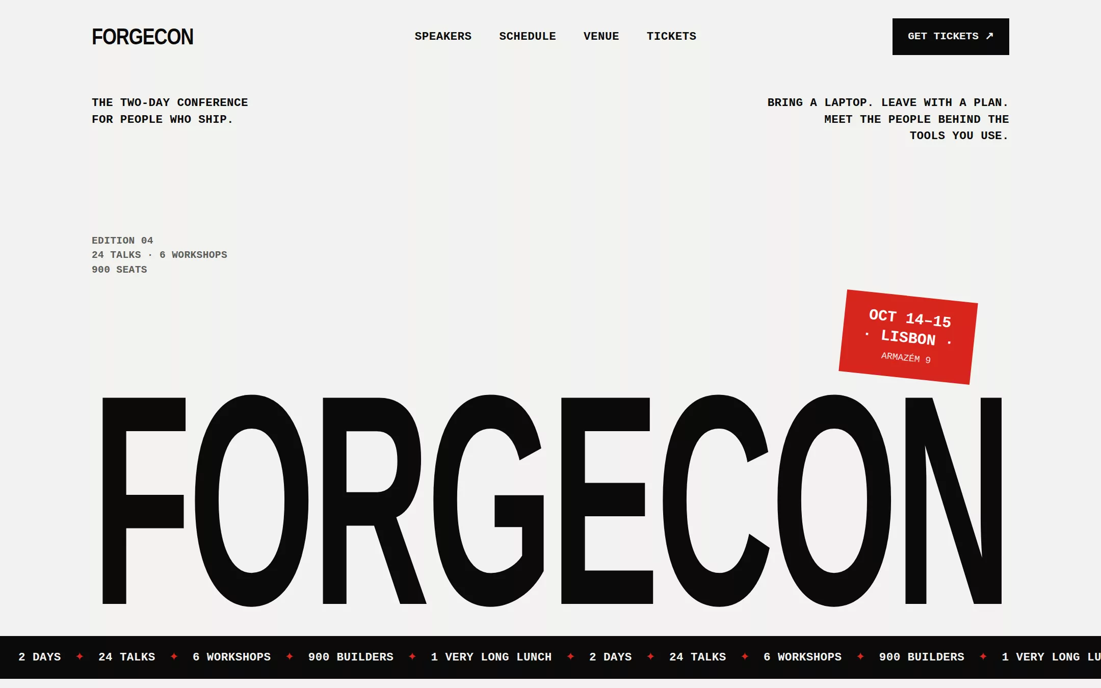
A type-first conference page that sells the event on confidence: a soft-white hero where the conference name fills the whole column in a giant condensed wordmark, with mono uppercase labels pinned to its corners and a single red date stamp. Below, hard black bands alternate with soft-white sections — a numbered speaker grid, a two-day schedule table, a ticket tier row and a waitlist form.
- Best for
- A developer conference, meetup series, hackathon or workshop day that wants to feel confident and crafted — all type and rules, no stock photography.
- Tech stack
- - Next.js (App Router) - React Server Components - TypeScript - Plain CSS with custom properties - Inline SVG and CSS for every graphic
- Tags
- conference · event · brutalist · condensed type · monospace · black and white · red accent
The creation prompt
1358 words, self-contained. Paste it into a chat session with your coding agent and it builds Developer Conference Landing (Light) end to end.
Build the "Developer Conference Landing (Light)" kickstart — A loud, type-first launch page for an in-person developer conference.

## Design
Use https://laracon.us/ as the visual reference: a soft off-white page, an enormous condensed uppercase wordmark, small monospace uppercase labels, dotted hairline rules and full-bleed black bands. Reinterpret it for a fictional conference without copying its brand, copy, speakers, venue, video or photography. The composition is a strict 1200px column with 24px gutters and a 12-column grid; everything aligns to it. The hero is about 820px tall: two short mono label blocks at the top (left and right), the giant black wordmark anchored to the bottom edge, and one red #D7261E rotated date stamp (a rectangle with the dates and city in white mono) overlapping the wordmark's top-right corner by about 6°. Section kickers are a mono uppercase label followed by a dotted 1px rule that runs to the right edge of the viewport. Black #0B0B0B bands carry the schedule and the waitlist; they flip the text to #F2F2F0 and keep the red accent. Speaker portraits are NOT photographs: each is a square panel of bold initials on a flat tone with a subtle 2px CSS scanline pattern. No gradients, no rounded corners, no shadows, no glow.

### Colour palette (use these exact values)
- Background: #F2F2F0
- Surface / cards: #FFFFFF
- Primary text: #0B0B0B
- Secondary text: #5C5C58
- Accent (buttons, links, active state): #D7261E
- Text on accent: #FFFFFF
- Borders / dividers: #D9D9D5
Use exactly one accent. Everything that needs emphasis earns it through weight, scale or space instead of a second colour.

### Typography
- Headings: 'Arial Narrow', 'Helvetica Neue Condensed', 'Roboto Condensed', 'Liberation Sans Narrow', Impact, sans-serif
- Body: ui-monospace, 'SF Mono', 'JetBrains Mono', Menlo, Consolas, 'Liberation Mono', monospace
- Two voices only. Display is a heavy condensed grotesque, always uppercase: the hero wordmark is sized so its letters span the full 1200px column (about clamp(96px, 19vw, 300px)) at weight 800, -0.04em tracking and 0.82 line-height, with transform: scaleY(1.08) for extra height. Section headings are clamp(40px, 5.4vw, 72px) at weight 800, uppercase, -0.02em tracking, 0.95 line-height. Everything else — labels, body, buttons, schedule — is the mono at 15px/1.55, and every label and button is uppercase with 0.02em tracking and weight 600.

### Page structure
1. Header: a condensed uppercase wordmark on the left, mono nav links (Speakers, Schedule, Venue, Tickets) in the middle, and a black square-cornered Get tickets button with a ↗ arrow on the right
2. Hero: a mono two-line tagline at the top left, a mono three-line invitation at the top right, the full-width giant condensed wordmark along the bottom, and the tilted red date-and-city stamp overlapping it
3. Marquee strip: a 56px black band with a slowly scrolling mono line of the event's facts separated by ✦ marks
4. Speakers: a kicker with a dotted rule, a big uppercase heading, then a four-column grid of eight speaker cards — a square initials panel, a two-digit index, the name in condensed uppercase and the talk title in mono
5. Schedule (black band): a kicker and heading, a two-button Day 1 / Day 2 toggle, and a table of time, talk and speaker rows divided by dotted rules, with breaks shown in the muted colour
6. Venue and numbers: a left column with the venue name, address and three short travel notes; a right column of four huge condensed figures with mono captions
7. Tickets: three square-cornered tier cards (Early bird, General, Workshop pass) with price, a mono checklist and a button, the recommended card outlined 2px in red with a red corner label
8. Waitlist (black band) and footer: a big heading, a short mono paragraph, a first-name and email form with a white Submit button, then a footer with the wordmark, mono links and a small print line

### Components and detailing
Buttons are square-cornered, mono uppercase at 14px weight 600, 48px tall with 20px horizontal padding: black with off-white text on light sections, off-white with black text on black bands; the primary call to action anywhere can be red #D7261E with white text. Hover nudges the ↗ arrow up and right by 2px. Inputs are 48px, square, a 1px border in the border colour (#3A3A38 on black bands), mono text, and a mono uppercase label above each. Cards have no radius and no shadow: a 1px border, or a 2px red outline for the featured one. Dotted rules are a 1px dotted border in the muted colour. The initials panels are aria-hidden decoration beside real text names. Focus rings are a 2px red outline at 3px offset.

### Motion
Blunt and quick. On load the hero wordmark slides up 40px and unclips from the bottom over 600ms, then the red stamp drops in and settles at its tilt. The marquee strip scrolls continuously at a slow, readable speed and pauses on hover and focus. Speaker cards fade up in a 40ms stagger as they enter the viewport through one IntersectionObserver. The Day 1 / Day 2 toggle swaps the table instantly with a 150ms opacity cross-fade. Under prefers-reduced-motion everything renders in its final state and the marquee is a static line.

## Tech stack
- Next.js (App Router)
- React Server Components
- TypeScript
- Plain CSS with custom properties
- Inline SVG and CSS for every graphic
Where the repo you are working in already has an equivalent in place, keep the repo's choice and say which one you kept.

## Everything else
Build a landing page for an in-person developer conference on the latest Next.js (App Router). Use the sample brand Forgecon: the wordmark “FORGECON”, the top-left tagline “The two-day conference for people who ship.”, the top-right invitation “Bring a laptop. Leave with a plan. Meet the people behind the tools you use.”, and the red stamp “Oct 14–15 · Lisbon”. The marquee reads “2 days ✦ 24 talks ✦ 6 workshops ✦ 900 builders ✦ 1 very long lunch”. Seed eight fictional speakers with initials, a two-digit index, a name and a talk title (for example Mara Okonjo — “Deleting half our backend”, Theo Lindqvist — “Types all the way down”). The schedule has two days, each with seven rows of time, talk and speaker, including a coffee break and lunch; the Day 1 / Day 2 buttons are a real tablist with arrow-key navigation, and only the active day is exposed. The venue block names the fictional “Armazém 9, Lisbon riverside” with three travel notes; the numbers are “24 talks”, “6 workshops”, “900 seats” and “2 afterparties”. Ticket tiers are Early bird at €349, General at €449 (featured) and Workshop pass at €599. The waitlist heading is “Get notified when Forgecon 2027 goes live”; submitting the form validates the email, shows an inline “You're on the list.” confirmation announced to screen readers, and sends nothing anywhere. Keep the brand, dates, copy, speakers, schedule, venue and prices in one typed site config so the owner can rebrand in one file. Buttons link to in-page anchors or #; there are no accounts, ticket sales, payments or backend. Label all speakers, venue and prices as sample content in the footer's small print. Include a short README explaining how to change the brand, dates, speakers, schedule, palette and prices. The finished page runs locally with no API keys, no database and no external assets.

### Non-negotiables
- Responsive from 360px through desktop — no horizontal page overflow at any width. Deliberately scrollable regions stay within the viewport and remain keyboard and touch accessible.
- Every text/background pair clears WCAG AA (4.5:1 for body, 3:1 for large text); adjust a tint rather than shipping a failing pair.
- Fully keyboard operable, with a visible focus ring drawn in the accent colour.
- Honour `prefers-reduced-motion` — swap every transition for an instant state change.
- Write real copy in the voice described above; no lorem ipsum and no TODO placeholders.
- Use system or self-hosted fonts and CSS/SVG-drawn graphics — do not depend on a remote image or icon service.

Build the whole page end to end and show me the result running — not a description of it.
Pasting the prompt is step one. Fredrin runs the agent that builds it, one ticket per look.