 Fredrin
E-commerce
Folio — Product Launch (Light)
A little fold. A wider world.
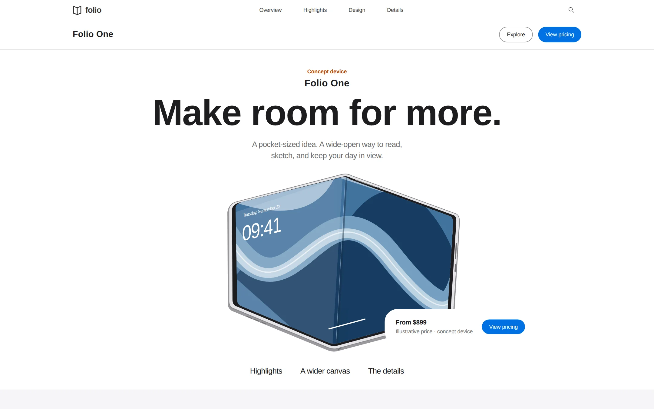
A white product showroom with oversized folding-device artwork, precise display type, compact blue actions and rounded, shadowless highlights on soft gray. The brief includes a complete fictional launch story and functional section navigation.
- Best for
- Hardware studios and product teams introducing one device through a spacious, image-led launch story.
- Tech stack
- - Next.js (App Router) - TypeScript - React Server Components - Plain CSS custom properties - Inline SVG for original hardware renders Keep content server-rendered. Use a small client component only for functional search and the manual highlights carousel; use native links and details/summary elsewhere. Prefer the existing equivalent stack in the target repository. Store product copy and illustrative specs in one local typed configuration. Use system fonts or an already-owned self-hosted Inter; no remote assets, proprietary font downloads, paid APIs, database, authentication, payment provider or external service.
- Tags
- hardware · product launch · white · blue · showcase · light
The creation prompt
1902 words, self-contained. Paste it into a chat session with your coding agent and it builds Folio — Product Launch (Light) end to end.
Build the "Folio — Product Launch (Light)" kickstart — A little fold. A wider world.

## Design
A light, product-first showroom for a fictional folding device. Center an oversized hardware render below a tightly set headline on white; follow it with pale-gray highlights and spacious white editorial chapters. Blue belongs to small actions and links. The device supplies the visual interest; the surrounding interface is quiet and flat.

### Color tokens
Keep these exact values and distinct roles:
- Canvas and cards: #FFFFFF.
- Feature bands and footer: #F5F5F7.
- Expanded navigation: #FAFAFC.
- Hairline boundaries: #D6D6D6.
- Disabled controls and navigation edges: #E6E6E8.
- Primary text and icons: #1D1D1F.
- Supporting text: #707070.
- Input and outlined-control edges: #86868B.
- Text links: #0066CC.
- Compact conversion fills: #0071E3 with #FFFFFF text.
- Unboxed launch annotations: #B64400.
The seven gallery palette fields are a summary; retain all eleven colors in the built page. Neither blue is a section background. Do not use gradients, colored status badges, or decorative cast shadows.

### Typography
Display family: 'SF Pro Display', Inter, 'Helvetica Neue', Arial, sans-serif. Text family: 'SF Pro Text', Inter, 'Helvetica Neue', Arial, sans-serif. Never download or bundle proprietary fonts; use the named locally available fallbacks, or a project-owned self-hosted Inter. Arial is also the explicit search-field face.
Use these role tuples in the order size / weight / unitless line-height / tracking:
- Utility navigation: 12px / 400 / 1 / -0.12px.
- Compact buttons: 12px / 400 / 1.33 (16px) / -0.12px.
- Small body: 14px / 400 / 1.29 / -0.224px.
- Body: 17px / 400 / 1.47 / -0.374px.
- Feature paragraphs: 17px / 400 / 1.24 (about 21px) / -0.374px.
- Product navigation title: 19px / 600 / 1.21 / 0.228px, display family.
- Product kicker: 21px / 600 / 1 / 0.231px, display family.
- Feature title: 40px / 600 / 1 / 0px, display family.
- Hero: 80px / 600 / 1.05 (84px) / -1.2px, display family.
Additional display sizes are 19, 21, 24, 28, 40, 48, 80px; available display leading values are 1.00, 1.05, 1.08, 1.14, 1.17, 1.21, 1.33, 1.38. Text sizes are 10, 12, 14, 17, 20, 26, 44px, with leading values 1.00, 1.18, 1.24, 1.29, 1.33, 1.43, 1.47. These are independent value lists, not size/leading pairs; the role tuples take precedence. Both families use weights 400, 500, 600. Tracking for 10px annotations is -0.37px; display tracking ranges from -0.015em to 0.012em and text tracking from -0.037em to -0.003em. The measured font feature is numr; reserve numerator glyphs for actual fractional annotations, not ordinary prices. Do not make the hero 700 weight.

### Spacing, shape, and separation
Use a 4px base and the spacing set 4, 8, 12, 16, 20, 24, 28, 32, 40, 48, 52, 64, 76, 80, 128, 144px. Major section spacing is specifically 90px; card padding is 28px and related-element gaps are 20px.
Named radii: cards and contained images 28px; links 10px; playback pills 36px; badges 0px; inputs 980px; buttons 9999px; floated navigation 20px. The supplementary radius values are 4, 10, 20, 28, 32, 36, 120, 170, 980, 999, 9999px; use the named roles where available rather than choosing arbitrarily from this set.
The only shadow tokens are outline-like rings: rgb(230, 230, 232) 0px 0px 0px 1px and rgb(134, 134, 139) 0px 0px 0px 1px. Cards, editorial sections, and pricing capsules have no shadow. White against #F5F5F7 and sparse 1px rules provide separation.

### Page sequence
1. Utility navigation: original Folio wordmark and fold symbol; links Overview, Highlights, Design and Details; an accessible Search disclosure.
2. Local product bar: Folio One at left, outlined Explore and blue View pricing pills at right.
3. Centered hero: plain orange Concept device label, Folio One kicker, Make room for more. headline, a short introduction, an original oversized partially opened folding-device render, and a floating demo-price capsule.
4. Section anchors: Highlights, A wider canvas, The details; all link to real sections.
5. Highlights: a #F5F5F7 band titled A fresh perspective. with a See the details link and three white rounded media slides: Two views. One thought.; Space for the small things.; Ready when you fold.
6. Editorial story: a white A wider canvas chapter pairs left-aligned copy about reading and sketching with an oversized open-device view.
7. Details and pricing: clearly illustrative device specifications, a demo price of $899, and an explanation that this fictional concept is not for sale.
8. Support and footer: keyboard-operable native disclosures for the concept, device artwork and customization; gray footer with real section links and a fictional-product notice.

### Component styling
Utility navigation is 44px high, white, with 12px/400 labels in rgba(0,0,0,0.8) and unboxed monochrome controls. Use an original folded-sheet mark. Its expanded search/menu layer is #FAFAFC, with a 1px #E6E6E8 edge and backdrop-filter blur(20px). The product bar has a 19px/600 title and small right-aligned actions; if floated, give its white container a 20px radius and #D6D6D6 hairline.
An Explore pill is transparent with #1D1D1F text, a 1px #86868B outline, 9999px radius and 12px/16px type. View pricing uses #0071E3 fill, white 12px/16px text, -0.12px tracking and the same radius. Keep these actions compact; do not turn the hero into a row of oversized buttons.
The hero has a centered 21px/600 product kicker, 80px/84px headline and an oversized folding-device render directly on white. A floating white 28px-radius price capsule sits near its lower edge, with 14px/600 price, small supporting text, and a blue pill inside; no shadow or enclosing hero card.
Section anchors are plain #1D1D1F 17px/500 labels with 25px leading, -0.374px tracking and 28px vertical padding, on transparent backgrounds. The highlights band is #F5F5F7 with a large heading opposite a #0066CC text link. Its horizontal media cards are white with 28px corners, no border or shadow, 28px padding and 24px/600 or 40px/600 titles; oversized hardware may crop inside them.
Carousel controls use rgba(210,210,215,0.64), a 36px radius and rgba(0,0,0,0.56) glyphs. Group the slide indicators and optional playback action together. For this static-artwork adaptation, use a manual carousel with real previous/next actions and slide indicators; do not show a nonfunctional pause button. If motion is later supplied, add a working pause control in the same track.
White editorial blocks have a small display kicker, a large left-aligned claim and 17px/21px paragraphs; place large hardware imagery opposite or below. Search expands from a named utility control: white input, #1D1D1F Arial 13px/1.2, 24px left and 45px right padding, 1px #86868B border, 980px radius. Launch labels are bare #B64400 text at 12px/600, 16px leading and -0.12px tracking, without fill or border.

### Motion
All text and artwork are visible on first paint. This static-artwork adaptation uses manual slide changes, no autoplay or entrance effects. Optional color/focus transitions last 120ms; reduced motion removes transitions and smooth scrolling. The source specifies no animation timing; 120ms is an implementation choice, not a measured token.

### Artwork and responsive adaptations
Build original local SVG/CSS hardware renders with a recognizable hinge, thin edge, two screen planes and restrained device UI. Show a large partially opened device directly on white, with small readable monochrome icons; subsequent views can crop into rounded media frames. This is the self-contained graphic substitute for photographic hardware imagery, not an instruction to reuse any brand's device image. Confine any illustrative color to the screen artwork; do not let it tint page chrome.
The source defines desktop geometry, not breakpoints. Implementation choices: use a 1120px content width with fluid gutters; reduce gutters to 20px below 800px, scale the hero from 80px to 44px, and stack editorial columns. Keep 28px media corners on narrow screens. Move the price capsule into normal flow before it overlaps essential imagery or text. Wrap navigation, make carousel slides fit the available width, and avoid horizontal page scrolling from 360px upward. Preserve the desktop values above at full width. Compact visible pills may have transparent hit-area padding to reach 44px touch targets without changing the specified label typography. Use #707070 supporting text only where it meets AA, and #86868B for edges rather than small copy.

## Tech stack
- Next.js (App Router)
- TypeScript
- React Server Components
- Plain CSS custom properties
- Inline SVG for original hardware renders

Keep content server-rendered. Use a small client component only for functional search and the manual highlights carousel; use native links and details/summary elsewhere. Prefer the existing equivalent stack in the target repository. Store product copy and illustrative specs in one local typed configuration. Use system fonts or an already-owned self-hosted Inter; no remote assets, proprietary font downloads, paid APIs, database, authentication, payment provider or external service.
Where the repo you are working in already has an equivalent in place, keep the repo's choice and say which one you kept.

## Everything else
Build a fictional folding-device product launch page: a complete hardware launch story, not a store or a Fredrin UI theme.

Use Folio as an original fictional hardware studio and Folio One as its folding device. Headline: Make room for more. Introduction: A pocket-sized idea. A wide-open way to read, sketch, and keep your day in view. Price capsule: From $899; Illustrative price · concept device; View pricing. Invent no real endorsements, shipping dates, availability or performance claims. Example specs and price are explicitly demo content.

Keep all navigation functional: Overview targets the hero, Explore and Highlights target the highlights band, Design targets the editorial story, and every View pricing action targets the disclosed illustrative price. Search filters a small local index of those sections, displays matching anchors, and has an explicit no-results state. Its disclosure can close with Escape and restores focus to the trigger. The carousel exposes previous/next buttons with disabled end states, named slide selectors and a current-slide announcement; retain a readable scrollable list when JavaScript is absent. Each slide uses different original device artwork. Do not invent a payment flow, signup confirmation, email capture or a dead shopping-bag control.

Use one h1, semantic landmarks, a skip link and accessible names. Informative SVGs need titles and descriptions; decorative marks are hidden from assistive technology. Keyboard focus is visibly outlined in #0071E3 with an offset. All text/background pairs must meet WCAG AA, including the gray feature band and blue pills. Keep content usable at 200% zoom and without JavaScript; native FAQ disclosures work without hydration. Prices and specification numbers are illustrative, not promises.

Use original copy and original local artwork, no reference-site names, URLs, logos, slogans or images. Include a short project README explaining local setup and how to replace the fictional brand, device graphics, copy and illustrative specifications. Responsive sizing, local graphics and interactions are the adaptations defined in this brief; retain all source-derived visual tokens.

### Non-negotiables
- Responsive from 360px through desktop — no horizontal page overflow at any width. Deliberately scrollable regions stay within the viewport and remain keyboard and touch accessible.
- Every text/background pair clears WCAG AA (4.5:1 for body, 3:1 for large text); adjust a tint rather than shipping a failing pair.
- Fully keyboard operable, with a visible focus ring drawn in the accent colour.
- Honour `prefers-reduced-motion` — swap every transition for an instant state change.
- Write real copy in the voice described above; no lorem ipsum and no TODO placeholders.
- Use system or self-hosted fonts and CSS/SVG-drawn graphics — do not depend on a remote image or icon service.

Build the whole page end to end and show me the result running — not a description of it.
Pasting the prompt is step one. Fredrin runs the agent that builds it, one ticket per look.