 Fredrin
Developer
Fly.io
A hand-drawn storybook for infrastructure: a lavender-washed canvas, an editorial serif, pastel sky bands and one violet pill.
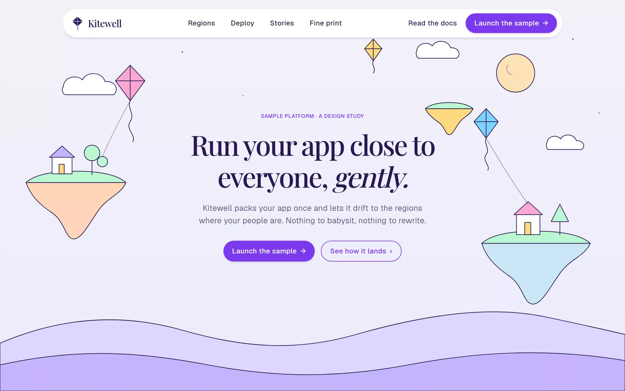
An original Kitewell app-platform page: a floating white navigation pill, a centered serif hero over an original inline-SVG storybook landscape of kites, clouds and floating islands, a three-step deploy card, a full-bleed sky-to-pink band with a checkmark list and illustration, two alternating text-and-illustration rows, a local region picker, a white fine-print card with native questions, and a Midnight Plum footer.
- Best for
- App platforms, hosting and deployment tools, databases, developer infrastructure and any technical product that wants to feel warm, whimsical and editorial instead of dark and dense.
- Tech stack
- - Next.js (App Router) - React - TypeScript - CSS custom properties - Native HTML disclosures Use Next.js App Router, React and TypeScript with plain CSS custom properties and original inline SVG for the kite mark, the storybook landscape and every illustration. Preserve equivalent tools already installed in the host project. Render the page as a server component; the only client component is the region picker, which keeps local React state and sends nothing. Native details and anchors need no JavaScript. Use local font stacks only — no remote font, image, logo, icon, video or analytics host. Provide page metadata. Build and run the production page before capturing its preview.
- Tags
- developer · infrastructure · light · illustrated · serif
The creation prompt
1657 words, self-contained. Paste it into a chat session with your coding agent and it builds Fly.io end to end.
Build the "Fly.io" kickstart — A hand-drawn storybook for infrastructure: a lavender-washed canvas, an editorial serif, pastel sky bands and one violet pill.

## Design
Build a rebrandable app-hosting platform landing page.

Create a complete landing page for Kitewell, a fictional app platform that lifts a small team's app into regions close to the people who use it. Its core idea: a hand-drawn storybook for infrastructure — a calm lavender-washed canvas where soft pastel illustration carries the emotion while the text and interface stay restrained. This is a concept presentation, not a real product — no sign-up, accounts, prices, plans, customer logos, testimonials, uptime or latency figures. Use original branding, artwork and copy throughout.

Color: Iris Haze #F1F2F9 is the page canvas, a barely-perceptible lavender rather than pure white. Canvas White #FFFFFF is every card, tile and the navigation pill. Deep Ink Violet #281950 is every heading, the logo and high-emphasis text. Heather Violet #5E537C is body copy — never pure grey, never pure black. Lavender Mist #E7E6F4 is every hairline border, divider and inset focus ring; separation comes from hairlines and tonal contrast, never heavy shadows. Electric Violet #7C3AED is the single saturated colour: filled pill buttons, the active region pill, eyebrow labels, checkmarks and outlined-pill borders only. Midnight Plum #191034 is the footer, with Mist Violet #A39AC1 labels and white links. The decorative band gradient is linear-gradient(to right, #7DD3FC, #A5B4FC, #F9A8D4); a 0.1-alpha version of the same stops washes the region picker section. Body text on the full-strength band is Deep Ink Violet, not Heather Violet, because Heather Violet drops to 3.5:1 on the indigo middle stop. Pastel illustration fills — lavender #C4B5FD, peach #FDD5B9, mint #BBF7D0, cream #FCE2B6, soft yellow #FDD97C, sky #CCE6F4 — appear only inside the illustrations.

Typography: display headlines in Mackinac, "Iowan Old Style", "Palatino Linotype", Georgia, serif at weight 500 only — 64px/1.15 at -0.045em for the hero, 36px/1.2 at -0.025em for section headings, 22px at -0.025em for card titles. The hero carries one italic accent word in the same serif. Body, buttons, navigation and labels in "Fricolage Grotesque", "Bricolage Grotesque", ui-sans-serif, system-ui, sans-serif: 18px/1.6 weight 325–400 paragraphs, 16px weight 450–500 UI at +0.025em, 12px uppercase weight 500 labels at +0.05em. Never tighten body or button tracking. All faces installed locally, no remote font request. Shapes: 9999px on every button and the navigation pill; 16px on cards and tiles. Page content max-width 1200px inside a 1440px frame, 96–120px between sections, 32px card padding.

Floating navigation pill: not a full-width bar — a white 9999px-radius pill, 1px Lavender Mist border and a soft rgba(91, 33, 182, 0.1) 0px 5px 5px -2px shadow, floating 20px from the top across the 1200px column, 10px 12px padding. Left: an original inline-SVG kite mark (a Deep Ink Violet diamond kite with a violet tail) beside Kitewell in the serif at 22px. Centre: Regions, Deploy, Stories, Fine print as 16px weight 450 Slate Dusk #202237 links. Right: a ghost link Read the docs and a filled violet pill Launch the sample. Every link is an anchor to a real section.

Illustrated serif hero: full-bleed Iris Haze with an original inline-SVG storybook landscape behind the text — soft layered hills, three floating islands with tiny houses and trees, a pale moon, rounded clouds and three pastel kites on thin Deep Ink Violet strings, all in the pastel fills with 1.5px Deep Ink Violet outlines, occupying the top and lower edges so the centered stack stays readable. The centered stack (max-width 760px) holds a 12px uppercase violet eyebrow SAMPLE PLATFORM · A DESIGN STUDY, the h1 Run your app close to everyone, gently. at 64px with gently in italic, an 18px Heather Violet paragraph (max 560px) Kitewell packs your app once and lets it drift to the regions where your people are. Nothing to babysit, nothing to rewrite., and two pills: filled Launch the sample and outlined See how it lands.

Three-step deploy card (id deploy): a centered white 16px-radius card, 32px padding, no border, max 880px, with a 22px serif title Three steps, no ceremony. and three numbered rows — Describe your app, Pick the regions, Watch it land — each with a 14px monospace inline command on an Iris Haze chip (kitewell init, kitewell regions add, kitewell launch) labelled sample.

Sky-to-pink gradient band (id regions-band): full bleed, the band gradient, two columns inside 1200px — left 60%: a violet 12px eyebrow, a 36px serif Every region is a short hop., an 18px Deep Ink Violet paragraph, an 80px Lavender Mist hairline, and a five-row checkmark list (16px violet checks, 17px weight 450 Deep Ink Violet labels, 16px row gap, no dividers): Private networking between regions, Volumes that stay near their app, Rollbacks in one command, Logs you can read, Secrets kept out of your code. Right 40%: a contained inline-SVG illustration (max 480px) of a kite carrying a small parcel between two floating islands.

Alternating illustrated rows (id stories): two rows inside 1200px, the first text-left/illustration-right, the second mirrored. Each text column: 36px serif heading, 18px Heather Violet body, 80px hairline, an outlined violet pill. Row one: Databases that follow along. with an illustration of a lantern-lit island library; row two: Quiet by default, loud when it matters. with an illustration of a sleeping moon over a signal tower.

Region picker (id regions, section washed in the 0.1-alpha band gradient): a centered 36px serif heading Where would you like to land? and a row of pill buttons — Americas, Europe, Asia-Pacific — in a group with aria-pressed; the active pill is filled violet with white text, inactive pills are white with a Lavender Mist hairline and Deep Ink Violet text. Switching swaps a grid of six white 16px-radius region tiles (a sample city name in the serif, a 14px Heather Violet sample note, a small pastel dot) from local state and sends nothing. Every city and note is labelled sample.

Fine-print card with native questions (id fine-print): a white 16px-radius card on the canvas, 32px padding, max 880px, a 36px serif heading Fine print, a 2–3 sentence Heather Violet line, then details elements on 1px Lavender Mist rules with 17px weight 500 Deep Ink Violet summaries and a thin + that turns to − when open: Is Kitewell real? — no, a fictional platform for this page. Are these regions real? — no; every city is a sample. Can I deploy anything? — no; there are no accounts, plans or prices. Below, two outlined pills: Back to the top and See how it lands.

Midnight Plum footer: full-bleed #191034, 96px vertical padding, the kite mark and Kitewell in white, a four-column grid — Platform, Regions, Stories, Studio — with 12px uppercase Mist Violet titles at +0.05em and 15px white links, each an anchor to a real section, a 1px rgba(163, 154, 193, 0.3) rule, then 14px Mist Violet Kitewell is a fictional concept. Not a real product or service.

At 760px and below: 16px gutters, the navigation pill keeps only the mark and the filled pill, a 40px hero h1, the illustration scales down behind the text, the band and alternating rows stack text above illustration, region tiles in one column, and the footer in two columns. The page fits a 360px viewport with no horizontal page overflow. Use semantic landmarks, one h1, a skip link, visible 2px Electric Violet focus rings offset 2px on every control, a text alternative for each illustration and the kite mark, and keyboard-operable pills and disclosures.

## Tech stack
- Next.js (App Router)
- React
- TypeScript
- CSS custom properties
- Native HTML disclosures

Use Next.js App Router, React and TypeScript with plain CSS custom properties and original inline SVG for the kite mark, the storybook landscape and every illustration. Preserve equivalent tools already installed in the host project. Render the page as a server component; the only client component is the region picker, which keeps local React state and sends nothing. Native details and anchors need no JavaScript. Use local font stacks only — no remote font, image, logo, icon, video or analytics host. Provide page metadata. Build and run the production page before capturing its preview.
Where the repo you are working in already has an equivalent in place, keep the repo's choice and say which one you kept.

## Everything else
Keep Kitewell clearly fictional and rebrandable: no source wordmark, balloon mascot or watercolor artwork, no customer or partner logos, no real company or person names, no prices, plans, testimonials, endorsements, uptime, latency or region-count claims. Every region, command and figure is labelled sample. Electric Violet marks pills, eyebrows, checkmarks and the active region only; separation comes from Lavender Mist hairlines, not heavy shadows; body text is never pure black or grey. Every link leads to a real section on the page; nothing is sent or stored. Deliver initially visible content with no scroll reveals, marquees, autoplay video or carousel; the only ambient motion is the slow kite drift, and hover and focus are a 150ms colour or shadow change, all disabled for prefers-reduced-motion. WCAG AA contrast on every text/background pair, keyboard-operable pills and disclosures, and a 360px layout without horizontal page overflow.

### Non-negotiables
- Responsive from 360px through desktop — no horizontal page overflow at any width. Deliberately scrollable regions stay within the viewport and remain keyboard and touch accessible.
- Every text/background pair clears WCAG AA (4.5:1 for body, 3:1 for large text); adjust a tint rather than shipping a failing pair.
- Fully keyboard operable, with a visible focus ring drawn in the accent colour.
- Honour `prefers-reduced-motion` — swap every transition for an instant state change.
- Write real copy in the voice described above; no lorem ipsum and no TODO placeholders.
- Use system or self-hosted fonts and CSS/SVG-drawn graphics — do not depend on a remote image or icon service.

Build the whole page end to end and show me the result running — not a description of it.
Pasting the prompt is step one. Fredrin runs the agent that builds it, one ticket per look.