 Fredrin
SaaS
Figma
Make room for an idea, in white and electric indigo.
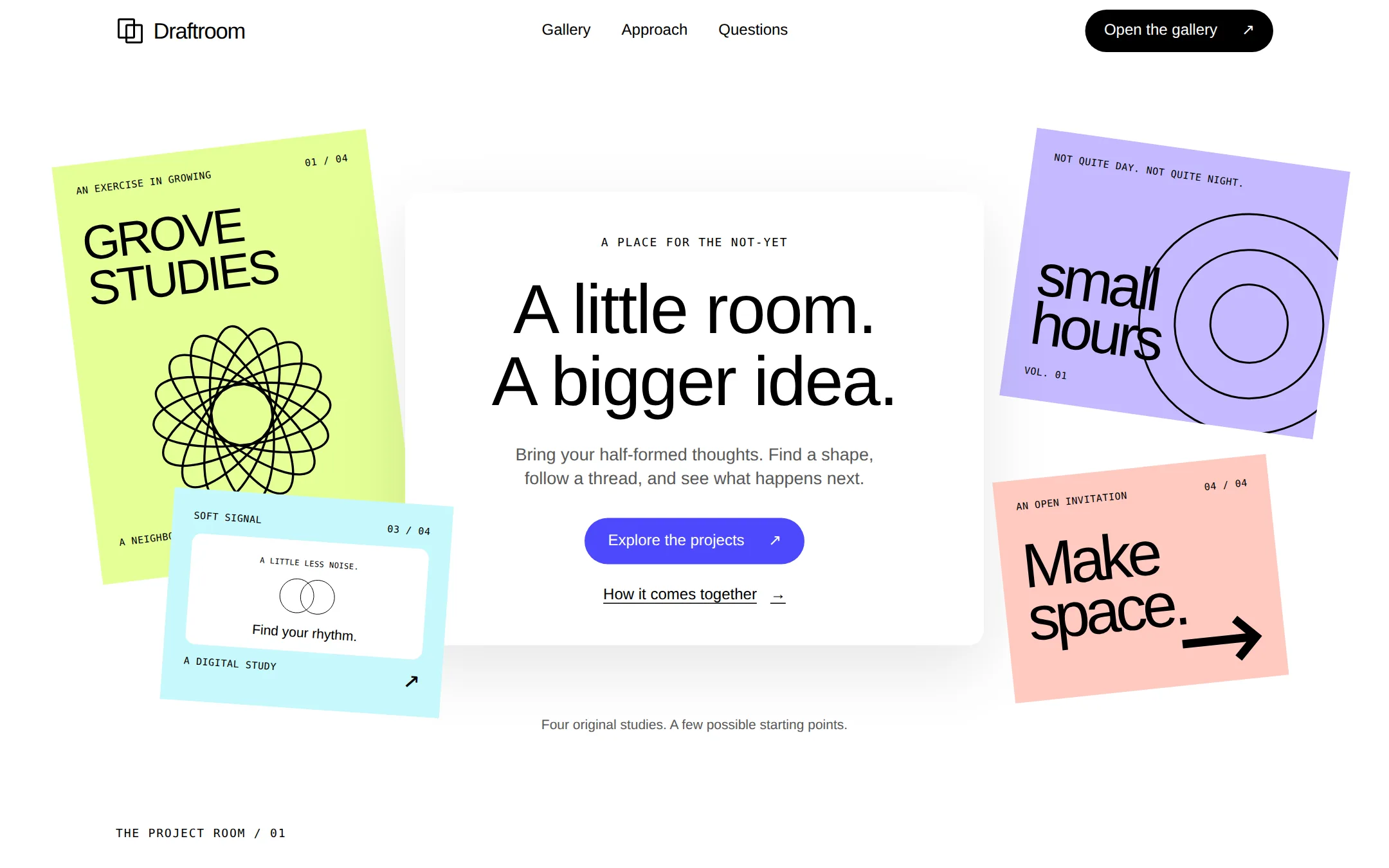
An original Draftroom creative-workspace page: a floating introduction among four colorful design studies, followed by a working local project filter and a simple creative-process story.
- Best for
- Creative tools and design studios presenting original visual work in an airy, playful gallery.
- Tech stack
- Use Next.js App Router, React and TypeScript with plain CSS custom properties and original inline SVG. Keep equivalent choices already present in the user's repository. Server Components render the layout, introduction, artwork and static sections; one small Client Component owns project filtering. Keep the four project records in typed local configuration. Use native buttons, details/summary and semantic HTML. No database, authentication, analytics, AI calls, API keys, paid services, remote images or remote fonts. The page must production-build and run locally without credentials. - Next.js (App Router) - React - TypeScript - CSS custom properties - Inline SVG - Local React state
- Tags
- creative · collage · gallery · indigo · light · SaaS
The creation prompt
1535 words, self-contained. Paste it into a chat session with your coding agent and it builds Figma end to end.
Build the "Figma" kickstart — Make room for an idea, in white and electric indigo.

## Design
Build a creative-workspace landing page where a centered introduction floats among four original design studies. Use a white #FFFFFF canvas, black #000000 ink, #595959 secondary text, #E2E2E2 quiet panels and borders, and #4D49FC for the sole filled primary action with #FFFFFF text. Keep UI chrome monochrome. Artwork alone uses #E4FF97 lime, #C4BAFF lilac, #FFC9C1 blush and #C7F8FB aqua. Use a 1200px content width, a 64px header, 80–120px section spacing, 16px cards, 8px outlined controls, and 50px primary pills. Only the floating hero card has a soft 0 24px 70px rgba(0,0,0,.1) shadow.

Use Arial, Helvetica, sans-serif throughout as an explicit local replacement for proprietary typography. Desktop hero: 72px, weight 300, line-height 1.05, tracking -0.02em. Section titles: 56px/1.1, weight 300. Body: 18px/1.4, weight 400. Navigation and controls: 16px. Artwork annotations use a system monospace at 12px with 0.04em tracking. These system stacks avoid remote fonts. Do not use bold display headings.

At 1440px, set a 64px header within 1200px, with an original black outline mark of two offset rectangles and Draftroom at left, Gallery / Approach / Questions at center, and a black Open the gallery pill at right. The hero is a 680px-tall bounded composition beneath the header. Position a 600px-wide white introduction card centrally, about 135px below the hero's top. Give it 40px horizontal and 44px vertical padding, a short eyebrow, a two-line headline, an 18px lead, the indigo Explore the projects link and a black underlined secondary link below it. The copy must remain fully readable above the surrounding work.

Arrange four static original artwork panels in the space around the hero card, with intentional partial overlap behind it but no clipping of the page or actionable text. Left: a large lime portrait poster, rotated -7 degrees, with GROVE / STUDIES typography and a black geometric flower assembled from eight outlined ellipses. Upper right: a lilac landscape composition rotated 8 degrees with three concentric black circles and the words small / hours. Lower left: a small aqua mobile-interface study rotated 4 degrees, containing a white inset panel, overlapping outline circles and the label Soft signal. Lower right: a blush typographic poster rotated -6 degrees reading Make / space. and carrying a broad black arrow. These are original SVG/CSS/HTML artworks, not screenshots of another product. Give each a short accessible name; hide redundant decorative paths. Make the artworks static, without fake interactive editor chrome. Put a short original-work caption beneath the collage.

After the hero, place a left-aligned gallery heading, filter row and four-column project grid within 1200px. Reuse the four artworks as clearly legible thumbnails in 16px-rounded frames with no shadows; put title and category below. Filters are outlined 8px buttons with a black selected state. Follow the gallery with three numbered approach columns separated by thin neutral rules, then native details/summary questions and a quiet footer. Use only real in-page destinations. Keep every target at least 44px high and add a 2px black keyboard focus outline with a 4px offset.

Below 900px, put the hero introduction in normal flow and the four artworks in a two-column grid with rotations removed. At 600px, stack the art and project galleries, keep the header links visible on a wrapping second row, use 20px gutters and a 42px hero heading. The narrow-screen hero has automatic height. At 320px and 200% zoom, controls wrap and content remains within the viewport; never conceal overflow to hide a layout error. Avoid entry animations, parallax and automatic movement. Limit hover color transitions to 150ms and remove them for reduced motion. The first paint must show the full content.

Typography stack: Arial, Helvetica, sans-serif.

Page structure:
1. Flat header with Draftroom wordmark and real section navigation.
2. Floating white hero card surrounded by four original project artworks.
3. Project gallery with local All, Identity, Editorial and Digital filters.
4. Three numbered approach statements and native-disclosure questions.
5. Quiet footer with section links and fictional-demo attribution.

## Tech stack
Use Next.js App Router, React and TypeScript with plain CSS custom properties and original inline SVG. Keep equivalent choices already present in the user's repository. Server Components render the layout, introduction, artwork and static sections; one small Client Component owns project filtering. Keep the four project records in typed local configuration. Use native buttons, details/summary and semantic HTML. No database, authentication, analytics, AI calls, API keys, paid services, remote images or remote fonts. The page must production-build and run locally without credentials.

- Next.js (App Router)
- React
- TypeScript
- CSS custom properties
- Inline SVG
- Local React state
Where the repo you are working in already has an equivalent in place, keep the repo's choice and say which one you kept.

## Everything else
Build a creative-workspace landing page with a locally filterable project gallery.

The original fictional product is Draftroom, a place for exploring visual directions. It is a rebrandable landing page and local gallery, not a functioning collaborative editor. Use an original two-offset-rectangles mark and original copy. Do not imply affiliation with a real design product, invent customers or claim connected collaboration. Header Gallery and Open the gallery target #projects; Approach targets #approach; Questions targets #questions. The wordmark and Back to top target #top. A skip link targets #main.

Hero eyebrow: A PLACE FOR THE NOT-YET. Headline: A little room. A bigger idea. Break between the two sentences on desktop. Lead: Bring your half-formed thoughts. Find a shape, follow a thread, and see what happens next. The primary Explore the projects action targets #projects; How it comes together targets #approach. Under the collage write: Four original studies. A few possible starting points.

The project gallery heading is Start somewhere unexpected. and its lead is A small collection of imaginary projects, made to get something moving. Store exactly four fictional sample records: Grove Studies / Identity / An imagined identity for a neighborhood garden.; Small Hours / Editorial / A publication for the hours between plans.; Soft Signal / Digital / An interface study for a gentler daily rhythm.; Make Space / Identity / A typographic invitation to leave a little room. Use the matching original lime flower, lilac circles, aqua interface and blush type artworks described in Design. Each project shows title, category and description. Cards are informative articles, not dead links.

Above the gallery, provide native buttons All, Identity, Editorial, Digital, with All selected initially. Filtering happens immediately in local React state: All displays four projects, Identity displays Grove Studies and Make Space, Editorial displays Small Hours, Digital displays Soft Signal. Mark each selected button with aria-pressed and a visible black fill; maintain keyboard focus on the clicked button. Announce the number of visible projects in a polite status region. Selecting All restores all four; reload also resets All. No persistence and no network requests. With JavaScript off, all projects remain readable and a noscript note explains that filtering needs JavaScript. Do not render new-project, sign-in, share, save or purchase actions without implementing their destinations.

Approach heading: From a loose thought to a lovely thing. Three numbered statements: 01 Gather the fragments — A color, a phrase, a shape you keep coming back to. Start with what catches your eye.; 02 Try a different angle — Put two things beside each other. Let the unexpected pairing lead somewhere.; 03 Give it room to grow — Keep the useful directions. Make a little space for the next version. These describe a creative process, not unimplemented software capabilities.

Questions use native details/summary: Is Draftroom a real product? — It is a fictional creative workspace and a working local gallery you can make your own.; Can I edit these projects here? — This page lets you browse and filter four original examples. It does not include an editor.; Is anything saved or sent? — No. Filtering stays in this browser and resets when the page reloads. Footer: Draftroom — Leave a little room for an idea. Include Fictional demo. Original sample projects. No affiliation or endorsement. Repeat Gallery, Approach and Questions links.

Use one h1, semantic landmarks, meaningful artwork names, keyboard-operable controls, visible focus and readable contrast. The entire page and native disclosures remain usable without JavaScript; only filtering depends on it. Document local startup and how to replace the name, copy, palette and four project records. All brief instructions are self-contained; no inspiration website is needed to build the page.

### Non-negotiables
- Responsive from 360px through desktop — no horizontal page overflow at any width. Deliberately scrollable regions stay within the viewport and remain keyboard and touch accessible.
- Every text/background pair clears WCAG AA (4.5:1 for body, 3:1 for large text); adjust a tint rather than shipping a failing pair.
- Fully keyboard operable, with a visible focus ring drawn in the accent colour.
- Honour `prefers-reduced-motion` — swap every transition for an instant state change.
- Write real copy in the voice described above; no lorem ipsum and no TODO placeholders.
- Use system or self-hosted fonts and CSS/SVG-drawn graphics — do not depend on a remote image or icon service.

Build the whole page end to end and show me the result running — not a description of it.
Pasting the prompt is step one. Fredrin runs the agent that builds it, one ticket per look.