Featurebase
A near-black, violet-lit support-platform homepage: a quiet one-line Inter headline, white conversion buttons and a dense dark inbox workspace rising from the hero's lower edge.
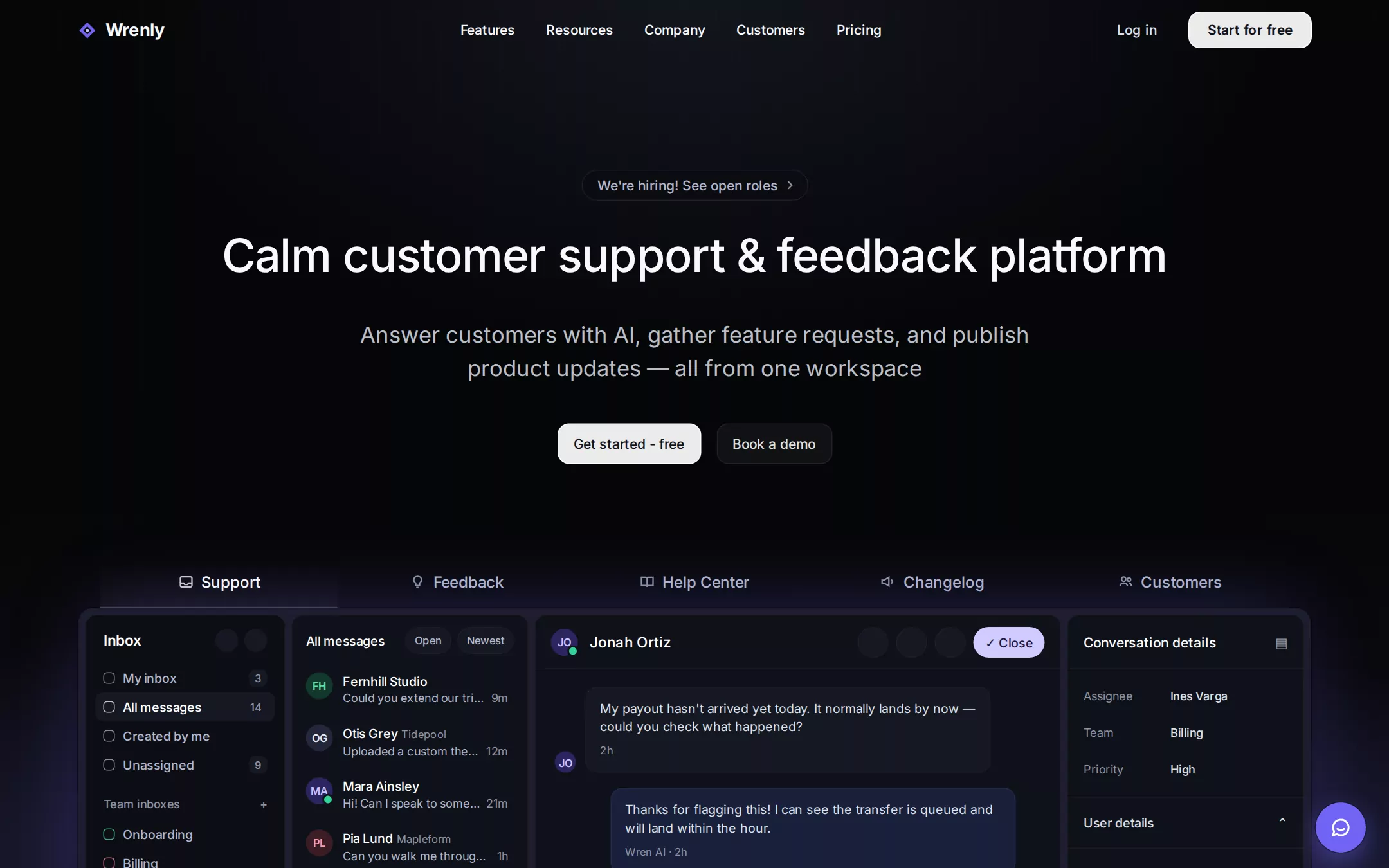
An original Wrenly support-platform page on Void Canvas: a transparent 62px header with a violet diamond mark, five centred navigation links, a quiet Log in and a white Start for free button; a centred hero with a low-contrast hiring pill, a one-line 48px Inter 500 headline, a two-line 23px Frost lead and paired white and ghost buttons; a five-tab product switcher over a 1278px dark inbox workspace framed in a faint violet glow, with a rail, conversation list, message thread and details panel; a violet support launcher; an unboxed logo strip; contained dark feature bands with three-column feature rows and a quote; and a quiet footer.
- Best forSupport desks, feedback boards, changelog and help-center tools, and other B2B SaaS products that prove themselves with a dense product screenshot.
- Tech stack- Next.js (App Router) - React - TypeScript - CSS custom properties Use Next.js App Router, React and TypeScript with plain CSS custom properties for every colour, gradient, radius, shadow and spacing token. Render the page as server components; only the product tabs, the mobile menu and the support launcher need small client islands, holding their state in memory. Self-host Inter (400–700, SIL Open Font License) as a woff2 file through next/font/local — no remote font request. Draw the Wrenly mark, the invented wordmarks, every icon and every workspace capture as inline SVG and HTML built from committed sample arrays, never bitmap screenshots, so the markup is identical on every render. Provide page metadata. Build and run the production page before capturing its preview.
The prompt. 1545 words, self-contained.
Build the "Featurebase" kickstart — A near-black, violet-lit support-platform homepage: a quiet one-line Inter headline, white conversion buttons and a dense dark inbox workspace rising from the hero's lower edge.

## Design
Build a rebrandable landing page for a customer support and feedback platform: an AI-assisted support inbox, a feedback board, a help center and a changelog in one product.

Create a complete landing page for Wrenly, a fictional customer support and feedback platform. This is a concept presentation, not a real company — no real product, customer, person or logo. Use original branding, artwork and copy throughout.

Color: a near-black stage with flat charcoal layers and one narrow violet signal. Void Canvas #050608 is the page and every full-bleed band. Ink Surface #0A0B0F is the hiring pill and inset regions. Charcoal Panel #0F1219 is the workspace frame and its panes. Steel Panel #151822 is raised controls, chips and the selected conversation row. Slate Edge #1F1E2A is every 1px divider and pane border — never a light grey or white divider. Headings are #F8F9FC; Cloud White #FFFFFF is icons, the active tab and white-on-dark labels; Frost Text #DEE1EA is leads, navigation secondaries and section copy (the hero lead at 85% opacity); Misted Slate #B2B8CD is muted body, inactive tabs and the pill text; Quiet Slate #8F94A6 is metadata and timestamps. Signal Violet #7064F2 is only the logo mark, selected-state glyphs, the support launcher and the glow around the workspace; it never fills a section, body text or a primary button. Filled conversion buttons are rgba(255,255,255,0.92) with #101219 text; on violet, text is #050608 or white only at 18px and up. Violet Atmosphere — linear-gradient(to right, rgba(145,130,248,0.1), rgba(192,132,252,0.1), rgba(145,130,248,0.1)) — washes the workspace frame. Slate Lift — linear-gradient(to top, rgba(93,104,144,0.15), rgba(93,104,144,0.1), transparent) — is a faint haze rising behind the workspace, joined by a soft slate radial at the top centre, two dim violet radials at the left and right edges level with the workspace, and barely visible 1px vertical hairlines that fade out towards the middle of the hero.

Typography: one family. Headings and body use "Inter", Arial, ui-sans-serif, system-ui, -apple-system, "Segoe UI", sans-serif. Display 48px/66px weight 500 at -0.96px; section headings 36px/40px weight 500 at -0.72px; feature titles 18px/28px weight 600; the hero lead 23px/34.5px weight 400 in a 768px measure; section copy 18px/28px in 700px; body 16px/24px; navigation and buttons 14px/20px weight 500; eyebrows 13px/19.5px weight 500; product tabs 16px/24px weight 500; the wordmark 18px/28px weight 700. Never set a display heading in 600 or 700.

Layout: a 1440px canvas with a centred 1280px container (x 80 to 1360). Spacing on an 8px base. Radii: 12px buttons, inputs, links and tabs; 16px cards and the product frame; 24px images; 9999px pills, avatars and the launcher.

Navigation: a transparent 62px header. At x 80 a 21px violet diamond mark with a dark inner diamond and a lilac centre dot, then the wordmark Wrenly. From x 461, five links — Features, Resources, Company, Customers, Pricing — each 44px tall with 12px 16px padding, #F8F9FC. Right: Log in (8px 16px, #DEE1EA) then the 128×38px white Start for free button ending at x 1360, both at y 12.

Hero (id top): centred. At y 176 the 32px hiring pill We're hiring! See open roles with a chevron. At y 232 the one-line headline Calm customer support & feedback platform. At y 330 the two-line lead Answer customers with AI, gather feature requests, and publish product updates — all from one workspace. At y 439 the 42px white Get started - free button and, 16px after it, the ghost Book a demo.

Product tabs (id features): at y 577 a 1232px row of five equal 246×53px tabs — Support (active), Feedback, Help Center, Changelog, Customers — each an outline icon and label, the row sitting directly on the workspace.

Workspace demo: at y 630 a 1278×719px frame (x 81) holding four panes with 6px gaps: a 208px Inbox rail (My inbox 3, All messages 14 selected, Created by me, Unassigned 9; Team inboxes with Onboarding, Billing and Engineering colour keys; AI Agent with Resolved and Handed to a human; Teammates), a 246px conversation list headed All messages with Open and Newest chips and six rows of a 28px avatar, a 13px name with a Quiet Slate company and a 12px Misted Slate preview with a timestamp (the selected row on #151822), a message thread with a 56px header (avatar with online dot, name, three round tool buttons and a lilac Close pill) over alternating incoming #151822 bubbles and outgoing deep-navy replies signed Wren AI, and a 246px Conversation details panel (Assignee, Team, Priority, then collapsible User details, Company, Recent conversations). Draw it all in HTML; it is dense, legible and realistic.

A 52px #7064F2 support launcher sits fixed at the lower right with a white chat glyph.

Logo strip (id customers): 96px top padding; the centred 18px line Trusted by fast-moving startups and global teams, then two unboxed rows of ten invented monochrome wordmarks in varied lettering — Fernhill, Tidepool, Mapleform, QUILLSTACK, Cobalt&Co, Northlake, Ostrava, BRIGHTMARK, Lumière, Halden. Never box or tint them.

Support band (id support): a 1280px rgba(11,12,17,0.8) card with 16px radius and 80px 64px padding: a violet-keyed Support eyebrow, the 36px heading Help every customer with AI, 18px copy, the white Explore support button, a wide workspace capture, then three columns split by 1px #1F1E2A rules — Omnichannel inbox, AI support agent, Workflows & automations — each a 24px icon, 18px title, 14px Frost copy and a Learn more → link (the first #E8E0FF, the rest Frost at 70%), and a bordered quote card with a 24px/39px weight 500 quote from an invented customer.

Feedback band (id feedback): the same card with a Feedback eyebrow, the heading Build what customers actually ask for, the Explore feedback button and a feedback-board capture — a voting list with In progress and Planned status tags, vote counts and a side panel of boards — framed in a violet gradient edge.

Footer: a 1px #1F1E2A top rule, the mark and wordmark, four 14px Quiet Slate link columns and the line © Wrenly sample · a fictional support platform. Not a real company.

## Tech stack
- Next.js (App Router)
- React
- TypeScript
- CSS custom properties

Use Next.js App Router, React and TypeScript with plain CSS custom properties for every colour, gradient, radius, shadow and spacing token. Render the page as server components; only the product tabs, the mobile menu and the support launcher need small client islands, holding their state in memory. Self-host Inter (400–700, SIL Open Font License) as a woff2 file through next/font/local — no remote font request. Draw the Wrenly mark, the invented wordmarks, every icon and every workspace capture as inline SVG and HTML built from committed sample arrays, never bitmap screenshots, so the markup is identical on every render. Provide page metadata. Build and run the production page before capturing its preview.
Where the repo you are working in already has an equivalent in place, keep the repo's choice and say which one you kept.

## Everything else
Keep Wrenly clearly fictional and rebrandable: no real company, product, customer, testimonial or person — every name in the logo strip, the inbox and the quote is invented. Filled buttons stay rgba(255,255,255,0.92) with dark text; never introduce a bright coloured filled button. Keep #7064F2 to the mark, selected states, the launcher and the workspace glow. Buttons keep 12px radii and product cards 16px; dividers stay #1F1E2A. Text pairs clear WCAG AA: #F8F9FC, #DEE1EA and #B2B8CD on #050608 and #0F1219, #101219 on the white button; Quiet Slate is for metadata only. Every link leads to a real section on the page; the support launcher opens a small in-page panel that sends nothing. The page loads no analytics or tracking script and shows no cookie banner. Content is initially visible: no typing effects, counters, parallax, marquees or scroll reveal; hovers take 150ms and every transition stops for prefers-reduced-motion. Every control shows a 2px #7064F2 focus ring with a 2px offset. Workspace captures are labelled figures; decorative glyphs are hidden from assistive technology. At 360px the navigation collapses into a Menu button, the headline drops to 32px/40px and wraps, the lead to 18px/28px, the buttons stack full-width, the tabs become a horizontally scrollable row inside its own container, the workspace shows only the conversation list and thread, the logo strip wraps into rows of three, feature columns stack, and the page never overflows horizontally.

### Non-negotiables
- Responsive from 360px through desktop — no horizontal page overflow at any width. Deliberately scrollable regions stay within the viewport and remain keyboard and touch accessible.
- Every text/background pair clears WCAG AA (4.5:1 for body, 3:1 for large text); adjust a tint rather than shipping a failing pair.
- Fully keyboard operable, with a visible focus ring drawn in the accent colour.
- Honour `prefers-reduced-motion` — swap every transition for an instant state change.
- Write real copy in the voice described above; no lorem ipsum and no TODO placeholders.
- Use system or self-hosted fonts and CSS/SVG-drawn graphics — do not depend on a remote image or icon service.

Build the whole page end to end and show me the result running — not a description of it.