 Fredrin
Developer
Developer Tool Landing (Parchment)
Warm paper, quiet type and a workspace worth a closer look.
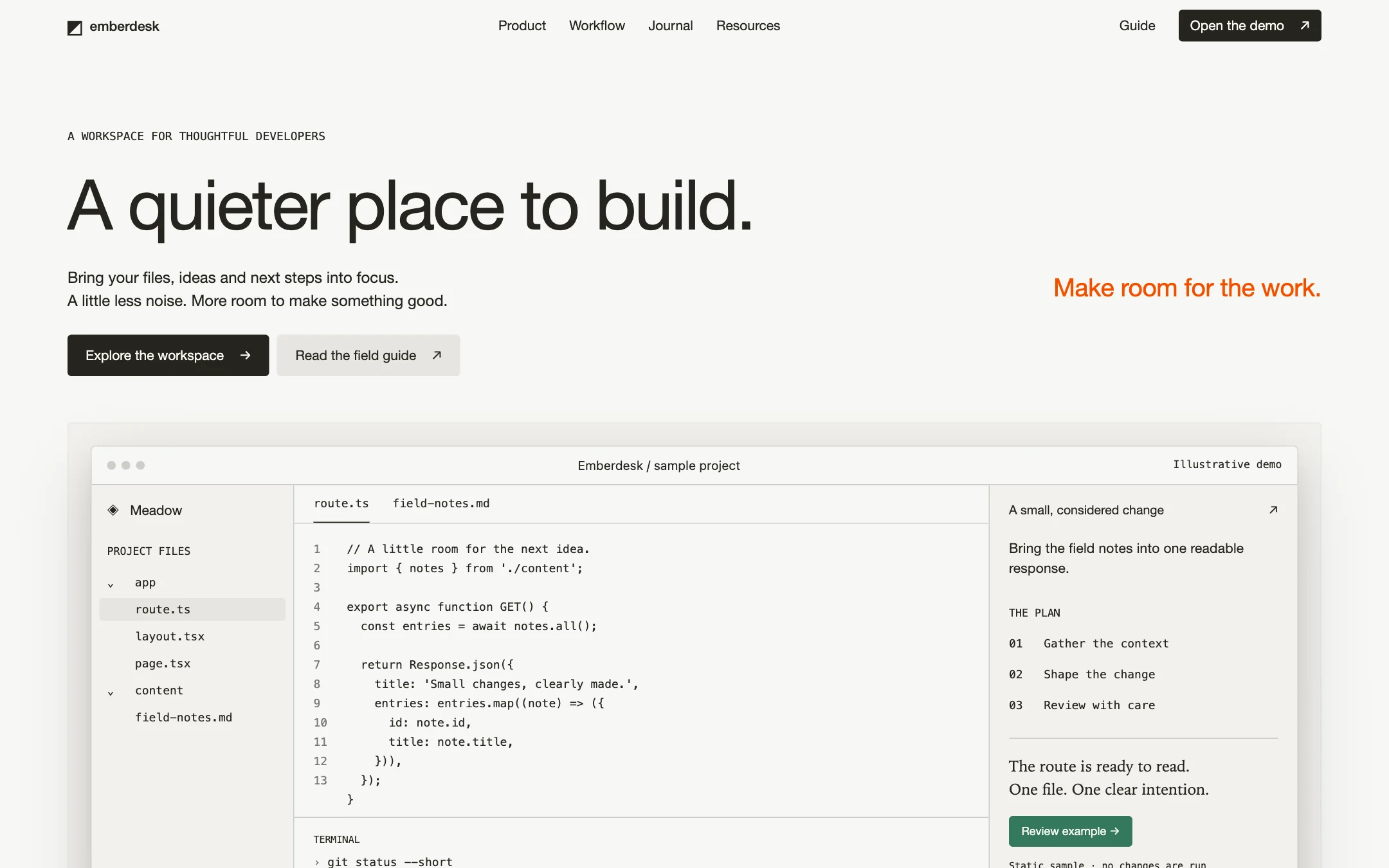
A light editorial landing page for Emberdesk, a fictional developer workspace. Warm parchment canvas, quiet ink typography, ember-orange text punctuation and large original product-window compositions. Headlines are weight 400, with tighter tracking as size grows. Surfaces look like layered paper: flat warm neutrals, hairline rules, 4px corners and restrained warm shadows. The product UI carries the visual weight; no gradients, glows, abstract art or borrowed brand imagery.
- Best for
- Developer tools, code editors and focused software product launches
- Tech stack
- - Next.js (App Router) - TypeScript - React Server Components - Plain CSS Next.js (App Router), TypeScript, React Server Components and plain CSS. Use the latest stable Next.js supported by the target project, retaining equivalent existing choices. Keep this mostly static: semantic HTML, CSS custom properties, local fonts and native details/summary. No UI kit, icon package, animation library, paid service, remote asset host, authentication, database or backend is needed. Use a small client component only for a requested real interaction. Product mockups are original HTML/CSS panels, not downloaded screenshots.
- Tags
- developer tools · parchment · editorial · product landing
The creation prompt
1981 words, self-contained. Paste it into a chat session with your coding agent and it builds Developer Tool Landing (Parchment) end to end.
Build the "Developer Tool Landing (Parchment)" kickstart — Warm paper, quiet type and a workspace worth a closer look.

## Design
A light editorial landing page for Emberdesk, a fictional developer workspace. Warm parchment canvas, quiet ink typography, ember-orange text punctuation and large original product-window compositions. Headlines are weight 400, with tighter tracking as size grows. Surfaces look like layered paper: flat warm neutrals, hairline rules, 4px corners and restrained warm shadows. The product UI carries the visual weight; no gradients, glows, abstract art or borrowed brand imagery.

Preserve all named colors in the token block. Parchment is canvas; Bone is card; Linen is raised neutral; Stone is separators; Mist, Driftwood and Ash are decorative/subdued tones. Ink is readable text and the primary action fill. Ember #f54e00 is text-only emphasis, never a background, icon fill or primary CTA. Forest, Verdant and Crimson remain supporting accents. For accessibility, small functional text and links use opaque Ink, with underlines for links; reserve Ember for text at least 24px regular, and the lighter muted tones for nonessential decoration. The seven-color gallery palette maps accent to the Ink primary button, with Parchment accentInk, rather than treating Ember as a button fill. Do not darken or approximate the supplied tokens. No solid pure white or pure black surfaces; the explicit translucent black shadow recipes are allowed.

Use locally available Helvetica Neue by default, with self-hosted Inter if supplied; both are permitted substitutes for CursorGothic. Never download or redistribute CursorGothic or berkeleyMono. Use EB Garamond if supplied under an appropriate license, otherwise Iowan Old Style, Palatino Linotype, ui-serif or Georgia for editorial prose only. Code and metadata use berkeleyMono only if licensed and supplied, otherwise ui-monospace, SFMono-Regular, Menlo, Monaco, Consolas. Preserve the exact type scale and features in the Design prompt.

Sans UI and headlines use weight 400; only small wordmarks/labels may use 500. Never use 600 or 700 on headings. Enable "ss08", "ss09", "tnum" where supported. Exact desktop scale (size / line height / tracking): eyebrow 12px / 1.63 / normal; body-sm 14px / 1.5 / 0.14px; heading-sm 22px / 1.3 / -0.11px; heading 26px / 1.25 / -0.312px; heading-lg 36px / 1.2 / -0.72px; display 72px / 1.1 / -2.16px. Other sans sizes: 11, 13, 16px. Editorial serif: 16, 17 or 19px, weight 400 or 500, line-height 1.35–1.50, normal tracking, "cswh" feature; never UI navigation. Mono: 12 or 13px, weight 400 or 500, line-height 1.43–1.67. System micro labels: 11, 12 or 13px, line-height 1.25–1.55, 0.004em tracking and "case" feature. Lato is an incidental detected face, not a required asset: if already provided, source sizes are 10, 12, 14, 16px and weights 400/600; do not add it for this page.

Center a maximum 1300px content column with 24px outer padding. Use a 4px base unit with 4, 8, 12, 16, 20, 24, 32, 48, 56 and 64px spacing, 8px element gaps and 24px card padding. Section rhythm stays within 64–96px; the CSS clamp encodes that range rather than the invalid literal 64-96px. On narrow screens keep 24px gutters, stack the 50/50 feature columns, wrap navigation and logo tiles, and scale the hero from 72px to 36px. Code scrolls inside its own region, never widening the page.

Exact design tokens (use plain CSS custom properties, not a Tailwind spacing override):
```css
:root {
  /* Colors */
  --color-parchment: #f7f7f4;
  --color-bone: #f2f1ed;
  --color-linen: #e6e5e0;
  --color-stone: #cdcdc9;
  --color-mist: #a1a19f;
  --color-driftwood: #84847e;
  --color-ash: #7a7974;
  --color-ink: #26251e;
  --color-ember: #f54e00;
  --color-amber: #c08532;
  --color-forest: #34785c;
  --color-verdant: #1f8a65;
  --color-crimson: #cf2d56;

  /* Typography — Font Families */
  --font-cursorgothic: "Inter", "Helvetica Neue", system-ui, sans-serif;
  --font-eb-garamond: "EB Garamond", "Iowan Old Style", "Palatino Linotype", ui-serif, Georgia, serif;
  --font-berkeleymono: 'berkeleyMono', ui-monospace, SFMono-Regular, Menlo, Monaco, Consolas, monospace;
  --font-system-ui: 'system-ui', ui-sans-serif, system-ui, -apple-system, BlinkMacSystemFont, "Segoe UI", Roboto, sans-serif;
  --font-lato: 'Lato', ui-sans-serif, system-ui, -apple-system, BlinkMacSystemFont, "Segoe UI", Roboto, sans-serif;
  --font-apple-system: '-apple-system', ui-sans-serif, system-ui, -apple-system, BlinkMacSystemFont, "Segoe UI", Roboto, sans-serif;

  /* Typography — Scale */
  --text-eyebrow: 12px;
  --leading-eyebrow: 1.63;
  --text-body-sm: 14px;
  --leading-body-sm: 1.5;
  --tracking-body-sm: 0.14px;
  --text-heading-sm: 22px;
  --leading-heading-sm: 1.3;
  --tracking-heading-sm: -0.11px;
  --text-heading: 26px;
  --leading-heading: 1.25;
  --tracking-heading: -0.312px;
  --text-heading-lg: 36px;
  --leading-heading-lg: 1.2;
  --tracking-heading-lg: -0.72px;
  --text-display: 72px;
  --leading-display: 1.1;
  --tracking-display: -2.16px;

  /* Typography — Weights */
  --font-weight-regular: 400;
  --font-weight-medium: 500;
  --font-weight-semibold: 600;
  --font-weight-bold: 700;

  /* Spacing */
  --spacing-unit: 4px;
  --spacing-4: 4px;
  --spacing-8: 8px;
  --spacing-12: 12px;
  --spacing-16: 16px;
  --spacing-20: 20px;
  --spacing-24: 24px;
  --spacing-32: 32px;
  --spacing-48: 48px;
  --spacing-56: 56px;
  --spacing-64: 64px;

  /* Layout */
  --page-max-width: 1300px;
  --section-gap: clamp(64px, 6vw, 96px);
  --card-padding: 24px;
  --element-gap: 8px;

  /* Border Radius */
  --radius-sm: 1.5px;
  --radius-md: 4px;
  --radius-lg: 8px;
  --radius-xl: 12px;

  /* Named Radii */
  --radius-cards: 4px;
  --radius-tiles: 4px;
  --radius-inputs: 4px;
  --radius-modals: 8px;
  --radius-buttons: 4px;

  /* Shadows */
  --shadow-xl: rgba(0, 0, 0, 0.14) 0px 28px 70px 0px, rgba(0, 0, 0, 0.1) 0px 14px 32px 0px, oklab(0.263084 -0.00230259 0.0124794 / 0.1) 0px 0px 0px 1px;
  --shadow-subtle: rgb(235, 234, 229) 0px 0px 0px 2px;
  --shadow-xl-2: rgba(0, 0, 0, 0.25) 0px 25px 50px -12px, rgba(0, 0, 0, 0.15) 0px 12px 24px -8px, oklab(0.263084 -0.00230259 0.0124794 / 0.1) 0px 0px 0px 0.5px;
  --shadow-subtle-2: oklab(0.263084 -0.00230259 0.0124794 / 0.1) 0px 0px 0px 1px, rgba(0, 0, 0, 0.28) 0px 18px 36px -18px;

  --color-selection: #8BC4F8;
  --color-theme-border-02: color-mix(in oklab, #26251e 10%, transparent);
  --shadow-popover: 0 0 1rem #00000005, 0 0 0.5rem #00000002;
  --shadow-window-inset: 0 -1px 0 0 var(--color-theme-border-02) inset;

  /* Surfaces */
  --surface-canvas: #f7f7f4;
  --surface-card: #f2f1ed;
  --surface-elevated: #e6e5e0;
  --surface-outline: #cdcdc9;
}
```

Primary action: Ink #26251e fill, Parchment #f7f7f4 text, 4px radius, 14px/400 sans, padding 0.78em 1.35em 0.8em, no border. Secondary: Linen #e6e5e0 fill with Ink text and identical geometry. At most two action styles together. Ghost: transparent, Ink at 60% for decorative mock labels, 13–14px/400, zero padding or 6px square for icons, underline on hover; functional text stays opaque Ink. Amber mock action: #c08532, 6px 12px padding, 4px radius; source cream text is illustrative only, use Ink for a real small-label control. Forest mock review action: #34785c fill and matching 1px border, Parchment text, 4px radius. Supporting Forest is an action color, not a global status color.

Cards: Bone, 4px corners, 24px padding, 1px color-mix(in oklab, #26251e 5%, transparent) border; product cards may use --shadow-xl, flat lists have no drop shadow. Window chrome has three gray dots and a centered 13px system label; active tabs use an underline, code tabs use 12px mono. Shadows belong to the surrounding card. Logo tiles use Linen and 16px padding; only logo tiles may be fully rounded, never action buttons or cards.

Terminal fields: transparent or Bone fill, 1px color-mix(in oklab, #26251e 10%, transparent) border, 4px radius, 10px 12px padding, 12px mono text, Ink caret and Ash prompt glyph. Metadata: 12px mono, transparent, no border or radius; Ash for decorative labels, Ink for readable information. Modals, if needed, use 8px radius. Selection alone uses #8BC4F8 with Ink text. Icons are thin monochrome strokes in Ash, not colored fills.

Page composition:
1. Header: 52px transparent bar, 24px horizontal padding, lowercase emberdesk wordmark left; Product, Workflow, Journal and Resources centered; Guide and dark Open the demo action right. No sticky shadow.
2. Hero: 80px top padding, left-aligned 72px/1.1 regular headline "A quieter place to build." with -2.16px tracking. A 16px introduction, dark Explore the workspace and Linen Read the field guide actions. One short 26px Ember text line: "Make room for the work." Below, a full-width Bone product card with 24px padding.
3. Product demonstration: original macOS-style window with three gray dots, centered Emberdesk / sample project title, sidebar files, active route.ts tab, an original code excerpt, terminal output and a review panel. Show fictional project Meadow with a three-step plan. Distinguish illustrative UI from working controls; no fake clickable buttons.
4. Example workspaces: eight fictional monochrome wordmarks (Meadow, Common, Northbank, Grain, Outline, Daybook, Pebble, Halfstep) in a single row of Linen logo tiles. Explicit label "Example workspaces · fictional demo content", never customer endorsements.
5. Features: alternate equal-width text and product-window columns, with 64–96px section gaps. Three sections: Gather the context, Shape the change, Review with care. Use 36px section titles and 22px subheadings, all regular weight.
6. Journal: selective 19px editorial serif prose, one complete on-page field-guide article about preparing a focused change, with an Ember large-text heading and ink links.
7. Resources: readable terminal snippet showing a harmless local git status command, plus native disclosure guidance for the fictional demo, accessibility and adapting the page.
8. Footer: wordmark left and four link columns for Product, Learn, Project and About. Column headings 14px/500; links 13px/400, 8px row gap, all on canvas. Finish with a fictional-product notice.

Render all content visibly on first paint. Only color and background transitions: 150ms cubic-bezier(0.4, 0, 0.2, 1). Underline text links on hover. Disable transitions for prefers-reduced-motion. No parallax, autoplay, entrance animation or marquee.

Source precedence: the named 4px button radius, cream action text, type-scale tracking in px and equal-column Layout rules govern this brief. Do not introduce a pill button, pure-white label or em-sized tracking from contradictory example prose. The serif fallback stays serif. An optional muted landscape photograph may sit behind the product panel only if the user supplies an original local asset; otherwise omit it. Never hotlink photography, invent gradients or substitute decorative illustrations.

Gallery role mapping (the same colors, hex case normalized): background #F7F7F4, surface #F2F1ED, ink #26251E, muted #26251E, accent #26251E, accentInk #F7F7F4, border #CDCDC9.

## Tech stack
- Next.js (App Router)
- TypeScript
- React Server Components
- Plain CSS

Next.js (App Router), TypeScript, React Server Components and plain CSS. Use the latest stable Next.js supported by the target project, retaining equivalent existing choices. Keep this mostly static: semantic HTML, CSS custom properties, local fonts and native details/summary. No UI kit, icon package, animation library, paid service, remote asset host, authentication, database or backend is needed. Use a small client component only for a requested real interaction. Product mockups are original HTML/CSS panels, not downloaded screenshots.
Where the repo you are working in already has an equivalent in place, keep the repo's choice and say which one you kept.

## Everything else
A fictional developer workspace landing page.

Emberdesk is a fictional developer workspace. Write original, calm copy about gathering context, shaping a change and reviewing it. Use a made-up Meadow project and local sample files. All workspace names are fictional examples, not users or endorsements. Do not copy real product names, logos, testimonials, screenshots, claims or marketing text.

Build a complete responsive one-page landing and on-page product demonstration. Every header, hero and footer action must reach a real section: #product, #workflow, #journal or #resources. Open the demo and Explore the workspace scroll to #product; Read the field guide opens #journal. Do not invent a downloadable app, sign-in service, contact endpoint or fake email submission. Clearly mark the workspace as an illustrative demo; its code, plan and terminal are static labelled examples. Native disclosures must work with the keyboard.

Use one h1, semantic landmarks, a skip link, meaningful link names, visible Ink focus outlines and readable contrast. Respect reduced motion and keep content usable without client JavaScript. At 320px, preserve 24px gutters and prevent document overflow; code and long filenames scroll or wrap within the panel. Do not put real brand names or reference URLs into the finished page. The result must contain finished original copy, never placeholders or lorem ipsum.

### Non-negotiables
- Responsive from 360px through desktop — no horizontal page overflow at any width. Deliberately scrollable regions stay within the viewport and remain keyboard and touch accessible.
- Every text/background pair clears WCAG AA (4.5:1 for body, 3:1 for large text); adjust a tint rather than shipping a failing pair.
- Fully keyboard operable, with a visible focus ring drawn in the accent colour.
- Honour `prefers-reduced-motion` — swap every transition for an instant state change.
- Write real copy in the voice described above; no lorem ipsum and no TODO placeholders.
- Use system or self-hosted fonts and CSS/SVG-drawn graphics — do not depend on a remote image or icon service.

Build the whole page end to end and show me the result running — not a description of it.
Pasting the prompt is step one. Fredrin runs the agent that builds it, one ticket per look.