Dub
A quiet, hairline-ruled SaaS landing page: Satoshi medium headlines, Inter UI text, two vertical page rails, a black primary button and one electric blue on white paper.
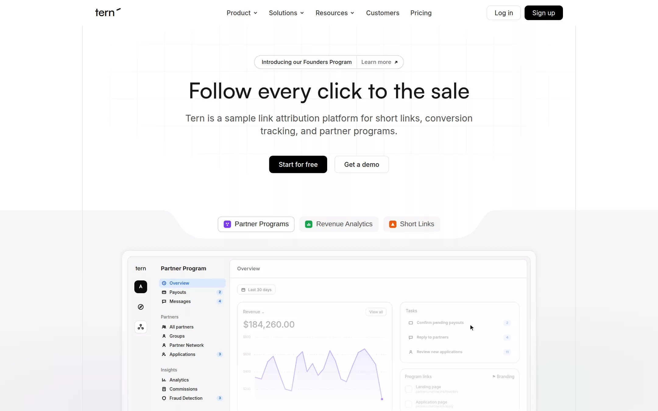
An original Tern page on white: a 56px navigation with ghost links and Log in / Sign up; a centred hero over a fading square grid with an announcement pill, a 48px Satoshi headline, a 20px subline and black / outlined buttons; a Paper Mist product band with a curved white notch holding three colour-coded product tabs above a framed partner-program dashboard; a logo wall; a fading 30px statement; Links, Analytics, Integrations and Partners feature sections; a closing call and a footer, all inside two hairline page rails.
- Best forMarketing-tech, analytics and growth SaaS that want a calm, editorial, border-driven page with a product dashboard as the hero image, colour-coded product pills and a wall of customer logos.
- Tech stack- Next.js (App Router) - React - TypeScript - CSS custom properties Use Next.js App Router, React and TypeScript with plain CSS custom properties for every colour, radius, border and spacing token. Render the page as server components; only the three product tabs and the mobile menu need small client islands, and they hold state in memory only. Self-host Satoshi 500 (Indian Type Foundry's free licence; fall back to General Sans or Inter 500 if it cannot be shipped), Inter (variable, 400–600) and Geist Mono (400–500) as woff2 through next/font/local — no remote font request. Draw the wordmark, the background grids, the notch, every icon, the dashboard, charts, link cards, funnel, integration tiles and partner rows as HTML, CSS and inline SVG with fixed sample data committed in the source, so the markup is deterministic between renders. Provide page metadata. Build and run the production page before capturing its preview.
The prompt. 2195 words, self-contained.
Build the "Dub" kickstart — A quiet, hairline-ruled SaaS landing page: Satoshi medium headlines, Inter UI text, two vertical page rails, a black primary button and one electric blue on white paper.

## Design
Build a rebrandable landing page for a link attribution and partner-program platform.

Create a complete landing page for Tern, a fictional link attribution platform: branded short links, conversion tracking from first click to sale, and partner and affiliate programs, in one product. This is a concept presentation, not a real company — no real customers, logos, people, quotes or figures. Use original branding, artwork and copy throughout.

Color: Canvas White #FFFFFF is the page, the navigation, every card and popover. Paper Mist #F5F5F5 is the first step down — the product-showcase band, inactive tabs, the customer-logo tiles, the dashboard sidebar and hover fills; #FAFAFA is the muted alt card inside a white card. Ash #E5E5E5 is every 1px border, divider and the two vertical page rails — borders do the work shadows do elsewhere. Smoke #D4D4D4 outlines the announcement pill and the active tab. Charcoal #171717 is every heading and body-strong label, never pure black text. Graphite #262626 is secondary text and icon strokes; Slate #404040 is the navigation links; Steel #525252 is the hero subline, muted body copy and helper text; Fog #737373 is placeholder text, eyebrow labels and links at rest; Silver #A3A3A3 is the faded dashboard figures and decorative strokes. Primary Action Fill #000000 is the one filled button style, with white text. Electric Blue #2563EB is the only brand chroma: inline links, the active sidebar item text on a #DBEAFF tint, key metric highlights and focus rings — never a large background fill. Three feature accents mark the three products, each on exactly one 16px rounded-square icon or one emphasised phrase: Lavender #7C3AED for Partner Programs, Vivid Green #16A34A for Revenue Analytics, Tangerine #EA580C for Short Links. Soft Mint #DCFCE7 is only the background of a small Completed badge. No gradients on UI elements; the only colour wash is a very faint violet and green haze inside the showcase band.

Typography: display headings in Satoshi, "General Sans", Inter, ui-sans-serif, system-ui, sans-serif — Satoshi weight 500 (medium, never bold), used only at 36–48px; everything below 30px in Inter, ui-sans-serif, system-ui, -apple-system, "Segoe UI", sans-serif, weight 400 for body, 500 for buttons, nav and labels, 600 for small important UI labels. Code, domains in the DNS table and large figures in "Geist Mono", "JetBrains Mono", ui-monospace, Menlo, monospace. Hero headline 48px/55.2px weight 500 Charcoal; section headings 48px/48px weight 500; hero subline 20px/28px weight 400 Steel; section sublines 18px/28px Fog; the statement paragraph 30px/41.25px weight 400 Graphite; nav links 14px/20px weight 500 Slate; buttons 14px/20px weight 500; announcement 12px/16px weight 500; eyebrows 12px/16px weight 500 Steel; dashboard text 10–12px.

Layout: one 1080px column centred at 1440px (x 180 to 1260), marked by two 1px Ash vertical rails that run from under the navigation to the footer; sections are separated by 1px Ash horizontal rules that span the column. Hero content is centred; feature sections are left-aligned at x 220 inside the rails. Radii: 9999px on pills, badges and the announcement; 8px on buttons and nav hovers; 12px on cards; 16px on the large product frame; 6px on inputs. 8px gaps between small controls, 16px between buttons, 40px between a subline and its buttons, 200px vertical padding around the statement.

Navigation: 56px tall on Canvas White, no bottom border. Left at x 208: the lowercase wordmark tern in Satoshi 25px weight 500 #0A0A0A with a short slanted stroke after the n like a wing. Centre, starting near x 484: Product, Solutions and Resources (each with a 12px chevron) then Customers and Pricing — 14px weight 500 Slate, 32px tall, 0 12px padding, 8px radius ghost buttons. Right, 8px apart: Log in (32px, 0 16px padding, white with a 1px Ash border, 8px radius, 14px weight 400 Charcoal) and Sign up (the same size filled #000000 with white text).

Hero (id top): a 404px-tall band over a faint 60px square grid of Ash lines that fades out radially toward the edges. Centred 65px below the navigation: a 30px announcement pill — a 1px Smoke border, 9999px radius — split by a 1px Ash divider into Introducing our Founders Program in 12px weight 500 Graphite (6px 10px 6px 16px padding) and Learn more with a small up-right arrow in Fog. 19px below, the headline Follow every click to the sale. 20px below, a 640px-wide two-line subline Tern is a sample link attribution platform for short links, conversion tracking, and partner programs. 40px below, two 38px buttons 16px apart with 8px 20px padding: Start for free filled #000000 with white text, and Get a demo in white with a 1px Ash border and Graphite text.

Product showcase (id product): a Paper Mist band beginning at y 460 whose top edge has a white notch — a 780px-wide tab-shaped cutout with smooth S-curved shoulders — holding three 34px tabs 10px apart: Partner Programs (active: white, 1px Smoke border), Revenue Analytics and Short Links (inactive: Paper Mist, Steel text), each 15px weight 500 with a 16px rounded-square Lavender, Vivid Green or Tangerine icon carrying a tiny white glyph. Below, a 908px product frame — 16px radius, a 1px Ash border, a translucent white ground, 12px padding and a 4px rgba(0,0,0,.02) ring — wrapping an original dashboard: a 56px icon rail on Paper Mist (the wordmark, a black tile, a compass and an active white tile), a 166px sidebar titled Partner Program with Overview active on #DBEAFF in Electric Blue, Payouts 2, Messages 4, a Partners group (All partners, Groups, Partner Network, Applications 3) and an Insights group (Analytics, Commissions, Fraud Detection 3) in 9.5px weight 500 with 10px stroke icons and tiny blue count pills; and a white main panel headed Overview with a Last 30 days chip, a Revenue card reading $184,260.00 over a jagged pale-violet line chart with dashed gridlines, a Tasks card (Confirm pending payouts 2, Reply to partners 4, Review new applications 11) and a Program links card (Landing page, Application page on partners.marrow.link). The lower half of the dashboard fades softly to white, and an arrow cursor rests on the first task. Under the frame, a dark #171717 caption bar with the active product's name, one 12px Silver line and a white Learn more button.

Customer wall (id customers): a 4×2 grid of 80px Paper Mist tiles with 12px radius and 12px gaps holding invented grayscale wordmarks — Marrow, Halcyon, Pinecut, Northfold, Quillstone, Brightwater, Orchard, Lumen — two with a tiny 7px uppercase CASE STUDY tab on their bottom edge.

Statement: on a faint dotted ground, a 530px column of four 30px/41.25px paragraphs that fade from Graphite to Silver — Marketing isn't just about clicks. It's about outcomes. / Tern is the sample link attribution platform that unifies short links, real-time analytics and partner programs — all in one place, with links, analytics and partner programs each tinted by its own accent colour and followed by its small icon. / It's fast. It's reliable. And it scales with you. / Because you deserve more than vanity metrics. You deserve clarity. Floating either side, small tilted white cards with link rows and click counts.

Links (id links): eyebrow with the Tangerine icon Tern Links, the 48px heading It starts with a link, the 18px Fog subline Create branded short links with built-in QR codes, device and geo targeting, A/B tests and deep links., and an outlined Explore Links button; then a Paper Mist panel with three staggered white link cards (marrow.link with a blue Primary badge and Verified in Vivid Green, refer.marrow.link Verified, try.marrow.link Pending in red) and a DNS table (Type, Name, Value, TTL) in Geist Mono; then a three-column feature row split by Ash rules — Custom domains, Advanced link features, QR codes — each a 16px icon, a 14px weight 600 title, two lines of Fog copy and a Learn more link (the first in Tangerine).

Analytics (id analytics): eyebrow with the Vivid Green icon Tern Analytics, the heading Measure what matters, subline and an outlined Explore Analytics button; a Paper Mist panel with a Play demo pill and an original funnel chart — Clicks 7.2K, Leads 165, Sales $506 — drawn as blue, violet and teal flowing bands with 100%, 36% and 1.3% chips; a three-column row Conversion tracking, Real-time analytics, Customer insights; then a large 24px quote from an invented Head of Growth, labelled sample.

Integrations (id integrations): on a Paper Mist ground with a faint 60px grid, the heading Connect with your favorite tools on the left with a subline and an outlined Explore integrations button, and on the right a scatter of 48px rounded tiles in the grid cells holding invented colourful app glyphs, some empty tiles outlined in Ash.

Partners (id partners): eyebrow with the Lavender icon Tern Partners, the heading Grow with partnerships, the subline Build embedded referral and affiliate programs that turn customers into a sales team., an outlined Explore Partners button and a panel of partner rows with initials avatars, Revenue and Payouts figures and Completed badges on Soft Mint.

Closing call (id pricing): a centred 48px heading Supercharge your marketing efforts, a 18px Fog subline and the same Start for free / Get a demo button pair over the faint grid.

Footer: Canvas White with an Ash top rule; left the wordmark, a 14px Fog line Giving modern marketing teams superpowers with short links that stand out. and four 16px social glyphs; right four columns — Product, Solutions, Resources, Company — with 14px weight 600 Charcoal headings and 14px Fog links; a bottom row with a green All systems normal status dot and © Tern sample.

## Tech stack
- Next.js (App Router)
- React
- TypeScript
- CSS custom properties

Use Next.js App Router, React and TypeScript with plain CSS custom properties for every colour, radius, border and spacing token. Render the page as server components; only the three product tabs and the mobile menu need small client islands, and they hold state in memory only. Self-host Satoshi 500 (Indian Type Foundry's free licence; fall back to General Sans or Inter 500 if it cannot be shipped), Inter (variable, 400–600) and Geist Mono (400–500) as woff2 through next/font/local — no remote font request. Draw the wordmark, the background grids, the notch, every icon, the dashboard, charts, link cards, funnel, integration tiles and partner rows as HTML, CSS and inline SVG with fixed sample data committed in the source, so the markup is deterministic between renders. Provide page metadata. Build and run the production page before capturing its preview.
Where the repo you are working in already has an equivalent in place, keep the repo's choice and say which one you kept.

## Everything else
Keep Tern clearly fictional and rebrandable: no real company, customer logo, integration logo, person, quote or copy; every name, domain, avatar, figure and testimonial is invented and labelled sample. Use example domains such as marrow.link only. Electric Blue #2563EB is never a large fill, and each card, pill or phrase carries at most one accent colour. Filled buttons are #000000 with white text and outlined buttons are white with a 1px #E5E5E5 border, both clearing WCAG AA; Steel and Fog on white clear AA, and Silver is only for decorative or faded dashboard detail. No drop shadows on cards except the 4px ring on the product frame; no radius outside 9999px, 16px, 12px, 8px and 6px. Every link leads to a real section on the page; buttons do not submit, sign anyone up or store anything; the page loads no analytics or tracking script and shows no cookie banner. Content is initially visible — no counters, typing, parallax or scroll reveal; tabs switch instantly, buttons and nav items take a Paper Mist ground over 150ms on hover, and transitions stop for prefers-reduced-motion. Every control shows a 2px Electric Blue focus ring with a 2px offset. The dashboard, charts and decorative cards are hidden from assistive technology, with a text alternative for the funnel figures. At 360px the centre navigation collapses into a Menu button, the vertical rails move to 16px from each edge, the headline drops to 36px, the product frame scales down inside its band, the customer wall becomes two columns, every feature row stacks and the page never overflows horizontally.

### Non-negotiables
- Responsive from 360px through desktop — no horizontal page overflow at any width. Deliberately scrollable regions stay within the viewport and remain keyboard and touch accessible.
- Every text/background pair clears WCAG AA (4.5:1 for body, 3:1 for large text); adjust a tint rather than shipping a failing pair.
- Fully keyboard operable, with a visible focus ring drawn in the accent colour.
- Honour `prefers-reduced-motion` — swap every transition for an instant state change.
- Write real copy in the voice described above; no lorem ipsum and no TODO placeholders.
- Use system or self-hosted fonts and CSS/SVG-drawn graphics — do not depend on a remote image or icon service.

Build the whole page end to end and show me the result running — not a description of it.