Dovetail
A near-black customer-intelligence homepage: a faint drifting character field, a giant two-line headline that drops one word into a pixel face, white type and a single electric-blue button.
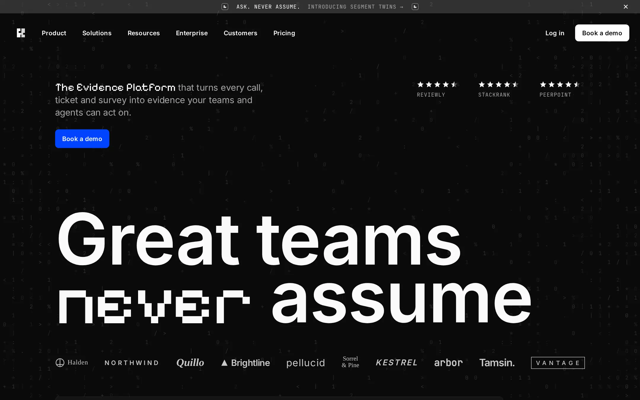
An original Mortise page: a 30px announcement bar of uppercase mono text, an 88px navigation with a joint mark, six 8px-radius link pills, Log in and a white Book a demo button, then a hero on a faint drifting character field — a 20px intro led by a pixel-face product phrase, an electric-blue Book a demo button, three star ratings with mono labels — and a 160px two-line headline whose second line opens with one pixel-face word, above a ten-logo customer strip; below, a dark live-looking product window, a second giant headline, a tabbed feature list, blue quote cards beside pixel-figure stat tiles, a trust grid, a customer-story rail, a closing call to action and a mono-labelled footer.
- Best forResearch, feedback, analytics and AI products sold to product, design and customer teams who want a confident, editorial dark homepage where the product UI is the hero.
- Tech stack- Next.js (App Router) - React - TypeScript - CSS custom properties Use Next.js App Router, React and TypeScript with plain CSS custom properties for every colour, radius, spacing and type token. Render the page as server components; only the tabbed feature list, the announcement-bar close and the mobile menu need small client islands holding state in memory. Self-host Inter, JetBrains Mono and Pixelify Sans (all SIL Open Font License) as woff2 files through next/font/local — no remote font request. Generate the character field from a fixed-seed array at build time, and draw the joint mark, every icon, the stars, the product window, the heat-map, the chat panel, the vignettes and the invented wordmarks as inline SVG, CSS and HTML built from committed sample arrays — never bitmap photos, stock imagery or video — so the markup is identical on every render. Provide page metadata. Build and run the production page before capturing its preview.
The prompt. 1736 words, self-contained.
Build the "Dovetail" kickstart — A near-black customer-intelligence homepage: a faint drifting character field, a giant two-line headline that drops one word into a pixel face, white type and a single electric-blue button.

## Design
Build a rebrandable landing page for an AI customer-intelligence platform that turns calls, tickets, surveys and reviews into decision-ready evidence product, design and customer teams can act on.

Create a complete landing page for Mortise, a fictional customer-intelligence company. This is a concept presentation, not a real company — no real product, customer, person or logo. Use original branding, artwork and copy throughout.

Color: a near-black, achromatic page. Carbon #0A0A0A is the page canvas. Graphite #141414 is cards and the product window; Iron #1E1E1E is card borders and table headers; Edge #313131 is hairline dividers and field borders; Smoke #454545 rings ghost controls. Snow #FAFAFA is headings and primary text; #FFFFFF fills the white buttons. Ash #A7A7A7 is mono labels, logos and captions; body copy on the canvas is white at 64% opacity. The announcement bar is white at 16% over Carbon. Signal Blue #0044FF is the only filled colour — the hero and closing Book a demo buttons and the quote cards — and Soft Indigo #6798FF marks stat arrows and chart series only. Nothing else is coloured.

Typography: "Inter", ui-sans-serif, system-ui, -apple-system, "Segoe UI", sans-serif for everything; Pixelify Sans (SIL OFL) as the pixel display face for one word per headline and the hero product phrase; JetBrains Mono (SIL OFL) for uppercase labels. Hero display 160px/130px weight 600 with -2.3px tracking; its pixel word 160px weight 400, matching the line height. Section headings 64px/68px weight 600 with -2px tracking. Feature-list items 56px/64px weight 600 with -1.7px tracking. Card titles 20px/24px weight 600 with -0.25px tracking. Hero intro 20px/28px with -0.25px tracking, its pixel product phrase 25px. Navigation links and buttons 14px/18px weight 600. Body 16px/24px with -0.25px tracking. Mono labels 12px/12px with 1px tracking, uppercase.

Layout: a 1440px canvas; the navigation spans 24px side padding and every section sits in a 1192px column with 124px side padding. Sections are separated by 120–160px; grids use 24–32px gaps. Radii: 8px on buttons, pills, cards and the product window; 4px on tags. No shadows anywhere — depth comes from stepping #0A0A0A to #141414 to #1E1E1E.

Background: a fixed full-page field of faint characters — JetBrains Mono 12px glyphs from 0 1 2 / % + = < > : | . * on a 20px grid, Snow at 6–14% opacity, densest at the left and right edges and thinning to empty behind the headline — generated from a fixed seed so every render matches.

Announcement bar: 30px tall, full width, white at 16% over Carbon; centred on one line a 20px joint glyph, the mono label ASK. NEVER ASSUME. in Snow, then INTRODUCING SEGMENT TWINS → in Ash, and a matching glyph; a 16px close icon at the right edge.

Navigation: an 88px row with 24px padding. At x 24 a 46px square holding a 22×24px joint mark (two interlocking stepped tenons, Snow). From x 78 six 40px link pills — Product, Solutions, Resources, Enterprise, Customers, Pricing — 14px/18px weight 600, 10px 16px padding. Right: a Log in text button and, 8px after it, a 122×40px white Book a demo button ending at x 1416.

Hero (id top): at y 182 a 508px intro paragraph — the pixel phrase The Evidence Platform in Snow at 25px, followed by that turns every call, ticket and survey into evidence your teams and agents can act on. at 64% white. At y 290 a 120×42px Signal Blue Book a demo button. At the right, from x 938, three rating groups 142px apart, each five 16px Snow stars (the last a half star) above a mono label — REVIEWLY, STACKRANK, PEERPOINT. At y 472 the 160px headline on two lines: Great teams, then the pixel word never followed by a space and assume in Inter; the pixel word sits on the same baseline. Customer strip: at y 796 a 40px band of ten invented Ash wordmarks spread across the 1192px column — Halden, NORTHWIND, Quillo, Brightline, Pellucid, Sorrel & Pine, KESTREL, Arbor, Tamsin., Vantage — each in a different weight or style, one with a small drawn glyph.

Product window (id product): 120px below, a 1008px #141414 window with an 8px radius and a #1E1E1E border, overlapped at its right by a 364px floating chat panel. The window bar holds a menu icon, a small square app mark and Voice of Customer, centred Ideas (selected, Soft Indigo text on #6798FF at 16%) and Evidence tabs, and three icon buttons. Below, a year heat-map of 4px-radius squares in Iron and Soft Indigo with month mono labels, an idea card with a 2px Signal Blue ring — Cut sign-in drop-off on slow networks, tags In progress and High, a mono reference MRT-218, and an evidence line Evidence 186 ↑ 7.4% · Sources 3 · Sum of ARR $1.9m — and a fading second card. The chat panel's header reads Pricing Expert Twin; one user bubble and one faded reply sit above a bordered input reading Ask the Pricing Expert Twin.

Punch above your weight (id features): the 160px headline Punch above, next line your followed by the pixel word weight. Then two columns: left a 24px/32px Snow paragraph and a white Book a demo button, then a tabbed list of four 56px items with 40px line icons — Segment Twins (Snow, selected), Agents, Channels, Docs (Snow at 24%); right a #141414 card showing a drawn chat exchange and a 20px/28px Ash description with a Learn more text link.

Proof (id proof): a 760px Signal Blue quote card with a 24px/32px quote, a round initials avatar, a name and role, beside a 400px #141414 stat tile with a Soft Indigo up-arrow and the pixel figure 30hrs, captioned Weekly time saved per researcher; a second row mirrors it with 61% Faster shipping.

Trust by design (id trust): the 64px heading Trust, then the pixel word by design; four #141414 cards in a 2×2 grid — Certification and compliance, Data handling and AI safety, Granular access control, Audit and oversight — each a 20px title, 14px/22px Ash copy and a small drawn interface vignette.

Customer stories (id stories): the 64px heading In their words, not ours with a white See all stories button at the right, then a horizontal rail of 286×380px cards: a dark duotone gradient panel holding an invented wordmark, and below it a 16px story title.

Closing call to action (id cta): the 160px headline Run on evidence, next line the pixel word not guesses, and a Signal Blue Book a demo button.

Footer (id footer): seven columns of 14px/24px Snow links under 12px mono uppercase Ash headings — Platform, Roles, Resources, Comparisons, Customers, Contact, Company — with mono NEW and BETA tags on two links, then © Mortise sample · a fictional product. Not a real company. in 12px Ash.

## Tech stack
- Next.js (App Router)
- React
- TypeScript
- CSS custom properties

Use Next.js App Router, React and TypeScript with plain CSS custom properties for every colour, radius, spacing and type token. Render the page as server components; only the tabbed feature list, the announcement-bar close and the mobile menu need small client islands holding state in memory. Self-host Inter, JetBrains Mono and Pixelify Sans (all SIL Open Font License) as woff2 files through next/font/local — no remote font request. Generate the character field from a fixed-seed array at build time, and draw the joint mark, every icon, the stars, the product window, the heat-map, the chat panel, the vignettes and the invented wordmarks as inline SVG, CSS and HTML built from committed sample arrays — never bitmap photos, stock imagery or video — so the markup is identical on every render. Provide page metadata. Build and run the production page before capturing its preview.
Where the repo you are working in already has an equivalent in place, keep the repo's choice and say which one you kept.

## Everything else
Keep Mortise clearly fictional and rebrandable: no real company, product, customer, person or logo. The page reads as black and white with one blue spark: Signal Blue #0044FF fills only the hero and closing buttons and the quote cards, Soft Indigo #6798FF only small marks and chart series, and every other button is white or text-only. Every button, pill and card keeps an 8px radius (4px on tags) and no element casts a shadow. Each headline has at most one pixel-face word, and pixel type never sets body copy. Text pairs clear WCAG AA: #FAFAFA and #A7A7A7 on #0A0A0A and #141414, #0A0A0A on #FFFFFF, #FAFAFA on #0044FF. Every link leads to a real section on the page; nothing submits. The page loads no analytics or tracking script and shows no cookie banner, chat bubble or launch modal. Content is initially visible: no counters, typing effects, parallax or scroll reveal; the character field drifts at most one glyph per second and freezes for prefers-reduced-motion. Every control shows a 2px #6798FF focus ring with a 2px offset. The product window and stat tiles are labelled figures; the character field and decorative glyphs are hidden from assistive technology. At 360px the navigation collapses to the mark, Book a demo and a Menu button, the ratings stack under the intro, the hero headline drops to 56px/52px with the pixel word at 68px, the customer strip becomes a two-row grid, the product window becomes a cropped scroll-free card with the chat panel below it, every grid becomes one column, and the page never overflows horizontally.

### Non-negotiables
- Responsive from 360px through desktop — no horizontal page overflow at any width. Deliberately scrollable regions stay within the viewport and remain keyboard and touch accessible.
- Every text/background pair clears WCAG AA (4.5:1 for body, 3:1 for large text); adjust a tint rather than shipping a failing pair.
- Fully keyboard operable, with a visible focus ring drawn in the accent colour.
- Honour `prefers-reduced-motion` — swap every transition for an instant state change.
- Write real copy in the voice described above; no lorem ipsum and no TODO placeholders.
- Use system or self-hosted fonts and CSS/SVG-drawn graphics — do not depend on a remote image or icon service.

Build the whole page end to end and show me the result running — not a description of it.