 Fredrin
SaaS
Cursor
A paper-toned writing workspace with room for the thought beside the thought.
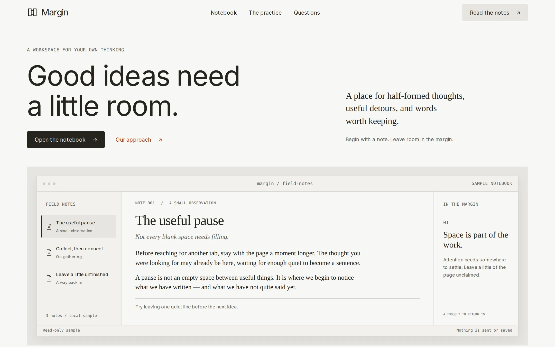
An original Margin writing-tool landing page with warm paper layers, quiet display typography and a working sample notebook. Three original notes, marginalia, a simple process section and native questions make a complete product introduction.
- Best for
- Independent writing tools, editorial software and small creative-product studios.
- Tech stack
- - Next.js (App Router) - React - TypeScript - CSS custom properties Use Next.js App Router, React and TypeScript with plain CSS custom properties. Keep the page, navigation, practice section, FAQ and footer as server-rendered semantic HTML. Isolate only the three-note selection into a small client component using React state. Use buttons with aria-pressed and a clearly labelled notebook region; announce the selected title through a polite status message without moving focus. Use native details/summary for questions and ordinary fragment anchors for this one-page navigation. No database, remote fonts, external image hosts, authentication, paid API, AI service, analytics or installation is required. Use local inline SVG for the small original mark and document icons; the notebook itself must be real HTML. If local Inter is unavailable, use the specified system fallback. Keep equivalent technologies already present in the receiving project.
- Tags
- writing · editorial · parchment · workspace · light
The creation prompt
1525 words, self-contained. Paste it into a chat session with your coding agent and it builds Cursor end to end.
Build the "Cursor" kickstart — A paper-toned writing workspace with room for the thought beside the thought.

## Design
Build a rebrandable writing-tool landing page with a local three-note reading demo: a complete page for Margin, a fictional writing workspace for independent thinkers. Make the product feel like a quiet desk: use #F7F7F4 parchment for the canvas, #F2F1ED for supporting panels, #E6E5E0 for secondary actions, #CDCDC9 for dividers, and #26251E for ink and primary buttons. Use #66655F for small supporting text. The only chromatic accent is #B33B0A rust on a few inline links; keep buttons, icons and surfaces neutral. Avoid pure white, pure black, gradients, glowing effects and oversized rounded corners. Define these values as CSS custom properties. Use 4px radii for controls and the workspace frame. Give keyboard focus a visible ink outline with an offset; interactive targets must be at least 44px high.

Set headings and interface text in Inter, system-ui, sans-serif: use locally hosted Inter Regular if available, otherwise system-ui with Helvetica Neue and sans-serif fallbacks. Do not download proprietary fonts. Set the desktop display at 72px/1.1, weight 400 and -0.03em tracking; headings at 36px/1.2 and 26px/1.25 with tighter tracking, body at 16px/1.5 and navigation at 14px. Use Georgia for the document's prose and a short editorial lead, and ui-monospace for 12px labels and filenames. Headlines stay regular. Use a centered 1300px maximum content column, 24px minimum gutters, a 4px spacing unit, 24px panel padding and 64–96px between sections.

Compact wordmark navigation: at 1440×900, the header is a 64px row: an original ink mark made from two offset open-book strokes and the Margin wordmark on the left, Notebook, The practice and Questions anchor links centered, and a linen Read the notes action right. Left-aligned editorial hero with paired actions: place the hero below with about 64px top space. Its left side has a small mono A WORKSPACE FOR YOUR OWN THINKING label, the two-line h1 Good ideas need / a little room., then an ink Open the notebook anchor and a quiet rust Our approach link. The right side, aligned low in the hero, holds a serif 23px lead: A place for half-formed thoughts, useful detours, and words worth keeping. Under it, a small sans-serif sentence: Begin with a note. Leave room in the margin. No large illustration or photography: the functional notebook is the main visual.

Interactive three-note notebook with marginalia: around y=390, place a full-width paper workspace in a slightly darker frame with 24px outer padding. Its inner window has a fine border and a subtle warm shadow. The 40px toolbar contains three decorative gray dots, a centered margin / field-notes label and a SAMPLE NOTEBOOK label right. Below, use three columns: a 220px notebook rail on bone, a flexible parchment document, and a 220px margin rail. The left rail has FIELD NOTES, three full-width document buttons, then the small footer 3 notes / local sample. The first button The useful pause is selected with linen fill and an ink left rule; the others are Collect, then connect and Leave a little unfinished. Each button includes a small document-outline icon and a smaller type label. Avoid a fake search or menu with no action.

The middle panel has a metadata line NOTE 001 / A SMALL OBSERVATION, a 36px serif document heading The useful pause, the short italic deck Not every blank space needs filling., and two readable original paragraphs at 17px/1.55 in Georgia, with a thin separator and a short takeaway below. Right: IN THE MARGIN, a small 01 label, a 22px serif thought, and short supporting copy; a second tiny footer label says A THOUGHT TO RETURN TO. The default margin thought is Space is part of the work. Use generous vertical breathing room and real text rather than gray skeleton bars. A thin bottom status row reads Read-only sample on the left and Nothing is sent or saved on the right. Keep the panel roughly 430px high at desktop so the 900px screenshot shows its complete frame and the beginning of the next section.

Three-part writing process: below the notebook, add a compact header The practice of paying attention. and three numbered columns: Notice, Connect, Return, each with one original sentence. Native questions and fictional-product footer: then add three native question disclosures and a simple footer with Margin, a sample contact link and a fictional-product disclosure. Keep everything visible without entrance animation. Below 800px stack the hero, let the three document choices wrap across the full width, put marginalia below the document, and stack process columns. At 320px use 20px gutters, 40px display type, wrap filenames and controls, keep all navigation destinations available, and prevent horizontal page overflow. Respect reduced motion.

## Tech stack
- Next.js (App Router)
- React
- TypeScript
- CSS custom properties

Use Next.js App Router, React and TypeScript with plain CSS custom properties. Keep the page, navigation, practice section, FAQ and footer as server-rendered semantic HTML. Isolate only the three-note selection into a small client component using React state. Use buttons with aria-pressed and a clearly labelled notebook region; announce the selected title through a polite status message without moving focus. Use native details/summary for questions and ordinary fragment anchors for this one-page navigation. No database, remote fonts, external image hosts, authentication, paid API, AI service, analytics or installation is required. Use local inline SVG for the small original mark and document icons; the notebook itself must be real HTML. If local Inter is unavailable, use the specified system fallback. Keep equivalent technologies already present in the receiving project.
Where the repo you are working in already has an equivalent in place, keep the repo's choice and say which one you kept.

## Everything else
Deliver a rebrandable landing page for the fictional Margin writing workspace. Use original copy and the five sections specified in Design. Open the notebook and Read the notes scroll to #notebook; Notebook, The practice, Our approach and Questions target #notebook, #practice and #questions. The footer contact is [email protected] and must be labelled as a sample address.

The notebook is a read-only local demonstration. Provide exactly three notes. Initially select The useful pause, label NOTE 001 / A SMALL OBSERVATION and deck Not every blank space needs filling. Its two paragraphs explain taking a short pause before reaching for another tab, and noticing the unfinished thought already on the page. Its takeaway is Try leaving one quiet line before the next idea. Margin: Space is part of the work., with a short reminder that attention needs somewhere to settle.

Collect, then connect uses NOTE 002 / ON GATHERING, deck A collection is the beginning of a conversation., two original paragraphs about collecting small observations and finding unexpected connections, and takeaway Put two unrelated notes beside each other. Margin: Let the fragments meet., with a reminder to look for a shared question.

Leave a little unfinished uses NOTE 003 / A WAY BACK IN, deck Give tomorrow somewhere to begin., two original paragraphs about stopping with a clear next question and returning with curiosity, and takeaway End with a question you want to answer. Margin: Keep a door open., with a reminder that a loose thread can be an invitation.

Each note button replaces the document number, type, title, deck, prose, takeaway and marginalia together. The active button has aria-pressed=true and a visible selection treatment; native keyboard activation works. Announce the selected title, keep focus on the chosen button, and reset to note one on reload. With JavaScript unavailable the first note, anchors and native disclosures remain readable; do not promise an editable or saved notebook. Do not add decorative buttons that do nothing.

The practice section explains Notice: Keep the detail that would otherwise disappear. Connect: Bring two observations into the same room. Return: Come back with a better question. FAQ: Can I write here? says this is a read-only three-note sample. Is anything sent or saved? says note switching happens only in browser memory with no transmission or persistence. Can I make it my own? explains that identity, notes, palette and contact can be changed in local files. Footer disclosure: Margin is a fictional product. This notebook is a local demonstration.

Avoid fabricated customers, testimonials, performance claims, downloads, pricing, sign-in and AI capabilities. Include a brief customization guide. Deliver the working responsive page and capture its initial rendered state as a real browser screenshot.

### Non-negotiables
- Responsive from 360px through desktop — no horizontal page overflow at any width. Deliberately scrollable regions stay within the viewport and remain keyboard and touch accessible.
- Every text/background pair clears WCAG AA (4.5:1 for body, 3:1 for large text); adjust a tint rather than shipping a failing pair.
- Fully keyboard operable, with a visible focus ring drawn in the accent colour.
- Honour `prefers-reduced-motion` — swap every transition for an instant state change.
- Write real copy in the voice described above; no lorem ipsum and no TODO placeholders.
- Use system or self-hosted fonts and CSS/SVG-drawn graphics — do not depend on a remote image or icon service.

Build the whole page end to end and show me the result running — not a description of it.
Pasting the prompt is step one. Fredrin runs the agent that builds it, one ticket per look.