Craft Docs
A scrapbook-calm notes app homepage: a rounded sky-blue hero with a frosted pill nav, a two-line 66px serif headline, a torn-paper collage and a floating app window full of colour-framed doc cards.
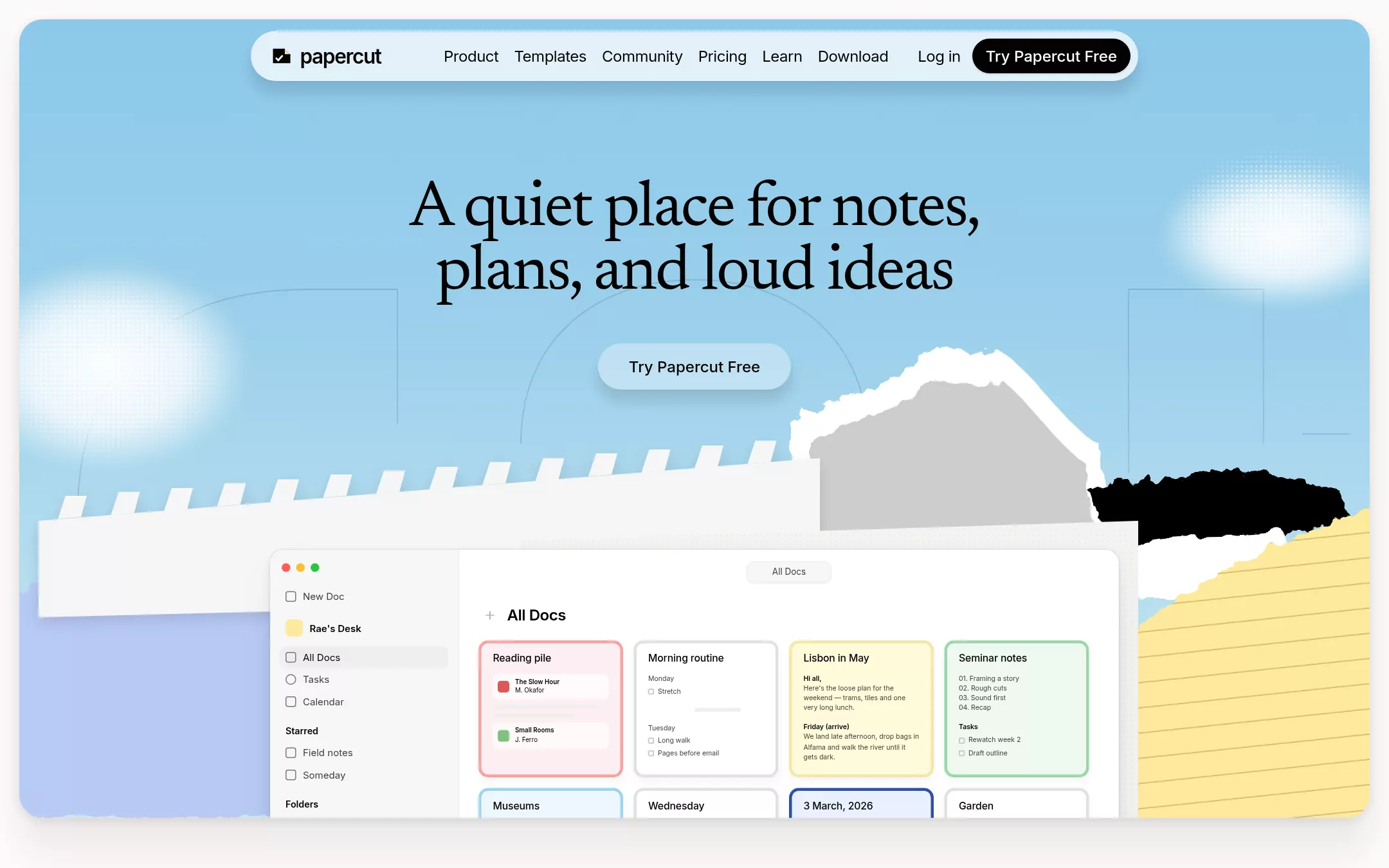
An original Papercut homepage: a 1400×828 sky-blue hero with 24px corners floating 20px inside a warm off-white page, a frosted 920×52 pill nav, a two-line 66px serif headline, a translucent pill button, ghost letterform outlines, halftone clouds, a torn-paper collage (perforated notebook strip, periwinkle, grey, black and ruled marigold scraps) and an 880px app window of colour-framed doc cards — then a five-icon category row, illustrated people cards, a periwinkle Write panel, a pull quote, a mint Connect panel, platform tiles, a closing call and a footer.
- Best forNote-taking, writing, journaling and personal-productivity apps that want to feel crafted and warm rather than corporate — any tool whose product screenshot is the hero.
- Tech stack- Next.js (App Router) - React - TypeScript - CSS custom properties Use Next.js App Router, React and TypeScript with plain CSS custom properties for every colour, gradient, radius and shadow token. Render the page as a server component; it needs no client JavaScript. Self-host Newsreader (400 roman and italic) and Inter (400, 500, 600), both SIL Open Font License, as woff2 through next/font/local — no remote font request. Draw the grain, clouds, halftone dots, ghost letterforms, torn-paper collage, app window, doc cards, icons, people and app tiles as inline SVG and HTML, never a bitmap or canvas, so every render is identical. Provide page metadata. Build and run the production page before capturing its preview.
The prompt. 1780 words, self-contained.
Build the "Craft Docs" kickstart — A scrapbook-calm notes app homepage: a rounded sky-blue hero with a frosted pill nav, a two-line 66px serif headline, a torn-paper collage and a floating app window full of colour-framed doc cards.

## Design
Build a rebrandable landing page for a notes, tasks and whiteboard workspace: one calm app for documents, to-dos, calendars, whiteboards and daily notes, sold to writers, students and makers on how good it feels to think in.

Create a complete landing page for Papercut, a fictional notes app. This is a concept presentation, not a real company — no real product, customer, person or logo. Use original branding, illustration and copy throughout.

Color: a warm paper page with one rounded sky window and soft pastel scraps. Canvas #FCF9F7 is the page, never pure white. White Surface #FFFFFF fills the app window, doc cards, panel cards and the pull-quote card, and is the label on the black pill. Ink #030302 is every headline and body line and fills the primary pill button — never pure black. Graphite #41413F is secondary copy and sub-lines; Stone #BEBBBA is captions and fine print on light ground only, never body text. Ash #E1E1E1 is every border and divider; Linen #F7F7F7 is the app sidebar; Cloud #EFEFEF is hover and selected rows. The hero sky is a top-to-bottom gradient from #8FCDEE through Sky #9ED4EF to Sky Pale #D1EEF9. Brand pastels, only for scraps, card frames and feature panels, never for type: Periwinkle #B8CAF5 (the Write panel and the left torn sheet; also the accent chip, with Ink labels), Mint #9BD8A9 (the Connect panel), Marigold #FDE99B (the ruled paper scrap and the workspace badge). Papaya #FF4500 and Azure #0087FF appear only as tiny details inside product mockups. Shadows: the medium shadow rgba(0,0,0,0.1) 0 12px 12px 2px, rgba(0,0,0,0.06) 0 2px 4px -1px on the nav and hero pill; the deep shadow rgba(0,0,0,0.01) 0 50px 40px, rgba(0,0,0,0.02) 0 50px 40px, rgba(0,0,0,0.05) 0 20px 40px, rgba(0,0,0,0.08) 0 3px 10px on the hero, the app window and every floating card. Never a hard single shadow.

Typography: headlines are "Newsreader", "Source Serif 4", Georgia, serif at 400 with ligatures on — the hero 66px/66px at -1.98px, section headings 54px/59.4px at -1.08px, the category heading 46px/56.12px at -1.38px, panel headings 32px/38px at -0.64px, the pull quote 30px/40px italic. One word per heading may go italic. Never the serif below 24px or on a control. Everything else is "Inter", -apple-system, "Helvetica Neue", Arial, sans-serif: nav links and labels 16px/22.4px at 400 with -0.32px tracking; buttons 16px/24px at 500; body 16px/24px; people captions 14px/20px 500 uppercase at 0.01em; app-window UI 10px to 16px.

Layout: a 1440px viewport, content centred in a 1080px column, at least 96px between sections. Radii: 9999px for every button, 24px for the hero and feature panels, 14px for the app window, 10px for doc cards.

Navigation: a frosted pill floating inside the hero at x 260, y 32, 920×52px, 26px radius, rgba(255,255,255,0.74), a 4px backdrop blur and the medium shadow, 20px left padding. The logo at x 280: a 24px folded-page mark — an Ink page with a Marigold dog-ear and a white tick — then papercut in Inter 600 21px at -0.9px. From x 460, 16px apart: Product, Templates, Community, Pricing, Learn, Download in 16px/22.4px Ink. Right-aligned, 12px apart: Log in, then the primary pill Try Papercut Free (36px tall, 8px 14px padding, Ink fill, White Inter 500) ending 8px inside the nav's right edge.

Hero (id top): a 1400×828 panel at x 20, y 20 with 24px corners and the deep shadow, painted in the sky gradient with a fine fractal-noise grain at 35% multiply. Two soft white clouds — one off the left edge near y 270, one off the right near y 150 — each half dissolved into a 5px white halftone dot screen. Behind everything, ghost letterforms: huge outlined arcs and stems in 1.2px rgba(3,3,2,0.13), as if a wordmark were traced across the sky. Headline top at y 184, centred, two lines: A quiet place for notes, / plans, and loud ideas. At y 356, centred, the 48px hero pill Try Papercut Free in translucent white. From y 470 down, a torn-paper collage drawn in SVG with displacement-filtered edges: a perforated notebook strip rising from the left to the centre with a row of slanted punched tabs along its top, a Periwinkle sheet under it at the bottom left, a grey (#CFCDCB) scrap edged in white torn fibre at centre right, a jagged Ink scrap at the far right, and a Marigold scrap with ruled lines filling the bottom-right corner. Over the collage at x 280, y 570, the 880px app window, cut off by the hero's bottom edge: macOS traffic lights; a 196px Linen sidebar with New Doc, a Marigold workspace badge Rae's Desk, All Docs (selected in Cloud), Tasks, Calendar, Starred (Field notes, Someday) and Folders; a centred All Docs tab; a + All Docs title; then a 4-column grid of 150×142 doc cards with 3px frames — Reading pile in a pink frame with two book chips, Morning routine in Ash with checkboxes, Lisbon in May in a Marigold frame with a short travel note, Seminar notes in a Mint frame with a numbered list and tasks — and a second row (Museums, Wednesday, 3 March, 2026, Garden) cropped by the hero edge.

Your things (id things): 120px below the hero, centred, Papercut isn't for one thing, / it's for your things. at 46px with your in italic. Below, five 24px line icons with 16px 500 labels, 120px apart: Docs, Tasks, Calendar, Whiteboards, Daily Notes.

How people use Papercut (id people): the 54px heading centred, then a row of 240×300 portrait cards with 16px radius running off both edges, each an illustrated person (flat shapes, never a photo) on a torn pastel scrap with a grid or ruled texture, a 14px uppercase caption such as ROSA, POTTER AND TEACHER, and a 20px italic serif line such as Glaze notes, lesson plans, kiln logs.

Write (id write): a 1080×640 Periwinkle panel with 24px corners and grain. Left, two overlapping app windows — a Todo list with tagged rows and a peach (#FDD9C4) recipe doc, My Sourdough Starter, with checkboxes and a paragraph. Right, a 14px uppercase WRITE eyebrow, From first draft / to finished page at 32px, a 15px Graphite paragraph, a White Learn more pill and a 2×2 list of icon features: Templates, Whiteboards, Write with AI, Publish & Share.

Pull quote (id quote): a 48px circular illustrated avatar, the name Imani, a 160px Ash rule, and a 30px/40px italic serif quote in curly quotes: Sharing a page straight from Papercut feels natural — it's where I write, so it's where I publish.

Connect (id connect): a 1080×600 Mint panel with 24px corners. Left, a CONNECT eyebrow, Imagine what happens when everything talks to Papercut at 32px, a 15px paragraph and a White Learn more pill. Right, White cards with 16px radius: Integrations with a 4×2 grid of invented 40px app tiles, Start building with four Mint-tinted template buttons (Reading Tracker, Garden Planner, Recipe Box, Dream Journal), and a Community row of five overlapping pastel circles with 300+ makers.

Every device (id devices): four 64px glossy app-store-style tiles drawn in CSS — App Store, Mac, Windows, Web — each over a 14px label, 120px apart, centred.

Closing call (id closing): the 56px headline Your space for notes, tasks, and big ideas with big ideas in italic, a 16px Graphite sub-line, the Ink pill Try Papercut Free beside a White pill with a 1.5px Ash border Learn more, and a 13px Stone note Free forever · No card required.

Footer: on Canvas, a 1px Ash rule, the logo, four link columns — Product, Use cases, Resources, Company — in 14px Graphite, and a bottom row with © 2026 Papercut Labs and a small language switch.

## Tech stack
- Next.js (App Router)
- React
- TypeScript
- CSS custom properties

Use Next.js App Router, React and TypeScript with plain CSS custom properties for every colour, gradient, radius and shadow token. Render the page as a server component; it needs no client JavaScript. Self-host Newsreader (400 roman and italic) and Inter (400, 500, 600), both SIL Open Font License, as woff2 through next/font/local — no remote font request. Draw the grain, clouds, halftone dots, ghost letterforms, torn-paper collage, app window, doc cards, icons, people and app tiles as inline SVG and HTML, never a bitmap or canvas, so every render is identical. Provide page metadata. Build and run the production page before capturing its preview.
Where the repo you are working in already has an equivalent in place, keep the repo's choice and say which one you kept.

## Everything else
Keep Papercut clearly fictional and rebrandable: no real company, customer or person, no photograph, and no source logo, screenshot, product name or copy reproduced. The serif is only for headlines of 24px and up; pastels are only for scraps, frames and panels, never for text. Text pairs clear WCAG AA: #030302 and #41413F on #FCF9F7, #FFFFFF and every pastel; #FFFFFF on #030302; Stone #BEBBBA is decorative fine print only. Every link leads to a real anchor on the page; the page loads no analytics or tracking script and shows no cookie banner. Content is initially visible; buttons lift 1px and cards 2px over 150ms on hover, and every transition stops for prefers-reduced-motion. Every control shows a 2px #030302 focus ring with a 2px offset. Decorative SVG and the app-window mockup are hidden from assistive technology. At 360px the hero keeps 12px margins, the nav keeps the logo, the Ink pill and a Menu button, the headline drops to 40px/42px at -1.2px, the collage scales down under the button and the app window shows two card columns, the people row scrolls inside itself, every panel stacks, and the page never overflows horizontally.

### Non-negotiables
- Responsive from 360px through desktop — no horizontal page overflow at any width. Deliberately scrollable regions stay within the viewport and remain keyboard and touch accessible.
- Every text/background pair clears WCAG AA (4.5:1 for body, 3:1 for large text); adjust a tint rather than shipping a failing pair.
- Fully keyboard operable, with a visible focus ring drawn in the accent colour.
- Honour `prefers-reduced-motion` — swap every transition for an instant state change.
- Write real copy in the voice described above; no lorem ipsum and no TODO placeholders.
- Use system or self-hosted fonts and CSS/SVG-drawn graphics — do not depend on a remote image or icon service.

Build the whole page end to end and show me the result running — not a description of it.