 Fredrin
E-commerce
Cowboy
A porcelain-white e-bike showroom: poster-sized Swiss type, charcoal pills and nothing between you and the machine.
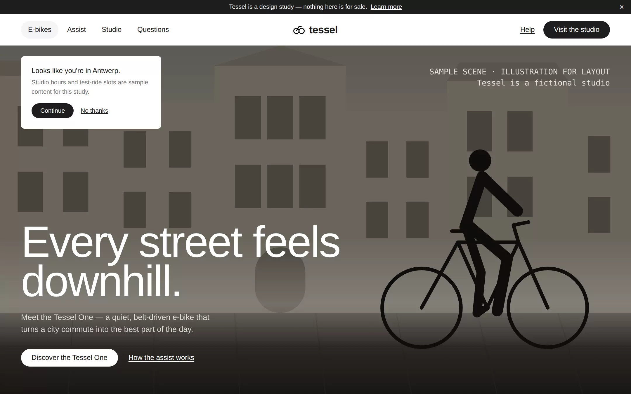
An original Tessel e-bike page: a Charcoal announcement bar, a white pill navigation with a centered wordmark, a full-bleed misty street hero with a floating locale card and a 100px headline, a centered editorial headline whose last word fades out, a product elevation with a segmented frame switcher and monospace specs, three feature cards, native questions and a hairline footer.
- Best for
- E-bike and mobility brands, premium hardware makers, design-led single-product companies and any launch where the object should carry the page.
- Tech stack
- - Next.js (App Router) - React - TypeScript - CSS custom properties - Native HTML disclosures Use Next.js App Router, React and TypeScript with plain CSS custom properties and original inline SVG for the street scene, the rider, the bicycle elevation, the wordmark and every icon. Preserve equivalent tools already installed in the host project. Render the page as a server component; the only client components are the frame tab switcher and the announcement dismiss, which keep local React state and send nothing. Native details and anchors need no JavaScript. Use local font stacks only — no remote font, image, logo, icon, video or analytics host. Provide page metadata. Build and run the production page before capturing its preview.
- Tags
- e-commerce · minimal · monochrome · hardware · editorial
The creation prompt
1676 words, self-contained. Paste it into a chat session with your coding agent and it builds Cowboy end to end.
Build the "Cowboy" kickstart — A porcelain-white e-bike showroom: poster-sized Swiss type, charcoal pills and nothing between you and the machine.

## Design
Build a rebrandable premium e-bike brand landing page.

Create a complete landing page for Tessel, a fictional Antwerp studio that designs one quiet, belt-driven city e-bike, the Tessel One, in two frame geometries. Its core idea: a gallery showroom where the machine and one sentence carry the room. This is a concept presentation, not a real store — no checkout, no booking, no accounts, no real prices, specs, reviews, press logos or awards. Use original branding, artwork and copy throughout.

Color: near-monochrome. Porcelain #FFFFFF is the canvas and every card surface. Charcoal #1D1D1D is primary text, the announcement bar, every filled primary button and dark feature cards — a soft, warm black; never use a chromatic action color. Hairline #E5E7EB draws every divider, card border, image frame and the specification grid — structure comes from 1px hairlines, never shadows or filled panels. Smoke #737373 is secondary body copy and inactive tabs, Ash #A3A3A3 the quietest tier (footer legal line), Mist #F3F4F6 only the active navigation pill and hover fills, Graphite #5E5E5E the primary-button hover, Onyx #000000 only SVG icon strokes. Moss #569D5F and Signal Blue #2563EB exist as semantic states only and appear nowhere on this page. The hero scene is the only place warm stone greys appear.

Typography: one Swiss grotesque for everything — "Suisse Intl", SuisseIntl, Inter, "Helvetica Neue", Helvetica, Arial, ui-sans-serif, system-ui, sans-serif — installed locally, no remote font request. Weights 400 body, 500 headlines, navigation and buttons, 600 only for the wordmark. Display headlines are poster-sized and cut: 100px/0.9 with -0.025em tracking for the hero h1 and the editorial headline, 72px/1.0 at -0.025em for section openers, 44px/1.05 at -0.02em for the product heading, 24px/1.25 at -0.015em for question summaries, 18px/1.25 feature labels, body 16px/1.5, secondary 14px. Tracking is never positive. The single departure: oversized specification numerals in a monospace — "JetBrains Mono", "IBM Plex Mono", ui-monospace, SFMono-Regular, Menlo, Consolas, monospace — at 64px/1.0 weight 400, plus a 13px monospace sample caption. Shapes: 9999px radius for every button, navigation item and tab segment; 8px for cards, image frames, dialogs and the tab container; never 4, 6 or 12px. No drop shadows anywhere.

Sticky announcement bar: a full-width 32px Charcoal strip, white 14px centered text Tessel is a design study — nothing here is for sale. with a weight-500 underlined Learn more link to the questions and a white × dismiss button at the far right (type=button, aria-label).

Pill navigation with a centered wordmark: a 72px white bar with a 1px Hairline bottom border, max-width 1440px with 48px gutters, a three-column grid. Left: navigation pills E-bikes, Assist, Studio, Questions — transparent, 16px weight 500 Charcoal, 8px 16px padding, 9999px radius; the current one and hover take a Mist fill. Center: the original wordmark — an inline-SVG mark of two linked wheels and a stem in Onyx strokes — beside tessel in 24px weight 600 at -0.02em. Right: an underlined Help text link and a Charcoal pill Visit the studio (12px 24px padding, 16px weight 500 white). Every link is an anchor to a real section.

Full-bleed street hero with a locale card: the hero fills the rest of the first viewport (100vh minus the two bars, min 640px). Its image is an original inline-SVG street scene, not a photograph: a misty dawn row of flat stone-grey Flemish facades with gabled roofs and dark window grids, an arched doorway, a cobbled road in darker greys with faint joint lines, a horizontal mist band, and a single rider on a bicycle drawn as a flat near-black silhouette mid-ride on the right. Over it a rgba(0,0,0,0.35) scrim. Top-left, floating on the image, a locale card — white, 8px radius, 24px padding, 320px wide — with a 16px weight 500 heading Looks like you're in Antwerp., a 14px Smoke line Studio hours and test-ride slots are sample content for this study., and inline a small Charcoal pill Continue plus an underlined No thanks ghost link. Top-right, a 13px white monospace caption at 75% opacity: SAMPLE SCENE · ILLUSTRATION FOR LAYOUT / Tessel is a fictional studio. Bottom-left, 64px from the base: the h1 Every street feels downhill. in white 100px/0.9 weight 500, max 820px wide; an 18px white sentence at 80% opacity Meet the Tessel One — a quiet, belt-driven e-bike that turns a city commute into the best part of the day.; then a white pill Discover the Tessel One with Charcoal text and an underlined white text link How the assist works. No gradient buttons, no decorative chrome.

Editorial display headline (id assist): white canvas, 120px top and 80px bottom padding, a centered 100px/0.9 headline Assist so natural, you forget it's there. whose last word fades to white with mask-image: linear-gradient(90deg, #000 10%, transparent 95%) — the system's single typographic flourish — and below it an 18px Smoke paragraph, max 560px, about a torque sensor adding just enough with no throttle.

Product showcase with a frame switcher and specs (id bike): 80px padding. A header row: left, the 44px heading The everyday one. and a Smoke subline One frame, two geometries. Belt drive, integrated lights and a battery hidden in the downtube.; right, a segmented tab switcher — 1px Hairline container with 8px radius and 4px padding, 9999px segments One and One Step-through, active Charcoal with white 14px weight 500 text, inactive transparent Smoke, real buttons with aria-pressed. Below, the bicycle floats on white with no border or shadow: an original inline-SVG side elevation in 10px Charcoal strokes — two wheels with Hairline inner rims, diamond frame, a thick downtube battery, a filled bottom bracket. Then a three-column specification grid under a Hairline top rule with Hairline column dividers: 64px monospace numerals 25, 80 and 18.9 above 14px Smoke captions km/h assisted top speed (sample), km range per charge (sample), kg frame weight (sample).

Feature cards (id studio): a 72px section opener Built for the ride you actually take., then a three-column grid, 24px gaps, of 8px cards with 48px padding: the first Charcoal with white text, the other two white with a 1px Hairline border. Each has a 28px line icon (circle, rounded bar, triangle), an 18px weight 500 label and a 14px descriptor at 70% opacity: Belt, not chain; Lights that stay on; One studio, one bike.

Native questions (id questions): a 72px Questions. heading and details elements separated by 1px Hairline rules, 24px weight 500 summaries with a + that becomes − when open, Smoke answers: Is Tessel real? — no, a fictional studio for this design study. Can I book a test ride? — no; there is no booking, store or checkout. Are the specs real? — no, every figure is labelled sample.

Hairline footer: white with a Hairline top rule, 64px padding, the wordmark and two short link columns (E-bikes, Assist, Studio; Questions, Back to top) resolving to real anchors, and a 13px Ash line Tessel is a fictional concept. Not a real brand, product or store.

At 760px and below: 16px gutters, navigation pills collapse leaving the wordmark and the primary pill, a 52px hero h1, 44px editorial and section headings, the locale card spanning the width, the sample caption hidden, the tab switcher below the product heading, the specification grid and feature cards in one column. The page fits a 360px viewport with no horizontal page overflow. Use semantic landmarks, one h1, a skip link, visible 3px Charcoal focus rings, the hero scene and product drawing each with one short text alternative and icons hidden from assistive technology, WCAG AA contrast on every text pair, and keyboard-operable tabs and questions.

## Tech stack
- Next.js (App Router)
- React
- TypeScript
- CSS custom properties
- Native HTML disclosures

Use Next.js App Router, React and TypeScript with plain CSS custom properties and original inline SVG for the street scene, the rider, the bicycle elevation, the wordmark and every icon. Preserve equivalent tools already installed in the host project. Render the page as a server component; the only client components are the frame tab switcher and the announcement dismiss, which keep local React state and send nothing. Native details and anchors need no JavaScript. Use local font stacks only — no remote font, image, logo, icon, video or analytics host. Provide page metadata. Build and run the production page before capturing its preview.
Where the repo you are working in already has an equivalent in place, keep the repo's choice and say which one you kept.

## Everything else
Keep Tessel clearly fictional and rebrandable: no source wordmark, photography, video, bike models, press logos, awards, copy or product names, no real brand, retailer or publication names, no testimonials, prices, discounts, financing or real specifications. Every figure is labelled sample and the hero scene is captioned as an illustration. No chromatic call to action and no drop shadows. Every link leads to a real section on the page; nothing is sent or stored. Deliver initially visible content with no scroll reveals, autoplay, video or carousel; hover and focus are a 150ms colour change, disabled for prefers-reduced-motion. WCAG AA contrast on every text/background pair, keyboard-operable tabs and questions, and a 360px layout without horizontal page overflow.

### Non-negotiables
- Responsive from 360px through desktop — no horizontal page overflow at any width. Deliberately scrollable regions stay within the viewport and remain keyboard and touch accessible.
- Every text/background pair clears WCAG AA (4.5:1 for body, 3:1 for large text); adjust a tint rather than shipping a failing pair.
- Fully keyboard operable, with a visible focus ring drawn in the accent colour.
- Honour `prefers-reduced-motion` — swap every transition for an instant state change.
- Write real copy in the voice described above; no lorem ipsum and no TODO placeholders.
- Use system or self-hosted fonts and CSS/SVG-drawn graphics — do not depend on a remote image or icon service.

Build the whole page end to end and show me the result running — not a description of it.
Pasting the prompt is step one. Fredrin runs the agent that builds it, one ticket per look.