Column
An institutional developer-bank landing page: tight Swiss-grotesque headlines in indigo navy on a cool off-white canvas, a halftone dot world map behind the hero and a floating transaction widget with a live-looking JSON response.
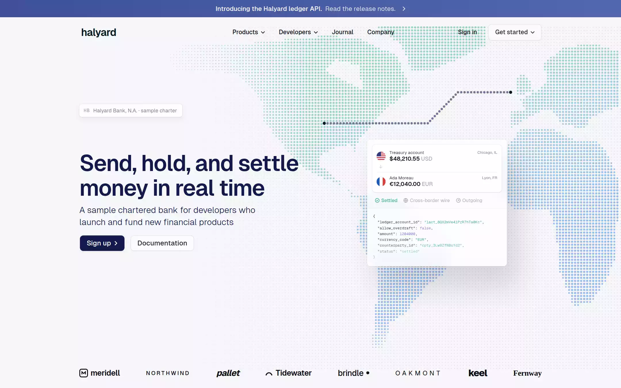
An original Halyard page on a cool off-white canvas: a gradient announcement bar; a 70px navigation with a ghost Get started button; a hero with a halftone dot world map, a dotted payment route, a sample-charter badge, a 52px indigo headline, a light 20px subline, a navy Sign up and ghost Documentation pair, and a floating transaction widget with a JSON response; a row of invented customer wordmarks; Trusted at scale with a seafoam candlestick chart and four stats; a one-orange Customer story card; Developer first with a numbered JSON panel; a Midnight Ink Infrastructure section with an isometric slab stack and product cards; a closing call and a footer.
- Best forFintech, banking-as-a-service, payments and infrastructure APIs that need to read as a trustworthy institution first and a developer playground second.
- Tech stack- Next.js (App Router) - React - TypeScript - CSS custom properties Use Next.js App Router, React and TypeScript with plain CSS custom properties for every colour, radius, shadow and spacing token. Render the page as server components; only the mobile menu needs a small client island, holding its state in memory. Self-host Geist and Geist Mono (SIL Open Font License) as variable woff2 through next/font/local — no remote font request — with Inter as the fallback stack. Generate the halftone world map at build time from a small committed land mask (coarse continent polygons rasterised to a 7px grid) into a static inline SVG, so the markup is identical on every render; draw the route line, flags, icons, the candlestick chart, the slab stack, the logos and every card as HTML, CSS and inline SVG with fixed sample data committed in the source. Provide page metadata. Build and run the production page before capturing its preview.
The prompt. 2322 words, self-contained.
Build the "Column" kickstart — An institutional developer-bank landing page: tight Swiss-grotesque headlines in indigo navy on a cool off-white canvas, a halftone dot world map behind the hero and a floating transaction widget with a live-looking JSON response.

## Design
Build a rebrandable landing page for a developer-first chartered bank and payments API.

Create a complete landing page for Halyard, a fictional nationally chartered bank that developers use to move, hold and lend money through an API: accounts, real-time payments, cross-border wires and lending, on one ledger. This is a concept presentation, not a real bank — no real charter, regulator badge, customer, logo, person, quote or figure. Use original branding, artwork and copy throughout.

Color: Cloud Canvas #F6F6F8 is the page — a near-white with a barely perceptible cool tint, never pure white. Pure White #FFFFFF is the top layer: cards, the transaction widget, code blocks, the ghost buttons' half-transparent fill. Indigo Navy #111A4A is the brand: every heading, the hero subline, the wordmark and the one filled primary button. Midnight Ink #011821 is the dark Infrastructure section and the end dots of the hero's route line. Obsidian #12161E is the navigation text; Charcoal #232730 is ghost-button text and code punctuation; Slate Ink #3B3E47 is secondary dark text; Body Gray #575A64 is muted body copy and helper text; Steel #7C7F88 is captions, stat labels and fine print on white; Fog #A9ACB6 is icon strokes, placeholder text and the faint ocean dots; Mist #CBCCCF is disabled detail; Silver Lining #E3E4E8 is every 1px border, divider and section rule — borders and whisper shadows separate surfaces, never heavy outlines. Data colours: Seafoam 700 #167E6C for stat figures, chart strokes and JSON keys on white; Seafoam 600 #44B48B for the Settled status, chart points and string values; Seafoam 400 #94EFB7 for string values on the dark section only. Signal Orange #EC652B is the single warm accent — exactly one featured card per page, in the Customer story — with Peach Glow #F2936B as its soft halftone wash. The announcement bar is a horizontal gradient from #3E5199 to #5467AC. The halftone map's dots run from a pale teal #8CCDBA at the top-left through #96C6DE to a soft blue #84B0E4 at the bottom-right; that gradient never touches a button or text.

Typography: one grotesque family for everything — Geist, "Inter", ui-sans-serif, system-ui, sans-serif — weights 300, 400, 500 and 600, with tight negative tracking at large sizes; Inter is the fallback if Geist cannot ship. Body text uses Geist, "Inter", ui-sans-serif, system-ui, -apple-system, "Segoe UI", sans-serif. Mono labels, eyebrows and code use "Geist Mono", "JetBrains Mono", ui-monospace, SFMono-Regular, Menlo, monospace. Hero headline 52px/57.2px weight 600, letter-spacing -1.56px (-0.03em), Indigo Navy; hero subline 20px/28px weight 300 (light) Indigo Navy; section headings 28px/30.8px weight 500 letter-spacing -0.28px; large dark-section heading 48px/52px weight 500 letter-spacing -0.96px; body 16px/22px weight 400; navigation 14px/21px weight 500 Obsidian; buttons 16px/16px weight 500; stat figures 28px weight 500 Seafoam 700 with 12px/13.2px Steel labels; eyebrows 12px/18px mono uppercase with 0.6px tracking; code 12px/18px mono (8.5–10px inside the small hero widget); announcement 15px/24px — weight 500 then 400.

Layout: one 1072px column centred at 1440px (x 184 to 1256). Radii: 8px on every button, card, input and widget; 6px on the hero badge; 9999px only on status badges. Section gaps 72px inside a section and 160–200px between sections; card padding 24px. Buttons sit 14px apart. No full-width hairline grids, no drop shadows except the three named ones below.

Announcement bar: a 40px full-width strip, the #3E5199→#5467AC gradient, centred white 15px text — Introducing the Halyard ledger API. in weight 500, then Read the release notes. in weight 400 at 82% opacity — and a small white chevron.

Navigation: a 70px row on Cloud Canvas with no border. Left at x 188: the lowercase wordmark halyard in 24px weight 600 Midnight Ink, letter-spacing -0.72px. From x 523: Products and Developers (each with a 10px chevron), Journal and Company — 14px/21px weight 500 Obsidian, 8px 16px padding, 8px radius, a rgba(255,255,255,.6) fill on hover. Right: Sign in as the same text link, then Get started with a chevron as a 38px ghost button — rgba(255,255,255,.5) fill, a 1px Silver Lining inset border, 8px radius, 0 16px padding, Charcoal text, a 6px backdrop blur.

Hero (id top): an 820px band. Its signature is a halftone dot world map drawn as inline SVG on a 7px square grid: land dots 1.5–5px in diameter (smaller at coastlines and toward the left and bottom edges, so the map fades out behind the headline and above the logos), coloured by the teal-to-blue gradient at 25–80% opacity; ocean cells carry tiny 1.5px Fog dots that fade in from x 320 and fill the right side. The Americas sit behind the centre of the page, Europe and Africa at the right edge. Over the map, a route of 5px slate dots (#6F7896), 7.5px apart, runs right from x 752 y 286, bends up at 45° and continues to x 1184 y 214, with 7px Midnight Ink dots at both ends. Left column, all left-aligned at x 184: a 30px badge at y 241 — 80% white with an 8px backdrop blur, 6px radius, a hairline ring and a soft 14px shadow — holding a tiny mono HB monogram in Fog and Halyard Bank, N.A. · sample charter in 12px Steel; the headline Send, hold, and settle / money in real time at y 350 on two lines; the subline A sample chartered bank for developers who launch and fund new financial products in a 446px measure at y 473; and at y 546 two 36px buttons — Sign up with a chevron, filled Indigo Navy with white text, 0 16px padding, an rgba(17,26,74,.1) 0 1px 3px shadow and a faint inset white top highlight; and Documentation as the ghost button. Right, at x 851 y 323: a 324px transaction widget — 72% white with a 10px backdrop blur, 8px radius, a 1px white inset border and the dramatic floating shadow rgba(30,30,44,.15) 24px 48px 64px. Inside: a white inner card (8px radius, hairline-plus-whisper shadow) with two rows — a 21px round flag, a 10px label (Treasury account / Ada Moreau), a 13px weight 600 amount ($48,210.55 / €12,040.00) followed by the currency in Fog, and a 9px Steel city (Chicago, IL / Lyon, FR) on the right — separated by a small down arrow and a hairline; then a row of three 11px status chips with 11px outline icons — Settled in Seafoam 600, Cross-border wire and Outgoing in Fog; then a JSON response in mono — keys in Slate Ink, strings in Seafoam 600, numbers and booleans in a soft violet #8B7FD9 — that fades out at the bottom edge.

Customer logos: one row at y 860 across the full 1072px column with space-between spacing — eight invented monochrome wordmarks in near-black #0B0D12 at 16–22px: meridell (with a rounded-square M glyph), NORTHWIND (spaced caps), pallet (bold italic), Tidewater (with an arc glyph), brindle (with a dot), OAKMONT (wide-spaced caps), keel (heavy) and Fernway (a serif). No card chrome, no colour.

Trusted at scale (id bank): a mono eyebrow TRUSTED AT SCALE in Seafoam 700 inside a 1px Silver Lining outline with a small seafoam dot, followed by a full-column Silver Lining rule. Left, a 526px block: the 28px heading Moving billions of sample dollars a month whose second half — for the teams building tomorrow's financial products. — fades to Steel; a 16px/22px Body Gray paragraph; and a Learn about our bank ghost button with a chevron. Right, a rising candlestick chart: thin vertical Seafoam 600 wicks with soft gradient tails and dark seafoam points, climbing from faint grey at the left to full colour at the right. Below, four stat columns with no dividers — $2.1T+ Annual sample volume, 99.995% Sample uptime, 24/7 Real-time settlement, 140+ Currencies supported — figures 28px Seafoam 700, labels 12px Steel.

Customer story (id customers): a large white card (8px radius, hairline-plus-whisper shadow) holding a row of four invented customer tabs, the first a Signal Orange #EC652B pill with a white wordmark and the others plain grey wordmarks. Left: a 28px heading Pallet runs its spend platform on Halyard, three small outline chips (Bank accounts, Domestic payments, International payments), and a quote mark with a 20px Indigo Navy quotation and a 14px Steel attribution, labelled sample. Right: stacked account cards over a Peach Glow halftone wash — the featured one a Signal Orange card with a 24px white balance, a white 60% line chart and 12px metadata; this is the page's only orange surface.

Developer first (id developers): eyebrow DEVELOPER FIRST in mono, a 28px heading The only bank built from the ledger up, a Body Gray paragraph, a Read the docs ghost button, then two 14px-heading columns — Close to the metal and Scale for every stage — with 14px Body Gray paragraphs. Right: a Pure White panel with a payment summary ($3,923.70, ACH, Outgoing, Submitted, a progress bar in Seafoam 600 between Halyard NA and a receiver) above a numbered JSON response in 12px mono — keys Slate Ink, strings Seafoam 600, numbers violet — fading at the bottom.

Infrastructure (id infrastructure): a full-bleed Midnight Ink #011821 section with 8px rounded top corners inset 8px from the viewport edges. Eyebrow INFRASTRUCTURE in mono Seafoam 400, the 48px white heading Flexible building blocks built on USD, a 16px rgba(255,255,255,.7) paragraph, and on the right an isometric stack of five dark glassy slabs drawn in SVG with thin hairline leader lines to small 11px labels — Your product, Middleware, Core systems, Sponsor rails, Central bank.

Products (id products): on Midnight Ink, a 2×3 grid of 8px-radius cards with a 1px rgba(255,255,255,.08) border — Payments, Accounts, Lending, Cards, Treasury, Reporting — each a 14px weight 500 white title, a two-line rgba(255,255,255,.6) description and a tiny mono endpoint such as POST /transfers in Seafoam 400.

Closing call: back on Cloud Canvas, a centred 48px Indigo Navy heading Start building on Halyard, a 20px light subline and the Sign up / Documentation button pair.

Footer: Cloud Canvas with a Silver Lining top rule; the wordmark and a 12px Steel line Halyard is a fictional sample bank. Not a real institution.; five columns — Products, Developers, Company, Resources, Legal — with 14px weight 500 Indigo Navy headings and 14px Body Gray links; a bottom row with © Halyard sample and a green status dot.

## Tech stack
- Next.js (App Router)
- React
- TypeScript
- CSS custom properties

Use Next.js App Router, React and TypeScript with plain CSS custom properties for every colour, radius, shadow and spacing token. Render the page as server components; only the mobile menu needs a small client island, holding its state in memory. Self-host Geist and Geist Mono (SIL Open Font License) as variable woff2 through next/font/local — no remote font request — with Inter as the fallback stack. Generate the halftone world map at build time from a small committed land mask (coarse continent polygons rasterised to a 7px grid) into a static inline SVG, so the markup is identical on every render; draw the route line, flags, icons, the candlestick chart, the slab stack, the logos and every card as HTML, CSS and inline SVG with fixed sample data committed in the source. Provide page metadata. Build and run the production page before capturing its preview.
Where the repo you are working in already has an equivalent in place, keep the repo's choice and say which one you kept.

## Everything else
Keep Halyard clearly fictional and rebrandable: no real bank, charter number, regulator logo or membership claim (the hero badge says sample charter), no real customer, logo, person, quote or figure; every name, amount, ID and statistic is invented and labelled sample. Indigo Navy #111A4A is the only filled button colour, always paired with a ghost button — never two filled buttons side by side — and Signal Orange #EC652B appears on exactly one surface. Seafoam colours mark data and code only, never prose. Buttons and cards stay at 8px radius; 9999px is only for status badges. Text pairs clear WCAG AA: Indigo Navy, Obsidian and Body Gray #575A64 on Cloud Canvas or white, white on Indigo Navy; Steel is for 12px captions on white only, and Fog is decorative. Every link leads to a real section on the page; buttons do not submit, sign anyone up or store anything; the page loads no analytics or tracking script and shows no cookie banner. Content is initially visible — no counters, typing, parallax, map animation or scroll reveal; buttons and nav items take their hover fill over 150ms, and transitions stop for prefers-reduced-motion. Every control shows a 2px Indigo Navy focus ring with a 2px offset. The map, route, widget, charts and slab stack are hidden from assistive technology. At 360px the centre navigation collapses into a Menu button, the headline drops to 36px/40px, the map shrinks behind the hero with the widget moving below the buttons, the logo row wraps to two lines, the stats become two columns, every two-column section stacks and the page never overflows horizontally.

### Non-negotiables
- Responsive from 360px through desktop — no horizontal page overflow at any width. Deliberately scrollable regions stay within the viewport and remain keyboard and touch accessible.
- Every text/background pair clears WCAG AA (4.5:1 for body, 3:1 for large text); adjust a tint rather than shipping a failing pair.
- Fully keyboard operable, with a visible focus ring drawn in the accent colour.
- Honour `prefers-reduced-motion` — swap every transition for an instant state change.
- Write real copy in the voice described above; no lorem ipsum and no TODO placeholders.
- Use system or self-hosted fonts and CSS/SVG-drawn graphics — do not depend on a remote image or icon service.

Build the whole page end to end and show me the result running — not a description of it.