 Fredrin
SaaS
CleanShot X
A blue-lit desktop studio: quiet white space, compact black type, one electric blue and layered Mac-window scenes.
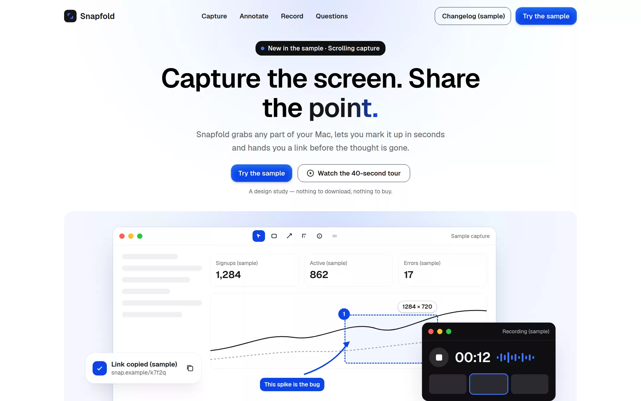
An original Snapfold Mac-utility page: a white navigation bar, a centred hero with a Studio Black announcement badge, a headline whose last word sweeps into electric blue and a pale blue glow, a large layered macOS demo scene with an annotation marquee and a recorder window, a monochrome workflow strip, three alternating feature rows with a local capture-mode switcher, sample field-note cards, a Studio Black shortcuts band with a guarded email field, native questions and a quiet white footer.
- Best for
- Mac and desktop utilities, screenshot and screen-recording tools, developer and productivity apps, and any product whose own interface should be the hero image.
- Tech stack
- - Next.js (App Router) - React - TypeScript - CSS custom properties - Native HTML disclosures Use Next.js App Router, React and TypeScript with plain CSS custom properties and original HTML/CSS or inline SVG for the mark, every macOS-window scene, tool icons and keycaps. Preserve equivalent tools already installed in the host project. Render the page as a server component; the only client components are the capture-mode switcher, the field-notes scroll buttons and the release-notes form guard, each keeping local React state and sending nothing. Native details and anchors need no JavaScript. Use local font stacks only — no remote font, image, photo, logo, icon, video or analytics host. Provide page metadata. Build and run the production page before capturing its preview.
- Tags
- saas · productivity · light · macos · minimal
The creation prompt
1964 words, self-contained. Paste it into a chat session with your coding agent and it builds CleanShot X end to end.
Build the "CleanShot X" kickstart — A blue-lit desktop studio: quiet white space, compact black type, one electric blue and layered Mac-window scenes.

## Design
Build a rebrandable Mac screenshot-and-recording utility landing page.

Create a complete landing page for Snapfold, a fictional macOS app that captures screenshots and screen recordings, annotates them and shares a link. Its core idea: a blue-lit desktop studio — quiet white space around compact black type, where one saturated blue and layered Mac-window scenes create every focal point. This is a concept presentation, not a real product — no purchase flow, accounts, prices, download counts, ratings, customer logos, testimonials or real people. Use original branding, artwork and copy throughout.

Color: Paper White #FFFFFF is the page, the navigation and every card. Absolute Ink #000000 is display headlines and high-emphasis copy. Graphite #161618 is navigation labels, secondary headings, outlines and icon strokes. Soft Charcoal #6A6A6B is every supporting paragraph and metadata line (never set paragraphs in black). Studio Black #0F0F12 is the announcement badge, dark app windows and the full-width dark product band. Electric Capture Blue #0D44E8 is the ONE saturated colour: filled primary buttons with white text, a few product accents such as a selection marquee or an active annotation tool — never a page background, a broad section fill or default text. Electric Blue Sweep linear-gradient(90deg, #161618 0%, #161618 60%, #174EF2 100%) sets only the final word of the hero headline (as background-clip text) and the top edge of the dark band. A pale blue atmospheric glow — radial-gradient(ellipse at 50% 0%, rgba(23, 78, 242, 0.14), rgba(164, 216, 251, 0.10) 40%, transparent 70%) — sits behind the hero and inside media cards only, never as a section fill. No other hues: no coloured semantic badges; chips are Studio Black or Paper White.

Typography: one family for everything — "Google Sans Flex", "Google Sans", Inter, "SF Pro Text", system-ui, sans-serif — installed locally, no remote font request. Display 60px/66px weight 600 with -1.2px tracking for the hero h1; section headlines 40px/48px weight 600 with -0.8px tracking; feature headings 20px/28px weight 600; body 18px/30px weight 450 in Soft Charcoal; navigation 15px/24px weight 550; metadata 14px/20px weight 550; captions and micro-labels 13px/16px at 450 or 550. Never bold 700–800 display type. Shapes: 14px radius on every rectangular button, badge and input (never pill buttons); 20px on cards and media containers; 16px on the dark-surface input; 9999px only on 40px circular icon controls. Spacing: 12px local gap, 16px compact inset, 40px section-gap token doubled to 80px between major sections, content inside a 1200px column. Elevation: cards use rgba(22, 22, 24, 0.02) 0px 7px 20px -8px, rgba(22, 22, 24, 0.02) 0px 29px 33px -4px, rgba(22, 22, 24, 0.05) 0px 22px 30px -8px, rgba(22, 22, 24, 0.06) 0px 0px 0px 1px; the blue primary button uses rgba(4, 24, 85, 0.28) 0px 2px 6px -1px, rgba(66, 174, 247, 0.48) 0px 6px 14px 0px inset with a 1px rgba(255, 255, 255, 0.4) border; white utility chips use rgba(22, 22, 24, 0.2) 0px 2px 6px -1px, rgba(22, 22, 24, 0.16) 0px 0px 0px 1px. No heavy black shadows anywhere.

Top navigation: white, 72px tall, inside the 1200px column. Left: an original inline-SVG mark (a Graphite rounded square with a blue corner-bracket crop mark) beside Snapfold at 18px weight 600. Centre: Capture, Annotate, Record, Questions as 15px weight 550 Graphite links, each an anchor to a real section. Right: a transparent outlined 14px-radius Changelog (sample) button with a 1px Graphite border and a filled Electric Capture Blue Try the sample button.

Centered hero (glow behind it): a Studio Black announcement badge — 14px weight 550 white text at +0.14px, 14px radius, 8px 13px 8px 8px padding, with a small blue dot — reading New in the sample · Scrolling capture; the h1 Capture the screen. Share the point. at 60px, centred, max two lines, with only point. set in Electric Blue Sweep; an 18px Soft Charcoal paragraph (max 560px, centred) Snapfold grabs any part of your Mac, lets you mark it up in seconds and hands you a link before the thought is gone.; a two-button group — a filled blue Try the sample button and a white Watch the 40-second tour button with a 1px Graphite outline, Graphite text and a small outlined play glyph at an 8px gap; and a 13px Soft Charcoal line below: A design study — nothing to download, nothing to buy.

Product demo media card directly under the hero: a 1200px-wide, 20px-radius media card filled with the pale blue glow over #F4F7FE, containing a layered macOS scene built in HTML/CSS — a large light app window (traffic-light dots, a toolbar of Graphite outline tool icons with the active arrow tool in Electric Capture Blue) showing a sample dashboard screenshot being annotated: a dashed blue selection marquee with a white utility chip reading 1284 × 720, a blue arrow, a numbered blue step dot and a short text callout; over its lower right, a smaller Studio Black recording window with a white 00:12 (sample) timer, a circular stop control and a thumbnail strip; and over its lower left, a floating white card (card shadow, 20px radius) titled Link copied (sample) with a fake short URL and a Graphite copy icon. Every piece is HTML/CSS/inline SVG, labelled sample, with a text alternative.

Workflow strip: a muted row on white with the 13px weight 550 Soft Charcoal label Made for (sample) followed by six monochrome Graphite-at-45%-opacity word marks of generic work types — Bug reports, Design reviews, Docs, Support replies, Onboarding, Release notes — never real company logos.

Alternating feature rows (ids capture, annotate, record): three split rows, 80px apart. Each: on one side a 40px section headline (Capture anything., Mark it up., Record the fix.), an 18px Soft Charcoal paragraph and a list of three 15px Graphite points each with a small blue check glyph; on the other side a 20px-radius media card with the pale glow and a layered Mac-window composition (capture: a region-selection scene with crosshair and pixel-dimension chip; annotate: a window with arrow, blur box, highlight and counter tools; record: a Studio Black recorder with a webcam bubble and a waveform). Sides alternate. The capture row carries a local mode switcher — a 14px-radius segmented control on rgba(22, 22, 24, 0.05) with Area, Window, Fullscreen, Scrolling — whose active segment is white with the utility-chip shadow and swaps the media card's caption from local state; it sends nothing.

Field notes (sample): a 40px headline Small captures, big saves. with two 40px circular icon controls (rgba(22, 22, 24, 0.05) fill, Graphite arrows) that scroll a horizontal row of three white 20px-radius cards with the card shadow and 16px inset — each an initials avatar, a 14px weight 550 Graphite role line (Sample · Product designer, Sample · Support lead, Sample · Staff engineer) and a 16px Absolute Ink note describing a workflow, clearly labelled sample, never a testimonial or rating.

Dark product band (Studio Black #0F0F12, full width, a 2px Electric Blue Sweep top edge): a 40px white headline Keep the shortcuts close., an 18px paragraph in rgba(255, 255, 255, 0.72), a row of five keyboard-shortcut keycaps (dark 14px-radius caps with a 1px rgba(255, 255, 255, 0.24) border and white glyphs) for Capture area, Capture window, Record, Annotate last, Copy link, and a dark-surface email field (transparent, white text, 1px rgba(255, 255, 255, 0.24) border, 16px radius, 18px horizontal padding, placeholder [email protected]) beside a blue Get release notes (sample) button; the form prevents submission and says Nothing is sent — this is a sample. below it in 13px rgba(255, 255, 255, 0.72).

Questions (id questions, white): a 40px headline Questions, then native details elements on 1px rgba(22, 22, 24, 0.12) rules with 18px weight 600 Graphite summaries and a thin chevron that rotates when open: Is Snapfold real? — no, it is a fictional app for this page. Where do captures go? — nowhere; the page stores and sends nothing. Can I change the shortcuts? — in a real build, yes; here they are illustrative.

Footer: white with a 1px rgba(22, 22, 24, 0.08) top rule, the mark and Snapfold, a four-column grid — Product, Workflows, Resources, Studio — with 13px weight 550 Soft Charcoal titles and 14px Graphite links, each an anchor to a real section, then a 13px Soft Charcoal line Snapfold is a fictional concept. Not a real product or service.

At 760px and below: 16px gutters, the navigation keeps only the mark and the blue button, a 40px hero h1 and 32px section headlines, the hero buttons stack full-width, the demo scene scales down with the recorder window below the main window, feature rows stack text above media, the shortcut row wraps, and the footer goes to two columns. The page fits a 360px viewport with no horizontal page overflow. Use semantic landmarks, one h1, a skip link, visible 2px Electric Capture Blue focus rings offset 2px on every control, text alternatives for every scene and the mark, and a keyboard-operable segmented control, carousel buttons and disclosures.

## Tech stack
- Next.js (App Router)
- React
- TypeScript
- CSS custom properties
- Native HTML disclosures

Use Next.js App Router, React and TypeScript with plain CSS custom properties and original HTML/CSS or inline SVG for the mark, every macOS-window scene, tool icons and keycaps. Preserve equivalent tools already installed in the host project. Render the page as a server component; the only client components are the capture-mode switcher, the field-notes scroll buttons and the release-notes form guard, each keeping local React state and sending nothing. Native details and anchors need no JavaScript. Use local font stacks only — no remote font, image, photo, logo, icon, video or analytics host. Provide page metadata. Build and run the production page before capturing its preview.
Where the repo you are working in already has an equivalent in place, keep the repo's choice and say which one you kept.

## Everything else
Keep Snapfold clearly fictional and rebrandable: no source wordmark, product screenshots or recordings, no purchase flow, prices, customer or partner logos, real company or person names, ratings, download counts, testimonials or endorsements. Every note, count, dimension, URL and timer is labelled sample. Electric Capture Blue is for filled primary buttons and small product accents only, never backgrounds, broad fills or body text; Electric Blue Sweep sets only the hero's final word and the dark band's top edge; the pale blue glow stays behind the hero and inside media cards. Buttons, badges and inputs keep 14px corners — never pills; only icon controls are circular. Supporting paragraphs are Soft Charcoal, never black; headlines stay at weight 600. Every link leads to a real section on the page; nothing is sent or stored. Deliver initially visible content with no scroll reveals, autoplay video, marquees or auto-advancing carousel; hover and focus are a 150ms colour or shadow change, disabled for prefers-reduced-motion. WCAG AA contrast on every text/background pair, keyboard-operable controls and disclosures, and a 360px layout without horizontal page overflow.

### Non-negotiables
- Responsive from 360px through desktop — no horizontal page overflow at any width. Deliberately scrollable regions stay within the viewport and remain keyboard and touch accessible.
- Every text/background pair clears WCAG AA (4.5:1 for body, 3:1 for large text); adjust a tint rather than shipping a failing pair.
- Fully keyboard operable, with a visible focus ring drawn in the accent colour.
- Honour `prefers-reduced-motion` — swap every transition for an instant state change.
- Write real copy in the voice described above; no lorem ipsum and no TODO placeholders.
- Use system or self-hosted fonts and CSS/SVG-drawn graphics — do not depend on a remote image or icon service.

Build the whole page end to end and show me the result running — not a description of it.
Pasting the prompt is step one. Fredrin runs the agent that builds it, one ticket per look.